
Mobile platforms are both limited in terms of their user input and also, in other ways, vastly superior to traditional laptops and desktops. Designing apps or web sites for mobile means taking into account the differences in the way that users can interact with a device and shaping the experience of the final product to take advantage of the strengths of the platform while avoiding, as best as possible, the weaknesses.
On the desktop user input is reasonably easy to coax from the user. There’s a nice big keyboard and a mouse for the individual to take advantage of. Of course, a good user experience still tries to avoid demanding too much effort from the user in terms of input but there’s a greater degree of freedom for designers than there is on mobile.
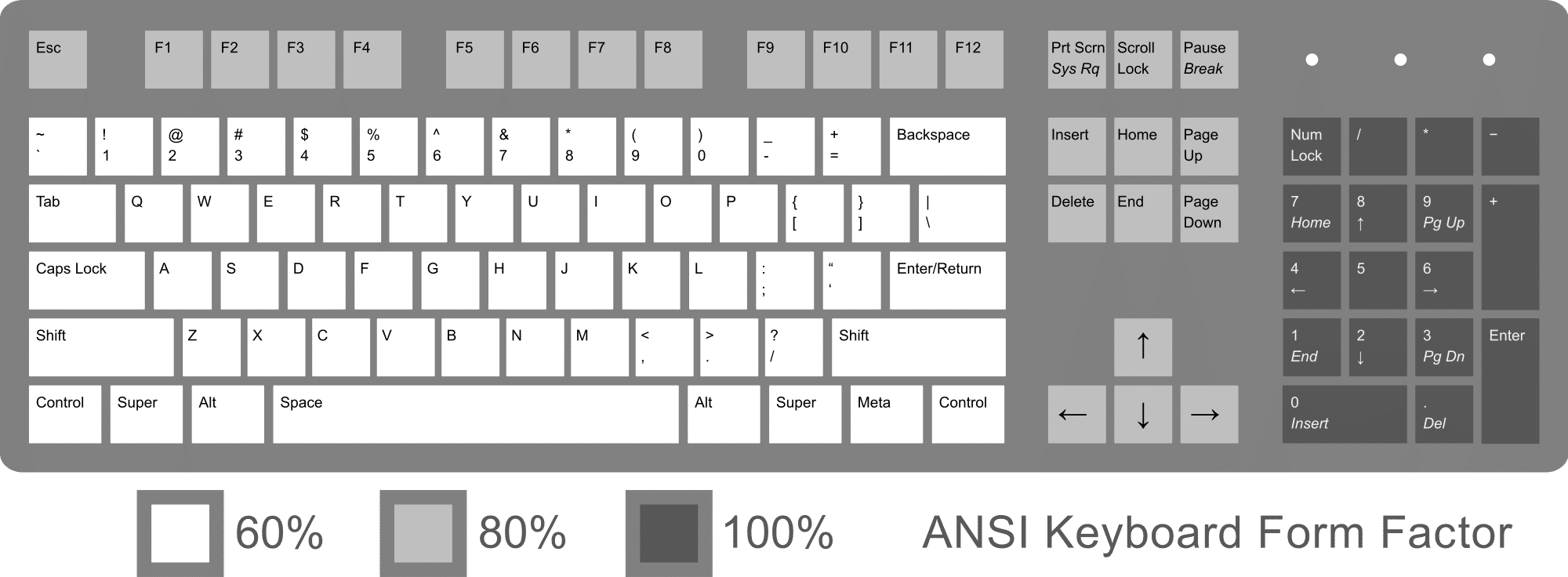
Author/Copyright holder: Rumudiez. Copyright terms and licence: CC BY-SA 3.0
Mobile input is substantially different. Keyboards aren’t as easy to type on when they occupy a tiny space on a touchscreen surface. There’s no mouse at all. Then there’s the addition of gesture controls and eyeball tracking that aren’t commonly available to the desktop user. So what makes for a good user input experience on mobile?
Simple Guidelines for Mobile User Input
Keep it Simple Stupid (KISS)
You don’t want to overwhelm users with page after page of data collection on mobile. It’s simply not practical to try and extract the same volumes of data from a user that you would on a desktop. So keep it simple stupid and try to reduce the input to essential data only. You want to be as thorough as possible when it comes to reducing the number of fields and try to capture data in the most efficient manner possible (for example – you could take a Post Code or ZIP Code instead of large amounts of address data).
Offer Default Inputs When It’s Practical
If you know, for example, that 85% of your customers come from the United States and that 10% come from the UK (with the other 5% coming from everywhere else) – your default country option should be the United States and if you offer a drop down list to choose from, the next option at the top of the page should be the United Kingdom. There’s no need to make users hunt for data that you can reasonably predict. This won’t always be practical but if you can find a decent default choice for a field – make sure that you have it filled in.
Think About the Device Capabilities
You can use motion capture, the camera, the internal accelerometer and gyroscope for positioning, the GPS and of course, voice on a mobile for input options. Mobile app designers seem to already have a pretty good handle on these ideas and take advantage of them wherever they can – mobile web designers, on the other hand, are flagging behind. It’s important to take advantage of simple ways to collect inputs and really build on the capabilities of the devices people use to access the mobile web.
Give the Right Keyboard for the Right Task
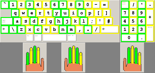
Author/Copyright holder: Jmarchn. Copyright terms and licence: CC BY-SA 3.0
For touchscreen smartphones – if you want the user to enter data – try to give them the right keyboard to do it with. If you’re capturing a telephone number; provide a numeric keyboard to get people started quickly. If you’re capturing a name; provide an alphabetical keyboard. This isn’t rocket science and it saves people from having to switch between the two and thus enables them to focus on providing the right input.
Don’t Forget Not All Phones are Smartphones
There are still people accessing the mobile web on more traditional handsets and it’s a pain in the posterior to enter data from these kinds of phone. Each letter requires multiple key presses and it can be really tedious to enter more than a small amount of data in this way.
Hold Information Where Possible
Assuming the application doesn’t hold hugely sensitive data – don’t make users enter passwords to access the information. Also make it easy to transfer data between devices, there’s no need for someone who has a desktop account to recreate the wheel when opening a mobile account. Data should move seamlessly between the two whenever possible.
Offer Error Minimization
It needs a little thought but if you can integrate auto-complete or spell check or predictive text into your application; you can make it easier on your users when it comes to providing the right information at the right times. However, you don’t want to overdo this as it can become annoying when applied to fields where there are no standard inputs (for example name fields).
Kill CAPTCHA
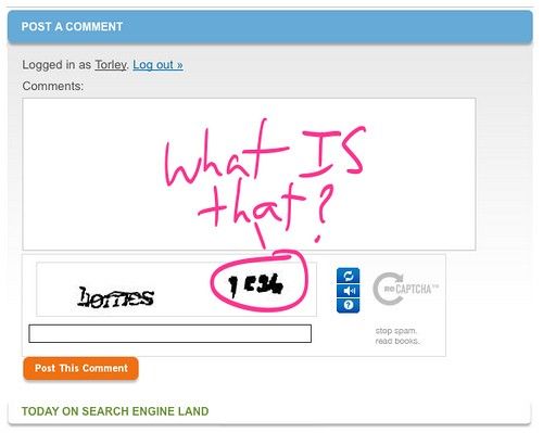
Author/Copyright holder: TORLEY. Copyright terms and licence: CC BY-SA 2.0
There is no bigger irritant online today than the CAPTCHA. You want to design your mobile applications to avoid CAPTCHA whenever possible. The small screens make it less than ideal as a security measure and there are better ways to secure an application (on any screen) than with CAPTCHA.
The Takeaway
Mobile inputs need to be carefully thought out in order to make the user experience a pleasurable one. However, the list above provides good guidelines to direct your thinking when creating mobile apps and mobile websites. Please remember that guidelines are not a substitute for user research and testing your user inputs remains a high priority when trying to deliver effective mobile products.
References
Check out these useful mobile input UI patterns at Design Modo.
The NN Group provides a handy checklist for mobile input design.
Some tips on mobile label positioning: Field Label UX: Place Labels Above the Field
Hero Image: Author/Copyright holder: matt buchanan. Copyright terms and licence: CC BY 2.0


