
Some design patterns improve your life on a daily basis. But do you even notice these patterns? Two-panel selectors are used in nearly every email application and should therefore be very familiar to you. And their usefulness goes far beyond using email. It’s time to step back and revisit these with a designer’s eye. Here, we’ll take a look at when and how to implement them... and what to look out for when we do. We promise you this: you’ll never look at your inbox the same way again!
The Design Problem
There are many occasions where the user needs to see a list of options, categories, commands or other related items, but he or she still needs the list in view in order to make a selection. The user must be given the facility to review the contents of one of the list items while having access to all other items, or—at the very least—an overview of the list structure, as is the case with email applications where the user can see the message folders on the left-hand side of the screen. Users need this, as their tasks require them to switch between overall items and specific content multiple times while they’re performing a task.
The Design Solution
Two-panel selectors are commonplace in web and application design as they enable users to view the contents of individual files, emails, and other content-carrying items in one panel and quickly switch between them in another. We typically find them in mailer user agents (MUAs) such as Outlook or file management programs such as Windows Explorer, and they are used frequently enough for the majority of users to be familiar with the design and means of interaction. As you can see from the application below (Slack), two-panel selectors are so-called as the user is provided with a list of options, files, commands or other clickable items in one panel and the contents of the selected item are displayed in a second panel.
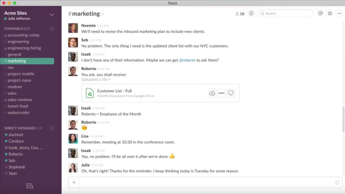
Author/Copyright holder: Slack. Copyright terms and license: Fair Use.
An example of a two-panel selector is the Slack collaboration application. It clearly shows a list of so-called channels (groups of users) and individual users in one panel and the contents of the conversations within a channel or with a specific user in the second panel.
Why Choose a Two-Panel Selector Design Pattern?
Maintaining the individual items in view, while users delve into one particular item in the list, means they can move seamlessly from one item to another. Users can view each item's contents simply by clicking on the region of space occupied in the list, or by clicking on a specific point, such as the file name or another corresponding element affording interaction. Positioning the two panels side by side or in a top-and-tail manner allows viewers to switch their attention from the contents of one item to other potential selections, without having to carry out any intermediate steps or interactions, as is the case with dropdown menus and tabs. Furthermore, users do not have to scan large amounts of screen space; nor do they need to skip between different sections of the site or application in order to gain access to the list of options or individual contents. This high level of cohesiveness between the list of options and their corresponding contents reduces the amount of physical 'traveling' required, both in terms of the number of interactions required and the distance users must span when switching their attention from one panel to another.
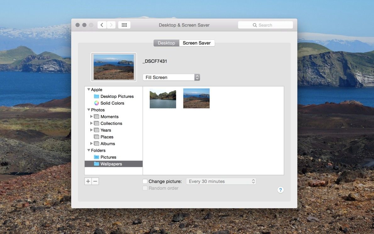
Author/Copyright holder: Apple. Copyright terms and license: Fair Use.
Two-panel selectors have the benefit of allowing the user to skip from one item to another at lightning speed, without having to switch between different sections of an application. In this example, the user can easily search for an appropriate background image in different folders.
Another benefit associated with using two-panel selectors is the minimal cognitive expenditure required, as the same visual framework is used for all objects and the same spatial location is preserved regardless of which list item is selected or how many selections the user makes. User interface designs that involve movement from one section, window or page to another sometimes involve multiple visual styles, formats or layouts. All of these demand more from the user, as users must orient themselves every time they reach a new position and find the information relevant to their current task(s).
Human spatial memory is limited. Did you know we are estimated to be capable of maintaining only nine distinct items in an active state? Perhaps if we envisage this as having to juggle nine balls at once, we might not balk so much or feel quite so inadequate. Even so, designs that involve movement from one region of the user interface to another interrupt the experience of scanning options and checking their contents, which forces the user to maintain information in short-term memory. Two-panel selectors relieve users of the burden of having to remember where things are, as they are never completely removed from view. In the same way global navigation bars, maintained across all pages of a website or application, serve as a reminder of where the user is in the system—two-panel selectors provide users with a stable visual framework that leaves them in no doubt where they are and how they can achieve their current aims.
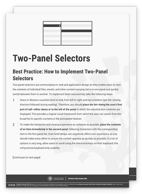
Best practice: How to Implement Two-Panel Selectors
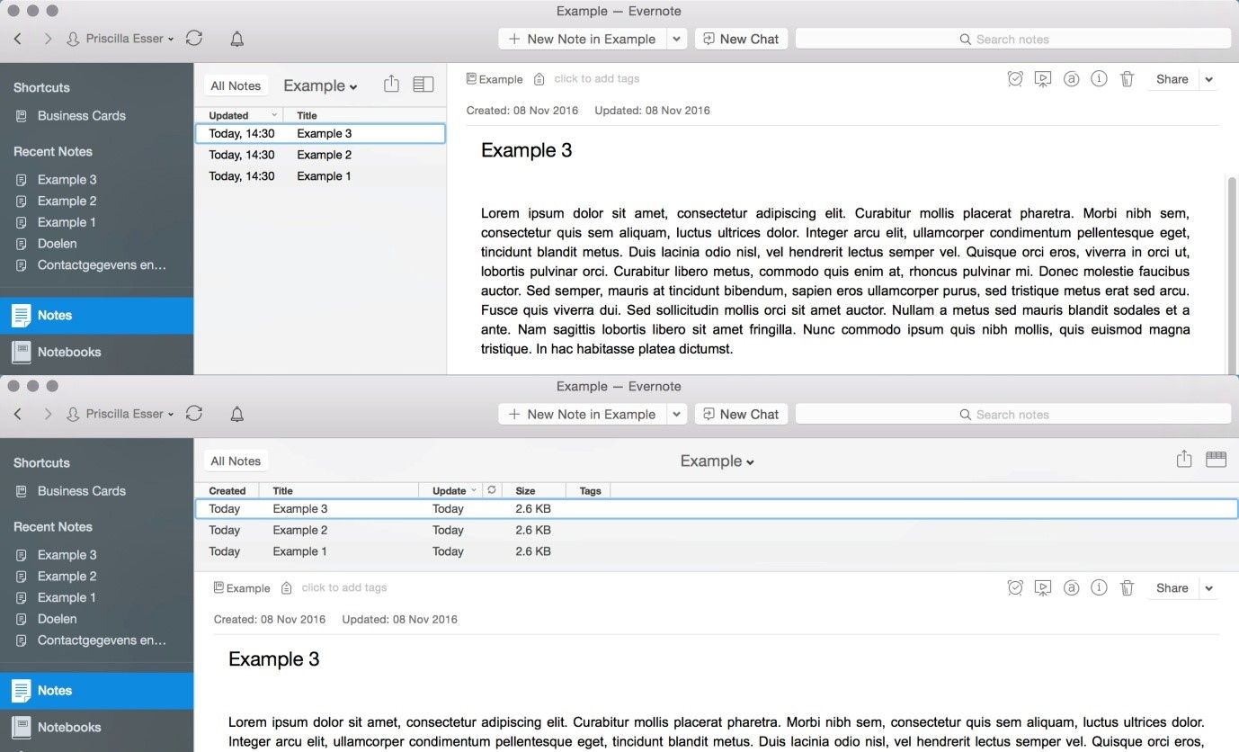
Whether users look from left to right and top to bottom or the opposite tend to change according to the viewing direction followed during reading in their home country. Therefore, how you place the list in your design depends on your primary user group- E.g. when designing for users from western countries, place the list—being the user's first port of call—either above or to the left of the panel in which the selected item contents are displayed. This provides a logical visual framework from which the user can switch from the broad list to specific contents in the anticipated fashion.
![]()
Author/Copyright holder: Evernote. Copyright terms and license: Fair Use.
Users in the Western world tend to look from left to right and top to bottom, so when you design for those users the list should be placed either above or to the left of the panel in which the selected item contents are displayed. Evernote offers users a choice between these (and other) types of views for the two-panel selector.
To make the interactive and viewing experience as cohesive as possible, place the contents of an item immediately in the second panel, following interaction with the corresponding item in the first panel list. Even brief delays can negatively affect user experience, so you should make every effort to ensure the content appears as quickly as possible. If a list of options is very long, allow users to scroll using the directional keys on their keyboard; this will promote keyboard-only usability.
The selected option in the first panel must also be distinguished from the rest so as to provide users with a means of instantly determining which item contents they are currently viewing. You can achieve this by using a different color background for the selected option or using a clear, unmissable marker, such as a black dot or some other eye-catching shape. Humans are amazingly adept at spotting differences; as long as the selected item is distinct from the unselected ones in some way and the chosen method does not occlude or sacrifice the clarity of the list item, it will likely achieve the desired effect.
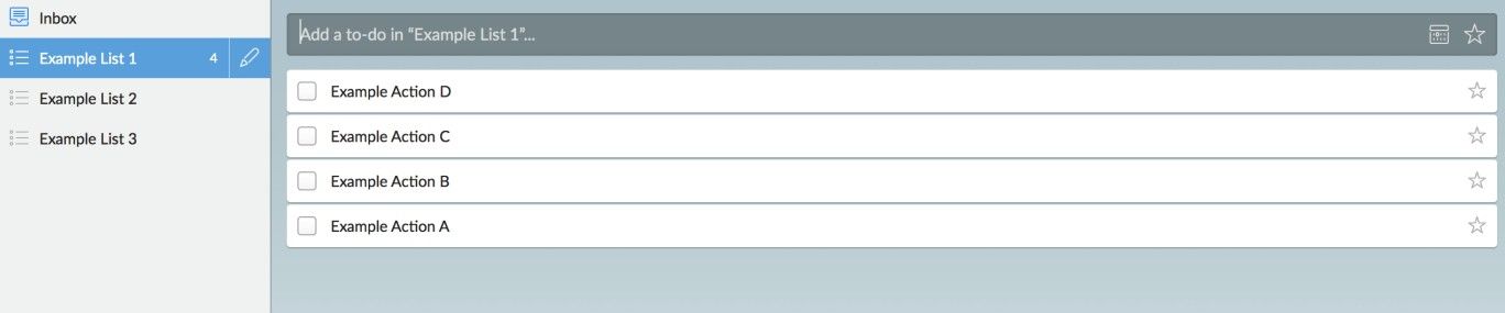
Author/Copyright holder: Wunderlist. Copyright terms and license: Fair Use.
This example from Wunderlist shows one way of distinguishing the selected option in the first panel from the rest, by using a different color background for the selected option.
To help you get started implementing two-panel selectors, you can download and print our “Two-Panel Selector” template:
Potential Problems with Two-Panel Selectors
The appearance of the option list is constrained by the nature of the content and the intended tasks. This means a one-size- or one-design-fits-all approach will not work for all occasions – for example, email clients employing a two-panel selector to display brief overviews of individual messages, while other applications simply show category labels or titled sections. Following convention is a reasonably sound policy; if the application or site you are designing performs or affords similar functions to existing sites or applications, use these norms to avoid the mistakes and bad designs that have gradually been filtered out over time. Don’t leave it to chance that the users will pick up on your stylistic choice – they may well not.
“The universe is not required to be in perfect harmony with human ambition.”
—Carl Sagan, American astronomer, cosmologist, astrophysicist, astrobiologist, and science popularizer
If, as a designer, you want to embrace the benefits of two-panel selectors to their maximum potential, beware of getting overenthusiastic and creating three or more panels. This may lead to a decrease in usability, as the example below shows. You should take this into consideration if you need to guide your users through multiple layers of content.
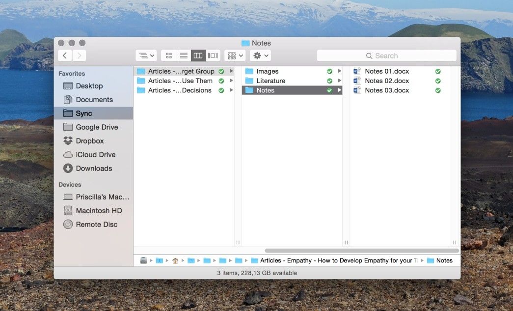
Author/Copyright holder: Apple. Copyright terms and license: Fair Use.
The Macbook Finder Application takes the two-panel selector design pattern to the next level, allowing a seemingly unlimited number of panels next to each other. Although this allows seamless movement through multiple layers of content, an important consequence of this design choice is the horizontal scroll bar that is needed to view all panels.
The Take Away
Use the two-panel selector anytime your users want to skip through content at speed. It helps them keep an overview and dive into the details at the same time. It also greatly improves efficiency and reduces cognitive load. However, take care when implementing this design pattern: a one-size-fits-all approach does not work. You need to take into account conventions as they apply to similar applications or websites, or allow the user to personalize the appearance of the panels. You’ll recognize a great application of this design pattern when your design allows you to take to the content without your needing to hesitate and question what’s going on.
References & Where to Learn More
Hero Image: Author/Copyright holder: Pixabay. Copyright terms and license: CC0.
Jenifer Tidwell, Designing Interfaces: Patterns for Effective Interaction Design, 2010
Martijn van Welie, Pattern Library, 2008


