
There are many rules for navigation UX; some of them complex and only used in very specific circumstances. Yet, there are some rules which will apply to nearly every situation. We’ve come up with six simple rules that may help you get your navigation UX closer to perfection:
Rule 1: Be Clear
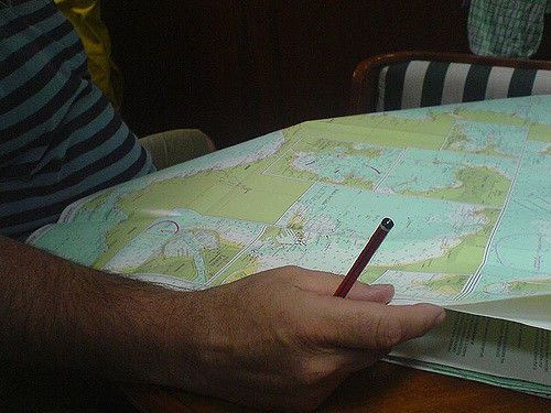
Author/Copyright holder: Tom Longfield. Copyright terms and licence: CC BY 2.0
This is true, not just for navigation, but wherever you use written content. You need to be clear. That means your text should say what it means and mean what it says. Lewis Carroll would approve. If you’re uncertain as to whether your text is clear – test it with some users or anyone who is not part of your design team. If they don’t get it; go back to the drawing board.
Rule 2: Keep It Simple Stupid (KISS)
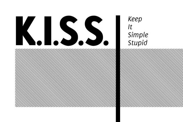
Author/Copyright holder: Kristian Bjornard. Copyright terms and licence: CC BY-SA 2.0
It is always better to assume that your users have no technical grounding in the acronyms, jargon, etc. associated with your product. Talk to them in plain English. Keep the number of words to a minimum. Keep the reading age (use a Fleisch-Kincaid score if necessary) as low as possible. The more familiar your users are with the words you use; the easier they will find them to understand.
Rule 3: Make Things Obvious
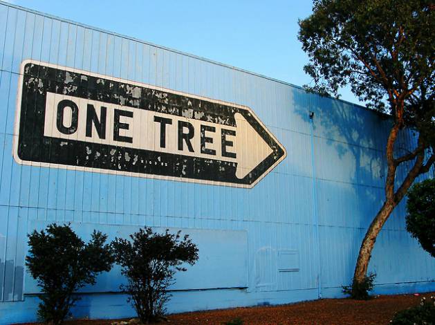
Author/Copyright holder: darwin Bell. Copyright terms and licence: CC BY-NC 2.0
This is particularly true when you start designing icons. You want to avoid overlap or similarity between items. You want your user to see an icon and think “Aha! That’s what I need to do.” and not “Is that the Save or Delete button?”
Rule 4: Rely on Recognition
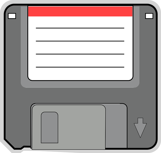
Author/Copyright holder: Pixabay. Copyright terms and licence: Public Domain
Never reinvent the wheel unless it’s absolutely necessary. Use familiar icons, descriptions, etc. that have become an industry standard. We all know that a little floppy disc icon is “save”; you can’t make that any easier or clearer. This remains true even when the last floppy disc to be used is gone. Once there’s a cultural agreement on what an icon means; the thing that inspired the icon doesn’t have to be around anymore.
Rule 5: Ensure Consistency
Your labels, icons, etc. must support each other. The help text for an icon, for example, should clearly reinforce the purpose of that icon and not offer any contraindication that it does something completely different. You want a single message that your user can understand; not a bunch of conflicting ones that confuse them.
Rule 6: Get the Tone Right

Author/Copyright holder: Norm4nNorm4l. Copyright terms and licence: CC BY 2.0
Nobody likes to be told what to do. Nobody likes to be SHOUTED AT. You need to design your navigation to feel supportive and reassuring. The objective is always to get the user to where they want to go with the minimum of fuss. It is never to ridicule, patronize, or annoy them for failing to do so.
Header Image: Author/Copyright holder: CSS Tutorial. Copyright terms and licence: Fair Use.


