
It doesn’t matter how great the functions and content, that your mobile apps serve, are – if your user can’t find them, they aren’t going to contribute to a great user experience. Navigation on the mobile web comes with challenges thanks to the reduced screen real estate available on smartphones. However, there are some good best practice guidelines to get your mobile app’s navigation moving in the right direction.
Author/Copyright holder: Mike Lee. Copyright terms and licence: CC BY 2.0
Users on smartphones don’t always have the time to hunt for what they need in a mobile app. With up to 150 interactions with a smartphone a day; the easier it is for a user to get to where they want to be – the more likely it is that they will find the experience of using your mobile app a pleasing one.
There are three considerations to bear in mind when designing navigation systems for mobile apps:
Top level infrastructure – how can people move around the app easily
Local cues – spatial constructs that enable the user to understand where they are
Guides – signs, symbols, etc. that help guide the user through a location
Top Level Infrastructure
There are many ways to manage navigation at the top-level and some of the most common are:
Hierarchical Tree Navigation
Nested Doll Navigation
Hub and Spoke Navigation
Bento Box Navigation
Filtered View Navigation
Hierarchical Tree Navigation
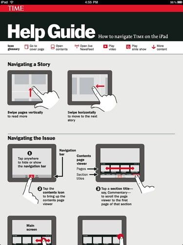
This is the most common form of navigation in traditional websites and applications. It provides a top-level category for navigation followed by further layers of content in sub-categories below that level.
The drawback is that this model can quickly become difficult to accommodate on the mobile screen; the more content you have, the more difficult it is to squash all that data into the screen.
The image below shows how an app might handle the navigation through the different sects of Islam using a hierarchical structure.
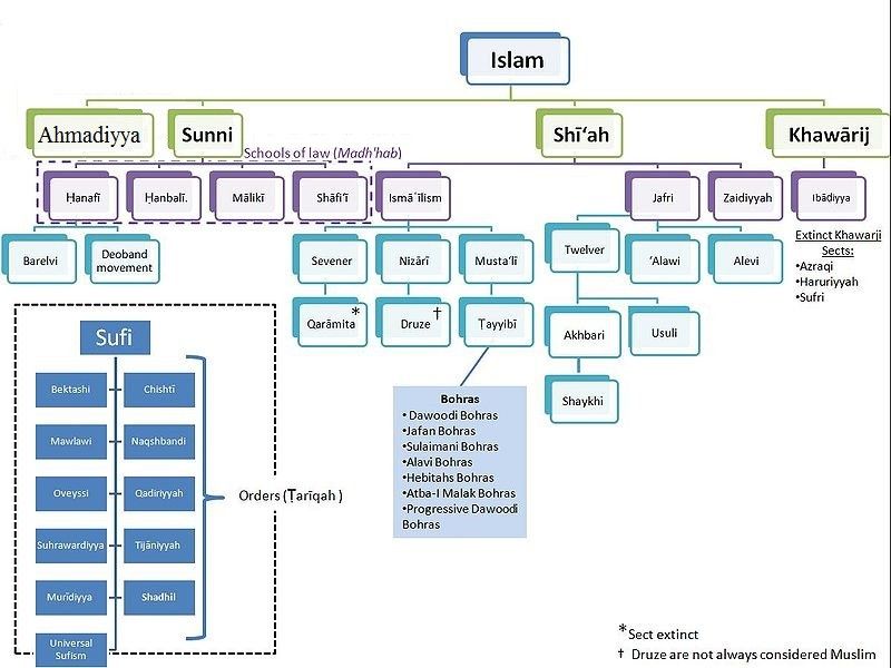
Author/Copyright holder: Aurelius787. Copyright terms and licence: CC BY-SA 3.0
Nested Doll Navigation
This is a more typical navigation system for mobile apps. Each time the user moves to a level in the hierarchy of navigation – new items below it are revealed. It uses a move from broad overviews to more specific details. It works well on the small screen but it can be challenging to support horizontal movement between sections when implemented. It gets its name from the concept of nested dolls which are a series of dolls which fit within each other (pictured below).

Author/Copyright holder: Pixabay. Copyright terms and licence: Free Use.
Hub and Spoke Navigation
This model uses a single central screen which acts to enable the user to explore different sections (spokes) of the app. If you wish to shift from one spoke to another – you must do so via the hub. This is a good way of minimizing onscreen noise and works very well for apps that are more concerned with task execution than presenting large volumes of content.
Bento Box Navigation
This model presents a dashboard of choices that delivers dynamic information on a single screen. Elements can then be interacted with to reveal more data. This works very well when using an app that aggregates multiple-data sources.
Filtered View Navigation
Filtered view navigation is based on allowing the user to manipulate a single data set from many perspectives – filters are user defined/controlled.
A Final Note on Top Level Infrastructure
In more complex applications it may be useful to combine different types of navigation so that the user is supported in an individual task or interaction in the way that is most suitable and when they change that task/interaction the navigation system adapts to the new choice.
Local Cues
Local cues are there to help the user orient themselves in the space that they are in. It is better to use these sparingly so that when the user encounters them – they are absolutely certain what they mean. Use too many and they are likely to conflict with each other.
Landmarks
A landmark is an instantly recognizable object that lets the user know exactly where they are. They are often used by drivers in real life (such as “The Eiffel Tower! I’m in Paris!”) and can be used in a similar way in the mobile app. Typical mobile app landmarks might include:
Logo or Home Icon
Clear primary navigation
Section headers/banners
Section navigation tools
Slideshows/galleries/calendars/etc.
Ideally you should pay careful attention to the form, colour, priority on page, position and visibility of landmarks so that they deliver a consistent user experience. Landmarks should not vary unless it is absolutely essential.
Boundaries
Boundaries denote, on the screen, where a user may or may not interact and how they may interact. The box around a button, for example, shows the boundary of the button’s area of action.
Guides
Guides are the visual signposts that help with decision making at any point in your app or website. They tend to be non-verbal (icons, buttons and images) but labels play an important role too.
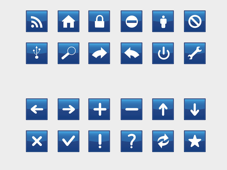
Icons
Icons should, wherever possible, fit the user’s mental model of that icon. Icons that don’t meet these criteria are apt to be confusing and add cognitive friction to the act of conducting a task. You can ascertain the mental model through research. Remember even the simplest icon may be confusing – a pencil icon, for example, might mean “draw something” or it might mean “write something”. Your users’ mental models will tell you what it means to them.
Author/Copyright holder: Pixabay. Copyright terms and licence: Free Use
Labels
Labels are important research shows that text and images are more effective in guiding users than text but it also shows that images are less effective than text on its own.
The Take Away
Navigation is a vital part of the user experience for mobile apps and getting it right will ensure that users can open your app, get to where they want to be and then get moving on something else. This in turn, is likely to incentivize long-term adoption of your mobile app rather than short-term use and then abandonment. The three levels of navigation given above all need careful attention to get the navigation just right for your users.
References
You can find some interesting navigation UI patterns here at UXPin.
You can find some more navigation UI patterns here.
Hero Image: Author/Copyright holder: Pixabay. Copyright terms and licence: Free to use


