Let’s look at three subjects that, at first glance, may strike you as being incredibly basic and self-explanatory. However, although they may seem like they should need no introduction, we should study them. By understanding these concepts, you’ll be able to apply them more effectively to captivate your users’ attention while making your designs more effective.
Say “repetition” and you might think about someone who says the same thing over and over again. However, it’s different in design. Repeating things does not have to be boring! In fact, it can empower a design when used in the right way. It can also ensure that messages are better understood. As designers, we have three repetition methods: repetition, patterns, and rhythm.
Repetition
Repetition is simply repeating a single element many times in a design. For example, you could draw a line horizontally and then draw several others next to it.
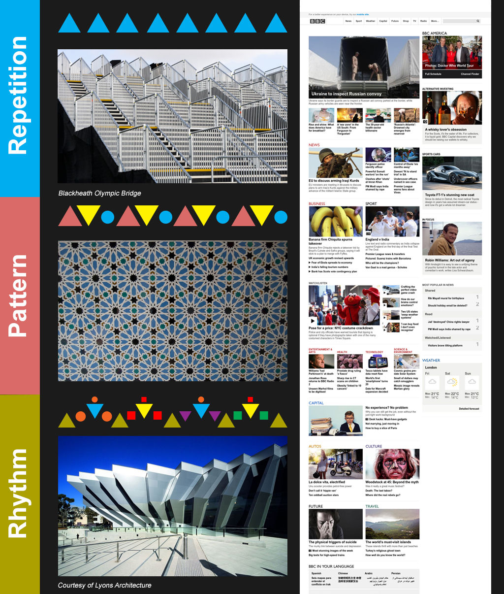
Repetition can be useful in web and app design. For example, you’d expect the logo of a business to be repeated on every page and in the same place. Menu items are also often repeated in the same place on a page. This helps provide a consistent user experience. By repeating elements, we as designers not only deliver according to our users’ expectations in this way, but we also improve their experience. Our being consistent makes the users more comfortable. Remember that the eye works in a certain way by default. Using repetition to keep the eye familiar with our design’s elements means we’re taking advantage of this tendency. We can also use shapes, colors, textures, fonts, etc. to maintain this consistency via repetition.
You can also achieve repetition by using repeated messages. If you want your customers to know that you’re the cheapest or the fastest in the business, you’ll want to tell them that on more than one occasion if you want the message to stick. In this instance, we use repetition for reinforcement. You may remember learning your times tables by repeating them until you drummed them into your mind. The principle here is the same. We retain information better the more often we encounter it and internalize it.
Pattern
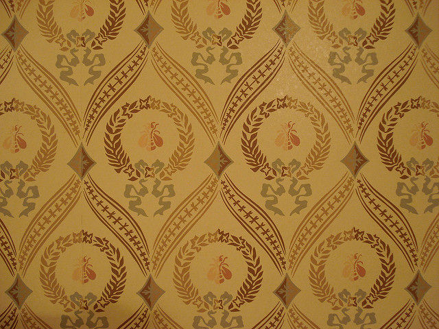
Patterns are simply a repetition of more than one design element working in concert with each other. A seamless pattern is one where every element within a design (no matter how often it’s repeated) combines to form a whole. This is most common in backgrounds on web and app pages. It’s also popular in carpet and wallpaper design. Look around you: your bed cover, wall, notebook cover. If you see a seamless pattern, look at it closely. Do you see how the elements (circles, spirals, cones, pineapples, etc.) appear again and again in the same way? Sometimes, they touch; sometimes, they have space between them.
Author/Copyright holder: Dirk Stoop. Copyright terms and licence: CC BY-NC 2.0
As you might expect, designers base most patterns on colors, textures and shapes, rather than words. We can recognize shapes far more quickly than words, which we have to read, no matter how quickly. You can find such patterns in architecture, too. Architects tend to include a unifying motif on the inside and outside of buildings to enhance the aesthetic appeal. This is nothing new. Think of ancient Greek buildings such as the Parthenon. Ancient designers could be ingenious in their use of patterns of such elements as lines and spirals.
When you consider using patterns in your web or app design, you’ll want to think about the pattern’s complexity. While it might seem like a nice idea to tile a single image as a background, this can make it much harder to read the text that lies over the pattern. If you want to create a design for a site that deals with travel to Greece, you could use the top of an ancient column for your design. At first, it looks great; you’ve got a beautiful design that features circles and grape leaves.
However, you still have to add text. So, writing over this, you soon notice a problem. The dark writing sometimes falls over the image’s dark lines. You could use brighter text, such as white or yellow, but you’ll find that the gray stone makes it hard to read, too. You’re having trouble reading it, and so will your users. They want to engage with your design, not work to try and read text. Simplicity and subtlety are key considerations if you want to maintain the user experience, keeping users on your page.
Rhythm
When you repeat elements, the intervals between those repetitions can create a sense of rhythm in the viewer and a sense of movement. Musicians create rhythm in the spacing between notes, effectively making these “silent” gaps play off the notes. Designers insert spacing between elements to make rhythm. There are, broadly speaking, five types of visual rhythm.
Author/Copyright holder: Eden-Lys. Copyright terms and licence: CC BY-NC-ND 2.0
Random rhythm – Repeating elements with no specific regular interval creates random rhythms. The spacing could be a millimeter here, a centimeter there, while the elements could be all over the place. Think of falling snow, pebbles on a beach, traffic movements: they are all examples of random rhythms in action.
It’s also worth noting that a rhythm may appear random if you examine a small section of the rhythm. However, if you step back and examine a larger section, it may be that there is a regular but complex rhythm applied to the design. Remember that you have positive and negative images, which you can use so that both the elements and the spaces between them make your design hard to “predict”. By using a larger series of elements, you’ll have virtually limitless possibilities to play with. The artist René Magritte made particularly interesting use of random rhythm.
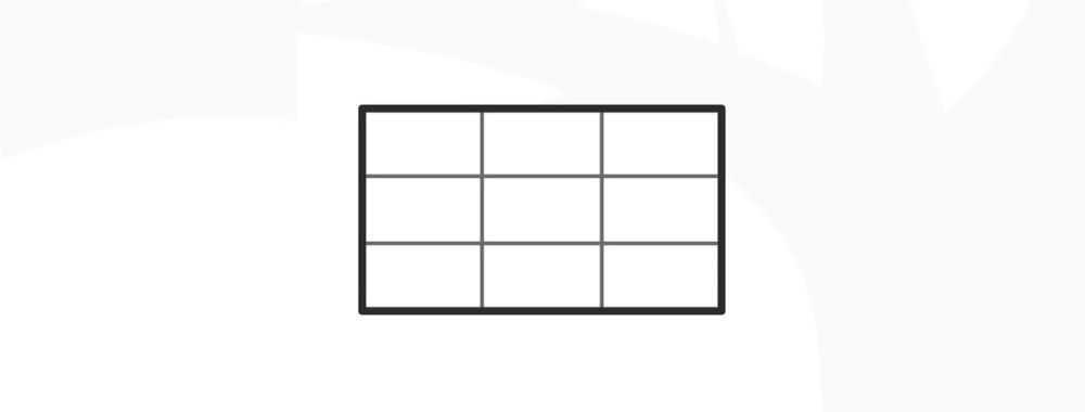
Regular rhythm – Like the beating of a heart, the regular rhythm follows the same intervals over and over again. You can easily make a regular rhythm just by creating a grid or a series of vertical lines. The user’s eye will instantly recognize a regular rhythm, scanning it for any irregularities in the process. Remember, the eye “likes” to be drawn to outstanding elements. Therefore, there is a risk that when you’re using a regular rhythm in a design that it can become monotonous (like the dripping of a tap).
Alternating rhythm – You can repeat more than one element in a design. In an alternating design, you use a 1-2-1-2-1-2 pattern. Think of the black and white squares on a chessboard: that’s an alternating rhythm in play. An alternating rhythm is, in fact, a regular rhythm with more complexity. It could be as straightforward as our chessboard, or we could envision something more intricate. Some fantastic alternating rhythms include rows of fish, birds, or other animals. Taking fish as an example, we can see that each identical fish is following another. Below, the sequence is repeated; however, the negative space between the rows shows fish of the other color (which we take to be the background) swimming the other way, the fine lines of their fins and tails interlocking with those of the first pattern of fish. M.C. Escher’s Lizard (1942) is another great example of this, incorporating three colors of lizards with a pair of lizards of each color facing away from each other, tail to tail. As simple or complex as we want to make an alternating rhythm, it can be an easy way to break up the monotony of a regular rhythm.
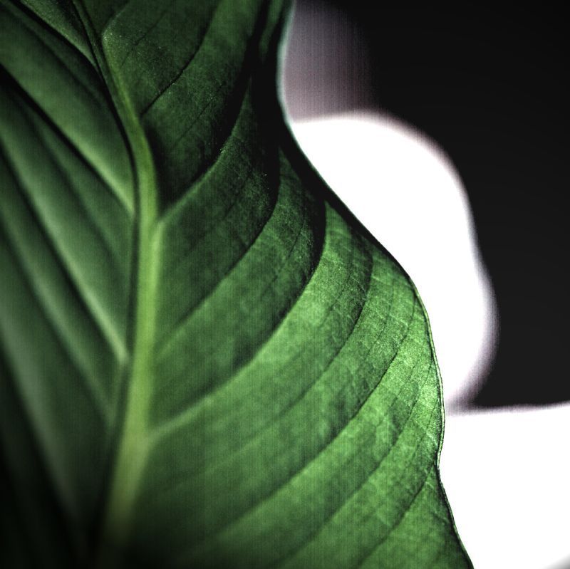
Flowing rhythm – A flowing rhythm shows the repeated elements following bends, curves, and undulations. In nature, you can see this in the waves on a beach or sand dunes. As designers, we can mimic nature by making wonderful patterns of elements with flowing rhythm. We can show clumps of seaweed underwater, their strands gently facing in a series of directions. The user imagines them washing against each other.
Progressive rhythm – We can make a progressive rhythm simply by changing one characteristic of a motif as we repeat it. We could draw a series of circles, one above the other, making each lower one larger. Do you see how the largest one at the bottom looks like it’s closest to you? We can make a progressive rhythm change subtly or dramatically. You could add shade to the smaller circles progressively so that the smallest one at the top is dark, the middle one in partial shade, and the biggest one only slightly shaded. Progressive rhythms surround us. If you were to video someone dancing and then examine that video frame-by-frame, you would have a progressive rhythm.
Designing with Repetition, Pattern, and Rhythm
The use of repeated visual elements is a technique designers commonly employ in web design. You can repeat design elements, for example, to provide a consistent visual experience. It will make it easier for users to focus on the content because they know where they can find specific types of content or navigation options.
You can also use repetition to draw attention to a particular area of content or design. You can use it to show relationships between content blocks, too.
Also, you can use patterns for backgrounds to add texture and consistency, and you can deploy them to deliver consistency between pages of the same type.
As designers, we can use rhythm to create excitement (building gradually over time) or reassurance (a heartbeat might be perfect on a page aimed at expectant mothers, for example). Or, we can use it to influence other emotions.
The Take Away
As a designer, you have three types of repetition:
Repetition
Patterns
Rhythm
You can use these to shape the user experience of your web or app. Through repetition, patterns, or rhythm, you set “the mood” of the user interface and use these elements to either reinforce your message and/or create the look and feel of your product.
Repetition is the simplest element you can use. Pattern is a combination of elements that are repeated. Rhythm involves using intervals or spaces between elements to give the user an impression of rhythm or movement. We can use five types of rhythm:
Random Rhythm
Regular Rhythm
Alternating Rhythm
Flowing Rhythm
Progressive Rhythm
There is also another conception of pattern that comes from architect Christopher Alexander. We will examine that in a later article. Rhythm, like in music, helps build a cadence in your design, engaging your users with all sorts of interesting variations. With some thought, you can maximize the impact of your message by working the right rhythm into your design.
References & Where to Learn More
Hero Image: Author/Copyright holder: Jonas Bengtsson. Copyright terms and licence: CC BY 2.0
Design in Art: Repetition, Pattern, and Rhythm. Sophia Learning. [2014, Aug]
Swinburne. Basic Design Principles. [2014 Aug]