While friction in UX is typically something you want to minimize, adding friction can improve the user experience and contribute to good design in many situations. Researchers at UCL define positive friction as friction that “can disrupt mindless automatic interactions, prompting moments of reflection and more mindful interaction.” Sounds like a mouthful? Don’t worry; we’ll lay it all out for you.
What Is Friction?
Friction refers to points during an interaction that makes it more difficult for a user to complete a task or achieve a goal, generally leading to a poor user experience. This means users go through additional steps and wait times that are considered unnecessary or disruptive. Ever sat staring at a blank webpage waiting for it to load? Or have you had to click through five pages just to unsubscribe from a service? That’s friction!
What Is Positive Friction?
Positive friction also inserts additional steps, but to the user’s benefit. It alerts a user who may be running on autopilot about an important step during an interaction and its potential consequences. The goal is to prevent them from making mistakes, place control back in their hands and give them a chance to learn or change behaviors.
Examples of Positive Friction
1. Confirming or Validating Important Actions
Life can get very busy, making it easy to automatically click, tap or hit some keys on your keyboard to act without thinking too much about it. This is something you want your users to avoid with actions that are irreversible (or very difficult to reverse), like money transactions, exiting a video game without saving your progress or sending your client an email without the attachment you mentioned in said email.
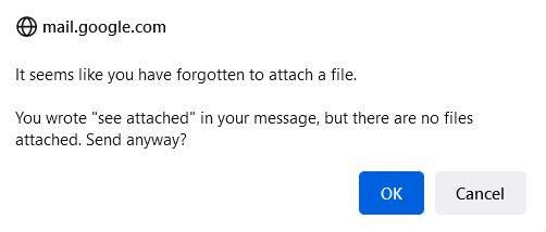
To save you from the latter, email platforms like Outlook and Gmail have added positive friction in the form of a pop-up flagging that you may have forgotten to add an attachment when you hit the Send button.
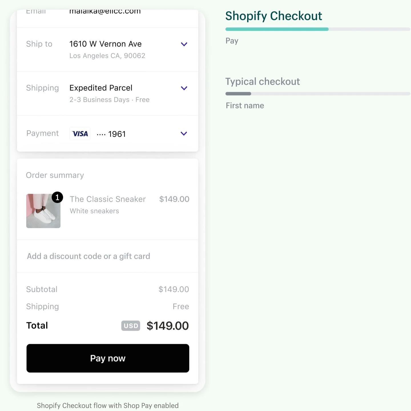
Confirming actions is even more important when money is involved. That’s why banking apps and e-commerce platforms often include an opportunity to review an order summary or transaction at the end of the process to double-check payment details, whether it’s the correct amount of money or the right number of items to order.
Just think of the headaches this saves while getting overpaid money back or returning mistakenly purchased items!
Many e-commerce platforms aim to remove as much of the “friction” part while still leaving the “positive.” Shopify only has a single checkout page using dropdown fields to enter details with an order summary and the “Pay now" button at the bottom of the page on a mobile device, rather than having users click through multiple pages.
2. For Health, Wellbeing and Behavioral Change
Designers can also use positive friction to benefit users’ health and wellbeing and encourage behavioral change.
In 2017, Monzo, a UK neobank, outlined plans for a feature to curb overspending, especially late at night. The concept followed the Money & Mental Health Policy Institute research that found that many bipolar users tended to overspend while in a manic phase at night.
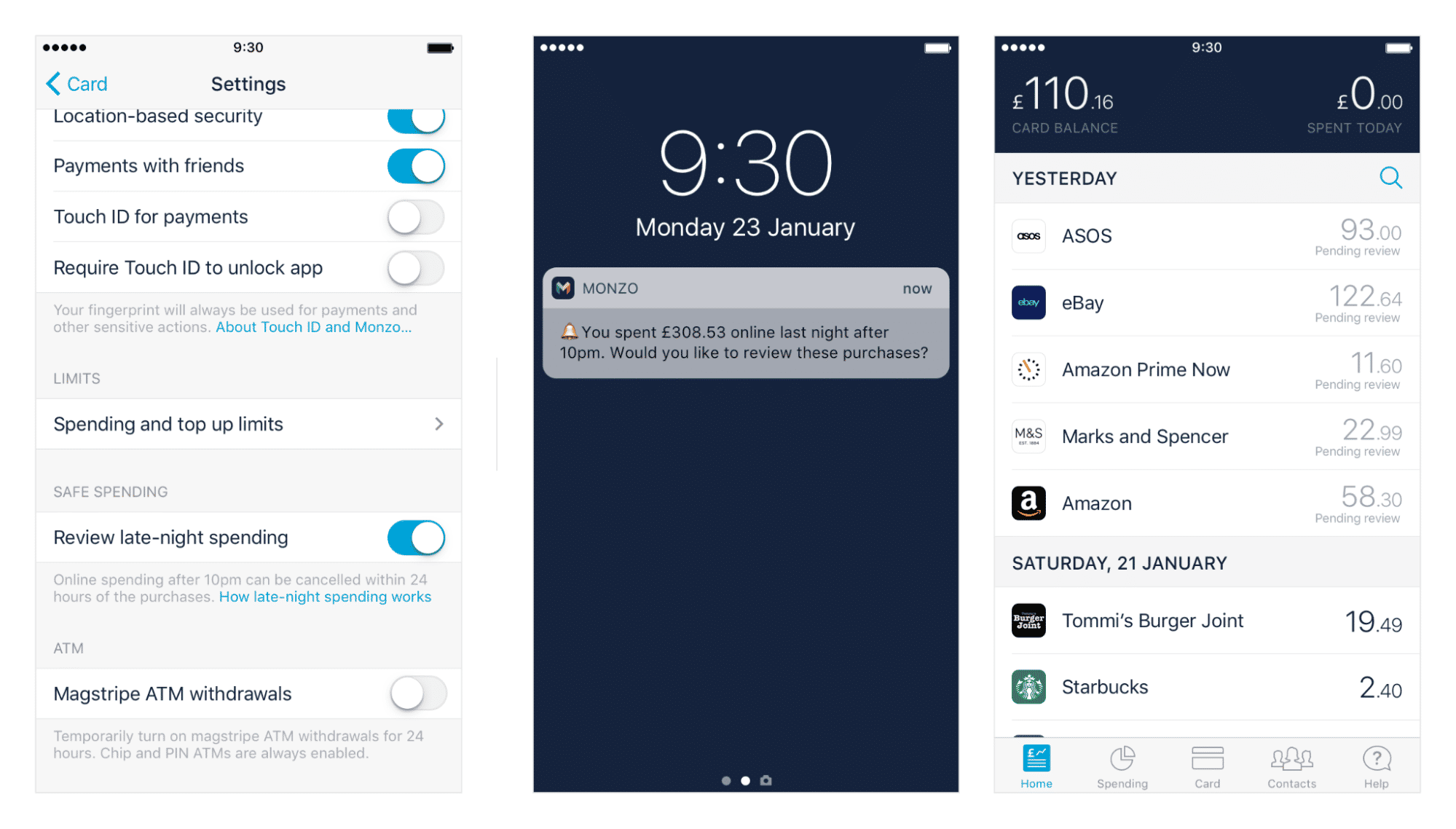
Once switched on, Monzo’s feature would ask the user to review purchases made late at night and, if possible, give them the option to cancel the transactions the following morning. While Monzo never implemented the feature, the extra step would have provided users with either an easy way to stop the unnecessary purchases or a helpful reminder to seek a refund sooner rather than later.
Positive friction can also help protect the work-life balance, especially as working from home becomes increasingly popular. With work computers sitting at home and most people linking work email and messaging apps to their personal phones, the “ding” of a work notification is enough to distract people from their personal time. Even if they choose to ignore it, their mind still flickers to work for a moment! Disabling notifications entirely, on the other hand, can cause stress. What if someone urgently needs you?
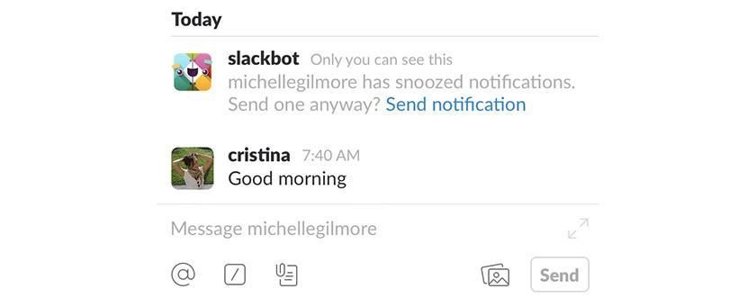
Messaging app Slack found a way around that by letting people know if the person they’re trying to message has snoozed their notifications and asking whether they want them to be notified of the message anyway. If it is urgent, the user can still send a notification. Otherwise, the positive friction could help them consider the other person’s off-time and whether a reply could wait until the next day. Which, in most cases, it probably can.
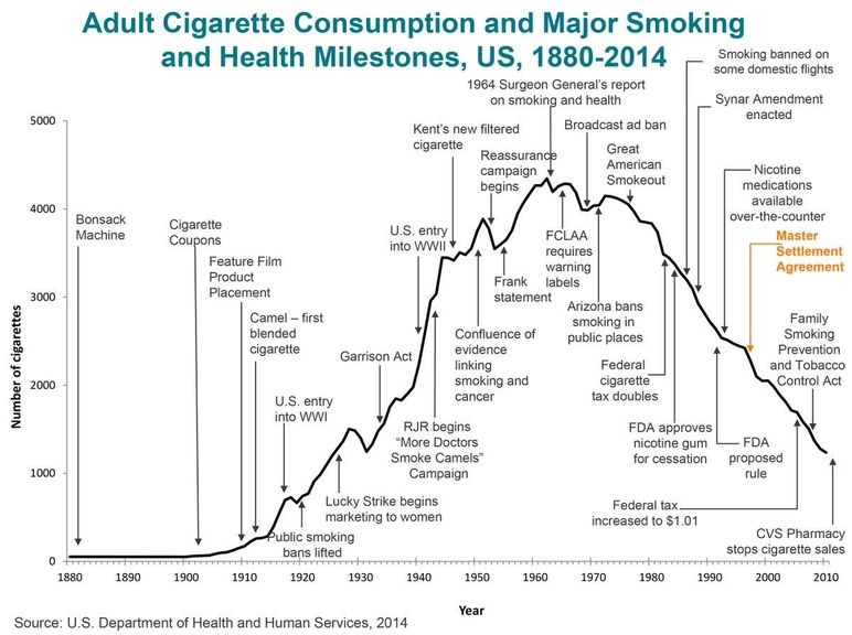
Moving away from digital, positive friction has been used for a long time to discourage certain bad habits like smoking. Many public places have gone from redesigning areas to separate a smokers’ area to banning smoking altogether. The below graph shows that information about health concerns had little effect. When positive friction such as smoking bans and tax increases were implemented, though, the US government saw a steep decline in cigarette consumption.
Similarly, Google successfully encouraged employees to pick healthier snacks in the company kitchen by “hiding” candy in opaque containers. At the same time, fruit remained visible in glass containers, as described in Laszlo Bock’s book Work Rules.
3. Enhancing Security
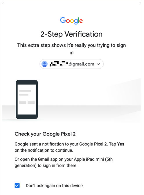
With cyber security becoming an ever-increasing risk, we have seen the rise of two-step authentication, where logging in with only a password is no longer enough. When trying to access an account, especially with sensitive information, you have to confirm your identity by entering a code sent to you via email, text or app notification.
Apps on your phone will often ask you to authenticate actions using biometrics, i.e., using your fingerprint, voice or face, rather than sending you a code via a secondary method, which is slightly faster but still a point of positive friction.
4. Shortened Perceived Time
Years ago, Houston Airport suffered from many complaints about long wait times at their baggage claim. Even when they reduced wait times to within the industry standard of eight minutes, complaints kept flooding in. After investigation, they found that it only took passengers one minute to walk from the gate to the baggage claim, where they would then have to wait seven minutes to collect their bags.
This was a problem because when people have to wait around with nothing to do, time feels like it passes much more slowly. If they’re engaged in an activity, they perceive time passing more quickly.
So, Houston Airport decided to move the arrival gate further away from the main terminal and send the bags to the furthest carousel, increasing the walk to six minutes and decreasing the wait time to only two minutes. The number of complaints dropped drastically as people’s perceived time was suddenly a lot shorter.
The same principle of perceived time applies to loading times on websites, in apps or anywhere people would otherwise be sitting around idle. This is why many sites or apps will add animation, a loading bar or a loading message while loading content that can briefly occupy your brain and make the wait feel less long than if you are staring at a blank page.
5. To Provide a Learning Opportunity
People are wired to learn new things. Without it, we could end up becoming as unintelligent and lazy as the Eloi in H.G. Wells’ novel The Time Machine.
A popular type of positive friction often used in video games is the tutorial. Instead of giving you full rein and access to all your abilities right from the start, games will first ask you to go through a carefully designed starter level or zone to familiarize you with basic gameplay mechanics.
The same principle applies when you download a new app. Applications often include an onboarding flow to highlight the most important UI elements one by one.
Often you can skip or very quickly click through tutorials, choosing to eliminate the friction yourself, but beware of the additional cognitive load you may have to deal with as you figure out everything yourself.
Grey Areas of Friction vs. Positive Friction
In 2018, Cass Sunstein, one of the founding fathers of the popular concept of “nudge” in behavioral economics, wrote an essay about “sludge,” nudge’s evil twin. In most cases, sludge is synonymous with friction.
In his essay, Sunstein’s starting point was the 9.78 billion hours of government-imposed paperwork Americans had to get through in 2015 to access important licenses and benefits. He argued that due to humans’ behavioral biases, many wouldn’t complete the paperwork and therefore miss out on what could be life-changing goods and services.
If the process of getting benefits is too easy, however, people who don’t need the benefits may be incentivized to apply for them as well. As a result, those who need them most may not get the benefits because the money has already been given to someone else.
In this case, there is a tradeoff between making goods and services more accessible and adding enough friction to discourage just anyone from applying for them: a good user experience sacrificed for the common good. It is by no means ideal because those most in need have to face the challenge of paperwork and it can only be a temporary solution till a better system is in place that ensures that benefits go to the right people (a design challenge in itself).
The Take Away
Positive friction in user experience can play an important role in both digital and real life. When designed well, it makes us more mindful of our actions and gives us opportunities to learn.
If you plan to incorporate friction while designing, consider the following questions:
Does the friction:
Prevent mistakes the user might otherwise make?
Drive positive behavioral change?
Protect a user’s account or data?
Engage a user to make wait times feel shorter?
Give the user an opportunity to learn?
If the answer to any of these is yes, consider including friction in your designs. Remember that friction, if implemented poorly, can turn an experience sour. So, conduct user research and test each design decision thoroughly before releasing a frictional experience in the wild.
References & Where to Learn More
Learn more about on UCL’s research into Design Friction here.
If you want to read more about Sunstein’s concept of Sludge, you can find his essay here.
Images
Hero Image: © Papichev Aleksandr, Commercial License