
We all know that the screen real estate on mobile devices is limited when compared to that offered by a desktop or a laptop; but what effect does that have on the comprehension of content by the user? What other pain points are there for mobile users? How could we go about avoiding them? Developing a better mobile user experience comes from better understanding of how mobile impacts user behavior.
Reading is reading, right? If you can read your own language to a reasonable degree – it shouldn’t matter if the content is displayed on a big screen or a small screen should it? Yet, according to Jakob Nielsen a researcher from the Nielsen Norman Group (which focuses on Evidence-Based User Experience Research, Training and Consulting) it very much does.
The Mobile User Experience
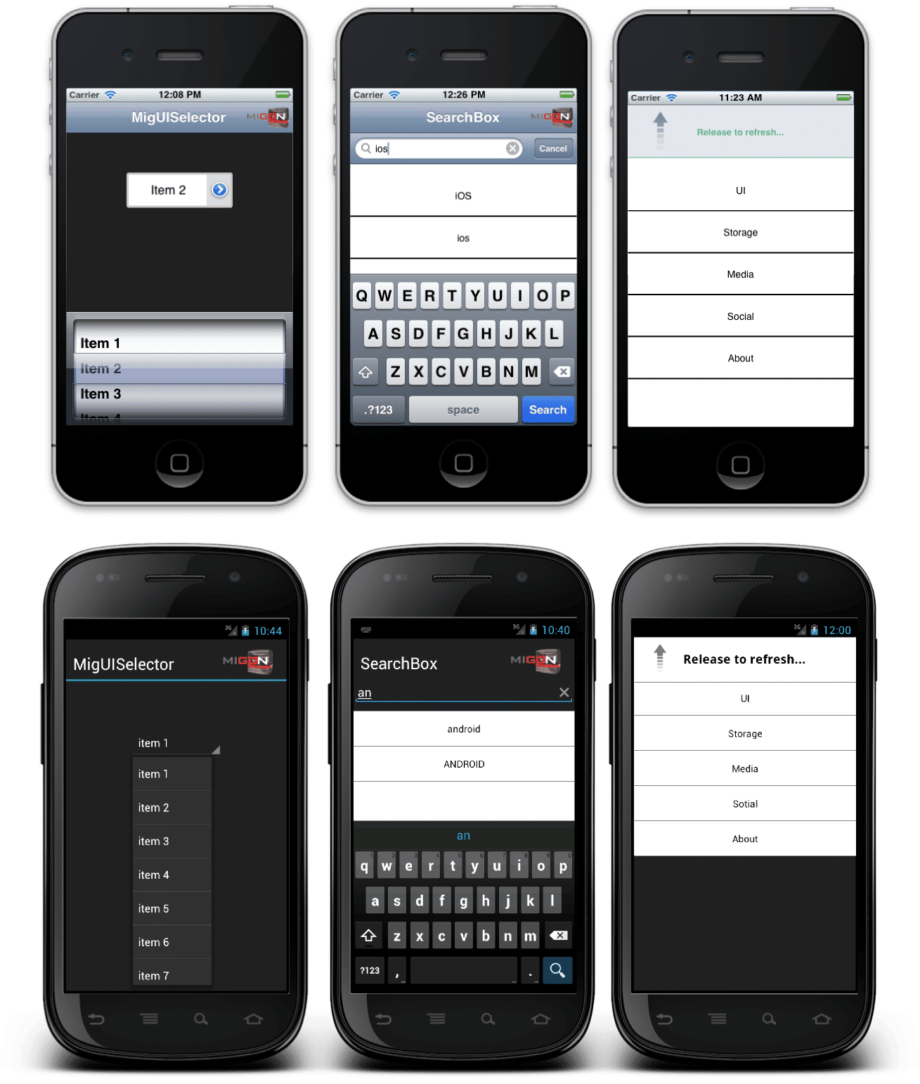
We already know that using the mobile Internet is, in some ways, more challenging that using the internet from the desktop. Some of the issues that users encounter include:
Smaller bandwidths for data transfer. 4G is definitely light-years ahead of 2G data transfer but it’s still much slower than high-end cable connections in homes and offices.
There’s no keyboard. Sure, there’s a keyboard on a touch screen but it’s not as easy to use or as accurate as a keyboard plugged into your PC.
There’s no mouse either. Users have become very dependent on mice over the years to interact with their IT and this can make it difficult to work with the mobile internet.
The screen real estate is seriously lacking. Coming from an awesome desktop wide-screen to a tiny little phone screen can be hard to get used to. This is particularly true when designers and developers try to cram way too much on to that small screen by reducing font sizes, etc.
Developers often aren’t familiar with or don’t follow mobile usability guidelines and mobile web standards. This can cause websites and apps to deliver sub optimal experience on mobile.
User interfaces haven’t reached a level of standardization when compared to desktops too. That can leave users confused as every designer tries something new.
Researcher R.I. Singh and his colleagues at the University of Alberta began to investigate the effects of mobile on reading comprehension.
Author/Copyright holder: Movile dev. Copyright terms and licence: CC BY-SA 3.0
What They Found – Mobile Makes It Hard to Follow
Singh and his team ran a test on 10 of the internet’s most popular websites to examine their privacy policies and how easy they were to understand over mobile.
Firstly, it’s important to note that these policies weren’t easy to understand on the desktop. They were incredibly lengthy in many instances and used complex language that made them inaccessible to those without graduate level education.
However, what they found was that even when you took that into account – mobile users found it twice as hard to understand the policies that were presented as desktop users did.
Nielsen cites their own research which says that complex policies are generally “treated with contempt” by users. They have found that only 10% of users will read long, complex policies and only a further 17% will skim read them – everybody else just skips them and clicks “Yes, I agree even if this agreement requires the soul of my first born child.”
It’s important to note that since these studies took place, some of the web’s big names have been working on improving their privacy policies but in truth – they haven’t gone far enough yet. Plain English agreements are still a long way away and if you wanted to improve the user experience; before you worry about reading comprehension – you might just want to simplify the way these are written and put together.
 Author/Copyright holder: Greg Z Fainberg. Copyright terms and licence: Fair Use.
Why Is Mobile Comprehension Twice as Hard as it is on The Desktop?
Actually, it may even be more than twice as hard to comprehend information on a mobile screen. Singh’s research took place in rather ideal circumstances. It was in a lab and there were no external distractions and users were guided to the reading material and just asked to follow the test through.
They concluded that even in these ideal conditions that it was twice as hard because of one single factor: the screen size of the device. They offered two explanations for this:
When you can’t see as much of the content – you must rely on your memory to keep the context alive. A lack of visible context reduces the level of understanding that the user has of the content.
When you can’t see as much of the content – you must navigate around the screen more. This distracts the user from the content and it requires additional time to carry out. In turn, this makes it more likely that the content will not be retained in short-term memory.
In short, small screens make us stupider when it comes to reading comprehension.

Author/Copyright holder: Qwertyus. Copyright terms and licence: CC BY-SA 3.0
What Can Be Done About This?
The only solution to this is for designers to simplify their content. It needs to be in plain English and kept to the bare minimum required to convey the important information. The less scrolling that’s required and the more context that’s available on screen at one time – will result in better retention.
For companies that are catering to audiences on the desktop, laptops and tablet platforms – this will mean redesigning the mobile experience to cater for the mobile user and their reduced screen real estate.
The Take Away
Singh’s research and Nielsen’s analysis shows us that smaller screens interfere with reading comprehension on the mobile device. The only sensible action from the UX design team is to try to keep content as simple and as brief as possible in order to minimize the effects of screen size on comprehension.
References
You can find Jakob Nielsen’s original analysis here: Reading Content on Mobile Devices
You can also find the research by Singh et al. here, but please note that it is behind a paywall (the Interaction Design Foundation does not use affiliate links, and there is no commercial relationship between IGI Global and us):
Hero Image: Author/Copyright holder: Jon Fingas. Copyright terms and licence: CC BY-ND 2.0


