By early 2016, Apple had captured nearly half of the smartwatch market, having extensively improved on old flaws. It’s essential that you learn the six fundamental UX smartwatch lessons that Apple learned the hard way. These UX fundamentals help you not only to conceptualize designing for smartwatches but also to appreciate the implications of how to design holistically across other devices and platforms.
If at first you don’t succeed—just excel far beyond expectations
In March 2016, Apple had captured 49.4% share of the smartwatch market—with Android Wear a distant second with 21.4%. At that time, the category was still in its infancy. Apple's typical product development path has been to launch and modify heavily for a better second-release product. This is starkly evident from the June 2016 release of watchOS 3 where Apple basically had to redesign the Apple Watch from the ground up after learning about key flaws in the user experience. The smartwatch category was to become poised for explosive growth. Apple would launch a second generation watch in September 2016.
It’s essential you know what these six lessons are so as to consider how to go about designing for smartwatches. If even Apple got the user experience wrong on their original Apple Watch, that speaks volumes about the risk. As a new category in the mid-2010s, it demanded a whole new path by which people experienced technology and how we would come to design for it. These changes are relevant for the whole category of smartwatches regardless of the device you’re designing for, as they offer timeless insights into how people use such a small intimate device.
Apple sold over 12 million smartwatch units within the first year. It was by no means a flop and allowed for a huge amount of research to be done to improve the experience in the second version of the smartwatch.
“Technologists are not noted for learning from the errors of the past. They look forward, not behind, so they repeat the same problems over and over again.”
– Don Norman, Inventor of the term “User Experience” and Chairman of the IxDF Executive Board
Learning from the errors of the past is essential when it comes to “hard-core” technical foundations of great designs. Apple would become the masters of this, as demonstrated with their tried-and-true formula of second-generation products, building on the feedback for the first. We will guide you through this process concerning smartwatches to help you learn from their mistakes.
The six essential smartwatch lessons Apple learned after launching their first version of it are easy to understand, but you will need to fine-tune them well to be successful. If Apple’s designers can get it wrong—you can, too. We’ll help you so you can avoid making the same mistakes and can start implementing the best design practices Apple learned.
The 6 critiqued areas – and your essential reading
1. Increase Speed; the 2016 benchmark for interaction with a smartwatch was 2 seconds.
2. You need to be direct. A couple of taps should do it.
3. Apps need to be more focused and purpose-built for the type of engagement.
4. Glances and notifications are the foundation of the watch and provide for actionable live data.
5. Complications make for better app on-boarding and personalisation.
6. Apps must be holistic,with increased cohesion between devices.
How Apple first approached the Apple Watch and got it so wrong
Craig Federighi, Apple's senior vice president of Software Engineering, would oversee the development of Watch iOS. In John Gruber’s live talk show at Apple's Worldwide Developers Conference (WWDC), he interviewed Craig about improvements made to the Apple Watch operating system called watchOS 3 (released in June 2016). Craig responded with the following: “we found that we actually really overshot the goal, which was an area of just massive focus and paranoia through the release.”
He was talking about battery life and how this defined the whole user experience because it meant the design centered on the misjudged goal of day-long battery life, when—in actual fact—it turned out to be not the big issue first thought.
By focusing so much on battery life, they sacrificed performance, resulting in unacceptable app load times and accessibility for many users and stunted purchase rates.
Why you need to pay attention to how smartwatches are now primed for mainstream adoption
In spite of perceived slower sales than expected, in June 2016 the Apple Watch still outpaced that of the first generation iPhone and iPod sales. Experts and even Apple's own website stated that watchOS 3 “feels like a whole new watch”. Sources in the supply chain said that the category in June 2016 was primed for explosive growth, with orders set for two million watches sold per month.
This is the sort of reality that makes for great news for UX professionals like you. These developments heralded the sheer potential for not only building new smartwatch apps but also creating holistic experiences that cross over and tightly integrate many platforms and devices.
How you need to think about designing for a smartwatch user experience to incorporate these lessons
The Apple Watch and other smartwatch experiences are like a crystallized version of how you’ve designed in the past for other platforms and devices. They are very small intimate devices actually connected to your body. They require a highly specialised set of design parameters because users experience smartwatches in a totally different way.
Thinking of the design as an essence is helpful because you need to make it the distillation of what you’re trying to build for users elsewhere. A helpful exercise and starting point is to think about the brand or idea of what you’re creating for. What is the brand essence of your product or service? The Brand essence is a two- to three-word phrase (typically in the format “adjective adjective noun”) capturing the “heart and soul” of the brand. If you were Nike, it would be “genuine athletic performance”.
Best practice tip: To design for the device, you must build your smartwatch app around this key idea of the essence. It needs to be fast, focused and delightful.
The 6 in-depth essential lessons to learn
1. Increase Speed
The most disappointing aspect from users of the first Apple Watch was the fact that loading up apps just took too long. For example, when you’re lifting your arm to interact with the device, the response times needs to be immediate.
Apple's reaction to this impediment drew excited audience gasps during Apple’s Worldwide Developers Conference demonstration of the improvements made to the Apple Watch operating system – watchOS 3. It was actually the very first key feature demonstrated on the highly anticipated event, proving how key Apple sees this improvement.
Comparing the before and after versions showed just how effective this crucial improvement was. The result was nothing less than an instant load time as opposed to the previous seconds. Mike Stern, User Experience Evangelist at Apple, who presented the Designing a great Apple Watch experience at the Apple Worldwide Developers Conference, noted how surprised he was at the new benchmark goal around lightweight interactions. They had shaved it down from five to two seconds.
Best practice tip: Checking scores for games, checking weather and stocks and taking action should be just as fast as setting a timer, turning on an alarm or crossing things off a checklist. Spot workflow inefficiencies and aim for this benchmark—even if you don’t achieve it, you're still working with the correct mindset for creating great smartwatch UX.
2. Be Direct
All your user experiences for smartwatch design revolve around getting to the core purpose of your app. To achieve this, you need to be direct.
Thinking of being direct encompasses all the lessons Apple learned from the first watch. Its whole experience is centered around this.
For example: instances exist where previously it had taken seven screens to achieve an action that could be solved in a mere two. This frees users up to get to what’s most important.
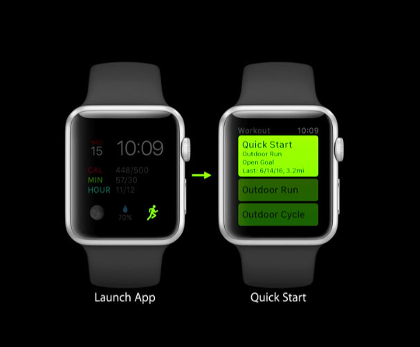
Author/Copyright holder: Apple Inc. Copyright terms and licence: Fair Use.
A two- step process to get from a watch-face complication directly to an app by pressing a running icon
Two features that showcase this directness of the experience are the Dock feature and the Complications feature. They both form two pillars of the WatchOS 3 experience.
The Dock keeps users recent and favourite apps stored in an easy-to-access spot where they are kept in their frozen state from when you last used them. We, as designers, might well consider this one of the best features. This way, it reduces processor and battery life while being super direct in letting the user get straight into the app. They also function on a level of usefulness by allowing the user to see any live updates just by swiping through the doc—data on each screen will then update.
Apple Watch is even more personal with watch faces and more apps that can launch straight from the watch face, including Workout, Music and Messages apps. Users can also add complications to watch faces.
The Complications feature is direct in the way it allows the user not only to get straight to your app but also to arrive at a specific place within the app. Customisation allows users to put the data they want onto a watch face so as to have info that’s relevant. This customisation is designed around responding to the need for users to get directly to what’s important to them while keeping your screens to an absolute minimum.
Best practice tip: Don't be scared to take the chainsaw to user flows to get to the heart of the feature.
3. Apps
Smartwatch app designs are purpose-built to respond to the specific needs of the user and how he/she wants info. Apps need to be responsive to the user to create a dynamic between user and app so as to offer a personalised experience.
Best practice tip: A good way to think of it is like an ongoing conversation. The watch wearer contributes information, and the app responds in a personalised way that informs and makes him feel empowered. The popular modern tech term ‘quantified self’ is applicable here in that users find real-time information about themselves useful. The quantified self is a movement to incorporate technology into data acquisition on aspects of a person's daily life in terms of inputs (e.g., food consumed, quality of surrounding air), states (e.g., mood, arousal, blood oxygen levels), and performance (mental and physical). This is also called self-monitoring and self-sensing. What takes this useful information to another level is what your app does with this ongoing stream of personal information.
Think about your brand essence and how your app combines this in a personalised way. This info gets more valuable over time as the app learns about the user and builds a history of interaction and data. There are lots of sources to pull information from, including taking advantage of your users’ bio data from the smartwatch sensors and your users’ favourite social media channels.
Think of ways to personalise with user data:
1. What activities might they be interested in?
2. What can you measure on the watch?
3. Who are they? Get to know them, and then work ways to personalise for them.
Best practice tip: The most important part of what makes up your app design will be how you integrate complications and notifications. Centre your app user experience around info that is glanceable, actionable and responsive.
4. Glances and Notifications
Glances and notifications are the foundation of the watch and provide for actionable live data. A key part of how they’re integrated is around the Dock.
The Dock keeps apps in memory—meaning less time waiting for app content to update. This is crucial in making a seamless smartwatch experience. Apps can be updated 50 times in a day. Think of a flight where the time around your departure and arrival are key moments of user awareness. A simple swipe of the doc will enable you to see updated info without having to click anything.
You can apply the golden rule of a two-second interaction and make magic in this simple but crucial interaction.
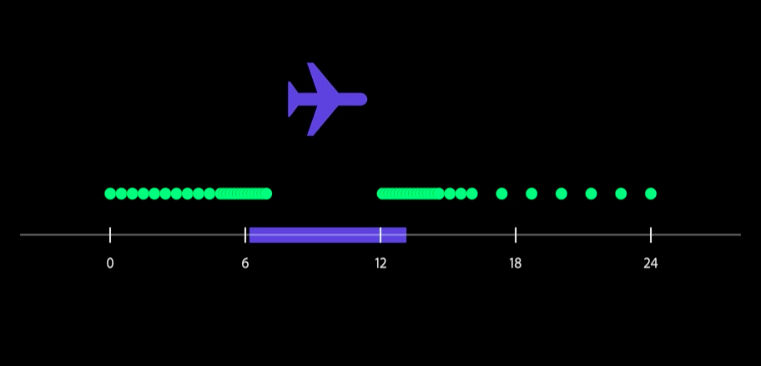
Author/Copyright holder: Apple Inc. Copyright terms and licence: Fair Use.
A demonstration showing how notifications can be updated 50 times a day, with a concentration around specific events
Notifications offer the user a dedicated screen related to a specific piece of info related to an app. The Taptic Engine, a technology which imparts forces or vibrations to the user to convey information, can trigger notifications. Think of a game controller which shudders when your character is shot: that’s haptic feedback. It sits in the hardware of the watch, providing haptic feedback—the sense of touch in a user interface design to provide information to an end user. The watch delivers this to the user through a small vibration.
Forget even the two-second rule here, as this biofeedback directly to the body provides the user with feedback from doing absolutely nothing. Users can either check what triggered the feedback, or—if they are expecting it from an app they’re in—they will simply know what it relates to.
Best practice tip: Make sure you craft your glances and notifications with precision and clarity. Keep in mind that your users could be in the middle of anything from running to catch a bus, to shopping for groceries, to even being in a movie theatre; they could be fully engaged in the task at hand, so you need to design these to be unobtrusive.
5. Complications
Complications are a big part of the WatchOS 3's streamlined smartwatch approach, offering increased customisation and personalisation.
Complications come in a bundled set that you can design around your specific app. You can pair them with a watch face so they are integrated in the default state of your watch, making them part of the core experience.
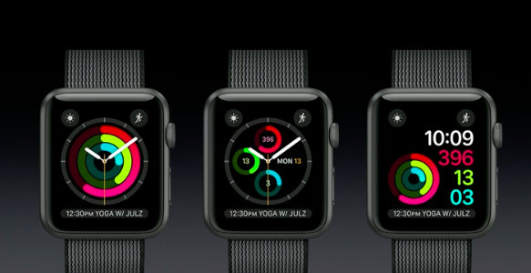
Author/Copyright holder: Apple Inc. Copyright terms and licence: Fair Use.
There are various ways of showing information in the way of complications—a user can easily swipe between the screens.
This design decision dramatically increases engagement with users because they can get directly to data within your app, making that data more useful and focused. It creates a purpose-built app centered around a specific type of engagement. This could be a running icon to get users straight into an exercise or a perception weather icon showing if showers are expected in the next hour. Note—zero user friction exists in these types of interactions. Ultimately, this inspires people to take action, which is the purpose for the existence of smartwatches. Either take an action or be informed—complications came to stand at the heart of this.
Best practice tip: A big part of driving discoverability of your app is how it integrates with your iPhone. You can browse bundled watch faces and complications from your iPhone before selecting them for your watch. Without this feature, it would be difficult to get users to download your app.
6. Holistic
Experience across devices moves your user experience in a direction that is more natural and in sync with how people live their lives.
It means the watch doesn’t lock up information; instead, that information travels across all your digital touch points. One example of this is how you can browse and discover new smartwatch apps from your iPhone before selecting them and placing them onto your watch. Without this holistic approach to design, you limit the experience to a very small screen that has limited capacity and feature set.
Best practice tip: Holistic smartwatch app design enables you to expand your app ecosystem towards integration across multiple devices and platforms that best fit the user's individual and specific use case. In it, you have a smart way to personalise the experience that best fits the real-life use.
The Take Away
Apple's ability to say they were wrong and change the way the watch worked would offer a great hope to spread the smartwatch category to a level of mainstream adoption.
With these improvements, Apple virtually created a whole new smartwatch that created huge implications for every other smartwatch maker. No matter what experience you are creating an app for, by following these timeless lessons, you will create a stellar smartwatch experience that users will love and keep loving.
With ever-increasing features, the whole smartwatch category would rise in prominence, allowing us to design some amazing and more holistic smartwatch experiences.
References & Where to Learn More
Hero Image: Copyright holder: Apple Inc. Copyright licence: Fair use
A report forecasting the expected prevalence of wearable technology for 2019
Happy Apple Watch Users - A podcast with real users of the Apple Watch after a year’s use.
Thinking about how to create apps for smartwatches based on an Apple Watch observation.
The Design of Everyday Things is a best-selling book by cognitive scientist and usability engineer Don Norman about how design serves as the communication between object and user: Don Norman, The Design of Everyday Things, Introduction, page xv, 2002