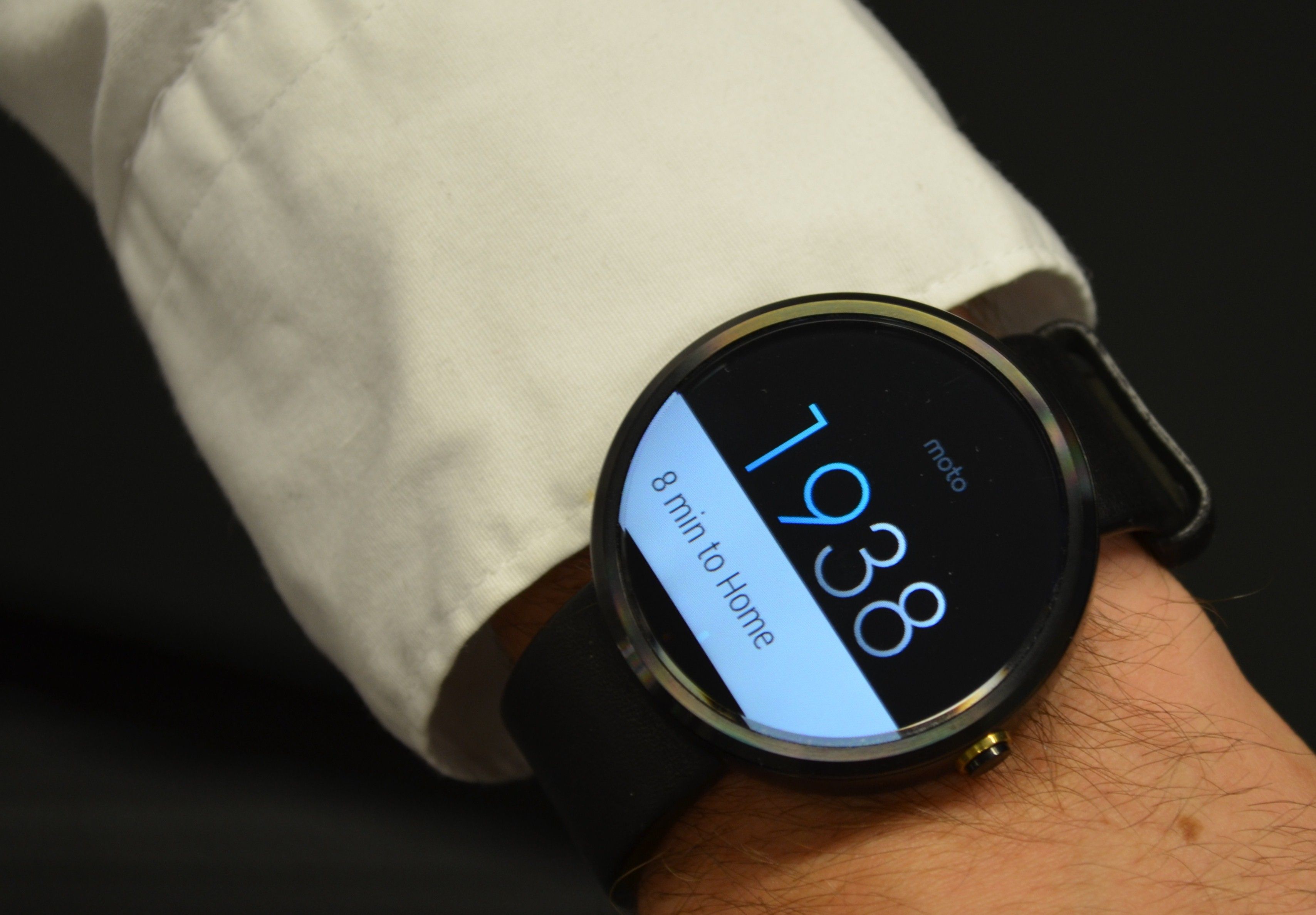
Smartphone users interact with their phones up to 150 times a day. Some of their interactions are long interactions but many are short and hurried. Because of this smartphone users may lack the patience of desktop users and without the appropriate feedback and notifications they may abandon an app or web presence quickly never to return. Mobile designers need to carefully consider incorporating feedback and notification systems and ensuring that these systems adhere to best design practices.

Author/Copyright holder: Geoffrey Gallaway. Copyright terms and licence: CC BY 2.0
When we interact with an app or website, we rely on feedback to inform us that we are progressing towards our desired objective. This is true on the desktop as much as it is on the smartphone. However, the immediacy of the smartphone and the short-time period interactions which users have with these devices means that feedback must be delivered faster and more regularly in order to keep users engaged.
What is Feedback?
Feedback is a process that works in a simple loop structure. With products it goes like this:
Step 1 – The user takes an action
Step 2 – That action creates an effect or effects
Step 3 – The effects of the action are then relayed to the user
Step 4 – Returns to Step 1
Every product has its own set of feedback loops; e.g. a series of actions which are repeated in sequence on a regular basis.
For example, a Gmail user might log in to Gmail, check their emails, read their emails, delete any emails they don’t need and then log out.
A Facebook user, on the other hand, may log in, create a post, like any of their friend’s posts, comment on those posts and then log out.
The first step to providing feedback to your users that offers meaningful information is to understand the feedback loop of activity that the user will undertake.
Loren Baxter, a product design team manager at ReadyForZero writing in Smashing Magazine, offers four key areas in which feedback can be provided and feedback processes improved:
Speed
Measurability
Context
Motivations
Speed of Feedback
Users are going to become frustrated if they don’t receive some feedback on their action as soon as it’s possible or relevant to do so. This is as true for long-life cycle processes (such as the progress of investment activity) as short processes (such as taking a photo).
Measurability
Feedback can assist the user in making comparisons and determining whether they are getting best value from their actions. Feedback, wherever possible, should include quantities. This allows the user to better understand how much benefit they derive from an action.
Context
Effective feedback also requires context. If, for example, a user is on a diet – presenting them with a roadmap, that shows how far they are from their eventual goal as well as their progress towards it, will be better received than feedback which only indicates current achievement.

Motivations
Feedback must also be connected to the user’s motivation for interaction with any given product. Gamification options often fail because the badges, points, etc. do not connect with the users actual motivations. Feedback must matter to the user to have value to them.
Guidelines for Providing Valuable Feedback within Mobile Designs
There are some straight forward guidelines to consider when implementing feedback systems within mobile apps. It is important to use these in conjunction with the four points above to maximize their value:
Notifications and alerts should be kept to a minimum and used only where they add genuine value to the user experience. They should always include valuable data and prompt meaningful actions. The exception to this rule is during mobile app installation and launch where notifications should be provided to suggest progress to the user to prevent them from aborting the process and uninstalling the app.

Author/Copyright holder: Raysonho. Copyright terms and licence: CC0 1.0
Alerts and feedback should be kept as simple as possible with clear and easy to understand choices generated from them. (Pay particular attention to button labels).
Notifications should not interrupt the user’s current activity unless absolutely necessary and be easy to dismiss if the user wants to ignore them.
Feedback should be provided in such a way that it does not interrupt the user’s current workflow.
Use feedback to validate and explain why an action was invalid. Telling someone an input is not correct is not a high value activity – showing them an example of a correct input is.
Don’t be afraid to use feedback and multiple notifications when a critical decision is being made. It is better to have a user confirm that they really want to delete data than risk the user deleting data they do want.
The Take Away
Feedback and notifications are an essential part of the user experience on the smartphone. When users interact with a device 150 times a day; it can be concluded that not every interaction will be a long and in depth one. That means making it easy for users to make decisions on the fly and ensure that they understand what it is they are doing when they make those decisions and that once they are committed they may have confidence in the outcome of their actions.

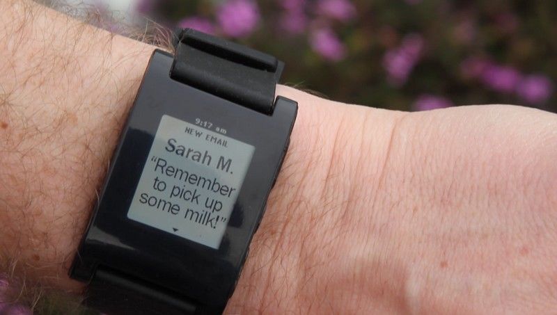
Author/Copyright holder: Pebble Technology. Copyright terms and licence: CC BY-SA 1.0
You do not want to overuse feedback and notifications in your mobile experience but neither should you underuse them. User testing will help you find the right balance for your user base.
References & Where to Learn More:
Loren Baxter explores, with some great examples, how feedback connects with users here at Smashing Magazine.
This article touches on feedback failures in Mobile UX as well as some other UX pitfalls in mobile design.
M-Way solutions examines the way that mobile feedback systems can be implemented here on their blog.
Hero Image: Author/Copyright holder: miyabi teraminato. Copyright terms and licence: CC BY-NC-ND 2.0


