
Mobile apps are subject to the normal rules of user experience design; a product of any kind requires user research, iterative design and user testing prior to release. However, there are specific rules which apply to mobile apps in general that are unique to the mobile app user experience. Knowing these rules enables you to make design decisions that deliver better user experiences with your mobile apps.
User experience design’s existing rules did not disappear when the mobile application arrived on the market. However, there are a series of best practices which apply to mobile apps UX that are unique to the mobile platform.
Google conducted in depth research on mobile applications user-research and published the results in their paper; “Mobile App UX Principles”. These principles can be summarized as follows:
Four Key Areas of UX for Mobile Applications
The paper showed that there were four key areas of UX for mobile apps:
Adoption – better UX can help remove barriers for user acceptance to the initial use of the product
Use – better UX can simplify decisions to convert users to the product
Transact – UX can deliver the best possible shopping experience through an app and deliver convenience to the user
Return – the UX can also provide high quality self-service options, and engage and delight users
ADOPTION
Author/Copyright holder: Keikendo. Copyright terms and licence: All rights reserved Img Src
The UX of adoption is designed to remove the barriers to use for the application. It focuses on the idea that users need to be able to get started quickly, assess the value in your application and then experience that value quickly.
Splash Screen Tips
Provide the user with an indication that the app is loading
Splash screens should be consistent with brand messaging
If you provide tips they should be provided in context with the user’s current needs
Onboarding should be relevant and users should be able to skip this if they want
Homepage and Navigation Tips
Branding (including logo use) should be subtle and kept to a minimum
The purpose of your app and any tasks a user may wish to conduct on their first use should be clearly signposted
Any reasons for the user to purchase or act should be clear
The default view should contain primary content/functions only
Menu drawers should display on first use and be accessible at all point through the app
App screens that scroll should have an onward point at the end of the screen as well as the top of it
Menus should be short (less than 7 items) or be divided into sections and terminology should be in the user’s language
Sign Up, Sign In and Permission Tips
Sign up must be as fast as possible and benefits for doing so should be very compelling
Ideally there should be a “guest” option or a demo option for users reluctant to sign up
Provide multiple sign up options
Passwords should be revealed/hidden at user’s choice
Return users should be perpetually signed in (unless they choose otherwise)
Any permissions are requested from the user and explanations given for the request
USE
Author/Copyright holder: Unknown. Copyright terms and licence: Unknown
The UX of use is all about ensuring that decisions regarding conversion are simple in nature.
Search Tips:
Search should be obvious and displayed prominently
Results should be displayed in order of relevance and by easy to sort and filter
Auto-suggestions should be used when completing searches
Any recent searches should be remembered for auto-complete
Product and Service Tips:
Product descriptions should be easy to get a quick overview from
The hero product should sit above the fold
Images should be fast to swipe, easy to zoom and of high quality
Product content should be helpful and reassuring and reviews/testimonials easy to find
Costs and stock levels should be clear and provided
CTA (Call to Action) buttons should be most prominent screen items
Additional suggestions should be provided
Basket/booking symbols should be clear and highly visible
Cross Device and Offline Facility Tips:
Searches should be easy to find
Baskets/bookings should be easy to save and return to and be synced via the client’s account
Social sharing should be easy
Click-to-call customer service should be easy within the app
TRANSACT
Author/Copyright holder: Jaemobi. Copyright terms and licence: All rights reserved Img Src
The easier you make it for customers to carry out a transaction, the more likely that they will carry out that transaction.
Shopping Basket Tips:
Contents should be easy to search, edit and review
Related/recommended products should be easy to find from the basket
Personal/Address Detail Tips:
Make it easy to focus on details by removing distractions
Populate data you already have in fields – cutting down transaction times
Return users should be able to complete the process on a single, simple screen
Payment Tips:
Make costs clear and transparent
Pre-populate details for return users
Make payment options auto-populate and relevant to the user’s location only
Provide express options
Auto-detect card type from first four digits
Let users choose to enter all details in a single field (CC No., Expiry Date and CVV) and offer the option to scan a card (and ID if required)
Checkout and Confirmation Tips:
Allow users to choose delivery dates and times
If checkout is closed – when it reopens all previous data entered should be restored
Always provide a confirmation screen for orders with contextual content
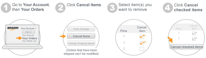
RETURN
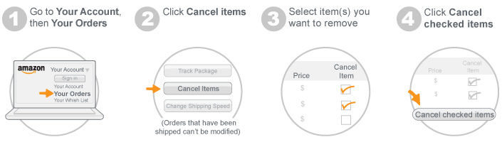
Author/Copyright holder: Amazon. Copyright terms and licence: All rights reserved Img Src
The process of self-service, user engagement and delight requires attention to the UX details too.
Account Management Tips:
Let users manage/cancel bookings/orders easily
Ensure easy access to coupons/loyalty schemes if implemented
Content/Design Tips for Return Users:
Deliver content rather than a homepage to immediately engage a user
Make it easy to discover new products/content
Allow users to recall recent/historic activity
Allow users to set alerts for particular items/actions
Think about tone of voice to engage and use visual and motion design to enhance the UX
Widgets and Notifications Tips:
Widgets are extensions to the app that allow you to publish additional (high value) data to the main smartphone screen which can be digested at a glance. Push notifications act as alerts prompting an action from the user.
Make push notifications user opt in
Make sure notifications and widget content is single glance friendly
Notifications should be personal, timely and offer incentives to take action
Make sure that notifications and widget offer single click access back to the app
The Take Away
Mobile UX is not different from desktop UX. All of the above tips from Google could be deduced via user experience research, iteration and testing. However, the research has already been carried out and there’s no sense in reinventing the wheel. Being aware of mobile UX best practices lets you get on with designing the best possible apps for your users.
References
The full 48 page paper on Mobile UX from Google can be found here.
Hero Image: Author/Copyright holder: Elena Baranova. Copyright terms and licence: All rights reserved. Img


