The history of information visualization is both rich and longer than you might expect. While the discipline of information visualization was only formally recognized by Xerox Parc in the 1980s – the act of information visualization is nearly as old as the written word. The history of information visualization up to and including the 19th century is concerned with static representations of data in visual format.
Information Visualization up to the 17th Century
There are stone tablets from Mesopotamia that date back over 2,000 years BCE that show representations of tabulated data. The need to represent information is not new and as you can see in the image below – one of the first uses of visualization was to measure finances. The tablet was used by a Sumerian governor to survey the silver under his control.
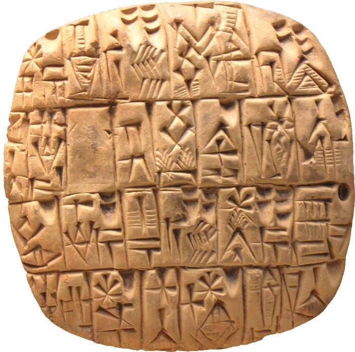
Author/Copyright holder: Gavin.collins. Copyright terms and licence: Public Domain.
However, it is fair to say that up to the 17th century our uses for information visualization were fairly limited. By far the most common representations of data were those used for mapping and surveying. In fact the map designed by Claudius Ptolemy (between 85 and 165 A.D.) of a spherical earth was still used in the 14th century as a reference guide. The image below is a 15th century rendition of this map – which may be the information visualization with the highest level of longevity to date.
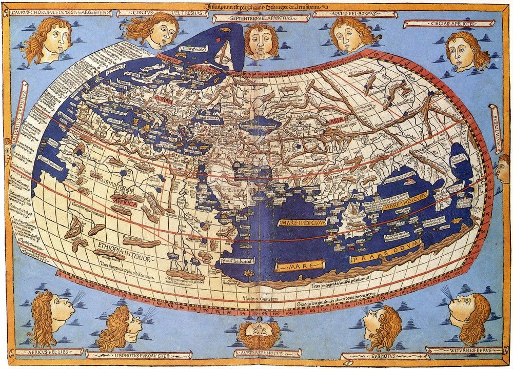
Author/Copyright holder: SCEhardt. Copyright terms and licence: Public Domain.
By the 14th century it was becoming more common for people to represent functions on graphs and by the 16th century as measurement systems became increasingly precise. There were many attempts to create ever increasingly accurate maps and graphs.
Information Visualization in the 17th Century – Measurements and Theories
The 17th century saw an extension from the traditional representations of geography and distance with time becoming increasingly important. Mathematics and physics were also on the rise and formal geometric systems were introduced to plot data visually (both Descartes and Fermat, the renowned mathematicians had a strong hand in these).
Galileo was studying the heavens and representing them. Pascal and Fermat were involved in creating probability theory and John Graunt began the discipline of demographic theory.
Author/Copyright holder: Dave Pape. Copyright terms and licence: CC BY 2.0
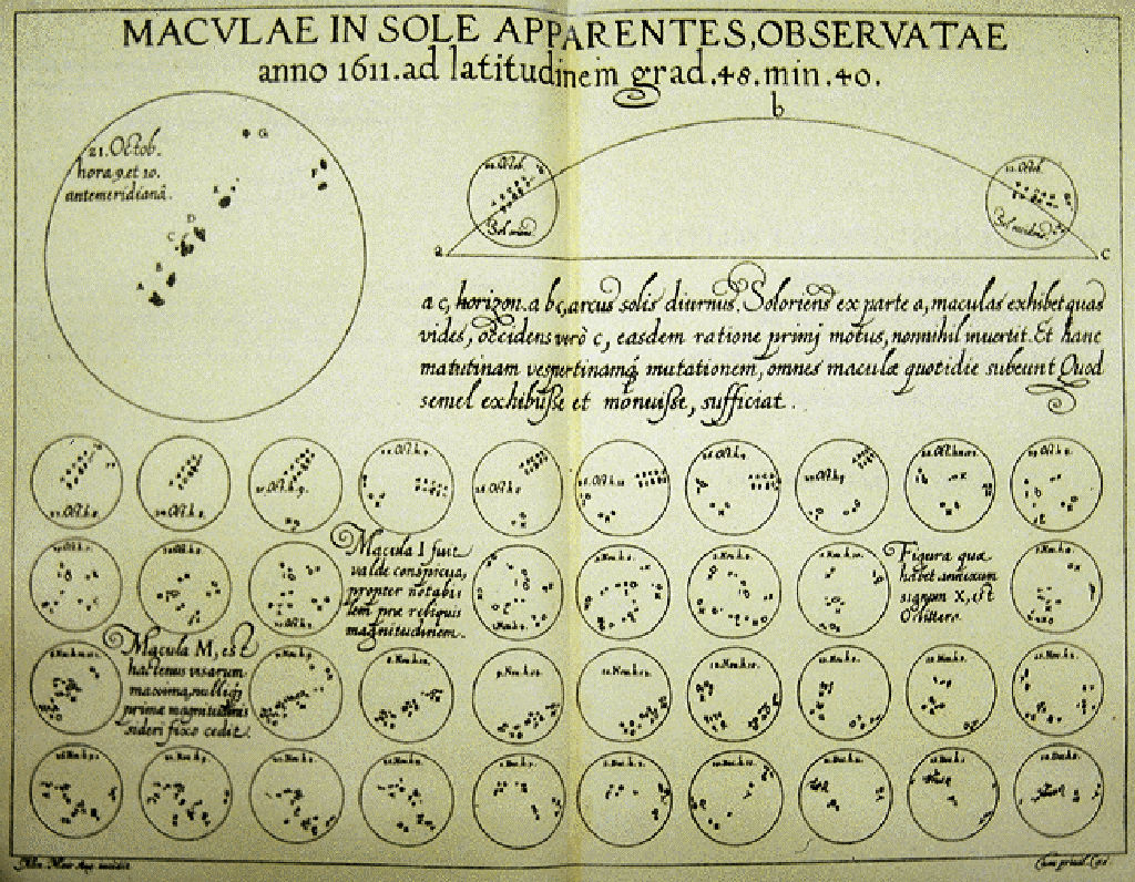
This led to information visualization of theoretical models, such as Christopher Schiener’s famous model of sun spot observations.
Michael Florent van Langren, the Flemish astronomer, created the world’s first statistical diagram in 1644. It represented the determinations of longitude between Toledo and Rome and was designed to help with navigation by offering a more accurate means of measuring longitude than previously existed. Though, it is fair to note that Langren’s model was not entirely accurate though for its time it was much better than had existed before.
It might be said that the 17th century in information visualization was the century which gave birth to “visual thinking” in a range of disciplines.
Information Visualization in the 18th Century
A combination of learning from different scientific disciplines also fed back into the generation of information visualizations in the 18th century. Maps became increasingly more accurate with the addition of isolines and contours. They also began to show more than just position with thematic data being applied to geographic data – for example to introduce economic or social geography.
William Playfair invented, or at least was the first to use, the line graph, the circle graph, the pie chart (pictured below) and the bar chart, in visual representations.
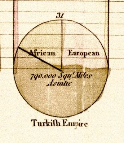
Author/Copyright holder: Schutz. Copyright terms and licence: Public Domain.
The end of the century saw the invention of pre-printed graph paper (by a Dr. Buxton) in 1794 which predates the introduction of ruled lines on paper by at least 15 years. The first published graph on such paper wasn’t published until 1800 however pushing it just over the line into the 19th century.
Information Visualization in the 19th Century
The 19th century was the time that statistical mapping came into its own. Graphs and maps of all kinds can be found from this time period: bar charts, pie charts, histograms, scatter plots, contour plots, etc. and on nearly any topic imaginable from economic data to weather data.
William Smith, the Geologist, would introduce geological maps to the UK in 1801 and create an entirely new information visualization discipline by doing so. The Ministry of Justice in France, in 1825, would create the first visual representation of crime figures – something that nearly every government in the world continues to do to this very day.
The field of medicine adopted its first epidemia mapping and this enabled the root causes of Cholera to be determined by Dr John Snow in 1855.
The railway and canal building industries also began to build ever more complex representations of their transport networks. Famously Minard, the French engineer, developed maps (one of which is shown below) to demonstrate why charging systems on the canal should be higher for partially completed journeys.
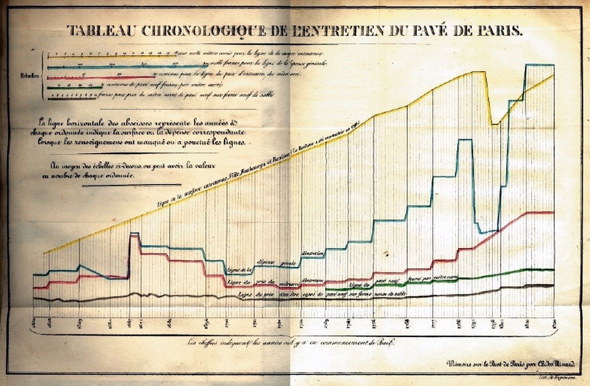
Author/Copyright holder: Minard, C. J. Copyright terms and licence: Public Domain.
In the latter half of the 19th century attention would turn to creating 3D representations consistently for the first time. Edwin Abbot, in 1884, would publish “Flatland” which suggested that it would be possible to create model views in 4 or even more dimensions.
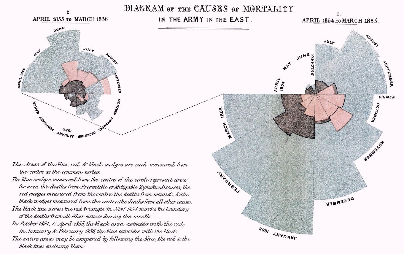
Florence Nightingale, who is famous for her contributions to medicine, invented the “rose diagram” (pictured below) which enabled improved sanitation for soldiers on the battlefield during the Napoleonic wars.
Author/Copyright holder: P. S. Burton. Copyright terms and licence: Public Domain.
Scales of graphs were also altered during this period with particular attention given to representing deformed scales (those which allow scaling of a variable) and logarithmic scales.
Francis Galton, the mathematician, would advance the mathematics of visual representations greatly through the end of the 19th century. He developed a clear picture (and formula) for bivariate distribution. He improved isolines, contour diagrams and general smoothing and created some stunningly accurate weather maps.
Numerous improvements by statisticians too numerous to count, were made to statistical analytics techniques during this period too and nearly all of them impacted the way that statistics were represented in visual form.
The Take Away
Information visualization has been with us for a long time, at least 4,000 years. However, it is fair to say that up to the 17th century its application was relatively limited then over a period of 3 centuries – information visualization, engineering, physics, mathematics, etc. combined to create a boom in information visualization. Models evolved to ever increasing levels of complexity and dozens of models were invented and used to carry out increasingly interesting and varied tasks.
Whether they knew it or not – the early pioneers of information visualization were trying to follow Edward Tufte’s, the world’s leading expert on information visualization, advice to; “Above all else show the data.”
References
A longer history of data visualization can be found here by Michael Friendly of York University, Toronto.
Edward Tufte’s work, which can be purchased from his website, offers a detailed history of information visualization.
Find out more about Rene Descartes, as well as:
And last but definitely not least, Francis Galton.
Hero Image: Author/Copyright holder: Sebastian C. Adams. Copyright terms and licence: Public Domain.