All the UX training in the world would be for nothing if you couldn’t get a job as a UX professional and fulfill your dream. Hiring for UX positions is difficult – recruiters need to assess many applicants’ skills, experience and attitudes towards their work. Contrary to being measured by traditional text-based résumés, UX candidates are typically assessed by looking at their portfolios. These contain a mix of facts about yourself, as well as visuals and text that describe how you tackled projects in the past. Through a UX portfolio, your aim is to demonstrate how you think and operate as a UX designer, showcasing not just the end product of your work but the process that you used to arrive there, as well. Developing the perfect UX portfolio may sound like a daunting task, but it doesn’t need to be. The good news is that Design Thinking provides a good way in which you can build your UX portfolio with the user—in this case, UX recruiters—in mind. Here, we will show you how Design Thinking can help you understand the fundamental steps towards the perfect UX portfolio.
A UX professional has, by definition, a people-centric role in the organization he or she works for. Even if you are the only UX person in a small team, you need to interface with both your co-workers and external stakeholders and users. Recruiters thus need to see more than just visuals that showcase your work. They need to see a process – i.e., how you think and collaborate with other people to get the job done. Here lies the main difference between a UX portfolio and a visual design portfolio. While the latter focuses on end products, the former focuses on the process.
Why have a portfolio in the first place, and in what format should it be?
Let’s begin with a statement about what a UX portfolio is: A UX portfolio is a designed product, targeted at other people so as to help them solve a need. Now, let’s break this statement down.
You are the designer of the product – i.e., your portfolio.
Your users (target audience) are the people who are going to be hiring you.
Your users’ problem is to find a person who will become part of their team and integrate well with it.
You might begin to think, “Now, well, if I am the designer of this product, what am I supposed to do?” The answer is easy: just do what you would do for any other user experience. Use the Design Thinking approach!
This means that you first have to empathize with your target audience, and understand their motivations, goals and limitations. If you can understand how UX recruiters think when reviewing applications, then you are halfway there to creating the perfect reviewing experience for them (and securing that job for yourself)!
There are typically two types of portfolios: PDF (static) and Web-based (dynamic). For a job application, it’s most common that you would send in a PDF portfolio containing a few samples of your work. If you have lots of content that you might like to demonstrate to a wider range of employers, you can build a website for your portfolio. The latter is harder – you need to demonstrate not just content but also the ability to create an appealing and usable interface for your website. Typically, though, most job applications require a static version of your portfolio, which should ideally be heavily customized to suit the role you are applying for.
Next, we will look at how to use the stages of Design Thinking to create your UX portfolio.
Empathizing with your portfolio audience
Your target audience is UX designers and recruiters – i.e., your potential collaborators. These people are already busy. If they are hiring, it means they have several ongoing projects and need help. They don’t have a lot of time on their hands: reviewing portfolios is yet another thing that gets added on top of an already packed schedule. Your reviewers need to find a person and find one quickly, and only the most promising candidates will be invited for a live interview.

Copyright holder: Ty-Rico Lea, US Air Force. Copyright terms and license: Public Domain
The UX designers who will be going through applicants’ portfolios will have to do this on top of their already busy schedules. In companies that attract lots of applications, this can be a really time-consuming task. Don’t expect that your portfolio will be examined for more than a couple of minutes.
What makes a promising candidate? Consider that as experienced UX professionals themselves, reviewers need to see in you something that resembles what they are. In that sense, then, your portfolio needs to be something of a mirror for them, but it also needs to serve as a window. They need to see how you think, how you collaborate, how you tackle difficult problems and how you remain critical and reflective of your own experience and work. These are the hallmarks of a great UX designer – technical skills and tools are things that you can learn in the process.
Defining the problem: What are the audience’s needs that your portfolio must meet?
It’s easy to see that now that we understand our intended audience better, we can begin to address their needs. Because of the little time available to the reviewers, portfolio reviews are very short – typically a minute or two of flicking through your content. So, there’s no point in having tons of it in there, because nobody is really going to pay attention to all of it, anyway. Remember that your portfolio has one job and that’s its only job: to get you invited to an interview. Below are the main points that should guide your portfolio development. Keep them in mind and make the reviewer’s life easy, to increase your chances of landing that interview.
It’s only a bait
From the reviewer’s perspective, your portfolio has one job, and you should focus on that aspect alone: to convince them to invite you to an interview. It’s not your life story. It doesn’t have to say everything about you. It can’t even say everything about you: people skills are only assessable in vivo, for example. Reviewers want to be made interested enough that they would want to meet you in person.
Keep it short
Your portfolio has to consist of a few facts about yourself and a few case studies (around 4 short ones, or 2 long ones) that represent your best work and reflect the full range of your abilities. Add a tailored section about your agenda – why do you want to be part of that team? What do you want to do as part of that team? What skills do you want to improve? Your case studies should also be tailored to the specific role of the job. If they are looking for a user researcher, there’s little point in placing an emphasis on projects where you did the design or code.
Demonstrate process, not end result
Your case studies have to show that you understand constraints and that you can think about how to solve a problem with these constraints in mind – i.e., the process that took you from a problem statement to a problem solution. Case studies can’t just be visual – you need about as much text as you need images, and even images should ideally be annotated to highlight important points about them. Don’t use filler images – everything has to be there to demonstrate something about your professional self. Everything in there must pull its weight for your cause.
Show humility
Last, but not least, you have to show humility – a reflective critique of your own work, what could be improved, changed or even avoided in a future project. What did you learn? It also helps a lot to acknowledge other team members you worked with – because that showcases that you are a team player and can collaborate well with others.
Ideating for the building blocks of the UX portfolio
So far, we have essentially covered the “empathize” and the “define” parts of the portfolio development process. Next, we can move on to the “ideate” phase. Thankfully, there are many portfolios out there that you can look at and borrow ideas from, for presenting your own case studies. It’s easy to get lost in the sheer variety of good and bad examples you can find, so let’s just look at what makes a good portfolio. You should use these guidelines to help you identify the good—or perhaps we should say “highly effective”—examples out there, so don’t just adopt something because it looks good. Make sure you assess it.
Let’s take a look at how you can separate the wheat from the chaff when looking for good examples in the portfolios of other professionals.
Personal facts
Have one (really, just one) page with the basic facts about yourself – education, skills, past working experience, recommendations. That’s it. Find an example that illustrates how you can do this with zero ambiguity.
Problem statements
It’s impossible for anyone to assess your case study thought process if that person doesn’t have some context about that case. Briefly describe the problem and key constraints that you had to work with. Even student projects have constraints: time, personal circumstances, lack of team members, lack of resources, etc. Find examples that succinctly outline goals and restrictions.
Thought processes
Great portfolios include rough sketches and prototypes, not just the finished product. This way, you can demonstrate how you think and iterate through project development. Find examples that show you how to illustrate and annotate these design artifacts optimally.
Point of view
Always explain your project goals, thought process and solutions from a user’s point of view, not your own. You wouldn’t just design something because it looked aesthetically pleasant to you – everything you do has to come from and matter to the users. Find examples whose narrative is focused on the user’s perspective.
Alternatives
A great case study highlights alternatives that were considered but ultimately discarded. Nobody believes that you would get a design just right the first time, because this seldom ever happens. Show your appreciation of this fact and how you handled alternatives. Find examples that show how alternatives were depicted and explain the rationale for selecting one.
Considerations for development
One of the hardest parts in any project is making sure that the implementation matches what was originally designed. Show how you worked with developers to bring your ideas to life. Find examples that discuss the designer’s interaction with the development team.
Outcomes
What were the final outcomes of your hard work? Did you manage to improve the UX in the project? Do you have some analytics, or evaluation results, showing that you did something well? Find examples where the results of a project are presented succinctly.
Reflective thinking
It’s not enough to show how you arrived at a design. Your case studies must demonstrate that there was something you learned from your experience. Comment on how things could be improved (e.g., if you had fewer constraints), done differently, or even avoided in the future. Find examples that demonstrate the designer took something on board as a lesson.
When you go through an example portfolio you’ve come across, review it against these guidelines and take notes. Identify the good bits of the example you found and the bad bits. Keeping these notes will help you mix and match ideas that you find in several projects, or even create your own ideas on how to do something better, and therefore give you a set of building blocks that you can use to craft your own case studies.
Prototyping for a portfolio
When you make a case study, the end result should effectively become the skeleton around which you could build a rich story, if you were to expand it with words. The reverse is also true: A great UX project story should also make for a good case study. To help you practice with this, take the inspirational building blocks from the great examples you found in the ideation stage, find a great UX story on the web, and deconstruct it into a case study. Give it to someone else: ideally, that individual should be able to grasp all of the important parts of the story without having read it. You can follow the same process for your own projects. Keep at it and with practice, you will eventually get it right. It’s not easy finding that sweet spot between keeping the case studies short without losing all of the vital parts that highlight your attitude and process to work, but practice makes perfect.
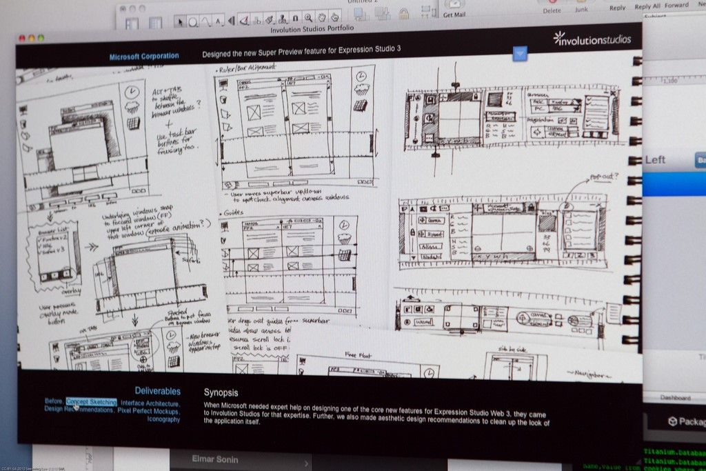
Copyright holder: See-Ming Lee, Flickr. Copyright terms and license: CC BY-SA 2.0
A superb example of a digital portfolio, showing design artifacts and process, and narrating the scope of the project. Reviewers can navigate to the various aspects of the process through the small menu at the bottom left.
Evaluating your portfolio
When you are done writing your portfolio case studies, you should revisit them and make sure they work for the purposes of your application. If you can answer “yes” to all of the following questions, then your portfolio should be looking good already and you should prepare to submit it.
Did you include one page with the basic facts about yourself in a clear and unambiguous style?
Did you describe the problems you were trying to solve and the constraints?
Did you show alternatives and explain how you chose between them, from a user perspective?
Did you identify the various tradeoffs that you had to make in the project and the reasons for those?
Did you showcase particularly difficult problems that got you stuck, and the solutions that you managed to find for those?
Did you highlight the important outcomes of your work? Using analytics, charts, stats or even text, are you demonstrating how your work made a positive impact on someone’s life?
Did you comment on what you might have done differently given additional time or resources to work on the project?
Finally, do your case studies combined highlight the range of skills that you have mastered, paying special attention to the skills required for the job role you are applying for?
It may very well be that despite all your hard work, that interview you had so hoped for never arrives. Don’t despair! It might be that other, more experienced people applied at the same time and they were simply several steps ahead in their careers already. It might just be a fact that your submission wasn’t that good, despite all your best efforts. This happens in any design project, and that’s why UX design methodologies are always iterative! Ask for feedback on your portfolio after a rejection letter. Even small tips and details can help you improve. Work at it – with dedication and commitment, you will get there.
The Take Away
The portfolio is your first and only chance to make a good impression on your potential employers. Making sure that you understand the reviewers’ perspective will dramatically increase your chances of submitting a portfolio that will land you that all-important interview. During the interview, you will have more time to expand on your experience and charm your future potential colleagues into hiring you, but that’s a different story altogether. When creating your portfolio, make sure the focus is on quality, not on quantity. A well-crafted portfolio is a product of love and attention to detail. In fact, it’s no different from any designed product that you might make using a Design Thinking approach. Getting the portfolio right first and foremost means that you understand Design Thinking: precisely the thing that interviewers need to see from you. That’s why the portfolio is so important, and this is what will get you that foot in your dream job’s door.
For more portfolio-building strategies and a structured, practical guide to the process, explore our course on How to Create a UX Portfolio. We've combined our experience in teaching UX design for 17 years with exclusive tips from design leads at Google, SAP and Oracle to bring you the most comprehensive guide to building your very own UX portfolio.
References & Where to Learn More
Hero Image: Copyright holder: lenovophotolibrary. Copyright terms and license: CC BY-ND 2.0
Course: “How To Create a UX Portfolio”.
Find some great case study full stories on uxdesign.cc here.
Lee, G. (2017). How to structure your first UX design portfolio. See here.
Cao, J. (2015).The pro guide to the perfect UX portfolio. See here.

