
The arrangement of items within user interfaces may, at times, seem a minor detail, but we are finely tuned to perceive order and structure. When items are in close proximity we see them as belonging to, or forming the same group. When users are meant to view items as grouped, place them close to one another, but if you do not want users to perceive certain elements as grouped, then space them apart; otherwise, selection errors are probable and correct choices will take longer.
The Amazon gift card page (shown below) serves as an example of 'good' design in this respect, as matching category items are placed in close proximity, whilst the two distinct categories (i.e. 'Best-Selling Gift Cards' and 'Gift Cards with Free One-Day Delivery') are placed further apart. The product descriptions are also positioned close to their corresponding images, so users can make instant selections with the minimum conscious consideration.

Research into Proximity
A number of studies have attempted to quantify the effect of proximity on our perception of sequenced items. For example, Palmer and Beck (2000) carried a study in which subjects were asked to identify pairs of shapes appearing among other non-paired shapes. The researchers then measured the length of time shape-pair detection took for each of the shape sequences. The graphic below shows the relative reaction times for each of the different arrangements of shapes used in Palmer and Beck’s perceptual grouping study.
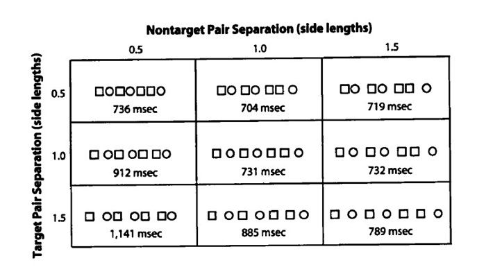
Results showed paired items were detected in the shortest time when they were in close proximity to one another (graph position: X - 1.0, Y - 0.5). However, they also found that the placement of other items had a disruptive or inhibitory effect on identical pair detection. Therefore, it is not enough to simply place grouped items close to one another to facilitate category identification in user interface design. Other items that belong to different groups must be placed far enough away to prevent any negative influence on the immediacy with which users can identify categories and extract relevant information. For example, the two user interface designs below represent ‘good’ and ‘bad’ proximity, respectively.
(You will find much more on arranging information in screen-based interfaces in our course: Gestalt Psychology and Web Design: The Ultimate Guide)

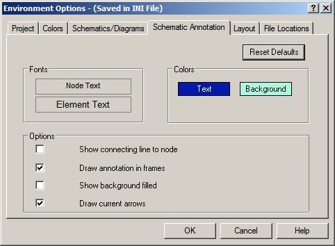
The ‘radio buttons’ design on the left is an example of 'good' proximity, as items have been arranged so that the buttons are in close proximity to the corresponding information yet spaced far enough apart from separate options to reduce the potential for inhibition of correct option selection. However, the right-hand dialog box is arranged in a way that makes all the information appear related, with option buttons and text entry boxes all in close proximity. By ordering items and instituting a logical structure, design can reduce the demand placed on users and help speed up the selection process. Busy user interfaces tax users unnecessarily and slow down navigation speeds, forcing people to scan whole areas before relevant information can be identified.
In Summary
In addition, spacing buttons or text entry boxes far from their corresponding information, such as the ‘Environment Options’ dialog box above, requires eye movements, or saccades, from one to the other. Distance can induce selection errors, as the ability to make immediate choices is impeded.
Proximity is a subtle, but instantly interpreted signal. Interface designers must take this simple aspect of user interface design into consideration to support the way visual information is instantly perceived. User interfaces should be designed so that grouped items are close to one another, but clearly separated from other distinct options, groups, or categories to prevent the inhibitory effect they may have on the speed and accuracy with which users are able to select their intended element.
Header Image: Author/Copyright holder: Society of Petroleum Engineers. Copyright terms and licence: All rights reserved. Img
Fig. 1 Amazon Inc. (Fair Use)Fig. 2 – http://socrates.berkeley.edu/~plab/pdf/Palmer&Beck.pdf Palmer and Beck (2000) (Fair Use)
Fig. 3 – http://www.tutorialsforopenoffice.org (All Rights Reserved Used Without Permission)
Fig. 3 – http://img.viralpatel.net/add-element-form-html-dynamically-javascript.png – (All Rights Reserved Used Without Permission)
Fig. 4 – National Instruments AWR (Unknown copyright)


