
The dropdown menu goes all the way back to the Start menu of the most classic Microsoft Windows versions. Now, you can find it nearly everywhere: from newspaper websites to online shops, and from graphic design applications to text-editing software. It has helped users time and time again to access sections of content, and if you’re looking for a way to give them all the options without sending them to a whole new page, it’s the pattern for you.
The Design Problem
You have a number of different selections which contain options of where the users can go or what they can do within a website or application. Some or all of these possible selections contain further, more specific options, but you do not want to send a user to a whole new page, window, or panel so as to be able to see them. For instance, consider a special effects suite for retouching images—from an initial dropdown menu of nine options, you might have to add an average of four options for each of those, and then a further five or so for each of those, before having about three final sub-options tailored to every one of those previous options. All told, what are we up to with our number of selections? It’s 9 x 4 x 5 x 3 = 540 options! Suffice it to say, 500-odd selections from an initial list of 9 is a lot of splintering; were we to try implementing how we offered our users these on a new-screen-by-new-screen basis, we’d lose them pretty quickly (the users, that is; we’d be stuck with all those screens, and what a sanity-threatening experience they would offer us). All of a sudden, we realize that although having the option to transform a linear image in our suite into one textured in the form of a galaxy of stars is a really cool idea, the point that we didn’t offer it appropriately to the user is an epic fail.
The Design Solution
A vertical dropdown menu allows you to display a list of contents, navigation points, and functions without flooding the user with lots of options all at once. We would present options to the user in the form of a vertical list whenever the user clicks the menu label or hovers the cursor over it – depending on which interaction we have enabled in the design. The user can then select one of the dropdown menu options by clicking on the appropriate content name. These options might take the user to another page—or they might lead to the presentation of a new menu or panel, or the execution of a function (e.g., “Save” vs. “Save As”).
In dropdown menus, each list of options is assigned a content-defining title, and these are placed horizontally along the top of the screen or panel. As the name suggests, the list of options ‘drops down’ when the user places the cursor over or clicks a menu label. Users can see all of the contents in that specific menu, ensuring they only ever have to attend to one list of options at a time. They can then make their selection from the vertical list of options by clicking on the appropriate point on the menu. Typically, dropdown menus are designed so the list item under the cursor is highlighted—serving to inform the user which option is or will be selected. As you can see from the dropdown menu below, the cursor is positioned over the ‘You’ option, with the user informed via the use of a grey font color.
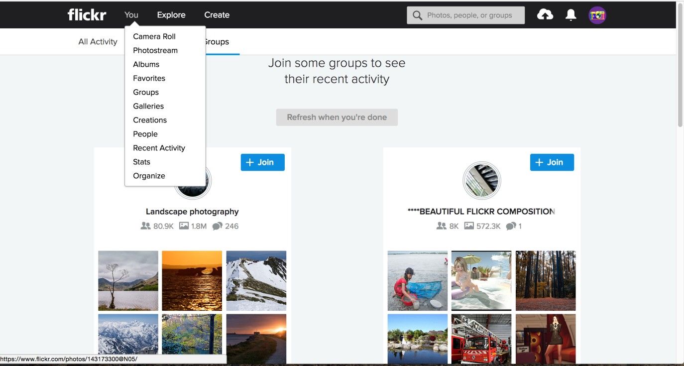
Author/Copyright holder: Flickr. Copyright terms and license: Fair Use.
This example, showing the Flickr Groups page, includes the highlight suggested above. On hover, the ‘You’ section of the top row of menu items is highlighted in a subtle grey. This is a gentle indication of which option is selected, beside the opened dropdown menu itself.
Horizontal dropdown menus are an addition to vertical dropdown menus, which help save the user from having to go to separate sections of the user interface at each stage of an option-selection sequence. As you can see from the example below, when the user places the cursor over an option in the first (vertical) dropdown menu, with an east-facing arrow to the right of the item, a further dropdown menu appears alongside the original, and contains more specific selections.
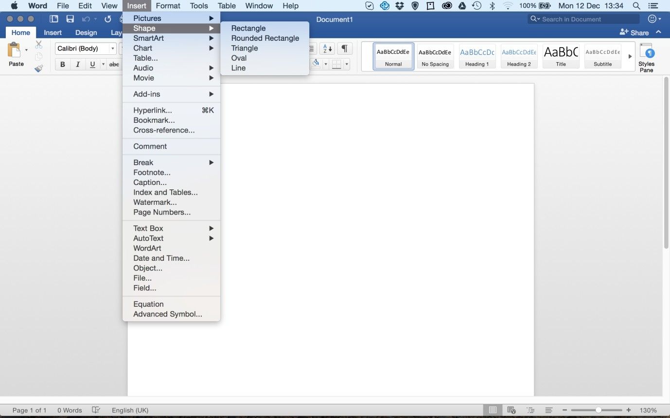
Author/Copyright holder: Microsoft. Copyright terms and license: Fair Use.
Microsoft Word uses dropdown menus in abundance. This example shows a combination of vertical and horizontal dropdown menus, allowing users to access even more content by hovering over the east-facing arrows. Each of these additional menus is like a ‘gearbox’ in itself, affording users fine-tuned control—in this case, having the choice of inserting a range of five shapes.
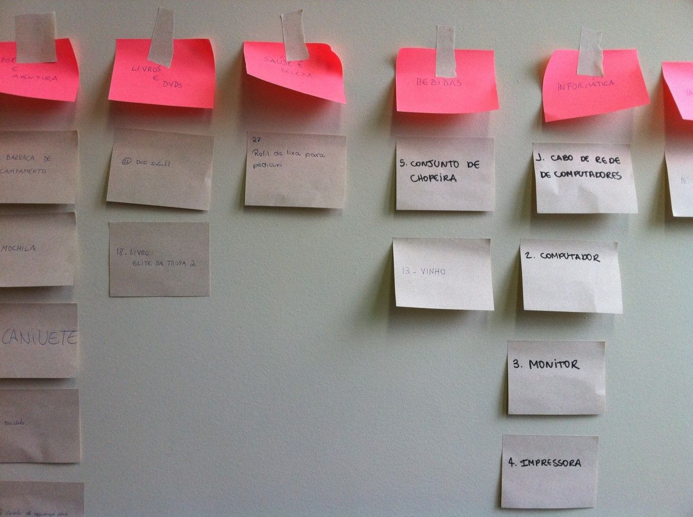
Mega dropdown menus (also referred to as 'fat menus') consolidate all of the different sections of the site, application, or system into one long list, which is further broken down into sub-categories and accessed from a navigation bar, such as the Asos homepage example below. As the name suggests, mega dropdown menus are used to show large groups of options, categories, data sets, or other types of related content at once.
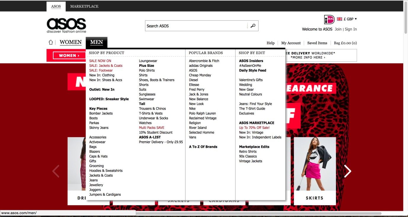
Author/Copyright holder: Asos. Copyright terms and license: Fair Use.
The Asos website uses a fat menu, or mega dropdown menu, showing all available options for ‘Men’ apparel at once. To do this in a usable way, the designers have divided the content into categories, each with a clear label.
Why Choose a Dropdown Menu Design Pattern?
As they are traditionally used in desktop applications, located at the very top of the screen, nearly all users, no matter what their level of experience, will be familiar with this means of organizing content and how they must interact in order to see the available options and make their selections. Therefore, if you are designing a website or application intended for general users, dropdown menus provide a familiar user interface design pattern that should not hinder their exploration.
Using a horizontal dropdown menu allows the user to view a large number of options from one page and which get progressively more specific, while helping keep the number of page refreshes to a minimum. Thanks to the displaying of all of the sub-categories of options within the same general space occupied by the highest order of categories, users simply have to switch their view a little to the right every time a horizontal menu is selected. If the users were taken to another page to see these sub-categories, they would have to re-orient themselves at each new page refresh—this isn’t a good idea, as not only would it add time to the process, but it would also give users the impression they are ‘working’ to find things.
The distinguishing advantage of using a mega dropdown menu is that users are given the opportunity to explore the full list of options for a given section of a site, app or system without having to switch between different user interface design patterns, such as scrolling lists, navigation bars, and menus. By being presented with all of the available navigation points, for a particular section within one menu, users can investigate a wide range of options that they might not have considered otherwise. This makes mega dropdown menus particularly useful in e-commerce site designs, as the users can be seduced with different groups of products that they would not have come across during their usual passage through the different levels of the site.
Fat menus also increase the connectedness of contents within a site or application, as they provide a single navigation point from which users can hop from one subpage to another. This can be particularly advantageous for sprawling sites or applications with many different categories, sections, and pages, as the user does not have to navigate to the homepage or another tier in the site or application hierarchy so as to move to a different body of content. Therefore, fat menus allow you to connect subpages within a multi-level design so as to create a cohesive and simple user experience. In addition, by your consolidating all of the connected links into one menu, the users always know where to go when they want to jump to another section of the site. This saves them from having to remember where contents are within the design, thus reducing short-term memory load.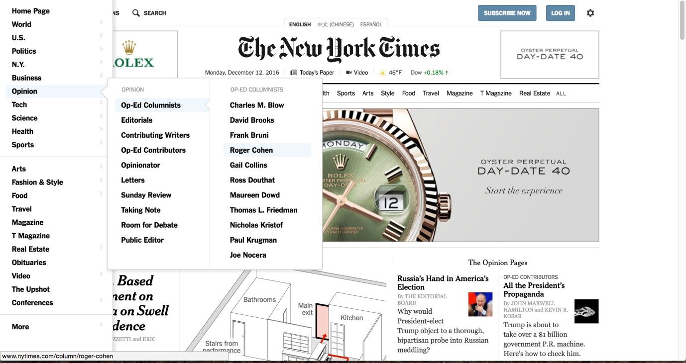
Author/Copyright holder: New York Times. Copyright terms and license: Fair Use.
Using a horizontal dropdown menu allows the user to view a large number of options from one page, options that are progressively more specific, while helping keep the number of page refreshes to a minimum. The New York Times website exemplifies how to guide the user across a wealth of options to a desired target, all within a mere three clicks.
Jakob Nielsen, author, researcher, and consultant on user interfaces as well as co-founder of the Nielsen/Norman Group, provided three reasons that fat menus are superior to regular dropdown menus. In short, these are as follows:
Regular dropdown menus in large, multi-level sites typically hide some or many of the options from the users. This requires them to scroll, search, or remember where particular options are within the user interface, which is either more interactively demanding (i.e., more clicking is required) or cognitively demanding (i.e., recall from short-term memory is required).
Regular dropdown menus are comparatively small, so there is limited space to represent the relationship(s) between options, such as shared sections or categories. The greater size of fat menus allows you to order options into titled sections or categories, such as those in the Asos.com fat menu above ('shop by product', 'most popular', and 'marketplace').
Once again, the sheer size of fat menus affords much greater flexibility in how options are represented. For example, small illustrations can be used to help the user instantly recognize an option within the long list. While text can be used to name an option unambiguously, illustrations and icons can be perceived within an instant so the user can make immediate selections. Even if you choose not to use imagery to represent options, fat menus allow you to be creative with font sizes, which can be utilized to help the user distinguish between category titles and direct content links or identify which links are of greater importance (i.e., largest to smallest).
Best Practice: How to Implement Dropdown Menus
Before implementing dropdown menus, you have to ask yourself the vital question of “Will they be the best way to organize the content of a webpage or application?”. Do not use dropdown menus when:
You wish to show the users where they are within the website or application. When providing the user with such contextual information is important, use navigation tabs.
The user would benefit from seeing the content of the individual menus together.
When a category contains only one item.
Follow these steps for the implementation of dropdown menus:
At first, you must identify what your categories or dropdown menu titles are, which involves reviewing your contents to establish common themes and links between items, options, functions and site/application contents. For vertical dropdown menus, the number of sets of options should be no greater than ten, due to the arrangement of menu titles side by side and spanning the width of the user interface. This restricts the amount of space available for presenting the menu titles and as (by their very nature) they drop down, you cannot stack them one on top of the other.
After arranging these options into their appropriate groups, you should assign a logical and fitting title to each category. This label must not be too long—so as to conserve the available space along the panel or screen—nor so short that the clarity of the content-defining term is sacrificed. Remember these labels are used to promote immediate awareness of what the users will find when they select a menu item; using ambiguous or unfamiliar terms can be confusing or misleading, wasting the users’ time when they investigate the options offered in a menu.
Now, place the menu titles in a row and determine how to order them. Depending on the situation, frequency of use can be an appropriate criterion. In other cases, an alphabetical order can be useful. Obviously, you will not know for certain what will work best for your users, so conducting some usability testing can be useful.
If you’re using a horizontal dropdown menu as well, now you should include some visual indicator, such as the east-facing, black arrows in the example above, informing the user that hovering the cursor over an option with extra options will reveal an associated sub-category in a further dropdown menu. This new menu then appears to the right, with the first possible selection now in line with the corresponding item in the original dropdown menu.
Now you have decided what will be in the menus and the order of the items that will be displayed, you must add some visual features that will help the user choose the intended option. There are two main features that assist the users: firstly, the use of background color to inform them which option will be selected according to the position of the cursor, and, secondly, the implementation of a clear boundary around the dropdown menu so as to help users isolate the group of available options from the rest of the user interface. Without some visual indicator, the users might assume the cursor is over their desired option, when in fact it is over a neighboring option. Therefore, this simple addition to the dropdown menu design can help reduce error rates and save the user from having to make annoying backward steps just to get back to the list of options. A clearly defined boundary serves to reduce the potential inhibitory effects of the surrounding information on an option’s selection. For example, a dropdown menu might contain Times New Roman, 12-font text; also, if the list of options does not appear to be separate from the rest of the display, similar text in the surrounding space could confuse the user or slow down the selection process.
If you decide to use a mega dropdown menu, getting the visual aspects right involves using headers and dividers so the user can immediately determine which category an individual option belongs to. White space can also play an important part in helping the user identify groups of options; so, include a small amount of this ‘dead’ space between different groups to avoid confusion and keep the experience agreeable.
At this point, all of the visual aspects of the dropdown menu design should be in place; now, you must choose the interactive elements of the design.
Firstly, should the dropdown list appear when the user simply hovers the cursor over the category title? Or should the menu only appear when the user has clicked on the category label? The former method saves the user from having to interact directly; the latter ensures the menu does not appear unless the user expressly wants it to.
Also, you must decide whether the menu should disappear when the cursor is moved to another region of the user interface. Again, removing the menu in this way saves the user from interacting in order to return to the rest of the display. Even so, it can be extremely frustrating if the user moves the cursor away without the intention of closing the menu. Ways around this problem are listed in 'Potential Problems' below.
Finally, when the user clicks on an option, the menu should automatically disappear and the associated content should open immediately.
Author/Copyright holder: IxDA BA. Copyright terms and license: CC BY-SA 2.0.
Card sorting is a good method to get insights into what your users think are appropriate categories to use in your dropdown menus. If you don’t have the time to do proper sessions with users, you might consider trying card sorting yourself so as to get a grip on the content. This may be a good idea, especially when you are designing a mega dropdown menu.
To help you get started implementing dropdown menus, you can download and print our “Dropdown Menu” template:
Potential Problems with Dropdown Menus
“I chose a lazy person to do a hard job. Because a lazy person will find an easy way to do it.”
—Bill Gates, Founder of Microsoft
Of course, Mr. Gates was not referring to dropdown menus here; even so, with a little imagination, we can see the parallel to our subject matter if we remember we are designing to organize potentially massive amounts of information on one screen. Corralling so many options in this way means we shouldn’t forget that while dropdown menus make finding things easy, designing them so they cause zero frustration is a harder matter. In particular, automatically removing the menu from the screen when the cursor is moved to another region of the user interface can be infuriating, but there are a number of possible ways around this problem.
You could implement a time lag of approximately 200–300 milliseconds between the user’s moving the cursor from the space occupied by the list of options and the removal of the menu.
You could make the margins around the menu options larger, so unintentional or inaccurate movements are less likely to cause the menu to disappear.
You could alter the cursor icon that appears when positioned over a tab (e.g., switching from an arrow to a pointing hand); this helps to inform users that they are within an interactive area of the user interface and moving away from this region will cause the removal of associated content.
The first two approaches allow a larger margin for error when the user is moving the cursor around the screen, and the last provides the user with important feedback. Therefore, the three techniques combined can help reduce the potential frustrations associated with the automatic removal of a dropdown menu when the cursor is moved away.

Author/Copyright holder: French Connection. Copyright terms and license: Fair Use.
The French Connection online shop is an example that shows really well how much space a mega dropdown menu can take up. In this case, it’s not a big problem, as users will not need to view the contents of the whole webpage while selecting a specific category. However, it could not be made larger than it is now, as it would cover the whole page.
One problem that is important to consider, especially for horizontal and mega dropdown menus, is that a large region of the user interface might be obstructed due to the sprawling nature of the open menus. As you can see in the example above, the open menu conceals a large amount of the user interface.
If mega dropdown menus are designed so options consume more space vertically, some of these options may stretch beyond the visible portion of the page. The user is then called upon to scroll up and down so as to view all options and compare those at the top to those at the bottom. This introduces a frustrating extra level of interaction to the experience and limits the speed at which the user can make selections.
Mega dropdown menus, by their very nature, present the user with lots of different options, which can be something of a double-edged sword. If the individual options are not arranged into sub-categories or clearly distinguished using some form of visual variation (font size, iconography, or imagery), then the user will have to scan a large number of options before identifying the favored one. Therefore, unless a designer takes measures to break the options into smaller, more specific groups, the benefits associated with displaying lots of options at once become restricted.

Author/Copyright holder: USA.gov. Copyright terms and licence: Fair Use.
In this example from USA.gov, users need to scan each item in the mega dropdown menu, as the categories don’t appear to be organized according to a logical structure. In this case, it is acceptable, since there are only ten options to consider. But when the size of the menu increases, sorting the items in an understandable way becomes important for ensuring proper usability.
The Take Away
Dropdown menus are a classic way to offer users a number of options, without taking them to a new page. Combining vertical and horizontal dropdown menus will already give you the option to open up many categories, but if you’re looking for more, the fat menu (mega dropdown menu) may be just what you need. Defining the categories of items is the most important step in implementation, and the card sorting technique may help you here. Take care to reduce the potential frustrations associated with the automatic removal of a dropdown menu when the cursor is moved away and to avoid having the menu cover the whole page. Above all, stay aware of how easily users will feel disoriented if they encounter such disruptions. These menus can be very strong allies in providing a good user experience, but their correct deployment is paramount.
References & Where to Learn More
Jenifer Tidwell, Designing Interfaces: Patterns for Effective Interaction Design, 2010
Martijn van Welie, Pattern Library, 2008
Jakob Nielsen, Mega Menus Work Well for Site Navigation, 2009
Hero Image: Author/Copyright holder: Rob Eslin. Copyright terms and license: CC BY 2.0..


