Welcome back to this week’s series of awesome UX practices. If you haven’t caught the first 4 instalments; don’t worry – they can be found under the UX Daily tab on our website. Today we’re looking at UI design:
Don’t Reinvent the Wheel
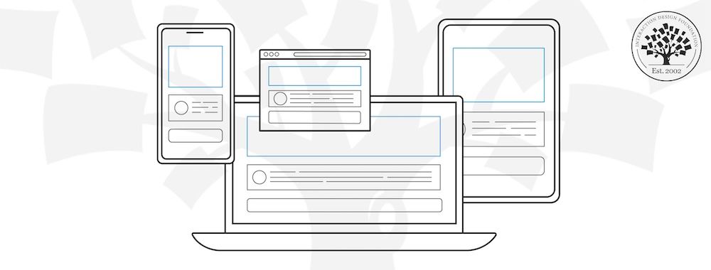
When it comes to UI design one of the simplest and most effective ways to cut down on workload is to take a look at other people’s UI patterns. If you can find someone who has done something similar and it seems to work; you can emulate that pattern. This often has the added benefit that some UX testing will already have been done on the pattern – that doesn’t guarantee that it will work for your users too but it does increase the odds.
Remember Your Users
You cannot design UI beyond your users’ tolerance and comfort zones. Even if your radical approach is truly ground breaking; you may need to move slowly forward with major innovation if you want it to be well received. If you pull people too far out of their comfort zone on a first run – they won’t come back for more; they’ll go looking for something more familiar instead.
Always Document The Patterns That You Use
Once you’ve put in the effort to create an awesome UI don’t think the job is done. You need to make certain that it’s easy for people to follow that pattern in the future. There are tools for this that make documenting multiple UI patterns over multiple projects easier but a Word Document might do the trick for a simple project.
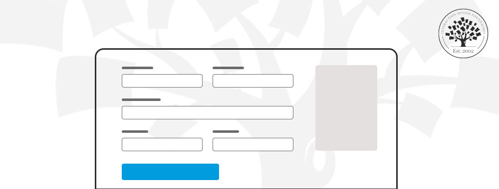
Don’t Badger First Time Users
That 6 page registration form that marketing wants to use? You need to kill it. You want registration to be as painless as possible in most cases. That means focusing on minimal data to make the sale, start the trial, etc. you can always go back when the user makes a second purchase or plays with the app a second time and get a little more data from them. The most off putting thing in the world; is being expected to fill in a catalogue of forms just to view a single web page. If the information exists anywhere else online – it will be easier to find than tackling that registration process – don’t throw customers away.
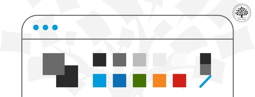
Don’t Be Afraid of Tool Tips
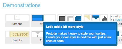
If you find that the number of actions on screen is becoming way too confusing; consider reducing the amount of text visible at any one time and offer tool tips instead (ideally on mouse over). This can make things much more visually appealing and it has the virtue of delivering only the information that the user needs; when they need it. That’s a pretty good principle for reinforcing the user experience.
Image Source:
Web Design Ledger (link to image)
Home Care Forms (link to image)
D Telepathy (link to image)