
Helping your users find their way around your website is a vital part of delivering a strong user experience. It can be somewhat challenging to get this right. Well formulated labels, the textual element of navigation, can make navigation very easy and badly formulated labels can send your users elsewhere.
Where to Begin?
The easiest place to begin designing useful labels is to talk to people. Ideally; this being a user related issue – ask your users what they’d call things. If you can’t ask a user; ask someone within the team to sit down with you and come up with some initial labels.

Author/Copyright holder: Pedro Ribeiro Simões. Copyright terms and licence: CC BY 2.0
At this stage it doesn’t matter what these labels are – you just want some quick ideas to jot down; you can refine them a little later.
Then Test The Labels
This may be one of the cheapest forms of user research ever. You can go full on guerrilla for this and there’s absolutely no need to go mad with lab testing unless you are developing an incredibly large taxonomy for a mega-site.
You could choose a card sorting exercise; which has the advantage of not just testing people’s understanding of the terms but also helping them arrange those terms in a logical order for you (information architecture structure becomes so much easier when your users tell you where they’d expect to find material).
Alternatively, you could try a Timmy Mallet style word-association game with the researcher reading the term to a user and asking them to call out similar terms.
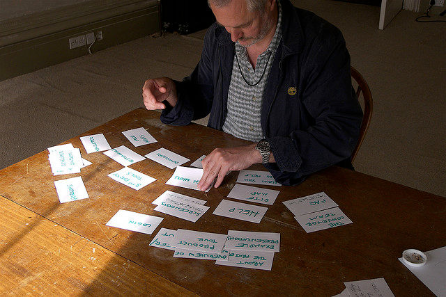
Author/Copyright holder: Yandle. Copyright terms and licence: CC BY 2.0
The idea is to ensure that your users can relate to the terms that you use and also to ensure that the terms you use can’t be confused with each other.
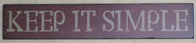
Revisit Them with a KISS
That’s “Keep it Simple Stupid” rather than anything to do with tongues. Remove redundant terms; “Our Computers!” is much better written as “Computers” because who else would be selling computers on your website? (EBay excepted).
Author/Copyright holder: Erich Ferdinand. Copyright terms and licence: CC BY 2.0
Wherever possible simplify terms. Reduce and reduce and ideally end up with a single clearly understood term for each navigation option. If you end up with two words; it’s almost certain that one of them is superfluous to your users’ needs.
Then Look to The Industry You’re In

Author/Copyright holder: Daniel R. Blume. Copyright terms and licence: CC BY-SA 2.0
Review 10 of your competitor’s sites; how do they label their navigation items? Look for trends. You may think that the word “Holler!” is a genius replacement for “Contact” but if everybody else says “contact” you ought to follow suit. Don’t make users learn new patterns when strong established patterns are in place.
Present them with navigation options that are familiar and they’ll thank you for it in the long run.
Summary
Textual navigation (labels) isn’t too difficult to get right. Consulting your users has the added benefit of helping you structure your information architecture and then it’s a simple matter of simplifying and ensuring you stick to recognized patterns wherever possible.
Header Image: Author/Copyright holder: atsunori kohsaki. Copyright terms and licence: CC BY-NC-ND 2.0


