Users are impatient creatures: anything that may seem like an inefficient course of action to achieve the goals they have they will regard as suboptimal and take a dim view of. Booking.com and other large companies offering flights or accommodations know the importance of getting this small section of a complex user interface just right. Stand on the shoulders of giants and learn from their experiences with implementing the event calendar design pattern. We will show you the dos and don’ts in order to make satisfied users who will love your designs out of those who visit what you produce.
The Design Problem
The user is required to enter a date or a date range – for example, when purchasing train tickets or arranging a vacation. Oddly enough, what amounts to eight (sometimes even six) digits can cause inordinately large problems. All it takes is one digit out of place or a misunderstanding in format for customers to turn up for a cruise one day too early or book a flight a month too late. Given the speed of twenty-first-century living and the point that proofreading is a vocational craft, not an innate character trait in the average human, mistakes can, do, and will continue to happen. That’s our cue to come to the rescue as designers.
“There’s many a slip ‘twixt the cup and the lip.”
—(Old Proverb)
The Design Solution
An event calendar design pattern solves this problem by allowing the user to select a date from a list. This list is not presented as a traditional list that a user scrolls through, but rather as a visual representation of a monthly calendar, as shown in the example below.
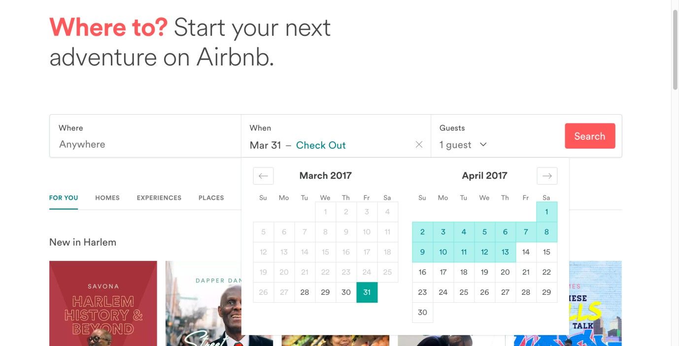
Author/Copyright holder: Airbnb. Copyright terms and license: Fair Use.
Airbnb offers at-a-glance functionality; with a few thumb clicks or finger taps, a user can plan out a stay and take it from there – a far different process from, say, using a dropdown list.
Why Choose an Event Calendar Design Pattern?
Allowing users to select a date from a list—rather than input the information manually— saves them time and effort. A user might be trying to submit a date, track an order, arrange content according to a specific range of dates, or filter results. By the designer’s offering users an event calendar, the process for each of these occasions is faster—provided the calendar has been designed in a user-friendly way—as they do not have to enter the numbers or abide by any particular format so as to make their selections. Better still, the familiar sight of a calendar lets users see on what day a date falls and its relation to other dates they may have to keep in mind (e.g., a user needs to be back at work on April 17th and has a little over two weeks to enjoy a vacation).
In some countries, the user is requested to enter the date as day/month/year—such is the case in the UK—while other countries' designs require the user to enter the date as month/day/year, and even a few, such as Sweden and Kenya, maintain a year/month/day format as a popular traditional option (in line with the ISO 8601 convention of putting the largest time denominations first). In addition, some designs request users to space the day, month, and year using a forward slash, while others use periods. All of these formats constrain the users and force them to consider how they must input the data, as opposed to allowing them the freedom simply to select an option from a list, as they can in an event calendar. This issue runs along the same lines as the difference in the conventions of spacing thousands and decimal points between the English-speaking world and many continental European nations, where one thousand appears as “1,000” and “1.000” (respectively) and “1.0” and “1,0” represent the number “one point-oh”; as you can see, mistakes are bound to happen, not least as users tend to type at speed.
Such calendrical representations are a great help for users. However, people are creatures of habit, and while the provision of an event calendar can speed up the process, many still do prefer to input the data manually. For this reason, it is best to use event calendars in combination with an input field; that way, users can enter their preferred date manually or select it from the calendar. In order to support the users further, you could use three separate boxes, one each for the day, month, and year, so they do not have to format their data (i.e., place any punctuation marks in between). Just make sure you mark each box clearly (e.g., 'D', 'M', and 'Y') so the user knows in which order to enter each component of the date.
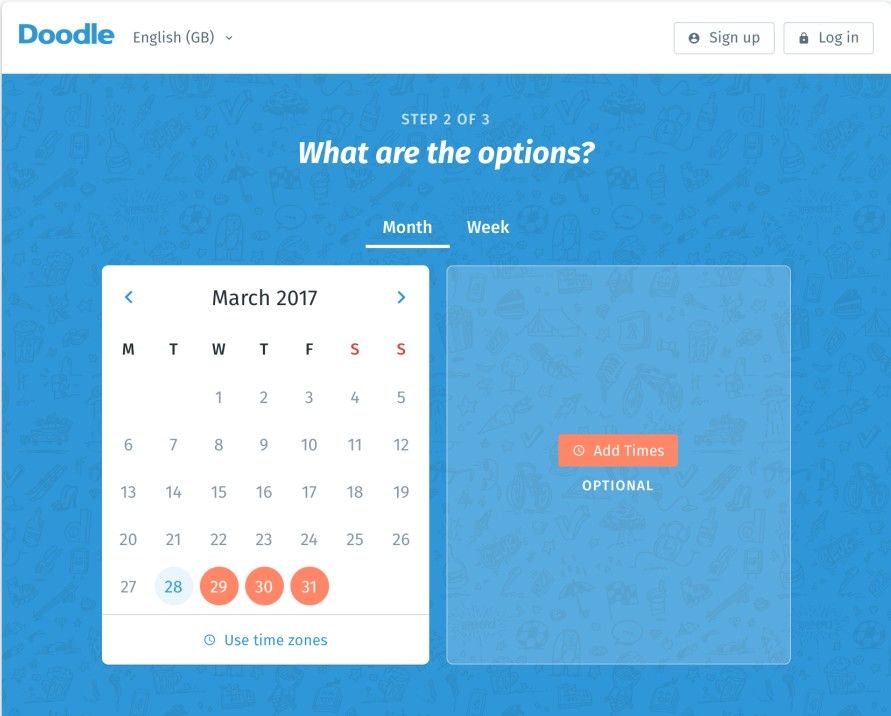
Author/Copyright holder: Doodle. Copyright terms and license: Fair Use.
The Doodle web service exclusively focuses on providing the means to select and share dates. In its date picker, a user can select multiple dates in month or week view. Doodle only provides a visual overview of a calendar. Because users will always input multiple dates, this is more appropriate than manually entering dates in an input field.
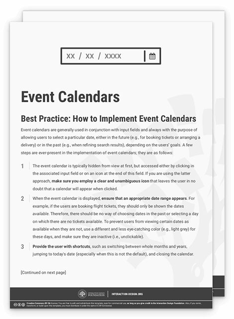
Best Practice: How to Implement Event Calendars
Event calendars are generally used in conjunction with input fields and always with the purpose of allowing users to select a particular date, either in the future (e.g., for booking tickets or arranging a delivery) or in the past (e.g., when refining search results), depending on the users’ goals. A few steps are ever-present in the implementation of event calendars; they are as follows:
The event calendar is typically hidden from view at first, but accessed either by clicking in the associated input field or on an icon at the end of this field. If you are using the latter approach, make sure you employ a clear and unambiguous icon that leaves the user in no doubt that a calendar will appear when clicked.
When the event calendar is displayed, ensure that an appropriate date range appears. For example, if the users are booking flight tickets, they should only be shown the dates available. Therefore, there should be no way of choosing dates in the past or selecting a day on which there are no tickets available. To prevent users from viewing certain dates as available when they are not, use a different and less eye-catching color (e.g., light grey) for these days, and make sure they are inactive (i.e., unclickable).
Provide the user with shortcuts, such as switching between whole months and years, jumping to today's date (especially when this is not the default), and closing the calendar.
When the user selects a date, that action should automatically fill the input field, with no delay in between the selection and the date appearing; otherwise, the user might think the choice has not been logged and he/she needs to do something else.
If users are entering a date range, you must make sure they cannot enter the end date as the start date. Therefore, you must design the system so that the date furthest in the future is automatically set as the end date.
Within the event calendar, ensure that whole weeks are shown, even when they span over two different months. Obscure or grey out the dates that appear from other months, but allow the user to select them still.
While you do not want the event calendar to span a large area of the user interface—as the process of identifying and selecting a particular date would take longer—the dates should be large enough for the user to click on them with ease and without accidentally selecting an unintended date.
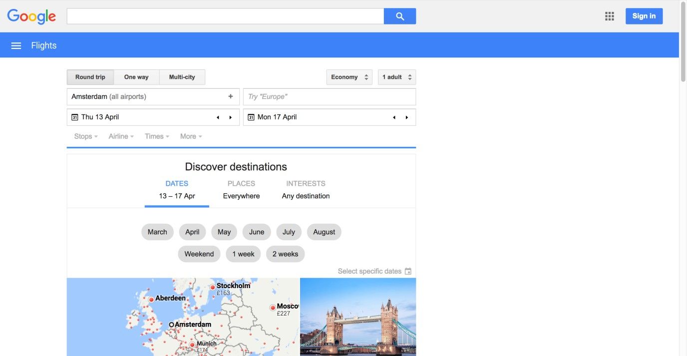
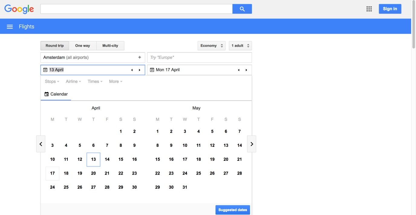
Author/Copyright holder: Google. Copyright terms and license: Fair Use.
The Google Flights web page shows an event calendar as soon as the user clicks in the date field. The user then has the freedom to choose whether he/she wants to enter a date manually or choose one from the visual representation. In this example, the weeks spanning multiple months aren’t shown in grey, like the best practice steps suggest. Adding this feature would allow users to select, for example, the first of June without first scrolling to the next month.
To help you get started implementing event calendars, you can download and print our “Event Calendars” template:
Potential Problems with Event Calendars
“Imagine if every Thursday your shoes exploded if you tied them the usual way. This happens to us all the time with computers, and nobody thinks of complaining.”
—Jef Raskin, American Human-computer interface expert and developer of the Apple Macintosh computer
Event calendars are at their best when the user is entering dates in the near future or past; when dealing with information far in the past or future, users have to flick through all the different pages in the event calendar before they reach the desired date or date range. For example, if the users are trying to enter birthdates, they would have to make many movements through the calendar and the process would take longer as the age increased, which is in no way ideal for older users (not to mention the added downer for many of them in getting a protracted visual showing just how old they are!). Therefore, on occasions where the users would have to go through many different pages of the calendar before they reached the desired date, it is probably best just to provide them with an input field.
As previously stated, in some countries the date format is day/month/year (e.g., in the UK), while in others month/day/year (e.g., in the USA) is the norm, and a few even go by year/month/day. In addition, some countries regard Sunday as the first day of the week, while others traditionally view Monday as the start of the week. Your event calendar must reflect these variations so as to prevent erroneous date selections. Therefore, cultural differences must be taken into consideration when designing event calendars, as incorrect choices could lead to big problems, such as appearing at the airport on the wrong day, and that problem tends to be even more painful when someone turns up a day too late.
The old adage that time waits for no one chimes in with the point that users will likewise have precious little patience for anything that gets in their way. That’s where we as designers have to take the time before the fact so as to invest in getting our designs right for the target audience. Those little extras such as providing a dual means to select/enter a target date can mean the difference between a happy camper (or traveler) and a user making a desperate call to a complaints department for a ticket refund. A good tactic for keeping mindful of how badly things can go in this regard is to look at the “best before” or “sell by” date on a perishable item the next time you’re at the supermarket. For instance, that tub of yogurt that says a European consumer has until “07/06” to eat it might be weapons-grade sludge if an American customer were to buy it thinking it could actually last until “July the sixth” (unlikely, but let’s consider the risk illustrated here). If time travel ever becomes an option, we may be able to revise our approach to making bookings a little – for the moment, though, you should look on an event calendar as a kind of safety net for the user experience; check that it works well.
The Take Away
Event calendars are a great visual way of letting the user enter a date or date range. When implementing event calendars, you need to take into consideration that date formats differ across cultures. Also, you should help the user out by presenting dates that are closest to the present. So as to prevent users from having to scroll through a large set of dates, this design pattern is often combined with an editable input field. As long as you introduce it with care, this pattern allows you to improve the usability of your products and decrease user effort. If you use it well, an event calendar will help users in their thought processes, catching potential time conflicts for them and enabling them to get where they want while winning their trust with your brand, time after time.
References & Where to Learn More
Hero Image: Author/Copyright holder: Pexels. Copyright terms and license: CC0.
Jenifer Tidwell, Designing Interfaces: Patterns for Effective Interaction Design, 2010
Martijn van Welie, Pattern Library, 2008