Information visualization has a long history and there were great strides made in the field between the 17th and 19th centuries, in particular. However, the 20th century has seen the greatest progress in the development of information visualization thanks to the development of computing power. Visualizations like the redrawing of the figurative map of the Successive Losses in Men of the French Army in the Russian Campaign of 1812–1813, pictured below, could now be rendered in increasing detail and with interactive elements.
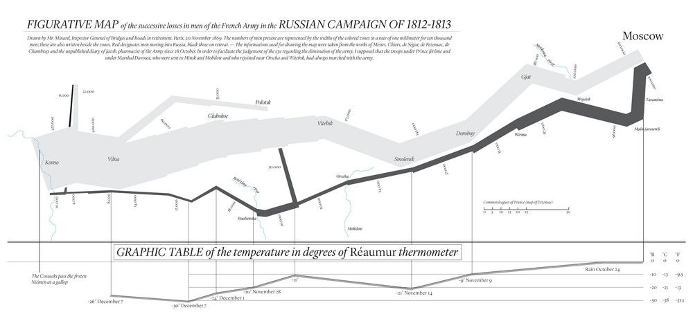
Author/Copyright holder: Iñigo Lopez. Copyright terms and licence: CC BY-SA 4.0
Information Visualization in the 20th Century
In the early 20th century the field of information visualization progressed little. Small efforts were made to refine existing models but overall – while visualizations were still being produced with regularity; the discipline seemed to fall from prominence and discoveries were few and far between.
However, the development of information technology in the latter half of the 20th century created a boom in information visualization which is still continuing to this very day.
The pace of change has been so dramatic in the 20th century that a detailed history would be next to impossible to create. No sooner had a new idea been created but it had been disseminated (thanks to the Internet and other networks) and improved upon, revised and republished.
However, Michael Friendly of the Psychology Department and Statistical Consulting Service of York University in Toronto, in his paper “A Brief History of Data Visualization” offers some of the most significant changes as follows:
1950-1975 - Data Visualization Changes
John Tukey, in 1962, published a paper “The Future of Data Analysis”. In that paper he explored the discipline of information visualization (without referring to information visualization as this term would only become common parlance after being coined at Xerox PARC in the 1980s) and in particular began to create new models that could be used for analysis such as boxplots, hanging rootograms, etc.
Tukey’s work revitalized the discipline and began to draw professionals back into the field of data analysis.
In 1967, Jaques Bertin, of France attempted to unify graphics and their presentation in his work Semiologie Graphique. It provided huge insight into the way that information could be produced visually to give greater insight in statistical analysis.
Then in the late 1950s and 1960s the adoption of the programming language, FORTRAN, which was the first “high level” language began to enable the creation of computer processed statistical data – greatly increasing the volumes of information to be processed. FORTRAN would move with the times and remain a language long after the original punch card entry systems (see below) were obsolete. In the late 1960s the process of creating information visualizations by computer was underway and the first statistical applications began to emerge in the early 1970s.
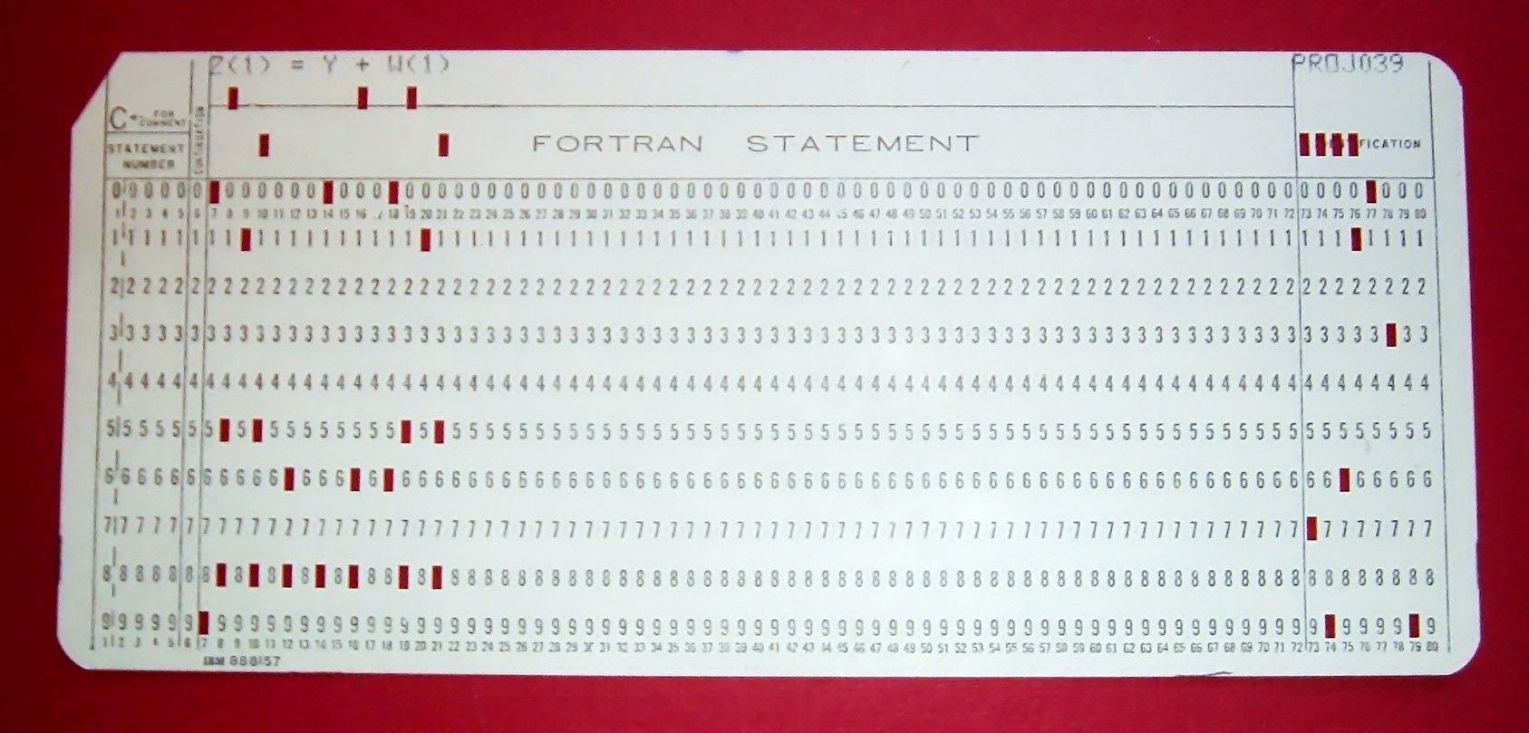
Author/Copyright holder: Arnold Reinhold. Copyright terms and licence: CC BY-SA 2.5
Many forms of statistical representation would emerge in the early 1970s too including: the Fourier function plot, Chernoff faces, start plots, clustering and representations and biplots using multi-dimensional scaling.
1975 – To The Present Day – The Emergence of Interactive and Dynamic Data Visualization
This is where it becomes more difficult to give a precise timeline to the delivery of advances in information visualization. Michael Friendly offers these key points:
Highly interactive statistical computing systems have been developed and are in common use. This is compared to early command-driven systems which used compiled, batch processing.
There are new methods for visual data analysis that have been implemented such as linking, brushing, selection, focusing, etc. that can be applied to interactive data models.
Data with large volumes of dimensions can be better analyzed thanks to the development of tools to do this such as the grand tour, the scatterplot matrix, parallel coordinate plots, etc.
There have been new techniques developed for graphing discrete, categorical data.
The field of information visualization has broadened to encompass many new forms of data, data structure and indeed problem solving.
The information visualization field has begun to implement understanding of the cognitive and perceptual aspects of displaying data in addition to delivering simple static visualizations which were aesthetically pleasing.
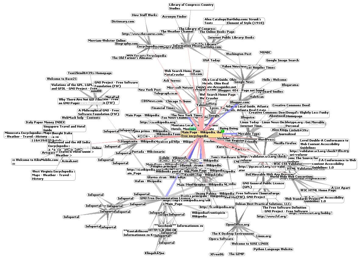
Author/Copyright holder: Chris 73. Copyright terms and licence: CC BY-SA 3.0
While, theoretically, images such as the one above could have been created manually – in practice they require computing power to be manageable to develop cost-effectively. A tiny mistake would render such a diagram useless if drawn by hand; on a computer a click of a button can amend the visualization.
In addition to this throughout the century – more and more powerful applications have been developed to enable information visualization. This includes the development of dynamic graphic methods which allow for fast and easy, direct manipulation of graphics and their properties by the users of the data.
The Take Away
The 20th century has been a period of remarkable advancement in information visualization thanks to the advent of computing and the dawn of “big data”. It is difficult, if not impossible, to provide a perfect chronology of events for this period thanks to the levels of rapid advancement in the field and collaborative iteration of new methods between ever more connected, thanks to the Internet, research and development teams.
References
A longer history of data visualization can be found here by Michael Friendly of York University, Toronto.
Edward Tufte’s work, which can be purchased from his website, offers the most detailed history of information visualization here.
Young, F. W., Valero-Mora, P., and Friendly, M. (2006). Visual Statistics: Seeing Data with Dynamic Interactive Graphics. New York: Wiley
Hero Image: Author/Copyright holder: Mario Klingemann. Copyright terms and licence: CC BY-NC 2.0