
When you’re designing a new website, application, or other product, you always start with the global idea and structure before addressing more detailed issues. Designing the navigation on a website is no different. Getting the global navigation right is the first step in designing a great user experience. Get to know all about the Global Navigation design pattern: when to use it, how to implement it, and what problems to watch out for. Think of it as the website’s steering wheel, central nervous system, GPS, and map all rolled into one – it’s that important to get it done right.
The Design Problem
You want to present the user with a number of groups of content that fall into distinct categories, but displaying everything on one page or window would place great strain on the user. Using one page or window would also give the wrong impression that information lower down the page/window is less important than content nearer the top. Therefore, users require the content to be divided into separate regions of the user interface, and they need to be provided with some means of navigating between different groups of content and returning back to their starting position. Like most websites, the ones we construct as designers seldom will not require us to spread copious amounts of information across numerous pages in an ordered way – we need to give our users some sort of grand plan, something between a map and a central ‘station’ from which they can access any page they want to visit.
The Design Solution
Global navigation is a region of the graphical user interface reserved for buttons, links, search bars, or any other design element affording movement from one set of content to another. This region appears identically across all different pages so as to provide a consistent means of traveling to anywhere in the application or website. This area may include titled sections, dropdown menus, buttons, module and/or navigation tabs, search bars, and homepage links. It’s the ‘steering wheel’ of any site and all the pages therein; it’s also the grand plan, showing what’s all around—with a built-in ‘compass’ to keep users informed as to where they are at any time. A site’s global navigation acts as its central nervous system—at least, to the user’s eye—and the main line from which users can see, at a glance, other places to visit.
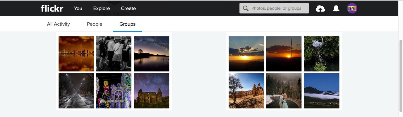
Author/Copyright holder: Flickr. Copyright terms and license: Fair Use.
In this example from Flickr, the global navigation consists of two horizontal bars (black and white) which remain visible at the top of the page, even when the user scrolls down to view all of the contents on the page. In this global navigation area, you can find dropdown menus, tabs, and a search bar.
The global (or top-level) navigation bar will include broad category titles that navigate the user directly to the associated content when clicked. The user is able to drill down into more specific content within the contents of these categories, but they provide an ever-present means of switching between the broadest categories. Top-level navigation bars are essentially the highest point in the architecture of the user interface, enabling the user to dive into a broad group of contents placed together on the basis of some shared relationship. These categories are assigned short labels that encapsulate the meaning of the group of contents (e.g., 'Sports' for football, rugby, baseball, and hockey content). The category labels serve as links to the contents, and they are arranged along the top of the window, page, or panel in a row. Whichever section of the user interface users are on, the top-level navigation bar is located in the same position, ensuring they are able to move quickly from one region to another without having to make any backward steps.
Most websites also hyperlink their logos or company, business, or group names in the global navigation area, so users can immediately switch back to the homepage. The homepage link is usually located in the top left-hand corner of every page, providing the ever-present facility to go from a narrow area of interest to the broadest group of options.
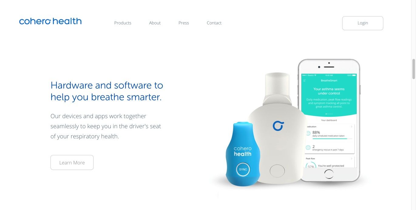
Author/Copyright holder: Cohero Health. Copyright terms and license: Fair Use.
The Cohero Health webpage uses a global navigation bar with the company logo to allow users to return to the homepage whenever they want.
Why Choose a Top-Level Navigation Design Pattern?
Firstly, nearly all users, regardless of their level of experience, will have come across a top-level navigation bar. Therefore, the vast majority of users will know how to interact with this user interface design pattern—in order to navigate freely through the contents of the design—without the need for instruction or eye-catching visuals to draw their attention to this facility.
Secondly, when you are dealing with a group of categories that are unlikely to change and are easily represented with a short title or label, top-level navigation bars can accommodate as many as twelve categories (the recommended maximum number) without occupying too much of the user interface.
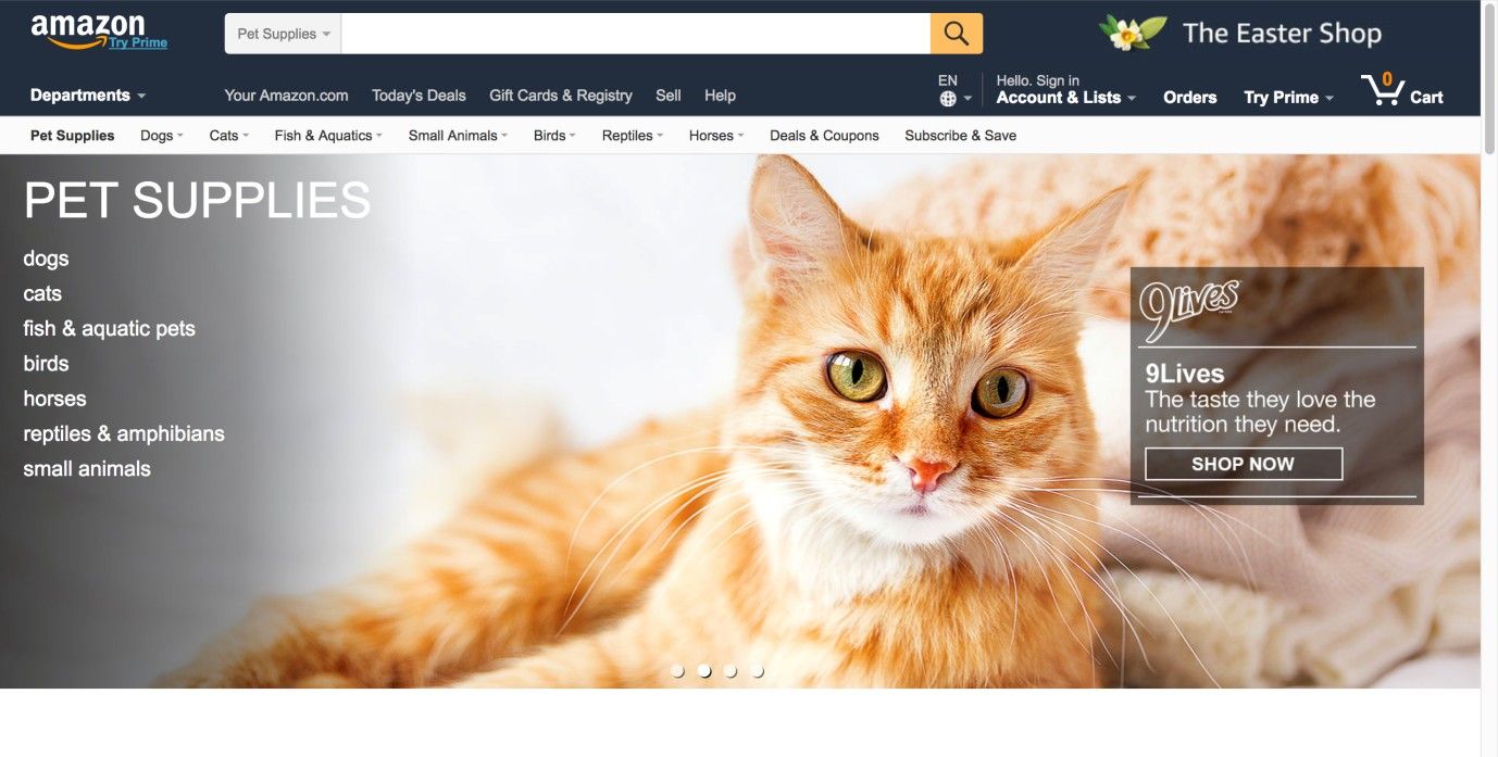
Author/Copyright holder: Amazon. Copyright terms and license: Fair Use.
The global navigation bar can accommodate quite a lot of elements, as can be seen from the Amazon website. However, a maximum of twelve categories is recommended, to avoid overcrowding and a decrease in usability.
Thirdly, as previously stated, a global navigation bar provides the highest-level means of navigation in one position across all different sections of the user interface – so, no matter where users are, they can hop to and from groups of content. Arranging content or category labels along the top helps give the users an overview of the user interface and informs them of where they can go and how they can get there, affording free movement and promoting exploration.
Homepage links, which can be an important part of the global navigation bar, serve as a stable means of leaving one page and navigating back to the first point in the site hierarchy. Providing users with this facility means—no matter where they are in the different levels, sections, and pages of the site—they can jump right back to the beginning, switching from a specific focus to a general overview of the site contents with a single click. When you as a designer implement it correctly, users can rely on this consistent design element; so, no matter where they are, they can always return to the homepage. This can be particularly useful for site visitors who entered on a page deeper into the site hierarchy; such is the case when using a search engine or clicking on a link in another website.
Best Practice: How to Implement Global Navigation
First, establish your groups of content; if the number of categories exceeds twelve, you might be better off combining global navigation with another user interface design pattern, such as a mega dropdown menu.
Assign each of the groups of content a fitting title (e.g., from the top-level navigation bar above: ‘Your Amazon.com’, ‘Today’s Deals’, ‘Gift Cards & Registry’, ‘Sell’, and ‘Help’).
Arrange these category titles in a logical order. For each group of categories, there likely will be an appropriate order, but the first option is usually the homepage, as this represents the first tier in the whole user interface. When used in combination with tabs, top-level navigation bars serve as the second tier of the user interface. In these instances, the first tab should be used to take the user back to the homepage.
Implement the same top-level navigation bar in all regions of the user interface. Then, link each title to the appropriate contents, so when the users click it, they are navigated directly to the associated information.
Inform the users of their current position by changing the appearance of the individual category label. In the WordPress example below, the color of the selected category label changes from light white to blue, while all other options remain the same color.
When you’re using a hyperlinked logo or name in your global navigation, it does not expressly state that it also operates as a homepage link. Therefore, you should include a number of other small touches to help the user identify this functionality. Firstly, you can use a simple tooltip to display the word ‘homepage’. This is not commonly implemented, but it would help novice users determine that this facility is afforded. Secondly, changing the appearance of the cursor when users hover over the hyperlinked logo or name shows them they can click on it.
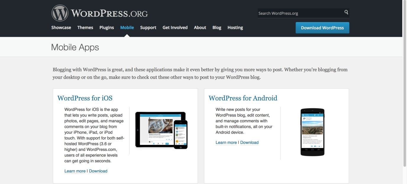
Author/Copyright holder: WordPress. Copyright terms and license: Fair Use.
The global navigation bar of the WordPress website shows whereabouts in the site the user is, thanks to the changed color of the selected category label. For extra emphasis, WordPress has used an arrow pointing at the selected label.
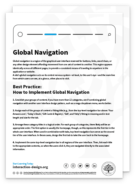
To help you get started implementing global navigation, you can download and print our “Global Navigation” template:
Potential Problems with Global Navigation
While global navigation bars are common—and most users are aware of how to interact to move from category to category—unless they are visible and apparent in each section, the user could overlook this design pattern. For example, when users arrive on websites, they seek strong visual clues to direct their attention to the most personally relevant information. This strategy, referred to as 'satisficing', means the user could overlook the top-level navigation bar if it is poorly designed or buried among a mass of other user interface design patterns and content.
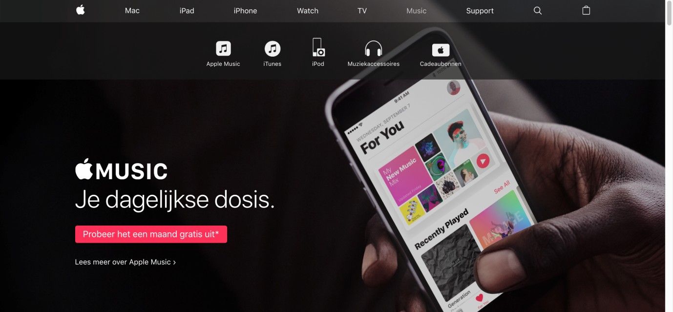
Potential overlap between categories represents another threat to the usability of top-level navigation bars. When two or more categories appear to represent the same content, the user is left to use trial and error in order to determine the exact location of a particular source of information. For example, in the Dutch iTunes webpage shown below, the location of the iPod category is not on the same level as the iPad or iPhone as you might expect. It is currently listed in the category of Music. This labeling issue can create ambiguity and slow the users down when they want to hop to a specific item.
A similar problem involves ambiguous category labels. If the words used to represent a group of contents lack clarity, the users are left to guess whether their desired products or information is located in a certain category. For this reason, the labels must be closely tied to their linked contents so as to save the user from having to investigate a page or window, before ascertaining whether the desired content is located in a particular region.
Homepage links are generally one of the least problematic design elements in global navigation. Most users are aware of their position, functionality, and how to interact with them. Problems only arise when these links have not been implemented properly. That is why taking the key considerations listed above into account when including homepage links in your design is so important.
Author/Copyright holder: Apple. Copyright terms and license: Fair Use.
The iPod is no longer positioned as a device that can be purchased, like the Mac, iPad, or iPhone. It has moved into the category of Music. For users, this may cause confusion when they are looking to buy a new iPod touch.
Overall, stay mindful of the importance of including this design pattern. The article “Killing Off the Global Navigation: One Trend to Avoid” for the Nielsen Norman Group concedes that while designers may consider some leeway in how they design global navigation regarding, for example, a site’s usership who are frequent visitors or constantly logged in, they should never dismiss the absolute value of including this design pattern.
“The temptation to put navigation menus into a drop-down is understandable: it allows much more flexibility to adjust categories in the future, and also means you don't have to clutter up your design with a menu bar. Plus, it’s an easy solution if you want to use the same design across multiple devices. But even if the global navigation is difficult to design and hard to maintain, most sites will still be better off showing top-level categories to users right away. It's simply one of the most effective ways of helping users quickly understand what the site is about.”
— Jennifer Cardello (User Research director at athenahealth) & Kathryn Whitenton (NNG's Digital Strategy manager)
The Take Away
Top-level navigation bars serve as a website’s central nervous system, a grand plan offering instant redirection to any page contained therein. Marking where the user is within a site, they are essentially the highest point in the architecture of the user interface, enabling the users to dive into a broad group of contents regardless of their current position within the website or application. Top-level navigation bars are always accessible and often include a homepage link, dropdown menus, tabs, and search bars. Such bars are vital to maximizing the users’ convenience and minimizing any chances of their feeling lost. So as to implement global navigation bars well, however, you need to make them highly visible and ensure they feature unambiguous category labels. A well-laid-out global navigation bar will be instrumental in systematically guiding your website’s visitors through desired sections without presenting obstacles, and encouraging conversions.
References & Where to Learn More
Hero Image: Author/Copyright holder: Unsplash. Copyright terms and license: CC0.
Course: Web Design for Usability
Jenifer Tidwell, Designing Interfaces: Patterns for Effective Interaction Design, 2010
Martijn van Welie, Pattern Library, 2008


