Linear data sets come in three varieties – univariate, bivariate and trivariate. A univariate data set has a single dependent variable which varies compared to the independent attributes of that data. A bivariate set has two dependent variables and a trivariate set has three.
Representing data sets of these types is a very common task for the information visualization designer. Choosing the right form of visualization will depend on the requirements of the user of the visualization as much as the data set itself.
Univariate Data Sets
Univariate data sets are very simple to represent visually. There are many different forms for showing univariate data and one of the most common is tabulating the data itself. For example you might want to show the relationship between types of car and their top speed.
Model | Top Speed |
Aston Martin One-77 | 220 |
Bugatti EB110 Super Sport | 216 |
Bugatti Veyron Super Sport | 267.8 |
Ferrari Enzo | 226 |
Hennessey Venom GT | 270.49 |
Keonigsegg CCXR | 250 |
McLaren F1 | 240.14 |
Pagandi Zonda F Clubsport | 215 |
Saleen S7 Twin-Turbo | 248 |
SSC Ultimate Aero | 256 |
Note: According to Automoblog.net these were the 10 fastest cars in the world in 2007.
Stephen Few, the information visualization consultant said; “Numbers have an important story to tell. They rely on you to give them a clear and convincing voice.” There is nothing intrinsically wrong with presenting this data in a tabulated format. It may be exactly what the user needs. Certainly, you can fairly quickly determine which car is the fastest (the Hennessey Venom GT) from the table – even if it’s not immediately obvious which is the fastest at first glance.
However, it might be better to represent the data graphically which would enable an easier comparison between all the cars.
There are many different graphical representations that can be used to show univariate data. They include pie charts, histograms, scatter plots, bar graphs, etc. The precise nature of the representation chosen will depend on the data set.
For example here’s the speed data shown as a pie chart:
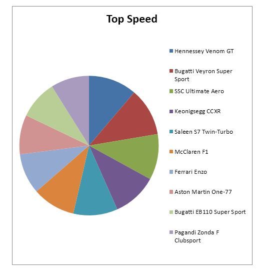
Not very useful is it? There’s too much data of a similar nature and the color key is equally confusing. You can’t tell very much about the cars and their relative speeds from a pie chart.
Whereas here’s the same data set represent as a bar graph:
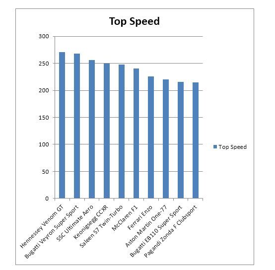
It is instantly clear from the bar graph which vehicle is the fastest and which is the slowest and how each compares to every other vehicle.
Bivariate Data Sets
Bivariate data sets have two sets of dependent variables that we wish to compare against the independent variable(s).
So let’s take our original data set and expand it to include the horsepower of each vehicle.
Model | Top Speed | Bhp |
Aston Martin One-77 | 220 | 750 |
Bugatti EB110 Super Sport | 216 | 612 |
Bugatti Veyron Super Sport | 267.8 | 1200 |
Ferrari Enzo | 226 | 651 |
Hennessey Venom GT | 270.49 | 1244 |
Keonigsegg CCXR | 250 | 1018 |
McLaren F1 | 240.14 | 627 |
Pagandi Zonda F Clubsport | 215 | 640 |
Saleen S7 Twin-Turbo | 248 | 750 |
SSC Ultimate Aero | 256 | 1183 |
Now we might want to examine the relationship between the speed of each vehicle and the horsepower that powers the vehicle. Does an increase in horsepower automatically mean an increase in the speed of the vehicle? Are they proportionate to each other?
Again, there are many different ways to represent the data. We’ve chosen a an area driven graph with the two data sets imposed on top of each other.
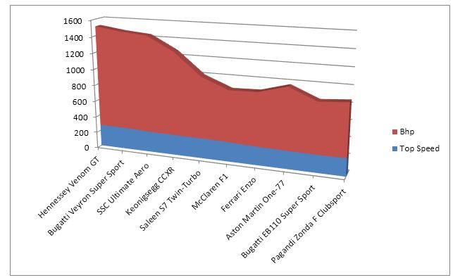
From this graph it’s very easy to conclude that while the speeds of the vehicles don’t vary dramatically – the horse power of each vehicle does. Yes, there’s definitely a case to be made that large amounts of horsepower do correlate with speed but it’s only a weak correlation. The McLaren F1 is faster than the Aston Martin One-77 but carries markedly less horsepower, for example.
It’s worth noting that caution must be taken when choosing bivariate representations. In this graph, we have focused our attention on the horsepower of the vehicles and the similarity between the top speeds of the vehicles. However, there is greater variation in the speeds than you can tell by glancing at the graph – it serves our purpose for analysis but is not necessarily the perfect representation for other purposes.
It could also be argued that the third-dimension, in our representation, adds little value to the viewer and could be eliminated in favor of a flatter representation.
Trivariate Data Sets
A trivariate data set includes a third dependent variable that can be represented against the independent variable(s).
For example we might want to include a stopping distance within our car data set (please note that these distances were created for this example and are not likely to be the actual stopping distances of these vehicles) :
Model | Top Speed | Bhp | Stopping Distance |
Hennessey Venom GT | 270.49 | 1244 | 800 |
Bugatti Veyron Super Sport | 267.8 | 1200 | 930 |
SSC Ultimate Aero | 256 | 1183 | 1200 |
Keonigsegg CCXR | 250 | 1018 | 750 |
Saleen S7 Twin-Turbo | 248 | 750 | 456 |
McLaren F1 | 240.14 | 627 | 765 |
Ferrari Enzo | 226 | 651 | 860 |
Aston Martin One-77 | 220 | 750 | 715 |
Bugatti EB110 Super Sport | 216 | 612 | 564 |
Pagandi Zonda F Clubsport | 215 | 640 | 765 |
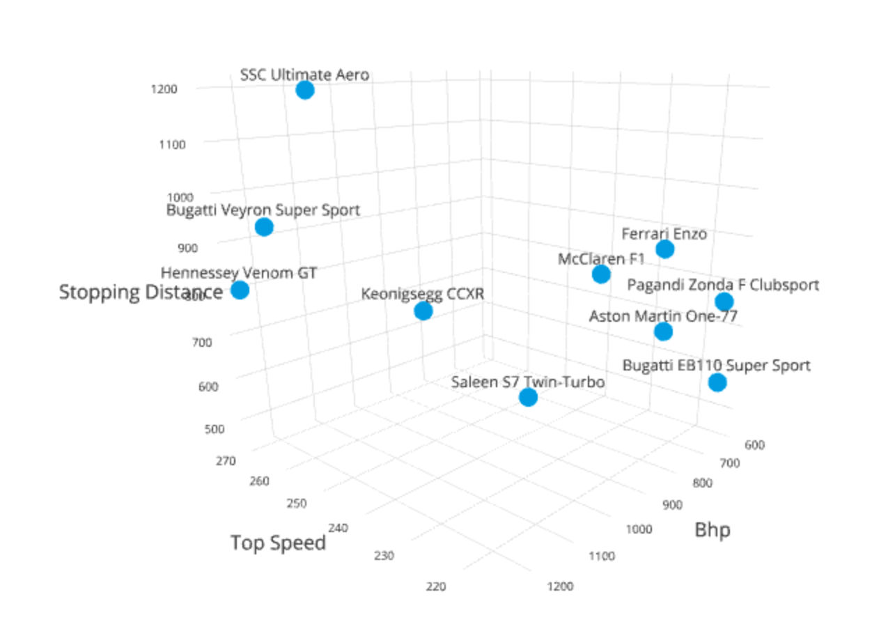
Once again trivariate data can be represented in any number of ways. However, a common methodology is the 3D scatter plot as shown above.
Again, caution must be taken when choosing the representation for trivariate data sets. Two common problems with models here are occlusion (where one item in a data set is obscured by another – so you cannot see its actual place in the model) and the fact that it can be hard to determine where, exactly, along any given axis the data point lays.
It’s for this reason that trivariate models are often interactive and can be manipulated by the user to be viewed from different angles in order to gain a better understanding of the data.
A Practical Tip
There is no usual reason to create your models by hand; most spreadsheet packages (such as Excel) can create univariate and bivariate models with ease from tabulated data. There are also specialist software modeling packages for more complex models including trivariate data sets.
You may decide to create the model in one package and then, for reasons of aesthetics, recreate the model in a graphic design package as the design elements in Excel, for example, are somewhat limited.
The Take Away
The key to creating visual representations of linear data is to ensure the usability of the final representation. Fortunately, you do not have to create these models “from scratch” but can use computer tools to do the job for you. This allows you to quickly switch between models until you find one that is fit for purpose.
References & Where to Learn More:
Stephen Few – Show Me Numbers Designing Tables and Graphs to Enlighten – Analytics Press, ISB 978-0970601971
Hero Image: Author/Copyright holder: Eric Fischer. Copyright terms and licence: CC BY 2.0