Users are only human, and, consequently, they make mistakes. For their errors not to lead to poor experiences, it’s your job as a designer to help them. Discover the two roads that lead to error-resistant user interfaces: correcting mistakes and providing multiple approaches to a problem. Together, these options form a highly useful design pattern that has helped companies such as Microsoft and Airbnb to keep happy and returning customers. But be warned, as you will only be able to implement this design pattern successfully when you engage in extensive user testing and iterations.
The Design Problem
Users are unpredictable, which is reflected in how they enter data into input fields, such as search bars. For instance, they often leave blank spaces, abbreviate words, add capital letters, and sometimes spell words incorrectly. However, you do not want to punish them for their irregularities and force them to correct things before providing them with the expected or desired responses. They’re users who are visiting your site by choice, not your students or employees. So, as a designer, you need to acknowledge that we’re all only human, and accommodate the imperfection that goes with the human condition. Somehow, your design has to know where to stick a safety net beneath your users when (and it’ll be when, not if) they fall.
The Design Solution
User interfaces should be simple and allow the users to enter data quickly and, where possible, without the need to go back and correct their mistakes. As best you can, you should stretch to predict the various combinations of possible entered words and numbers and target typos. In other words, you need to build some flexibility into your system, some ‘smart’ feature that affords this unpredictability and accepts variations. You need to show the users you’re listening to them while they’re making their way through the pages you’ve created for them.
Therefore, there must be a 'Forgiving Format' in your user interface design that allows users to make mistakes, while correcting them on their behalf, or performing the desired function without the need for corrective measures. You need a fluid design—happily, you can get the information you need from your users without having to resort to a rigid key-and-keyhole approach that will tend to frustrate them when they stumble.

Author/Copyright holder: Airbnb. Copyright terms and license: Fair Use.
The forgiving format on the Airbnb website allows users to enter the name of a country, city, or specific address. Allowing the users to take a variety of approaches to a problem will help them carry out their tasks in a pleasant way.
Why Choose a Forgiving Format Design Pattern?
There are many small tasks in the majority of user experiences; if users were forced to correct all of the mistakes or slip-ups they made along the way, they would soon abandon the user interface for a much less demoralizing experience. Many users will encounter our designs in rushed circumstances, or environments where they don’t have the luxury of sitting down and focusing entirely. Even when they do have a quiet moment in a comfortable seat—mistakes can happen all too easily; users’ ‘job descriptions’, as far as we’re concerned, don’t involve proofreading. In fact, they don’t have any ‘job description’ as far as the interfaces we design are concerned—that would involve work on their part, remember. Any work they must do has to be entirely focused on the other side of the screen with the intent they have to complete a task (e.g., paying a bill or booking a flight with the organizations we’re working for), not on the design itself. So, the user interface design must allow users to carry out their tasks in a free and easy fashion, cleaning up after them as they go along to ensure they do not have to make continual backward steps.
As designers, we have to keep in mind that—unless our client organization is an official government bureau, such as a tax department—the users reserve the right to leave at any time and not bother with us.
“We don’t make mistakes, just happy little accidents.”
—Bob Ross, American painter, painting instructor, and TV show host
As you can see from the example above, a forgiving format is not just shown in the system's ability to contend with the mistakes users make. The user interface should allow the users to take a variety of different approaches to a problem—so that in the event they do not know or have the ability to take one particular approach, they can resort to another. For example, a user might not know the zip code for her current location, but she is well aware of the city she’s in. Using a forgiving format could mean that entering this information is sufficient for the user to carry on unhindered. That means we would build an override feature into our design so that the page would not jam on the blank left for the zip code. If the user’s exact position is important, we could include a feature behind the scenes to work back the zip code from the street address and city; if, for some reason, her exact whereabouts really don’t matter, though, then all the better in this case – we can simply write off the blank field and move on.
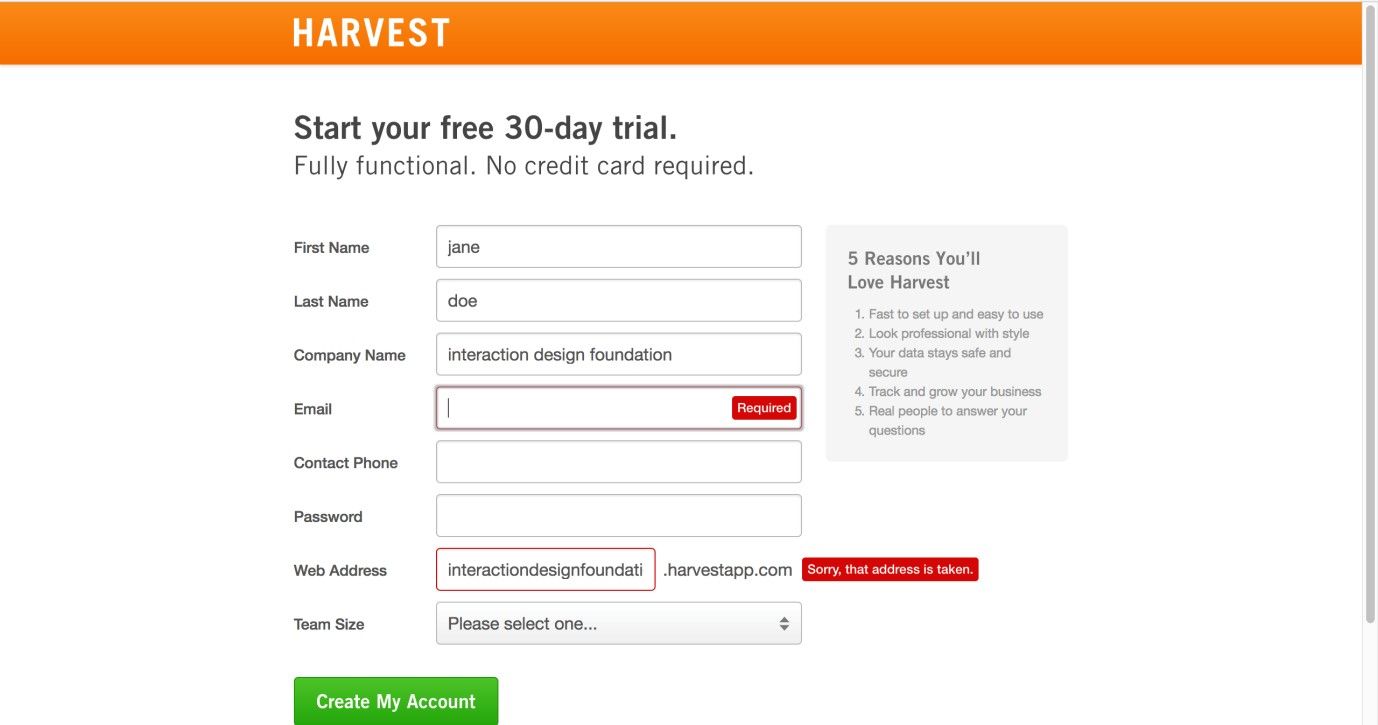
Author/Copyright holder: Harvest. Copyright terms and license: Fair Use.
The sign-up page from Harvest gives indications of incorrect entries before a user has filled out and submitted the entire form. Giving these early warnings will prevent users from being annoyed, as they won’t have to return to the form and review where they went wrong when they have already mentally proceeded to the next step.
Best Practice: How to Implement Forgiving Formats
As the types of mistakes people can make for different tasks is unbelievably diverse, we cannot provide you with a generally applicable step-by-step approach to implementing this design pattern. However, we can guide you in the right direction, as the forgiving format design pattern appears in two forms: correcting mistakes (or coping with irregularities) and providing users with multiple approaches to a problem.
In the first application, the system must be designed to cope with the errors users make, such as adding extra characters or duplicate words.
In the second application, different options must be provided so the user is able to approach a problem from a number of different angles. Again, this requires a simplified and flexible user interface capable of moving to the user's tune, rather than imposing a single, rigid means of solving problems.
All instances of a forgiving format are different in some way, but at the heart is an understanding of what the user is trying to do or say. This understanding is derived from common sense or user testing (ideally a combination of the two) so as to determine the types of mistakes users might make in a specific situation, or the different approaches users might use to tackle the same problem. In the same way that software such as Grammarly or Word can deduce the correct versions of misspelt words and correct these, your system should be able to pick up on the fact that ‘Srteet’ is ‘Street’, ‘Aev.’ is ‘Ave.’, and ‘Untied States’ is ‘United States’. Another vital consideration is getting users who are registering to enter their password choice twice, so as to confirm they haven’t made a mistake on that—and we all know how idiosyncratic, impossible-to-analyze and weird, wild and wonderful passwords can be. Somewhat amusingly, a problem can still arise if the user makes the identical mistake twice (e.g., for the password and re-typing of the password, he speed types the names of his three pet cats in lowercase and stuck together as one long word but then, a couple of days later, tries to enter them with capital letters appearing to mark the start of each cat’s name).
In the second application, providing the fluidity for your input field to take multiple forms of information and work them back to the same meaning is vital. Providing an auto-recognition feature to scan, swallow, and proceed after keying off a variety of entered words (e.g., “Chicago Ill.” or “Chicago, IL” or “Chgo, Ilns.”; “can’t find download” or “fail locate program” or “where is file?”) can immensely improve the user experience, and—magically—without users even realizing it.
Potential Problems with Forgiving Formats
As the system designer takes the responsibility for determining the different approaches users might want for a problem or how to correct their mistakes and cope with irregularities, getting these assumptions right is all-important. If the options are not the ones the user wants, or the user interface does not behave as expected, the forgiving format might become something of a hindrance. The only way to ensure the forgiving format is perfectly in tune with the user is to carry out rigorous user testing until the users are able to carry out their tasks quickly and without the need for manual correction or seeking alternative, time-consuming methods. As Jennifer Tidwell, author of Designing Interfaces: Patterns For Effective Interaction Design, states, "Test, test, and test again with real users."
In some cases, some ambiguity may arise when users have to enter data. For example, if you are working on a design for a travel agency’s site, consider the following scenario. Mr. Jones wants to go to Athens, Greece, but Mrs. Smith wants to go to Athens, Georgia (U.S.A., not the one in the Caucasus). Both travelers always use abbreviations, so we have “Athens, Ga.” and “Athens, Gr.” inputted on their screens; as luck would have it, the travel agency arranges flights to both cities. However, what if both our travelers were in a rush to book their flights? What if they were burnt out from either busy preparations for a business presentation or clearing the work decks so as to get ready for a vacation and something went wrong? What if they were so caught up in what they were doing that they didn’t notice the point that the price didn’t match the destination? Remember, this is real life; mistakes can and will happen. In an instance such as this, where the user stands to make a big error, including a “Did you mean Athens, Greece, or Athens, Georgia?” warning flag would be a great help. On this note, consider how close ‘A’ and ‘R’ are on a standard keyboard (or touchpad). Can you think of other cases where frequent misspellings or ambiguities may cause mistakes because one key is too close to another on, say, a touchphone?
A tangent issue is the point that English is extremely vocabulary-rich, and not all mistakes will be typos. Some will be inadvertent word-choice errors (e.g., ‘underserved’ and ‘undeserved’; ‘desert’ and ‘dessert’); others will be homophone errors (e.g., ‘there’ and ‘their’; ‘meat’ and ‘meet’). Luckily, although catching these is extremely hard, such mistakes should rarely derail a user’s experience. However, bearing this point in mind as you create your design and test it out with users may prove helpful.

Author/Copyright holder: Thomas Link. Copyright terms and license: CC BY-SA 2.0.
In order to know whether users are capable of using an interactive system without problems or frustrations, or to check whether the forgiving formats you implemented work, you need to test your design with users. Have them execute several relevant tasks and use observation and interviewing techniques to understand what happens. Testing frequently enables an iterative design process.
The Take Away
The forgiving format design pattern takes into consideration that all users are human. This design pattern appears in two forms: correcting mistakes and providing users with multiple approaches to a problem. Giving users the ability to catch mistakes there and then, as they proceed from field to field, also saves them from that ultimate frustration of believing they’ve completed a form, submitting it, and then seeing a red exclamation mark at the top saying something is wrong. Implementing a forgiving format in the right way ensures that users will not get frustrated with your product. So as to achieve this, you’re well advised to test your assumptions with users as soon and as often as possible. The investment you make from doing that, and from empowering your input fields with autocorrective, autosuggestive, and other smart features, will help ensure enduring success for your design far into the future.
References & Where to Learn More
Hero Image: Author/Copyright holder: Hans. Copyright terms and license: CC0.
Jenifer Tidwell, Designing Interfaces: Patterns for Effective Interaction Design, 2010
Martijn van Welie, Pattern Library, 2008