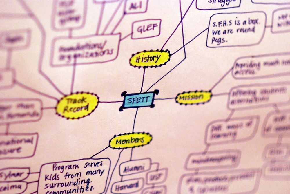
A network is a collection of data where the entities within that data are related through the principles of connection and/or containment. Many simple networks can be easily represented visually – mind maps and concept maps, for example, are excellent tools for doing this.
The US presidential candidate Carly Fiorina said; “The goal is to turn data into information, and information into insight” and network visualizations do just that.
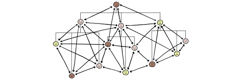
However, as the complexity of networks increases (such as in the diagram below – showing a spatial analysis of a social network) these techniques become increasingly harder to use. As you can see from the diagram below the huge levels of complexity make it difficult, at first glance, to glean useful information from the diagram.
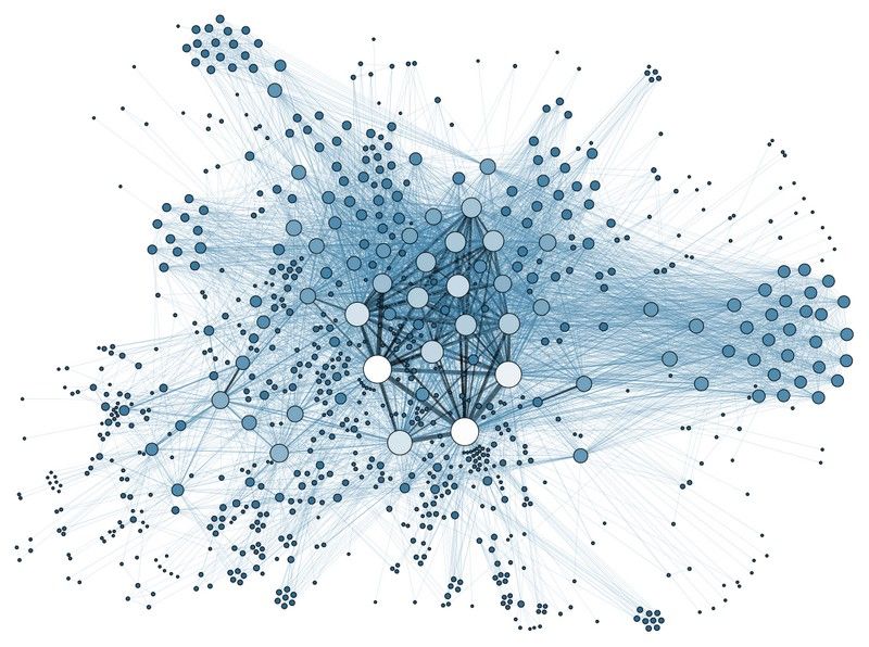
Author/Copyright holder: Martin Grandjean. Copyright terms and licence: CC BY-SA 3.0
Each node here represents an individual within the network. The edges are used to define relationships to friends, colleagues, peers, parents, etc.
This kind of representation is useful to help us understand the relationships an individual has and how they are forged. However, the complexity of the data makes it hard to separate visual elements and difficult to understand what exactly is going on.
In his book “Introduction to Information Visualization” Riccardo Mazza offers 3 strategies for tackling complex networks when translating them into diagrammatic form.
Three Strategies for Tackling Complex Networks in Information Visualization
The field of handling complexity in graphical representations is relatively new and advances are being made regularly. It is always a good idea to conduct some research prior to tackling a complex information visualization to see if a similar problem has already been handled and to examine how a successful result was achieved.
However, these 3 strategies are good general rules for tackling complexity in network diagrams:
Change the layout for the graphical design to improve the readability of the design
Create an approximation of the overall structure but reduce the complexity so that it may be easier to comprehend (this can be achieved by either reducing the volumes of edges displayed on a graph or by removing relationships entirely if they are not of specific interest)
Implement interactivity so that the user can manipulate the representation to match their needs
Changing the Layout
Much of the complexity found in a complex network comes from the large numbers of nodes which are then joined by edges. These edges are going to overlap and cross over each other – creating a confusing picture of what is going on in the diagram.
The ideal layout is one where the number of crossing points is kept to an absolute minimum. There are two commonly used techniques for this “force-direction” and “spring-embedder” these involve the use of complex algorithms to resolve the minimum number of crossing points.
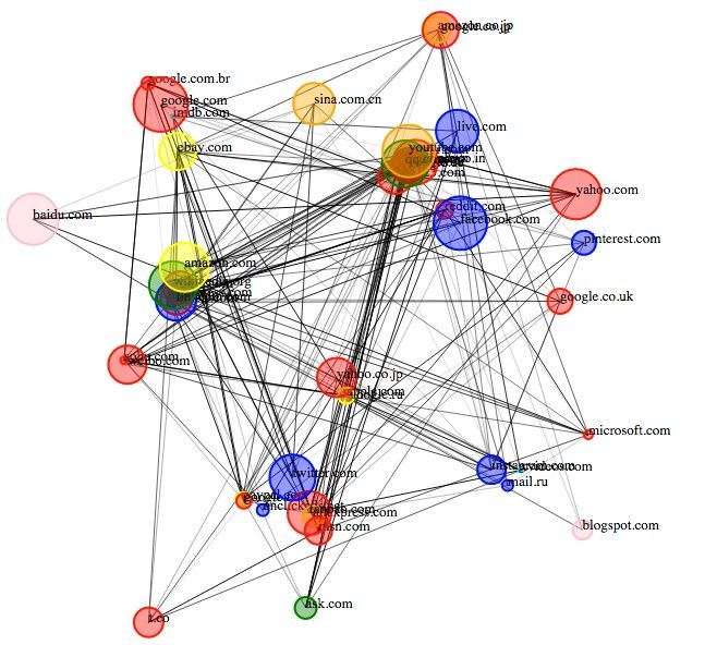
Author/Copyright holder: Deepthiyathiender. Copyright terms and licence: CC BY-SA 4.0
Above is an example of a force-directed graph which has been created to show relationship between different websites. As you can see, the technique still hasn’t eliminated all the complexity from the network diagram and there are serious problems with entities occluding the view of other entities.
Reducing Graph Complexity
Reducing graph complexity involves scaling down the level of information portrayed within a graph but maintaining the overall structure of data and still enabling analysis of whatever it is that we wished to investigate.
The most common technique for this is to use “link reduction” which means that you only represent edges above a certain weight or which meet certain criteria. This, in theory, means that only edges that are relevant to a reader are displayed.
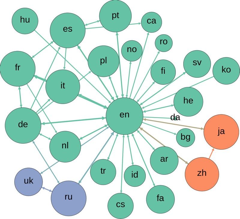
Author/Copyright holder: Computermacgyver. Copyright terms and licence: CC BY-SA 3.0
Above we see how a link reduction graph might appear for relationships between languages.
There are also more advanced methods for reducing complexity in graphs such as Pathfinder Network Scaling (PNS) and Minimum Spanning Trees (MST). These techniques are extremely advanced and while software can aid their implementation it requires a background in statistics and mathematics to get the most from them.
Implementing Interactivity
This final step requires user research to determine what levels of interactivity are required within the information visualization. The focus of this research should be determining what it is that will make the information visualization useful to the individual.
It may be that they need to be able to manipulate the view, so that they can better understand a 3-dimensional representation by viewing it from different angles; or it might be that they need to be able to manipulate the data set to cluster nodes or eliminate or give weight to edges.
Interactivity requirements will vary from project-to-project and from user-to-user.
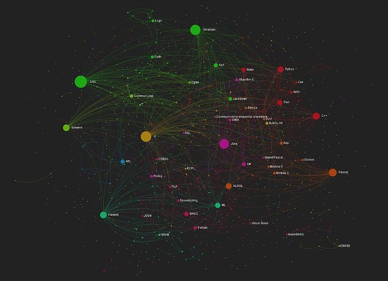
Author/Copyright holder: yaph. Copyright terms and licence: CC BY-SA 2.0
This image shows an interactive graph mapping relationships of influence within computer languages.
The Take Away
The field of complex network information visualization is evolving. There are three simple principles which the information visualization designer can apply to their complex network visualizations to try and simplify them to the point where they give the viewer the clearest picture possible. Interaction should only be implemented after conducting user research. The use of the most complex methods of information visualization for network data will require further study and a knowledge of mathematics and statistics.
References & Where to Learn More:
Spring Embedders and Force Directed Graph Drawing Algorithms
Pathfinder Associate Networks: Studies in Knowledge Organization
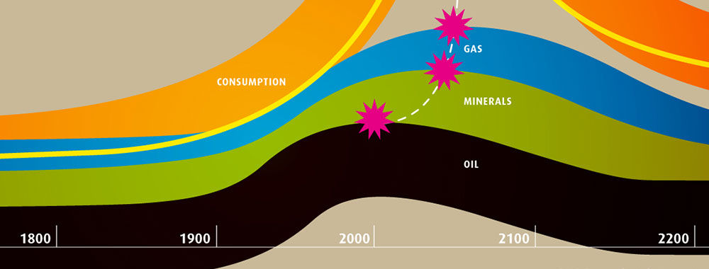
Hero Image: Author/Copyright holder: Zohar Manor-Abel. Copyright terms and licence: CC BY-NC 2.0