Have you ever felt overwhelmed with information while you were searching for something specific? Have you ever been lost in the haystack, looking for that one tiny needle? If your users are anything like you, they will sometimes feel overwhelmed or lost, too, unless you minimize their efforts by providing them with a search box. These may be small, and sometimes only appear after a “Command-F” or “Control-F” keyboard shortcut, but they are truly powerful design elements you should be confident to use. Here, we will give you the insights you need to implement search boxes with spunk, and show you how to keep your users happier on your pages, as they will know you value their precious time.
The Design Problem
The user needs to find the answer to a query, locate a particular word or item within a large body of text, locate a file within a system, or jump to a particular option within a list. Manually scanning through the available options or sections of a website, system application, or a large database to find an answer, word, item, file, option, or any other element would take a long time, and the users might not even be able to find what they are looking for.
While we’re considering this, let’s look at what our users may be experiencing. If they’re desperately trying to find information about paying a bill on time—or some other scenario where they stand to lose something due to a delay on their part—their angst is likely to skyrocket, maybe into anger; they might even feel you as the designer are deliberately trying to stall them. Even if your page is about something more leisurely, such as a travel-writing resource, they may still feel you’re keeping them back if you don’t give them a fast-track way to get where they want to go on your site. Any way we slice it, we have the same equation: manual search = work = frustration. Therefore, your users need something that will cut out the manual search process for them; from that, they will feel better if they see you’ve taken the trouble to help them out this way.

Author/Copyright holder: International Journal of design. Copyright terms and license: Fair Use.
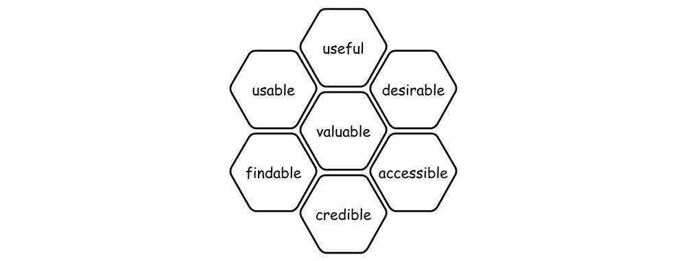
Searching for a particular piece of information in large texts is easier when a search box can be evoked with a keyboard shortcut, such as Command-F or Control-F. In this example, it helps users quickly skip to practical recommendations for developing design tools for positive emotional granularity in product design.
The Design Solution
A search box or search field is a common graphical user interface design element, one which allows the user to enter letters, words, and terms in a web search engine, database, website, archive, or list of options. As a result, users expect it to return content or options directly related to their input. The search box typically appears somewhere along the top of a search engine, website, application, or database, to ensure it is visible within the overall design. Including the search field in a prominent position is vital. The reason is users will often treat this as their first port of call when visiting a website or any other program that contains a large number of sections with contents buried deep within the architecture.
Search box examples can be commonly found in:
Word processors – where the user can search for particular words, numbers, or symbols within a document.
Websites – such as news providers, which allow users to enter a term to return stories saved in the site archives.
Web browsers – these are application-level implementations that allow users to find text in any displayed webpage, regardless of whether the website also has a search box!
Help and documentation – Systems often allow the user to enter a query, producing stored answers to common problems.
While digesting these points, we should take a moment to aim past the screen and remember what’s driving our need to do this. Let’s hear what users really want from us in this department:
“Search lets users control their own destiny and assert independence from websites' attempt to direct how they use the Web. Testing situations routinely validate this. A typical comment is: "I don't want to have to navigate this site the way they want me to. I just want to find the thing I'm looking for." This is why many users go straight to the home page search function.
Search is also users' escape hatch when they are stuck in navigation. When they can't find a reasonable place to go next, they often turn to the site's search function. This is why you should make search available from every page on the site; you cannot predict where users will be when they decide they are lost.”
—Jakob Nielsen, Danish “king of usability” and principal of the Nielsen Norman Group
Why Choose a Search Box Design Pattern?
Aside from web search engines, which are used for the sole purpose of searching an index database, many designs contain large amounts of information, text, options, and general contents that would simply take users too long to scan through when they want to locate a specific item, file, option, etc. Therefore, search fields are an important time-saving design element that should always be provided when the user is dealing with a complex program or website with many different sections, pages, categories, options, or groups of content.
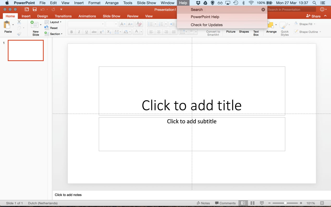
Author/Copyright holder: Microsoft. Copyright terms and license: Fair Use.
Search boxes are often applied in help-functions of an application, to allow users to find an answer to a specific problem they are encountering and do so quickly. Without the search option, users would be forced to go through a list of categories, guessing as to what category their problem would belong. Especially for novice users, this may be difficult to do, to say nothing of frustrating.
Best Practice: How to Implement Search Boxes
Many different designs call for some form of search box, and each one of these occasions will present different constraints, such as the appearance, location, size, and visibility afforded by the particular website, application, program, archive, or database. Therefore, these implementation guidelines are in no way exhaustive or applicable to every specific instance where search boxes are required. However, some qualities must remain the same across all of these different uses; so, we shall focus on the more general nature of search boxes and how to implement them to make the user experience as smooth, quick and efficient as possible, without focusing on any one application specifically.
To distinguish the search box clearly from the rest of the user interface, you must outline the input field and make sure the internal color of the box contrasts with the surrounding color. Generally, search boxes are white, so they appear prominent within the design, regardless of the other colors used in the surrounding regions.
Always try to place search boxes above the region where the results will be displayed. For this reason, you should position search boxes at the highest point on a page, or just beneath the global navigation area.
If the main aim of a design is to allow users to search for content the moment they arrive, you should automatically place the cursor within the search box. When users are frequent visitors to a site and they always have to click within the search box before they can start navigating through the contents, it can become frustrating. For example, on the website of Rightmove, users must first enter a location before they can view properties, but the search box is only active once they have clicked in the input field. It may seem like a small detail, but remember the last time your system was running slow. For some reason, you had to get something done or get answers now and you were slowed down because your computer was having a brain freeze or your internet service seemed to be having a stroke. You know the cursor appears automatically in your default search engine’s search box, so you type away, expecting to see your words magically appear—and...eventually,they do.
![]()
Author/Copyright holder: Rightmove. Copyright terms and license: Fair Use.
At the website of Rightmove, the main task that a user will want to perform, is to search for properties for sale and to rent in a specific area of the United Kingdom. Ease of use would be improved here if the cursor were to appear automatically within the search box upon arrival at the homepage.
When you are using a search box that directs the user to a new page, the search term should still appear above the results or contents on this new page. This way, the users are provided with confirmation of their search term, so they do not have to remember what they had entered on the previous page, or wonder if they may have made a typo.
While search boxes are common within user interface design, you should include a word or icon to show the user that the search field is editable. If the input field is blank, the user might assume it is simply an area of dead space within the design. Typically, the word 'search' appears in the search box and there is a small magnifying glass icon either in the right- or left-hand corner of the input field. When the user clicks in the search box, the word or phrase that is put there to trigger users to input text (often the word 'search' is used) should instantly disappear, so they do not have to delete the word manually before they can enter their search term.
Where appropriate, visualize previous search terms in a dropdown menu from the search box, to help speed up the process when users make common searches. If you implement predictive search options, the dropdown menu should appear once the user has entered a letter or portion of a word. For example, if a user has previously searched for 'pandas' in a web browser, this search term should appear once the user has entered the letter 'p'. Other search suggestions should also appear within this dropdown menu, but they must be displayed after the user's own prior search terms.
You must provide the user with a clearly visible 'submit' button or an icon, such as a magnifying glass, that performs the same function when clicked. However, the user should also be able to use the return key to submit the search term.
When the search results are listed, display them in order of relevance to the term—from the most related to the least related—or according to the regularity with which the user selects a particular option.

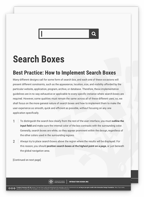
To help you get started implementing search boxes, you can download and print our “Search Boxes” template:
Potential Problems with Search Boxes
If the search results are directly connected to the user's search terms, there will be very few potential problems arising from using search boxes. However, if the superficial design of the input field is camouflaged by the rest of the display, then the user could easily overlook this useful design element. Therefore, you must attempt to make the search box prominent within the design, and distinguishable from the background, so users know they can input data into this region. This is achieved by using strongly contrasting colors for the input field and surrounding space and including one of the aforementioned 'submit' icons or buttons.
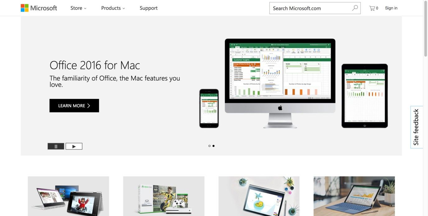
Author/Copyright holder: Microsoft. Copyright terms and license: Fair Use.
On the Microsoft customer webpage, the search box is not designed to stand out from its background, but due to the appropriate placement in the global navigation bar, users will be able to find it quickly when needed. The search box is appropriately visualized, by giving it a distinctive border, search icon, and suggestion for input.
The Take Away
Implementing a search box is an easy way to help users find the information they need, whether this information is a solution to a problem they may be experiencing with an application, or a term in an online article. For a search box to be effective, it needs to be designed with attention to its findability, and the cues it gives the user as to what can be done with it. It is a relatively problem-free design pattern that can help you create supportive user experiences. However, you will need to consider any problems users may face in accessing what you want to offer them. Because deciphering is the last thing you want your users to do, a golden rule is erring on the side of redundancy (i.e., making it very obvious) and ultra-convenience, so they can make contact with what they want to find without having to wonder where the instrument you have designed for them to do so is, or what you intend them to do with it.
References & Where to Learn More
Hero Image: Author/Copyright holder: Bradley Howard. Copyright terms and license: CC BY 2.0.
Jenifer Tidwell, Designing Interfaces: Patterns for Effective Interaction Design, 2010
Martijn van Welie, Pattern Library, 2008