
The ability to harness GPS data and map data on smartphone platforms offers designers a chance to enhance the user experience of their products. However, in order for maps to deliver better experiences for users – it’s important to integrate these features with UX in mind. There are some sensible rules that can be used to increase your chances of success when using location data and maps in mobile apps.
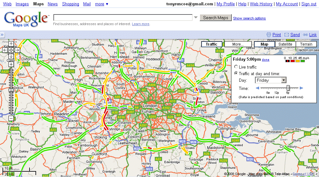
Author/Copyright holder: Search Engine People Blog. Copyright terms and licence: CC BY 2.0
There’s no doubt that the smartphone has brought users and designers a wealth of choices when it comes to new facilities; one of the most popular of those is the GPS (Global Positioning System) functionality. GPS can be used to calculate the user’s position and be combined with map data to provide ways for users to find locations and get directions to them.
However, it is important to consider how you will implement maps within your mobile websites and applications before automatically deciding on their conclusion. Research from the Nielsen Norman Group found that when presented with a mobile site which did not include a map on location search results pages – not a single user wished that a map had been provided. In fact their research recommended that maps should be an option for users to toggle out to and that location data should be presented as a list ordered by mileage from the nearest location in the first instance.
Why is this the case? It is almost certainly because maps within mobile apps and websites fail to take into account certain usability considerations.
Usability Considerations when Implementing Maps in Mobile Designs
Scrolling and Panning
One of the nice things about maps is the ability to pan across them by dragging the map. This functionality works extremely well in a desktop environment when the user clicks on the map and then drags the map with a mouse. It is more difficult to pull off on a smartphone screen where the user interface is a touch screen.
Users will often scroll the page rather than pan or vice-versa because the boundaries of the map and the boundaries of the screen conflict. This may be overcome with the use of borders around the map so that the user has a distinct area for panning within.
Pinpoints Conflict with Target Sizes
It can be easy for designers to forget that touchscreens are not the most sensitive of devices and that ideally, for a user to click on an area, it needs to be about 36 x 36 px.
Pinpoints on maps are all too often rendered smaller than this 36 x 36 px target which makes it difficult for the user to affix on a target and interact with it.
There is also the issue that if a map is presented at too high a level; there may be pinpoints found at the same location on the same screen. Differentiating between these pinpoints via touch is a frustrating experience. This may be handled by using notifications that allow the user to touch a single point and then choose from a list of pins or by presenting a map at the appropriate magnification to ensure all pins are distinct and separate.
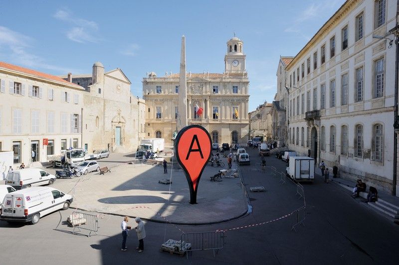
Author/Copyright holder: Arambar. Copyright terms and licence: CC BY-SA 4.0
Touchscreens, Networks and Other Issues
The touchscreen is not the most sensitive of devices and when combined with a slow network connection; maps can often lead to frustration beyond the designer’s control. A user who uses the screen to expand a map view, for example, may find that a slow network connection makes it appear their efforts are not having the correct impact.
This in turn leads to the user redoubling their efforts and over expanding the view, which becomes a source of frustration. It is difficult for the map interface to provide useful feedback to a user in these circumstances – it is very much worth considering an option to allow the user to move directly away from the map and back to a list view of locations at any given point in their interaction with the map.
Gesture Control
The simpler you keep the UI on the map, the more likely you are that your pins and controls will meet that 36 x 36 px guideline for touch points. That does not mean that you cannot offer additional functionality to a map user. It does mean that you will need to consider gesture controls for this additional interactive functionality. These gesture controls may not be immediately obvious or intuitive for the user and will need careful application to add real value to the user-experience.
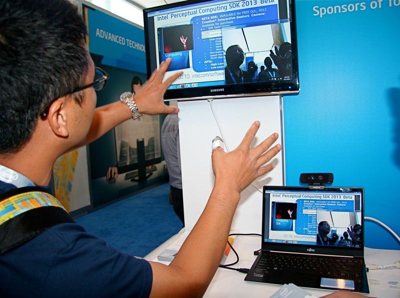
Author/Copyright holder: Intel Free Press. Copyright terms and licence: CC BY 2.0
Tool Bar Positioning
Tool bars can occupy a big chunk of screen real estate and they must remain spaced out far enough from the map itself so that the user does not accidentally end up activating the tool bar when trying to interact with the map.
Ideally, tool bars should also be simplified and reduced when the user is engaged with the map to try and accommodate the easiest interactions with the map.
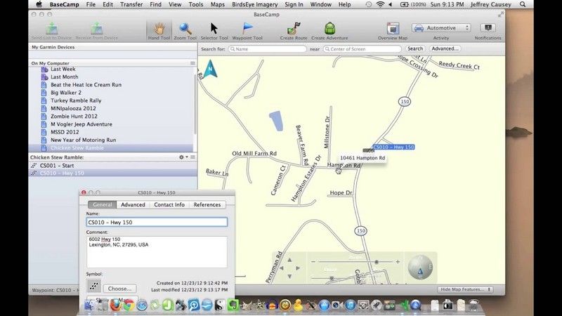
Author/Copyright holder: BaseCamp. Copyright terms and licence: Fair Use.
Help and Escape
The final tip for implementing maps is one that applies to many areas of UX design. Always give your users a little assistance (you can use pop up messaging to aid understanding of gesture controls or other functionality that may require explanation, for example) and a way to get out of the map and back to a more familiar interface.
The Take Away
Implementing GPS and map functionality may not be necessary and it is a good idea to test the requirement with users prior to implementation. If it is useful to your user base, you should try to incorporate the guidelines in this article in order to improve the UI and UX of the map implementation. Maps are a real challenge for small screens on smartphones and need careful handling to provide value to users rather than detract from it.
References & Where to Learn More:
A case study in map deployment using Google maps.
An interesting examination of usage issues for map data within mobile apps.
Brad Frost examines the adaptive map.
Hero Image: Author/Copyright holder: Johan Larsson. Copyright terms and licence: CC BY 2.0


