
Designing for mobile devices is not the same as designing for laptops or desktops. It's about creating a unique user experience that focuses on what matters to mobile users. To achieve this, it's important to focus on the tasks that users want to accomplish and ensure they can be executed efficiently.
Designing for mobile devices is no longer a choice, but a necessity. With billions of people using smartphones and tablets to access the internet, it's crucial for designers to prioritize mobile users to stay competitive. Ignoring this trend could mean missing out on a significant portion of the market.
That means putting mobile first in many product development strategies. It means understanding that mobile is different and not a desktop experience. For example, screen real estate is more limited on a smartphone, connectivity may not be guaranteed, battery life is precious, and many more considerations.
Then there are the benefits of these devices to consider; they are more personal than a desktop, they’re always on (when battery permits), and you can talk directly to the user through them. They have motion sensors, GPS, accelerometers, and more too.
So how do we approach design for mobile? Let’s take a look:
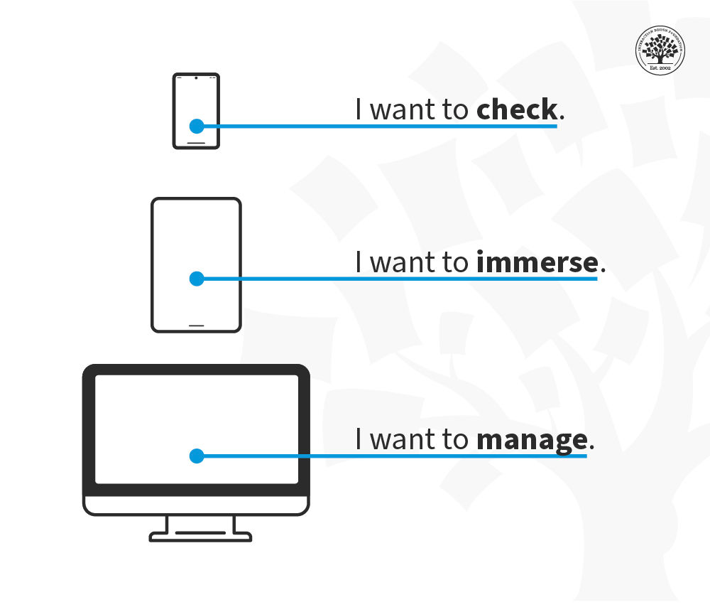
Focus on Mobile
.png)
© Interaction Design Foundation, CC BY-SA 4.0
The limitations of screen real estate mean that less is more. You need to keep features to a minimum. You have to focus on the key tasks the user wants to carry out, and you will have to drop stuff from other platforms to make mobile work.
Personal Functionality
If mobile devices are personal, the functions they deliver should also be personal. Make them fun, make them customizable and make them integral to your users’ lives. Getting tasks done doesn’t need to be a chore.
Consider the Context of Use
When will your user access your functionality? When they’re bored? When they’re busy? When they’re lost? Make the functionality fit the situation, and you’re on the road to relevance to your users.
Functions that Fit the Device
The functions you offer need to follow patterns that deliver the experience on every device consistently:
© Interaction Design Foundation, CC BY-SA 4.0
Keep the user in the picture. It may take time for data to process, but you need to let the user know when you’ve received their data and how long they will wait, and you must do that immediately.
Pay attention to the detail. Apps have to deliver seamless experiences where users can carry out tasks efficiently. They also need to look and feel good to use.
Watch the interface. Users are all thumbs, literally, on smartphones. Can your tasks be easily completed with someone’s thumbs? No? Then rethink them.
Keep things intuitive. This is back to the thumbs issue – keep buttons, tabs, boxes, etc., to a minimum and keep content easy to access and navigate.
Keep controls consistent and at the bottom. This lets the user focus on the content and manipulate it as they need to.
Reduce user input where necessary. Pay attention to whether auto-correct is a help or hindrance on the device for your tasks. Make sure that you help the user pick the right keyboard to get the job done. Don’t forget to support a landscape orientation – particularly if you want a lot of typing done. Think about providing an orientation lock to make this easy.
Think about Navigation
A lot depends on the complexity of your task, but navigation on mobile can fall into these categories:
© Interaction Design Foundation, CC BY-SA 4.0
None at all. If you’re releasing a weather app for your neighborhood – a single screen could (and should) deliver all the tasks for the user.
Simple tabs. When you need to break consistent content up into several areas. (Think Twitter)
Drill down menus. When you need to deliver higher levels of complexity. Group content and make it easy to move through the hierarchy. (Think your settings menu on your smartphone.)
Keep Communicating
It’s important to keep the user informed as they go about their tasks. You need to:
Have a method to deliver feedback. From the tactile (think the vibration function) to the visual (progress bars), you must keep users aware of whether things are going well as they execute their tasks.
Ask for confirmation when necessary. Modal boxes are annoying, but the exception is when you want to protect the user. For example, if someone wishes to delete a photo, you can ask if they’re sure before you carry out the action.
Keep on Task
If a user exits your app without completing a task, when they open it back up – they should be brought right back to the same task in the same place. Make it fast and easy to restart a process, and your users will love you for it.
Consider Graphics
The icon you use for your app – should ideally be representative of the key task your users want to carry out. Make it blindingly obvious at a glance what your app does, and it will be much more likely to be downloaded and used.
Consider the First Time of Use
Keep things simple and focus very much on key tasks when your app first launches. You can add complexity over time. If it’s confusing or hard to carry out a task the first time your app is used – it will likely never be used again.
The Take Away
By focusing on the tasks required by a user from a mobile platform and ensuring that functionality and form support those tasks – you can deliver a premier mobile user experience through your app. Mobile is different from the desktop, but that doesn’t mean that it’s harder to do a good job, just that a different approach is required.
References
Take our course on Mobile UX Design: The Beginners Guide.
Learn everything you need to know about task-oriented design.
Smashing Magazine offers its Mobile Design Techniques That Boost UX.
SoluteLabas takes a look at mobile UX design principles.
Learn how to balance tasks, content and mobile optimization in mobile UX.
Hero Image: © Interaction Design Foundation, CC BY-SA 4.0


