When you’re designing a website for an online newspaper, your users will probably want to read some background information relating to a new government policy, a new whistle-blower, or any other word or phrase they don’t have all of the information on yet. When you’re designing something completely different, such as a complex online tax return form, users will probably need additional explanations of terms and regulations. The answer to both challenges lies in the blue underlined text you can find on practically every web page today: inline links. Allow us to take you through the basics of implementing them problem-free, and you’ll soon find yourself able to add whole new dimensions to your work.
“No, no! The adventures first, explanations take such a dreadful time.”
― Lewis Carroll, British author (from Alice's Adventures in Wonderland & Through the Looking-Glass)
The Design Problem
While going through a text or other section of a website, users may come across words or phrases they need additional information on. They may need an explanation of the meaning of a term, or they may want to read some additional background on an event you mention. Whichever way you look at it, you’ll see how easily a user can become confused if you’ve got a page that features an already complex subject and is full of unfamiliar terms. Speaking of unfamiliar terms, let’s take a prime example. Imagine that you’re designing for an organization that promotes American dialects of English, with the particular aim of keeping many obscure words from dying out. On their landing page, they want you to showcase many of these, complete with the definition of each, its history, and information about its regional roots. So, you’ve been tasked to feature at least ten words so as to dazzle and allure would-be long-term users of the resource (and purchasers of an obscure dictionary that includes witty annotations). The trouble is, when you’ve got a word such as ‘eellogofusciohipoppokunurious’—which, strange as it may seem, actually exists and means ‘very good’—you’ll have another potential issue on your hands. You want to allow users to investigate these keywords or terms without overloading the pages of your website with all of the related information. You also want to lend credibility to your text by proving to users that other sources can verify these words and you’re not either twisting explanations to suit your client’s purposes or making things up as you go along.
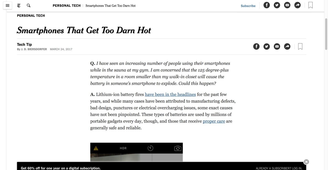
Author/Copyright holder: New York Times. Copyright terms and license: Fair Use.
On The New York Times page, articles are supported by inline links that navigate to other sections, giving additional information to readers.
The Design Solution
In the image above, you will see certain words, which are underlined and colored blue. When clicked, these hyperlinked words and terms divert users to another page containing related information. This design feature is referred to as 'Inline Linking', 'Hotline Linking', or 'Piggybacking', among other terms. Inline links are employed so that the information linked from the highlighted words does not clutter the user's current web page. Instead, users can follow the link if they are interested to find out more. This is a handy design element as it ensures clutter in the user interface is kept to a minimum, while providing interested users with the immediate means of following links and accessing relevant and more detailed information.
Why Choose an Inline Linking Design Pattern?
Inline linking empowers users; if one user wants to read a body of text without wading through in-depth definitions or specific detailed information related to a word or term, he or she can do so. Likewise, if a user is unsure of the meaning of a word, clicking the hyperlinked word or term can instantly provide this insight. Therefore, inline links perform two important functions:
They reduce screen clutter by keeping web page information specific to a certain thread or topic without veering off onto other topics mid-sentence;
They afford instant and fluid navigation to other web pages that contain more specific and detailed content.
A page featuring text set out in this way saves you from having to break the user’s train of thought with many asides in parentheses. That way, you can stay focused on the big picture of what you want to achieve on a page, and leave the explanations of the smaller components to expert sources.
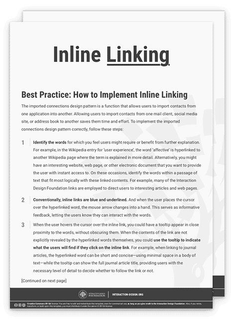
Best Practice: How to Implement Inline Linking
Identify the words for which you feel users might require or benefit from further explanation. For example, in the Wikipedia entry for ‘user experience’, the word ‘affective’ is hyperlinked to another Wikipedia page where the term is explained in more detail. Alternatively, you might have an interesting website, web page, or other electronic document that you want to provide the user with instant access to. On these occasions, identify the words within a passage of text that fit most logically with these linked contents. For example, many of the Interaction Design Foundation links are employed to direct users to interesting articles and web pages.
Conventionally, inline links are blue and underlined. And when the user places the cursor over the hyperlinked word, the mouse arrow changes into a hand. This serves as informative feedback, letting the users know they can interact with the words.
When the user hovers the cursor over the inline link, you could have a tooltip appear in close proximity to the words, without obscuring them. When the contents of the link are not explicitly revealed by the hyperlinked words themselves, you could use the tooltip to indicate what the users will find if they click on the inline link. For example, when linking to journal articles, the hyperlinked word can be short and concise—using minimal space in a body of text—while the tooltip can show the full journal article title, providing users with the necessary level of detail to decide whether to follow the link or not.
When the user clicks on the inline link, you should either let it open on the user's current page or in a new tab or window.
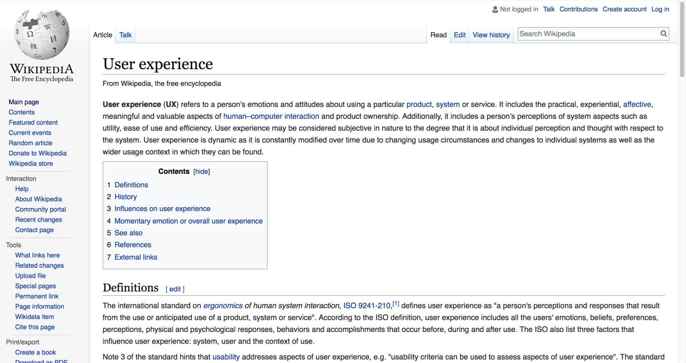
Author/Copyright holder: Wikipedia. Copyright terms and license: Fair Use.
Wikipedia pages often use inline linking to direct users to sections with more information on specific terms. Sometimes, these are terms that require more explanation (e.g., ‘affective’). Other times, these links refer users to related articles they may be interested in (e.g., ‘human-computer interaction’).
To help you get started implementing inline linking, you can download and print our “Inline Linking” template:
Potential Problems with Inline Linking
Two options are usually employed for opening inline links: either opening the link in a new window or replacing the current window with the new information. Each option has its own inherent benefits, but replacing the current window may be frustrating, especially for inexperienced users who may not know they can navigate back to their previous page by clicking the back button. Opening the link in a new window is often used for information regarding installation progress and files in different formats, such as PDFs, or for instructions, so that users can complete steps without having to remember everything. Also keep in mind that if users are being asked to fill out fields or are on a transaction page, opening up a new window from an inline link will save them from losing data, as they won’t be prompted to resubmit (refresh). It is up to you to make the decision according to the type of user you’re catering your design for.
When the hyperlinked words do not explicitly state what users will find when they click the words, they might ignore these, even though they might have been of use. Alternatively, they might simply click one, only to find out it is of no interest to them. On these occasions, you should try to use more detailed tooltips that reveal the title of the linked document, web page, or article before users commit to clicking or to catch them before they decide to move on, unaware of what they’ll miss.
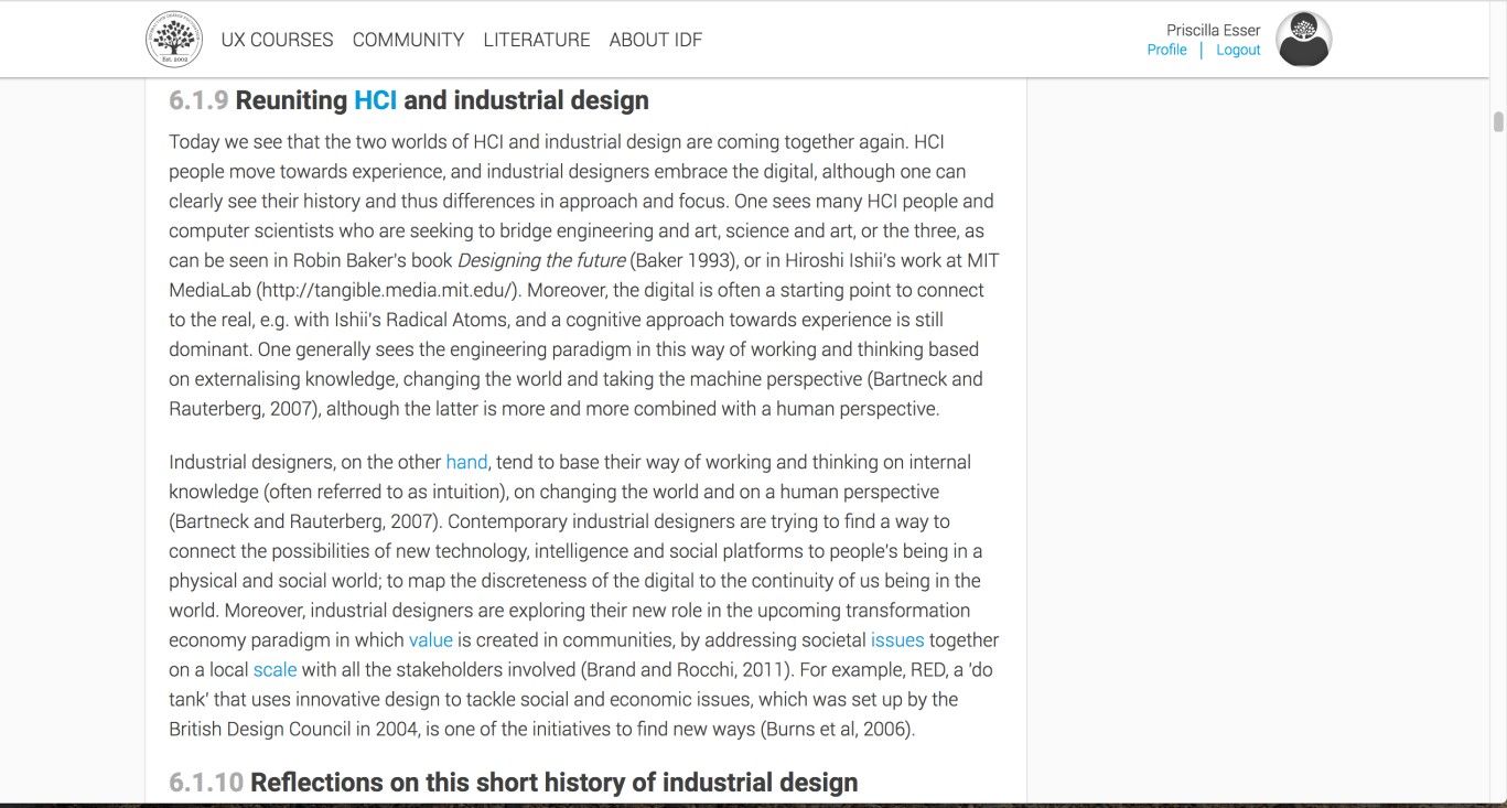
Author/Copyright holder: Interaction Design Foundation. Copyright terms and license: Fair Use.
Problems with inline linking can happen to the best of us. Here, an Interaction Design Foundation Encyclopaedia chapter uses inline linking for words that do not necessarily explain what the user may find when they click them. For example, what would the word ‘hand’ in the first line of the second section link to?
The Take Away
Inline linking is a user interface design pattern that designers use to help users find additional information on terms they are either interested in or confused about. Conventionally, inline links are discriminated from the rest of the text by making terms blue and underlined. Implementing them is fairly straightforward, as long as you ensure that the terms are self-explanatory regarding what they link to. Opening the inline links in a new tab or window may enhance user experience further, creating a free and explorative navigation style for users. A well-linked body of text can help streamline your message while lending it credibility and authority, at the same time providing a pleasantly punctuated screen that is easier to digest than if you were to flood your work with well-meant but ultimately disruptive explanations and asides.
References & Where to Learn More
Hero Image: Author/Copyright holder: Christian Campos. Copyright terms and license: CC BY 2.0.
Jenifer Tidwell, Designing Interfaces: Patterns for Effective Interaction Design, 2010
Martijn van Welie, Pattern Library, 2008