Want to improve the usability of your website but don’t have much in the way of time or budget to do it? Then we have 5 simple usability tips that are easy to implement and which won’t break the bank:
Facial Alignment Matters
You can use the images of faces to highlight the most important content on a page. We’re social animals and we use our faces to communicate our mood and our interests without even thinking about it. That means when we see other people; we instinctively look to their faces to try and decipher some of that information.

Author/Copyright holder: Bill Dickinson. Copyright terms and licence: CC BY-NC 2.0
We also tend to follow people’s eyes. If you walk into a room and everyone is staring behind you what do you do? Most people will glance behind them to find out what people are looking at.
You can use facial images to pull this trick online too. If your face’s eyes are pointing at something; people will tend to look where they’re looking.
People Hate Scrolling
A survey by Jakob Nielsen, showed that less than a quarter of first-time visitors to a web presence will engage the scroll functionality. That means more than three-quarters of people never scroll down the page. So if you want your content to have maximum impact; it needs to be above the fold. Now, you can’t put everything over the fold (without creating a mess) so you need to prioritize the most important content and then try and place it there instead.

Author/Copyright holder: SamahR. Copyright terms and licence: CC BY 2.0
We’d suggest that your value proposition is clear. That a user can identify where they are (yes, make your brand and name clear above the fold). And that you make it easy for them to move to other parts of the site if they want to do so.
We Are Creatures of Habit
Don’t spend any time at all thinking about the colours for your links; choose blue. Why? Because we’re creatures of habit and pretty much everything from Google to Microsoft Word uses blue links. Why reinvent the wheel? Show us a pattern we know and we’ll conform to it; we’re creatures of habit because it’s less time consuming than learning something new every time we do the same thing.
Expand the Search Box
We’re in an age where we ask search engines complex questions all the time. This is easy when you land on the Google home page but on most websites… there’s a tiny little box in the top right hand corner. People are more likely to ask questions when they’re sure they’ve asked them properly.
Author/Copyright holder: Yandle . Copyright terms and licence: CC BY 2.0
How big is big enough? The same Jakob Nielsen survey suggests that 27 characters could be good. They said that around 9 in 10 queries will fit in that space.
Be Informative
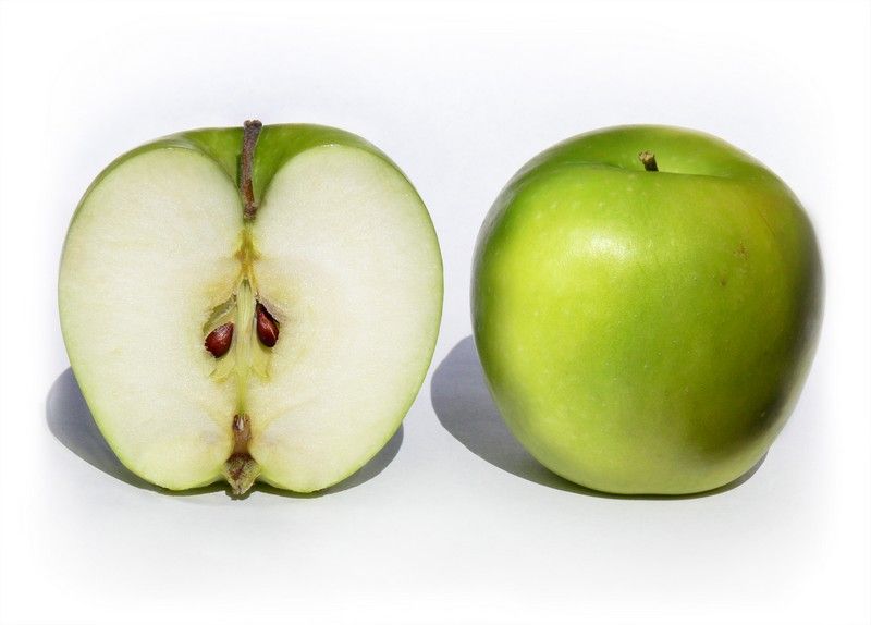
Author/Copyright holder: Benjamint444. Copyright terms and licence: CC BY-SA 3.0
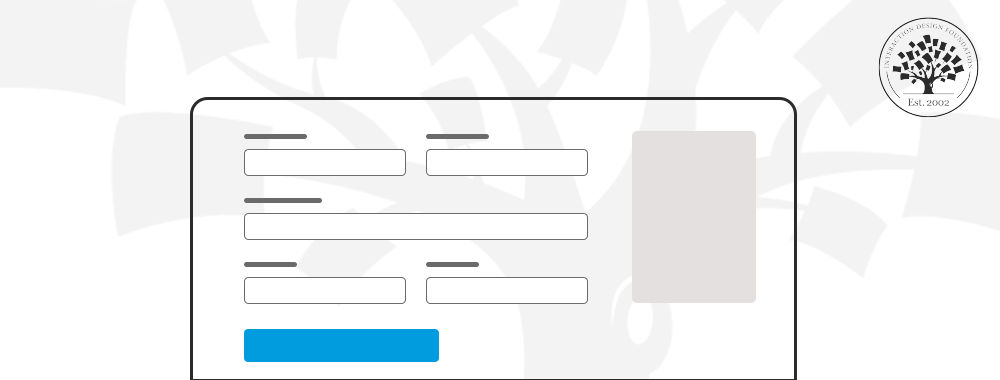
Product pages are often terribly short on detail. Yet, that’s the detail that makes the sale. People want information so they can make informed decisions. Even if they don’t read the data; they like the security of having it to hand. When you add detail to product pages – you help users make decisions, purchasing decisions. However, don’t make it too complicated. Break it down into tables, charts, images and keep paragraphs short. Nobody likes a wall of text either.
Header Image: Author/Copyright holder: Andre Charland. Copyright terms and licence: CC BY 2.0