Chunchu, A. (2024). Adaptive user interfaces: Enhancing user experience through dynamic interaction. International Journal for Research in Applied Science & Engineering Technology, 12(9), 949–956.
This article explores the concept of Adaptive User Interfaces (AUIs), focusing on how they dynamically adjust to individual user needs and preferences. It delves into key techniques used in AUI development, including personalization, context awareness, machine learning algorithms, user feedback loops, and modular design. The paper examines real-world applications of AUIs in healthcare, education, e-commerce, and smart home systems, highlighting their impact on user experience and efficiency. Additionally, it discusses the benefits of implementing AUIs, such as improved user engagement, increased efficiency, and enhanced accessibility, while also addressing challenges like data privacy and balancing adaptation with user control.
Ramazanov, I. (2025). Approaches to creating adaptive design in mobile applications using React Native. Universal Library of Engineering Technology, 2(1), 20–24.
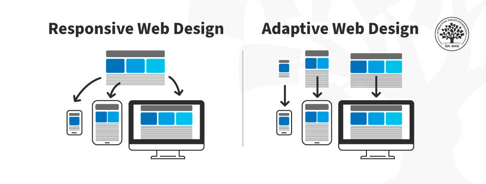
This article by Ramazanov explores modern methodologies for implementing adaptive design in mobile applications using the React Native framework. It details practical approaches such as media queries, Flexbox, proportional sizing, and device-aware layout adjustment to address diverse screen sizes, pixel densities, and orientations. The paper emphasizes the importance of selecting appropriate tools—like react-native-responsive and PixelRatio—to optimize user interfaces across platforms. The article is grounded in technical specifics and offers actionable recommendations, making it highly relevant for developers and UX professionals. It contributes practical insights for creating user-friendly, efficient, and scalable cross-platform mobile applications.


