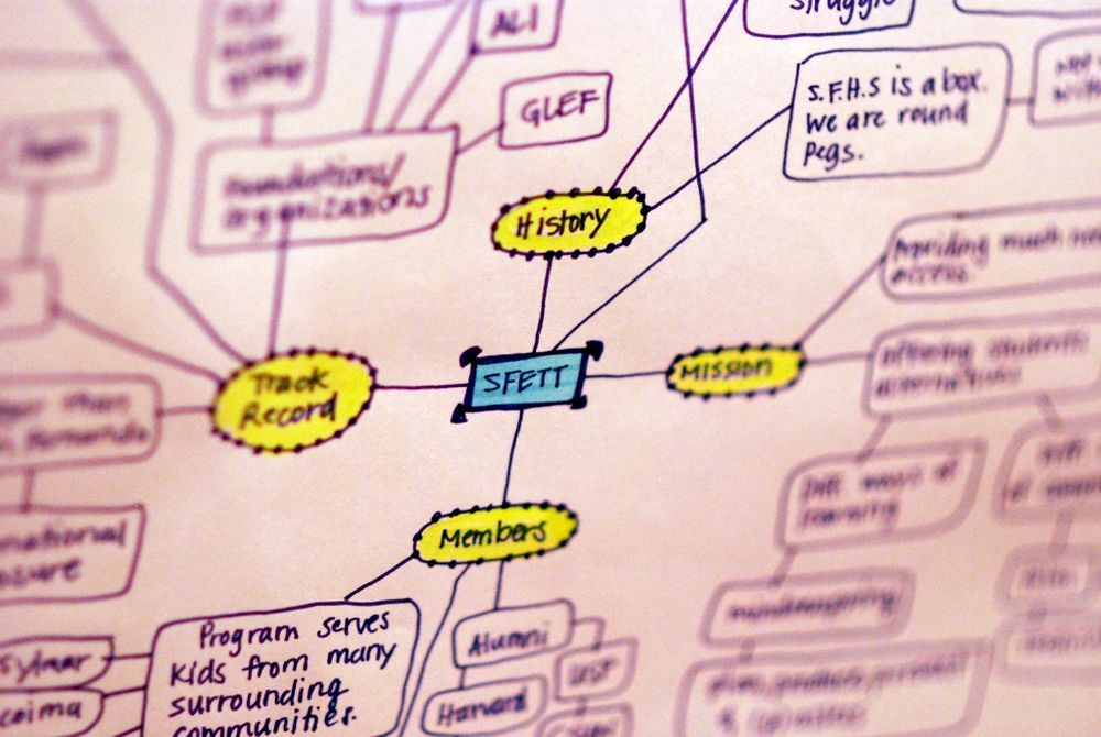
Information visualization is a process by which data (or information) is represented to help the recipient of the information build an accurate representation of it in their mind. It is most common for information visualization to be constructed graphically (e.g. to facilitate visual understanding) but it may also be carried out in sound (e.g. to facilitate aural understanding) often, but not always, for the visually impaired to be able to understand data.
The term “information visualization” was coined at the Xerox PARC labs in the 1980s and was meant to signify that a new discipline in design was needed to create artifacts that would aid in the comprehension of data. While the term may be relatively new – the concept is not and though computers are commonly employed today to visualize information; information visualization may still be carried out with nothing more than a pen and paper (for visual) or a tape recorder (for aural).

Author/Copyright holder: MartinGrandjean. Copyright terms and licence: CC BY-SA 3.0
This diagram (above), Minard’s Map, is one of the earliest complex pieces of information visualization. It shows the march of Napoleon’s army during the invasion of Russia in 1812. It was done completely without the use of computers (though the version pictured above has been rendered “prettier” with the use of graphic design).
The Process of Understanding Data
Nathan Shedroff, the renowned interaction designer, proposed in his paper “Information Design” a process by which we understand data. He offers a “continuum of understanding” which begins with data and culminates in wisdom. Along the way, the data is transformed in order to help us gain that wisdom.
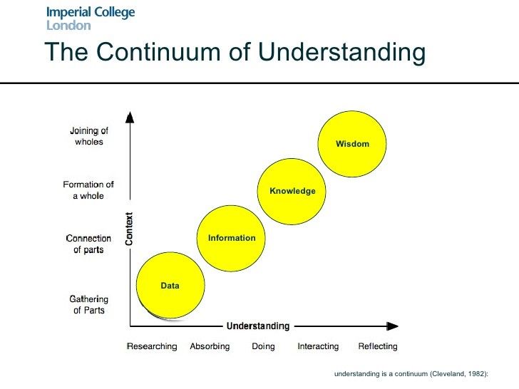
Author/Copyright holder: Imperial College London. Copyright terms and licence: All rights reserved.
1. Data
We begin the process of understanding with data. Data, itself, has no intrinsic meaning. It is the first building block in the process of extracting information. For example, I may have data on the occurrence of cancer in a population but that data is relatively meaningless without context. It is only through the act of comparison with other populations or other time intervals that I can create meaning from these figures.
2. Information
The next step in the process is to give the data meaning and transform it from data into information. This involves sorting data, processing it, and presenting it in a format which brings substance to that data. The National Health Service, in the United Kingdom, for example will take data on the incidence of cancer in many populations – it will compare rates across time and geography and tabulate it to enable it be examined for trends.
3. Knowledge
Knowledge is the process by which we put information to use. We test hypotheses and develop practical applications for the information at this stage. We examine the information in a viable context so that we can discover the value of that information and how it can be put to work for us. Without application, information is also relatively useless but when we apply information to the world around us – it enables us to learn and grow.
4. Wisdom
Wisdom is the final step in the continuum of understanding. It is the point at which we have gained so much knowledge and expertise from the data that we have become able to judge the data itself (in a qualified manner). Wisdom is something we create for ourselves throughout this process; it is not something that we can teach to others – it is something that is brought about through study and careful interpretation of knowledge derived from data.
Where Does Information Visualization Come Into the Continuum of Understanding?
Information visualization will be used to help transform data into information. It provides us with a set of tools and methodologies by which we can sort, process and represent data to deliver valuable information in context.
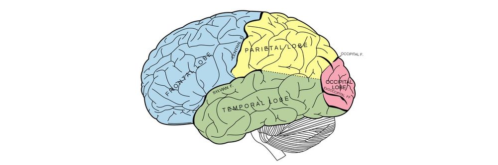
Information visualization, for a long time, was a subset of HCI (Human Computer Interaction) that is the study of how users interact with the computer equipment they employ; a basic explanation of the HCI process can be found in the diagram below. However, information visualization is now very much considered to be a separate discipline.
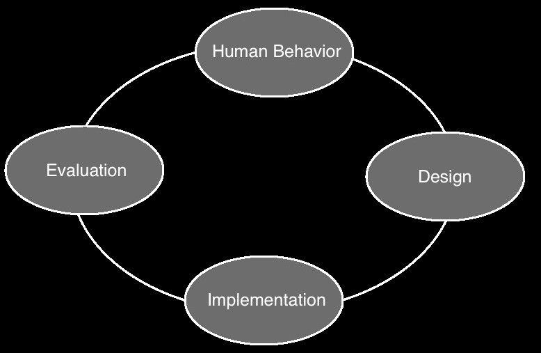
Author/Copyright holder: Sanilshah. Copyright terms and licence: CC BY-SA 3.0
Its focus is very much on aiding the cognitive processes of human beings to fully understand the data that they are presented with. This may be done visually or auditorily. It is most commonly done through the use of computing and this explains why information visualization was once part of the HCI discipline – there is a natural overlap between the two disciplines. This is because over the past decades computers have become increasingly powerful tools capable of crunching even the largest data sets and turning them into representative models. However, there is no requirement for computer modeling within the field of information visualization – it just makes the job much easier.
The Take Away
John Heywood, coined the term “There is none so blind as those who will not see” in 1956 according to the Random House Dictionary of Popular Proverbs and Sayings. It is often a fair assessment of people but in this age of increasingly complex data, it is fair to say that many cannot see deeply into information without the assistance of information visualization.
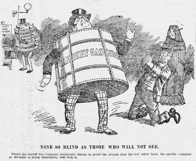
Author/Copyright holder: Joseph Morewood Staniforth. Copyright terms and licence: Public Domain.
The discipline bridges the gap on the continuum of understanding between data and information and allows us to go on and develop both knowledge and, hopefully, wisdom from that data.
References and Resources
Nathan Shedroff’s original paper on Information Design – Edited by Robert Jacobson. Information Design. MIT Press, Cambridge, MA, 1999.
Nathan Shedroff is still very active in the field of Interaction Design. Check out his thoughts on a range of topics.
Hero Image: Author/Copyright holder: Martin Grandjean. Copyright terms and licence: CC BY-SA 3.0