The Apple Watch is coming and this week the company launched their developer’s toolkit the “Apple WatchKit” for all those keen to build wrist-bound applications. What can you learn about the new product from the developer’s kit?
Same, Same not Different
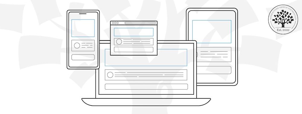
The watch is going to work rather like the Galaxy Gear. That means its applications are going to be rather similar to applications built for other products in the Apple range. Apple warns its developers to keep things simple for the watch interface. It’s also worth noting that much of the work required by watch applications will be done using the iPhone processor… that means without an iPhone connected to it; the watch is going to be severely limited in functionality.
Keeping Up Appearances
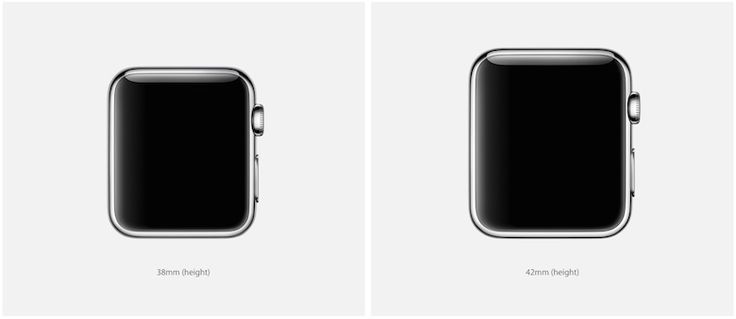
Apple’s screen spaces on the Apple watch come in two sizes. That means that developers need to keep in mind how things will look at these different scales. Apple wants to make certain that your applications don’t make the rest of us want to throw up when we look at them and that means all watch applications must have a black background.
You are still allowed to use branding on your applications for the iWatch but Apple sternly advises keeping logos to a minimum.
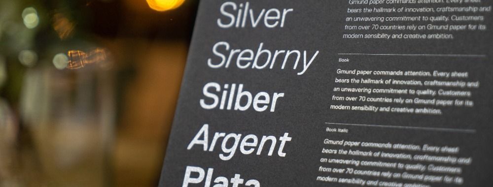
One cool piece of news for developers is that you get to try out Apple’s first in-house developed font in years; San Francisco. Fast Code Design refers to it as “the most important typeface in 20 years” which we think might be overdoing it but it surely is going to be important. It’s worth noting that San Francisco isn’t compulsory for your apps but if you want to build your own; you’ll need to make sure that it follows Apple’s guidelines closely.
One UI or the Other but Not Both
You can choose either hierarchical navigation or horizontal swipe navigation but you can’t use them both in the same application. This isn’t much of a drawback but it does seem a shame that it limits the creative use of navigation in new ways.
Under Pressure
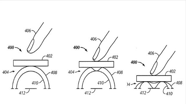
We really like the fact that the Apple Watch’s UI will recognize how hard a user is pushing the screen. Pressure sensitive controls will add a certain something extra when compared to other types of personal computing (for the moment at least).
Summary
We’re quite impressed with the Apple Watch developer’s kit. We still don’t know how Watch based applications will bear up in the long run. We know that if anyone can make a smartwatch a success it should be Apple but we’re not yet convinced that anyone can make one a success at all.
However, from a developer’s point of view – the kit is simple to use and the guidelines Apple supplies are sensible one. This should keep the UX similar across all applications for users and make development activities relatively straightforward too.
Images: Apple Watch, Size, Touch