Whenever someone requests, “Please explain in plain language,” we know a message has failed to latch. Created in the early 1990s by U.S. government employees who’d had enough of work jargon, the plain language movement would soon reach all industries. Choosing plain-language words in UX design takes some thought—we must fine-tune them to reflect our users’ personal stories, in their vocabulary and in a familiar tone. Meeting a target audience with appropriate words in easy-to-read chunks accesses them quickly, helping them find and do what they want. Better still, plain language can dispel our arch enemy, uncertainty.
Plain Language in Exceptional Designs?
Plain language means plain English. Another plain reality— users are on our sites because they want what we offer them. Potential customers who urgently need a service or casual browsers all want to find what they’re looking for quickly. Especially when used in short, grabbing sentences, plain language lets them understand information without making them stop to think (and lose trust in your organization). Then, they can use this to go to the next place—meeting their needs, which complement your organization’s needs. We’re talking about the all-important call to action now, and leaving converted or soon-to-be converted users with a pleasant experience. That memory will help bring them back. They may well tell others about “this great site” that can help them, too. Best of all, the magic you worked involved nothing harder than picking the simplest word to fit the occasion. The Plain Language Action and Information Network (PLAIN) shows us how it’s done in this sample.
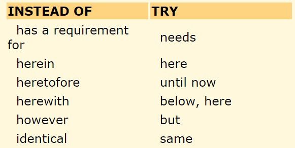
Author/Copyright holder: Plain Language.gov. Copyright terms and licence: Fair Use
In a 2004 interview with PBS Frontline, American political consultant and “public opinion guru” Frank Luntz stated that life is 80% emotion and only 20% intellect. With that in mind, imagine you’ve just landed on a company’s site whose services you need, only to find a solid slab of data. Even worse, the language puffs and swells in elaborate, technical, 25-words-per-sentence babble. Your time’s precious. Perhaps the author believed his writing might flatter you because he’s treating you like a fellow techie. If so, he’ll have made the ultimate sin—pushing his ideaof your world in your face, when he should have introduced you to the magic UX mirror you expected. You’ll have switched off in seconds and gone to check out what a competitor can offer. There could have been a great message buried in there, but the designer was too infatuated with his own keyboard to care about reaching out properly to you. His lack of clarity drowns the usefulness of his expertise.
No one wants to get bogged down in long, dense writing. Even the most patient readers find it tedious and demotivating. If you had to stop users in the street and persuade them there, you’d have little time. You certainly wouldn’t risk using words they mightn’t know. The remove of being a UX designer may save you from the embarrassment of seeing people walk away, but the statistics would soon prove that users are clicking away from you! You’re writing for the eyes and minds of real people in your target audience—you’re just the medium. Hide your pride, or at least channel it into matching your words to your audience; your great writing will show in user conversions. The content is the hardest working part of your design—its job is to carry and entice users onward, without so much as a hint you’re doing that deliberately. Whatever message your organization has to tell, you need to present it so that it’s:
Engaging
Compelling
Strategic
Go with the Flow
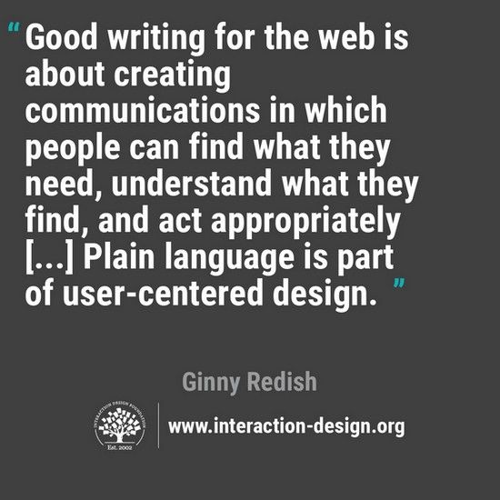
Using plain language helps keep the flow moving in well-structured sentences. Don’t think it dumbs messages down. It helps sharpen these ‘blocks’ into ‘spearheads’ to stick in users’ minds. Plain language expert Ginny Redish has written books on clear communication in web writing, and her challenge to writers remains powerfully timeless—let go of the words. You’re having a conversation with users, people you claim to know and be like. Word selection is an art that’s too great to cover in its entirety here, but we’ll share Redish’s profoundest observation as it relates to plain language:
The spirit of plain language is older, stretching back to the plain style movement H. W. Fowler pioneered in his 1906 guide, The King’s English. Fowler set down five rules:
Prefer the familiar word to the far-fetched. (E.g., use ‘there’ instead of ‘thither’.)
Prefer the concrete word to the abstract. (E.g., use ‘smiling’ instead of ‘happy-looking’.)
Prefer the single word to the circumlocution. (E.g., use the word, not its definition, such as ‘pen’ instead of “tubular writing instrument”.)
Prefer the short word to the long. (E.g., use ‘main’ or ‘lead’ instead of ‘principal’.)
Prefer the Saxon word to the Romance. (E.g., use ‘big’ instead of ‘grand’.)
George Orwell, in his much-reprinted essay, “Politics and the English Language” (in the April 1946 issue of Horizon Magazine) recommended five rules to help political writers rein themselves in. One that’s particularly relevant is: “Never use a foreign phrase, a scientific word, or a jargon word if you can think of an everyday English equivalent.”
The SEO Connection
The 1990s plain language movement began at the right time. With plain language, organizations can predict what potential users will type as search terms. Therefore, they can target the keywords their users will enter in a search engine and make those keywords more relevant for them. Users will enter simple terms to find what they want. Keep Google keywords in mind; they’re powerful.
The Second Part of a First Impression
You could have designed the most beautiful layout that surpasses users’ expectations during that all-important first glance. However, when they move on to read your words, those had better match the promises made by the pictures. Writing in plain language is all about transmitting knowledge, empowering users to persuade themselves they need you.
Let’s pretend we’re designing for a charity organization that’s trying to appeal to members of the general public to donate money to save polar bears. Which of the following would be better to write?
The symptoms of global warming are such that the much-oppressed polar bears (Ursus maritmus) must now expend terrific charges of energy to catch their prey in fewer expanses of ice floes.
One of global warming’s most obvious victims is the polar bear. Their habitat is melting, and many die while swimming farther to find prey.
The two sentences in 2) do the job nicely. Notice, too, how the sentences are short, and the paragraph is shorter than 1)’s.
How Easy it is to Alienate Users
It should come as no surprise that the plain language movement entered the legal and medical professions. Those fields are notorious for containing complex terminology, so much so that we have legal and medical dictionaries. If you approached a lawyer for advice because you wanted to know about the legality of creating a new app, you’d want answers given clearly in plain language (or “layman’s terms” as some call it). You would not want to be led on a winding path of legalese. Or, imagine if you were concerned about a family member with a medical condition and spoke to a doctor. You’d want the issue explained right away in plain language. The longer you’re left wondering what you’re reading or hearing, a) the more frustrated/worried you’ll become, and b) the more time both you and your lawyer or doctor will have to spend to clarify the issue. Sometimes, it may take a lot of explaining, as this video link from another industry shows:
Imagine being a business representative tasked with understanding that clip’s ‘engineeringese’. The big difference with UX design is that you do not have a captive audience. Your users are not pinned anxiously to their seats in a doctor’s office. They can, and will, leave and look at your competitors the moment they feel uncertain. Happily, whatever industry you’re designing for, conversion to plain language needn’t hurt. Let’s see an example:
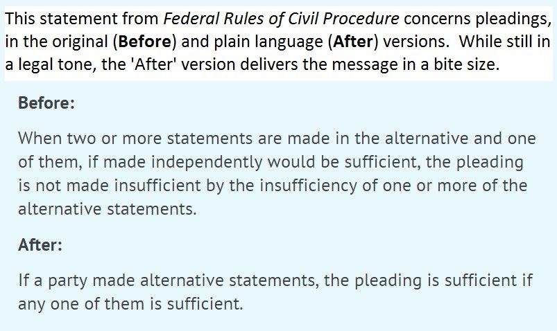
Author/Copyright holder: UXPA. Copyright terms and licence: Fair Use.
Luckily, plain language is simple to write. Better still, you don’t have to follow any one technique. You only have to sharpen your eye to notice that your text is:
Easy to read;
Easy to use; and
Easy to understand.
Begin by reading your first draft aloud. Are those words you’d use in everyday speech? If not, try swapping them for words you would use (note: this does not mean using slang, unless slang would help getting your target audience moving with your message!). Then, check you’ve broken up your text into paragraphs—each one presenting a new idea—with headings and, if possible, bullet points. It’s like a quick conversation, where you’re giving directions.
You notice the value of plain language when you need it. If you’ve ever had to open a manual to troubleshoot a faulty appliance, device or program, you’ll understand the need for speed. Unlike savoring the florid take-you-there descriptions of a fiction writer, you’re in a different mood—you want answers, because you’re not reading for the sake of enjoyment! Your users, while hopefully not as stressed as instruction book grabbers in a crisis, don’t want to be detained with words that might confuse them, or frustrated by big blocks of text. Shorten paragraphs, sentences and words, but try to vary your sentence lengths, too. How does your text sound? If it’s awkward, fix it. Can you use bullet points? These will reach users far quicker, helping them move with you, not away from you.
Fine-tuning the Suitability of your Plain Language
Plain language and audience type sit on a UX seesaw. Knowing how to balance them means knowing your audience inside out, starting with their reading level. Your content must fit them like a glove: a high school style will insult most professionals; a graduate style will bore or bewilder teenagers. For instance, if you’re an app developer catering to teens and fashion, you’d write in teen vernacular, perhaps including slang. However, if you’re designing for a medical device manufacturer, your writing would be far more formal, with more advanced vocabulary.
To familiarize yourself with any audience, type three words that define it in a search engine, such as Google Scholar. Then, type “values of” in front of those words and search. Now, narrow down the results from finding two or three lists saying essentially the same thing about your target audience. Do they have a regularly published journal? Mimic that style. Whether writing for children or brain surgeons, organize your text with a logical and natural flow, keep to the active voice, and keep users engaged by using ‘You’.
The Take Away
Plain language engages users best, helping them fulfill their purpose for visiting your site. Easy to read, easy to understand and easy to use, plain language—plain English— lands your organization in the users’ world. English is the richest language, often having five words for a concept, while many have two. Make the most of this great advantage.
Using plain language doesn’t mean abandoning more sophisticated vocabulary. It depends on your audience’s expectations. Word as they would word a message; become one of them. Also, empathize with them and respect their attention spans. Users’ time is valuable. Isn’t yours? A good thesaurus shows how many words have many simpler alternatives. Aim for words that engage users appropriately and efficiently. Set in a good-looking visual layout, approachable text laced with plain language gets conversions. To make the best-balanced text in plain language may take much editing and proofreading. Yet, with the skill of knowing which words to choose and lose, you’ll soon notice results. Word selection pays powerful dividends.
Where to Learn More
Baldwin, S. (2010). “Plain Language Tenets in UX Design”. UX Magazine.
Willerton, R. (2014). “Finding Empathy for Users: A Plain Language Model”. UX Experience Magazine.
Friedman, V. (2008). “10 Principles of Effective Web Design”. Smashing Magazine.
UX Content Strategist Genevieve Conti’s blog makes for fascinating and fun reading on this topic.