Parallax design, contrary to some information online, has been around for a while. In fact, it was first found in computer games back in the early 1980s. The title Jump Bug, 1981, had elements of parallax design and both Moon Patrol and Jump Bug, 1982, had complete parallax design implementations.
Today, parallax design is becoming more and more popular in website implementations and it’s a nice tool to have in your design toolkit.
Though don’t forget as Joel Marsh, the author of The Composite Persuasion said; “Power users don’t decide very much based on aesthetics. Look and feel creates appeal and not loyalty.”

Author/Copyright holder: Frozenbyte. Copyright terms and licence: CC BY-SA 3.0
Parallax design has come a long way since the early game designs as seen here in this scene from Trine 2.
What is Parallax Design?
Parallax design is a simple technique whereby the background image in camera moves more slowly than the foreground image. This has two effects in your web designs; firstly, it gives a sense of depth to 2 dimensional pages and secondly, the relative motion can help hold the eye’s attention on page.
Why Would You Implement Parallax Design?
Proponents of parallax design say that it helps:
Impress viewers with both the depth of page and the animated approach.
Support telling stories with your design
Makes it easier to guide visitors through your site by providing a natural flow to a web page
Provoke curiosity in the reader
Signposts calls to action and increases the likelihood of getting clicks
Reinforces the credibility of a site by making it feel more interactive
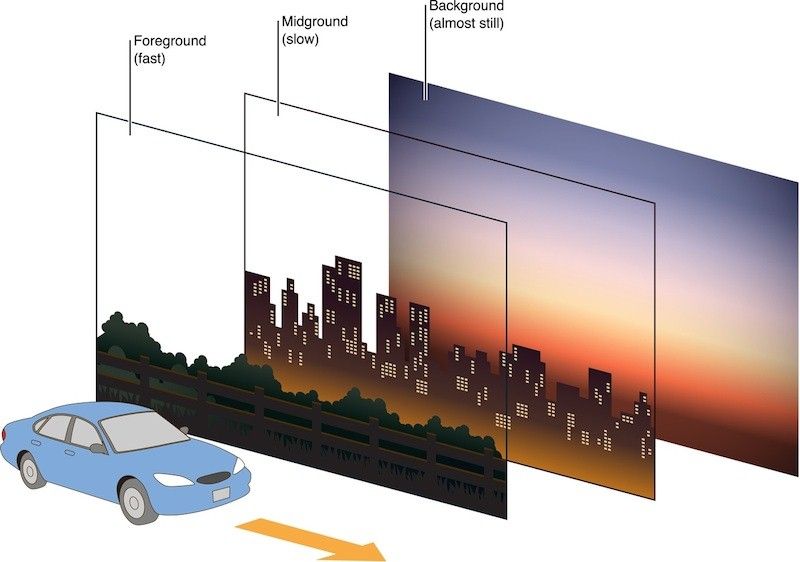
Author/Copyright holder: Digital Leaves. Copyright terms and licence: All rights reserved Img source
A simple illustration of how parallax creates motion effects.
Are There Any Reasons Why Parallax Design Might Not Work For My Project?
Yes, there are also possible downsides to implementing this kind of design including:
If done poorly it can be jarring for the user rather than valuable
It can impact on the way that the SEO is implemented as it makes it harder to diversify meta information, limits you to a single H1 tag and a single URL
If too many images and information are employed on a page, careful thought needs to be put into the web design or you end up with incredibly poor page load times and lots of visitors will simply go elsewhere
It is very hard to make it work with responsive design and may push designers supporting mobile and other platforms to implementing adaptive design (with the associated costs and drawbacks of this design method)
It reduces the capability to implement internal linking within the site
How is Parallax Design Actually Implemented?
There are four main methods for implementing parallax designs in general. Some are better suited to the web than others.
Method 1 – Layer Parallax Design
This form of parallax design relies on the display system to support the use of multiple background layers which may then be scrolled at independent rates. This scrolling can normally be done either horizontally or vertically.
Parallax is achieved by instructing each layer’s position to change, by a given but differing amount for each layer, in a specific direction.
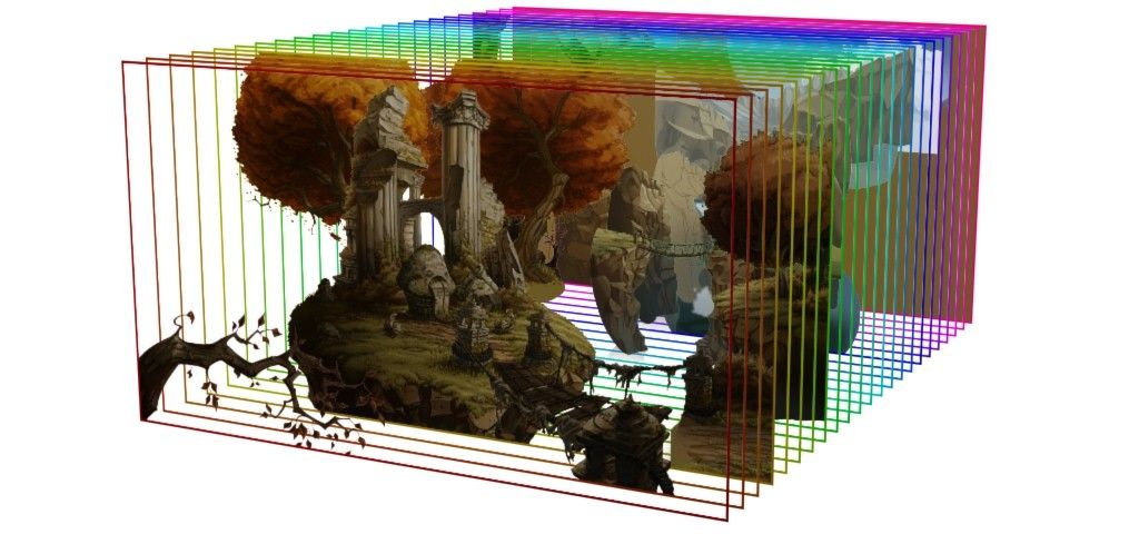
Author/Copyright holder: Claas Paletta. Copyright terms and licence: CC BY-SA 3.0
Parallax design using the layer scrolling method.
Method 2 – Sprite Method for Parallax Design
The sprite method works by taking composites of images and combining them into pseudo-layering of “sprites”. Moving the “camera” angle for viewing then delivers visibility on only a single layer or group of layers rendering others invisible. This method also creates a striking 3-D effect on images which would otherwise be flat.
Method 3 – Repeat Pattern Animation for Parallax Design
This method uses a scrolling display consisting of individual floating tiles which layer over a repeating background layer. The individual bitmaps for each tile are animated to give the illusion of the parallax effect. One popular technique for this is color cycling which can quickly animate all tiles on the screen.
Method 4 – Raster Method for Parallax Design
This method requires that you draw an individual pixel line and then refresh it all the way down the screen (top to bottom) you leave a slight delay between each line being drawn to create the parallax effect.
Multiple sets of raster can be combined to deliver stronger depth of field.
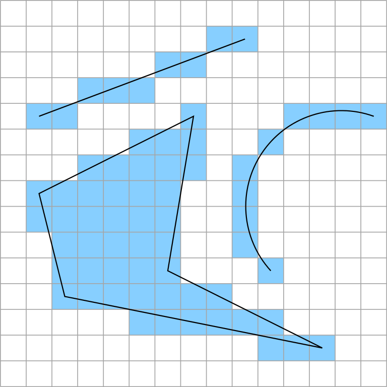
Author/Copyright holder: Wojciech Muła. Copyright terms and licence: CC BY-SA 3.0
Rasterization works by drawing pixel lines.
Tips for Successful Implementation of Parallax Design on Your Website
There are a number of simple tips that can improve the UX of parallax designs on websites including:
Try to keep things relatively simple. Overly complex parallax designs can confuse the user and make it difficult to separate content from the design.
Try to use parallax design to tell a story. Stories are automatically more engaging for users and parallax can really enhance this.
Try to keep things fun. Make certain to try and enhance the depth of the page when utilizing parallax design.
Try to use it to emphasize calls to action. This won’t just improve the user experience but should bring better business results too.
Don’t forget to try the design on multiple browsers and on mobile – parallax designs are often very fragile when deployed on these platforms.
The Take Away
Parallax design is a technique designed to add depth to flat pages and give the illusion of movement. It can be used to drive calls to action and to improve the user experience. However, careful thought needs to go into implementation or it can quickly become overwhelming and detract from the user experience instead.
References
An inspiring list of websites encompassing parallax design can be found here.
Hero Image: Author/Copyright holder: Chris Wood. Copyright terms and licence: Fair Use.
