Do you remember the fairy tale about Hansel and Gretel, a small boy and girl trying to retrace their steps in the forest? They only wanted to find their way back home, and so do your users. They should feel free to explore all the options and information on your website, without losing track of where they are and how to return to where they came from. You can help them in the same way Hansel helped his little sister: by using breadcrumbs. Here, we will explain how to implement them and what problems to look out for—so you will always be able to keep your users safe from stumbling into the real witch in our story: frustration.
The Design Problem
When users are moving through a multilevel website, there are often occasions where they would benefit from being able to retrace their steps. Think of the last time you found yourself arriving on a webpage that was five, six, seven, eight, or more clicks away from the landing page. Now, remember the last time you came in via an outside link, finding yourself in the midst of a very involved website (i.e., one having a small skyscraper’s worth of levels). While you’re at it, remember why you went there—was it because you needed to do something important, such as finding out how to start a high-interest savings account, or checking about a visa requirement to enter a country you wanted to visit? Or were you just satisfying a curiosity about, say, your favorite TV show at an idle moment and wanted to find out in which season a certain episode appeared, or see other productions an actress had been in.
Multilevel websites are hardly rare. The online presences of banks, government agencies, and fan (not the bladed type) resources for many aspects of popular culture certainly spring to mind, but so do all sorts of websites from companies that offer a diverse range of products and services. So as to cover every angle of what they do, these organizations have to create page after page after page, branching across categories and nesting these pages within other ones. Pretty soon, all the information falls into place in something resembling a family tree... or, if we want to think linearly—in keeping with Hansel, Gretel, and their breadcrumbs—pathways that wend their way through a forest, opening out into many little clearings. If you’ve clicked 10, 11, or 12 times to get to the page you want from the landing page, you’re dealing with 10, 11, or 12 removes from a familiar spot, like the entrance to a forest. If you’ve been teleported from outside to land on a page that’s 10, 11, or 12 clicks ‘down the line’, it’s a little like parachuting into the middle of that forest. Okay, so you have been clicking the left-pointing arrow on your browser to get you back as an option, but what if your system hangs? What if you suddenly realize you want to look at a related product, topic, or what you have instead? You’re probably going to want something that shows you the big picture—something that, at the very least, keeps you from shaking your head and abandoning your ‘journey’ because you feel lost. Therefore, you need a user interface design pattern that provides direct links to return you to the various levels of the site you previously visited – some way of taking you back up to a point where you can either stay and investigate another section or easily work your way over to the page you’d really like to visit.
The Design Solution
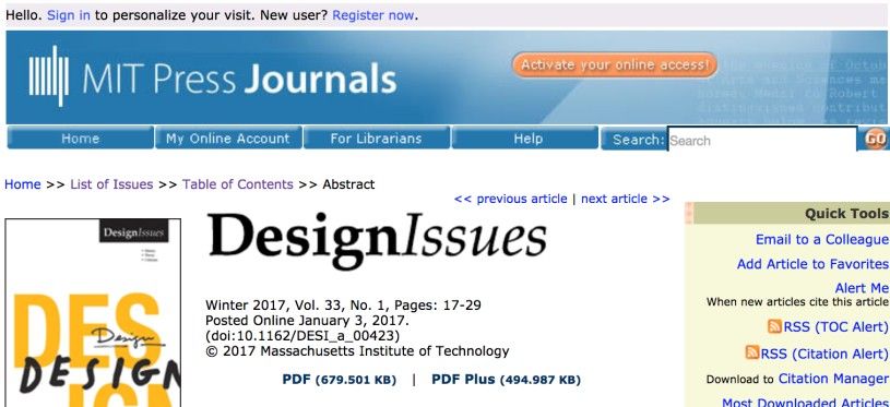
Breadcrumbs satisfy the users’ needs in this respect, as each visited level in the site hierarchy is represented by a link, allowing the user to jump to a particular page of contents or options in an instant. Thanks to a designer’s listing the different levels of the site hierarchy users have visited, they can trace their steps and navigate directly to any one of these levels by simply clicking one of the breadcrumb links. We see breadcrumbs in the example below; they are: 'Home' > ‘Vol 18, No 1 (2017)’ > ‘Milligan’. The first breadcrumb represents the highest level within the site architecture; meanwhile, the last breadcrumb represents the user's current position. All of the links in between are the various stages of the user's journey, in order, through the site.

Author/Copyright holder: Athabasca University. Copyright terms and license: Fair Use.
In this example from the online scientific journal ‘the International Review of Research in Open and Distributed Learning’, the breadcrumb design pattern is placed right below the global navigation bar. It does not attract a lot of attention, but it is findable when needed.
The name 'breadcrumbs' is somewhat misleading as the user might have arrived at a page without having progressed through all of the others, after following a link or entering via a search engine. It is important to understand that breadcrumbs do not represent actual steps taken but rather the hierarchy of a website or application. Additionally, the users do not have to follow the exact order so as to return to their starting position; instead, they can skip steps in between and navigate directly to a specific page.
Why Choose a Breadcrumb Design Pattern?
First things first; let’s see what a certain usability guru has to say about breadcrumbs:
“Breadcrumbs never cause problems in user testing: people might overlook this small design element, but they never misinterpret breadcrumb trails or have trouble operating them.”
—Jakob Nielsen, Eminent Danish web usability consultant
When your website is divided into a clear and apparent hierarchy, with individual sections devoted to specific groups of contents, breadcrumbs can be a great help to the user. This is especially so when there is no other means of navigating to specific points within the site structure, as they allow the user to move back to any of the previously visited pages. They also work well when combined with other navigation patterns, such as top-level navigation bars. As the user progresses deeper and deeper into the hierarchy of a site, breadcrumbs become more important as they present a simple, highly visible and instantly accessible way of navigating back through the higher levels.
Breadcrumbs also provide users with important contextual information, which is especially useful when they have arrived from some outside source such as a link from another site or through a search engine. The breadcrumb links tell the users exactly where they are within the site structure and how they can move to other, more general categories or groups of contents.
Best Practice: How to Implement Breadcrumbs
First, assign a label to each of the individual pages within the hierarchy. These labels should, preferably, match the title of the page so as to provide context and help the users identify exactly where they will be taken within the site structure if they select a particular breadcrumb.
Arrange the breadcrumbs in the order they appear within the site hierarchy, with the first level at the furthest left and the user's current level on the far right. As the user moves deeper into a site, allow the breadcrumb list to grow one link with every new page.
Separate each of these breadcrumbs with a ‘greater than’ sign (>) or some other symbol that helps space the links apart.
Hyperlink all of the breadcrumb labels, apart from the label representing the current page, so the user can jump directly to each page. Also, make sure to leave the ‘greater than’ symbols as inactive dividers (i.e., do not hyperlink ‘>’ or any other symbol used to separate breadcrumbs). Each of the hyperlinks should maintain the same appearance regardless of whether the user has visited it or not.
As the user moves back through the breadcrumbs from a deeper level, labels should no longer be present within the list, with the user's current position always represented as the last breadcrumb. As breadcrumbs are used to track the user's current position in the website’s or application’s hierarchy, they should not be present on the homepage or the highest point within the site hierarchy.
Finally, provide users with the facility to navigate between the different breadcrumbs with the tab key.
Author/Copyright holder: Massachusetts Institute of Technology. Copyright terms and license: Fair Use.
The MIT Design Issues Journal’s webpage uses double arrows to separate the individual breadcrumbs. As is customary, the breadcrumbs are placed right below the global navigation bar.
To help you get started implementing breadcrumbs, you can download and print our “Breadcrumbs” template:
Potential Problems with Breadcrumbs
Poorly labelled breadcrumbs can be confusing, especially when they do not match the page title. Therefore, breadcrumb labels must clearly describe the contents of a page. However, you must also keep the breadcrumb labels brief, so there is something of a balancing act required between explicitness and brevity. Otherwise, the labels might span across the width of the user interface, occupying an unnecessary amount of space and forcing the user to scan a larger region of space than is entirely necessary.
While breadcrumbs are a useful addition to a design, they should not be the sole means of navigation. Instead, think of breadcrumbs as a supplementary navigation tool, especially for designs with very deep pages of content. In those, providing a means of quickly returning to higher levels within the structure would serve as an essential guide. For this reason, breadcrumbs are often used in combination with global navigation. Using these navigation patterns together allows users to trace their current path with breadcrumbs, while also being able to jump directly to other sections of the site—regardless of the depth of contents within the hierarchy—by using global navigation. Therefore, so as to afford true freedom of movement through the site and encourage exploration of the site contents, it is often best to use multiple user interface design patterns that perform similar functions together.
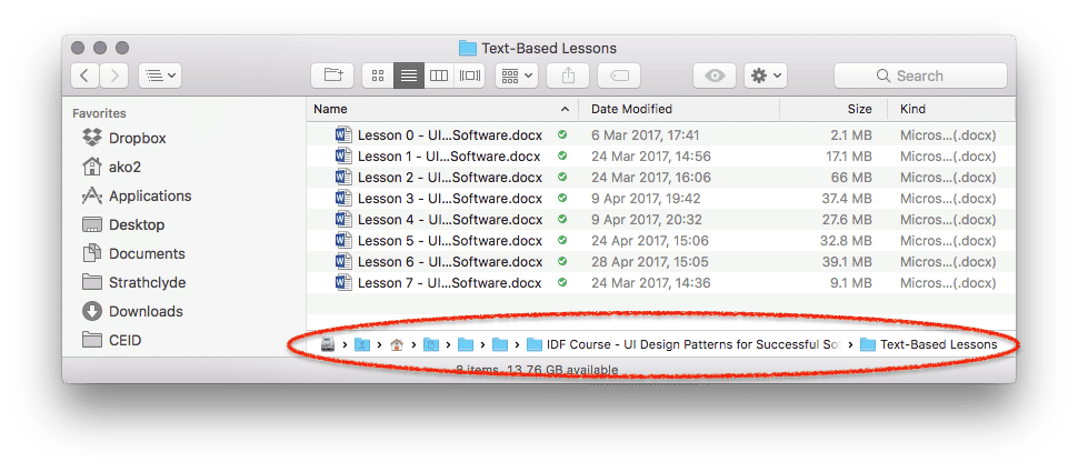
Author/Copyright holder: Apple. Copyright terms and license: Fair Use.
A potential problem with breadcrumbs occurs when the path of crumbs is too long to display. By obscuring the labels from view, the user is unable to know where he will go when clicking one of the folder icons in this example from the Finder application. Additionally, the breadcrumbs are located at the bottom of the window, which may not be where the user will expect to find them. As the previous examples have showed, breadcrumbs are often located just below the top-level navigation opportunities.
The Take Away
Breadcrumbs can help users to navigate through a hierarchy quickly and effortlessly. Many websites are laced with information about products, services, topics, etc. that, by their very nature, have to be nested within categories and sub-categories. Consequently, breadcrumbs serve as an at-a-glance guide or legend, showing how many removes, or clicks away, a page is from the landing page, for instance. Implementing breadcrumbs is relatively simple, as long as you make sure that labels are clear, unambiguous, visible and located just below the top-level navigation opportunities. Using breadcrumbs affords true freedom of movement and encourages exploration of contents. Combined with other user interface design patterns, they will help you create great user experiences.
References & Where to Learn More
Hero Image: Author/Copyright holder: Immanuel Giel. Copyright terms and license: CC0.
Jenifer Tidwell, Designing Interfaces: Patterns for Effective Interaction Design, 2010
Martijn van Welie, Pattern Library, 2008.