
The key word for web designers in the last few years has been “responsive”. The idea is simple, design websites once that automatically work on all screen sizes and devices. It’s a time saving ideal and makes it easier for businesses to maintain a presence online without investing in a completely mobile solution.
But what does that mean for the user experience? Is responsive truly delivering what people want? Or is it a cheap half-way house and instead of being “all things to all men” (or women), more some things to some men, some of the time?
Why Responsive Design Sucks for Me
This article was inspired in part because I have come to hate responsive web design. I know, hate’s a strong word, but that’s exactly how I feel about it.
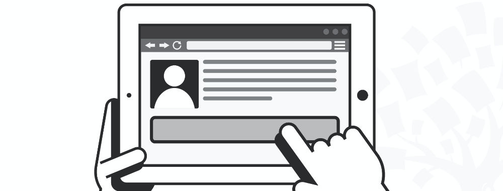
I’m a writer and I work on a desktop computer. I bought that computer because it offers a large amount of screen real estate. The theory was simple, I can research online in my browser in half the screen and write in the other half. This was a pretty good idea – until every website started going responsive.
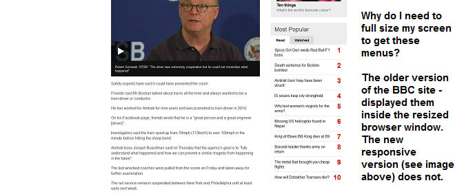
When people say “responsive” what they really mean is… this works well on tiny screens. What I get, on my much larger screen, is a shoddier user experience. Menus which used to appear alongside the text? They’re all gone… unless I maximize the browser window. Text often fails to resize to the browser as well… leaving me with huge fonts and a need to scroll sideways…
The utility of my larger screen is disappearing. I’m OK with catering for mobile users but not at the expense of the rest of us. While 60% of people may access the internet via mobile devices (including tablets), 40% do not. You will almost certainly find that many businesses, etc. aren’t using mobile devices for their day-to-day grunt work. The link in this paragraph shows that mobile use is mainly for leisure and shopping not research and work.

There are other reasons that responsive design can suck the life out of the user experience too:
Why Responsive Design Can Damage the User Experience in Other Ways
Text Can Be Ruined By Line Breaks
You don’t want widows and orphans ruining your prose but using line breaks to protect your text won’t work on responsive designs. The layout on smaller screens can become unmanageable and that means time spent rewriting text so that it works on several formats, which means more testing and more expense to preserve the user experience.
Old Browsers Don’t Like Responsive
Yes, everyone should use the latest edition of their browser but people don’t. You design with mobile in mind for responsive and that leaves people on old browsers with some pretty dreadful stretched screens when they access your site.
Author/Copyright holder: Pietro Zanarini. Copyright terms and licence: CC BY 2.0
Double Input Support is a Must
Responsive can’t tell the difference between touch and mouse input… which means you need to provide for both or leave a large chunk of your audience out in the cold.
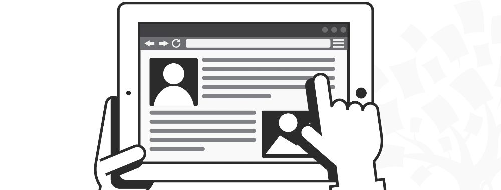
Dynamic Background Images Don’t Work
If you like to use background images, the chances are pretty good that they’re going to look awful on certain screen sizes. Images rarely scale well to fit different screen types.
Vertical Centring is Out of the Question
Vertical centring was always a tough act to pull off but responsive makes it way harder. When elements and rows resize constantly, you need to design clever algorithms to ensure that central position or scrap it altogether.
Page Loading Suffers
It’s a nice idea that we can have the same user experience on every device but it’s really not that case. You have to ensure that all the elements load to deliver the experience. That’s often a slow and painful task on the average smartphone. It means your users are going to experience longer wait times. If you design for mobile, on the other hand, it means your experience won’t be all it can be on the desktop…
Tiny increases in loading times lead to potential customers jumping ship. That’s a big problem. It’s also why so much of internet access on smartphones is via dedicated apps rather than a browser. Apps give a much better user experience for load times than a responsive website can.

Author/Copyright holder: Mihael Mafy. Copyright terms and licence: CC BY-SA 2.0
Animations Can Clash with Responsive Sizing
We like animated elements of websites, when they add to the overall experience, but there’s a growing feeling that animations require a lot more testing within a responsive environment. They seem to be able to mess with page resizing when served in certain sizes.
Checkout Processes Need Careful Thought
There’s a growing body of research that says responsive design checkouts can be much clunkier than their non-responsive counterparts. Bad user experience at shopping checkouts can kill sales. Online payment has to be easy and quick whatever the screen real estate. Otherwise you are losing business… despite the investment in responsive web design.
Final Thoughts on Responsive Web Design
Look, there’s no doubt that responsive web design is a good thing for many users. Smartphones are awesome. It’s not just that they’re handy and convenient. They’re opening up the web to millions of people across the developing world who would otherwise never have been able to get online.
What is true, however, is that responsive web design is not a miracle cure for all screens and sizes. You really need to understand what your users want before you go ahead and deploy responsive design. This is doubly so if the majority of your users access from a desktop or laptop rather than a tablet or mobile device.
We know that the alternative, building multiple versions of your website, comes with its own set of issues and challenges. In particular, maintenance of multiple versions can be a complete PITA. However, there is a good case for doing so in that’s what your users really need.
Header Image: Author/Copyright holder: Intel Free Press. Copyright terms and licence: CC BY-SA 2.0


