
Naomi Robbins, the author of Creating More Effective Graphs commented on our text “Data Visualization for Human Perception” by Stephen Few (owner of Perceptual Edge). She offers some ideas on misleading representations of data. This led us to wonder; how can you design data representations that don’t suck?
The Misleading Graph
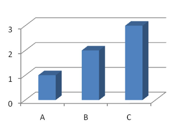
Here’s a simple graph. Yet, it sucks big time. It’s an incredibly simple representation that nearly no-one can read properly. What does it mean? Well… it’s a chart of 1, 2 and 3. Seriously, jump into Excel and plot it yourself and then use their 3-D bar chart to generate it.
If it’s hard to represent 1,2 and 3 in a way that most people can understand; it’s going to be harder to represent meaningful data in graph format right? Well… not exactly.
Rules for Designing Data Representations that Don’t Suck
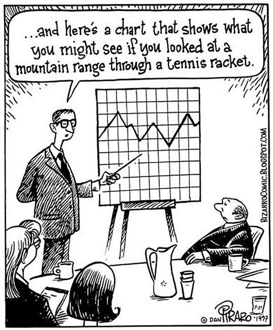
Author/Copyright holder: Dan Piraro. Copyright terms and licence: All rights reserved Img source
Stephen Few offers some very simple guidelines for making meaningful graphs and data representations. If you follow these rules; it should be much easier to make graphs that don’t suck.
The rules are as follows:
Rule 1
It must be clear how values relate to each other. That means you want someone to be able to tell you how one piece of data relates to another. So for example; if you were grouping children at school into age groups and put them into a simple table.
|
Age Group |
Number of Children |
|
7-8 |
25 |
|
8-9 |
32 |
|
9-10 |
23 |
|
10-11 |
27 |
It would be pretty clear that if you added up all the numbers you would get a total number of children in the school. You would then be able to relate each age group to that number as a percentage of the whole.
Rule 2
Quantities must be represented accurately. Our table above represents the quantities for our imaginary school accurately. It’s numbers of children and there are no hidden data to change the accuracy. Nor have we used a scale (such as ‘000s) which might vary the picture.
Rule 3
Qualities should be easy to compare too. The qualities in our table are age groups. They are very straight forward to compare.
Rule 4
It should be easy to find a ranked order of values. You can see, for example, that in our chart there are fewest children in the age group 9-10 and most in the 8-9 age group.
Rule 5
It should be obvious how this information might be useful to the person using the chart. You have to assume that in our example here – the chart might be used by a head teacher to plan class sizes or something similar.
Header Image: Author/Copyright holder: Information Is Beatiful.Copyright terms and licence: All rights reserved. Img


