
Being on a website with your credit card in hand and then not being able to find what you want to buy is a PITA. It’s also expensive for the website owner. If someone can’t find what they’ve come to buy; they aren’t buying it – well they’re not buying it from you, they can probably find it someplace else and buy it there.
We have some simple tips that might make navigation easier and thus improve the UX for your customers:
Use Parent Categories
If your products can be grouped; it makes sense to group them. If I’m looking for a laptop – then I will probably click on any of the following parent categories: Computers, PCs, Laptops, etc.
Author/Copyright holder: Peter Morville. Copyright terms and licence: CC BY-NC 2.0
It is best to keep parent categories reasonably broad because otherwise the user is likely to be overwhelmed by choice. Computers is probably better than laptops if you also sell tablets and/or desktops. Give people a placed to start and make it easy for them to choose.
It’s important to try and pick parent categories with very little overlap. If you offer “Computers” and “Mobile Computing” – where do I go for my laptop?
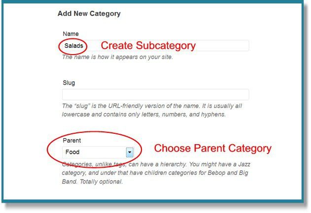
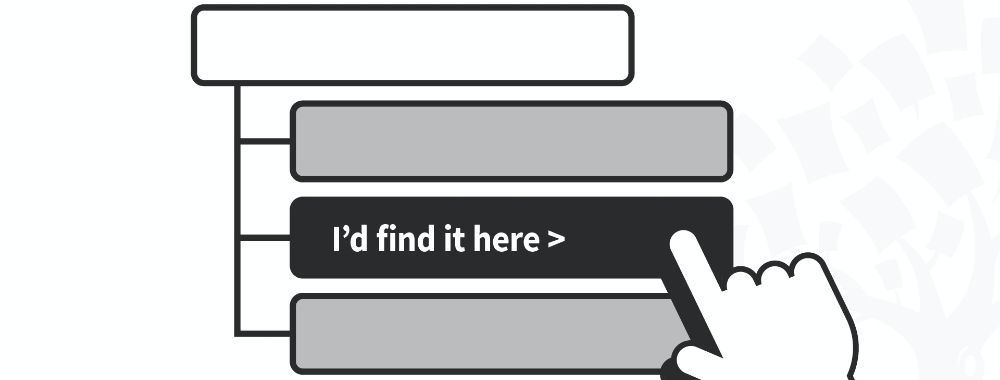
Subcategories Can Be Recycled
Sometimes, you’re going to find that sub-categories – no matter how broad your parent category – belong in two (or more) places. For example; storage products might need to go in the “Storage” category but also in the “Cameras” and “Computers” categories. It’s OK to re-use subcategories. It makes for a better user experience by promoting multiple paths to the same end result.
Author/Copyright holder: wpmudev. Copyright terms and licence: All rights reserved Img source
Be careful about how you implement them though; it can be confusing if a user finds themselves presented with breadcrumbs that don’t match the path they took to the page.
Not All Customers Are New to Your Site – Make New Content Easy to Find
If we visit a website again and again it can be difficult to work out what’s new and what’s not. Users don’t want to waste their time. They want your help finding what they need. You can use a “New Products!” category or even just tag items with “new” and then let people filter them out. This is quick and easy and very rewarding for the time poor but enthusiastic repeat customer.
Make it Easy to Go Back

Author/Copyright holder:Unknown. Copyright terms and licence: Unknown Img source
It’s always a good idea to help your customers find where they have been. Why? Because many customers compare a bag load of similar items before deciding on the one they want. If you have a “Recent” box somewhere on screen; you can make it a one click process for the user to return and make a purchase. You can even extend the concept and show people what other users with similar searches have viewed recently – so that the user can gain a little social reassurance about the products they’re viewing.
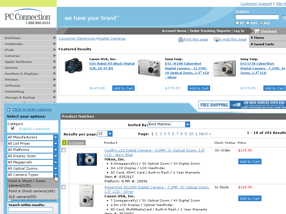
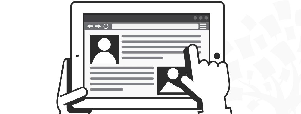
Images Should Link to Products
If you show a picture of a product; make sure that it links to that product’s description. If I see an awesome camera on the home page; I should be able to click it and find out more. This saves time wasting and maximizes the value of the image to the website owner.
Header Image: Author/Copyright holder: The U.S. Army. Copyright terms and licence: CC BY 2.0


