Large companies such as Google and Facebook are experts at showing the right advertisements to the right people. At first glance, this may seem like a pretty nifty feature that actually helps you avoid ads that have nothing to do with who you are or want to be. But it’s actually a dark pattern designed to seduce you into buying more things than you intended. Let’s have a look at how they do it, so you can be more mindful of your users and their real needs when you design for them.
Advertising is a necessary evil, which means designers are constantly trying to find ways that force you into viewing and clicking on links to the sponsors' and advertisers' links. For example, when users sign into their Google mail accounts, what greets them when they choose the 'promotions' option are sponsored advertisements. These are promotions, ones targeting you.
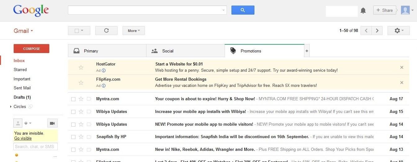
Gmail uses a special Promotions tab to sort out the email messages that have a commercial message. Within this tab, in a screenshot from the 2010s, Google prioritizes advertisements that it adds itself, based on your browsing history. Although indicated with a different background color and the word ‘Ad’, it is an instance of a dark pattern, as the messages serve Google’s own purposes rather than yours.
© Google, Fair Use
Why is this classed as a dark pattern?
Google are prioritizing the contents of your email account on the basis of what serves it (Google) best. Google collects information from your email messages to be able to make its advertisements more and more relevant to the interests you pursue and the activities you undertake. For example, you might be planning a short break in Europe and—within hours—you will receive a sponsored advertisement from a vacation-planning website. Google might give you the impression that providing ever-more relevant advertisements benefits you. By using information from the sponsored links you reject and those you select, Google can improve the economy of advertisements to successful conversions (i.e., websites you visit and make purchases on), which increases its own advertising revenue.
"We Know Where You Are. We Know Where You've Been. We Can More Or Less Know What You're Thinking About."
—Eric Schmidt, former Google CEO
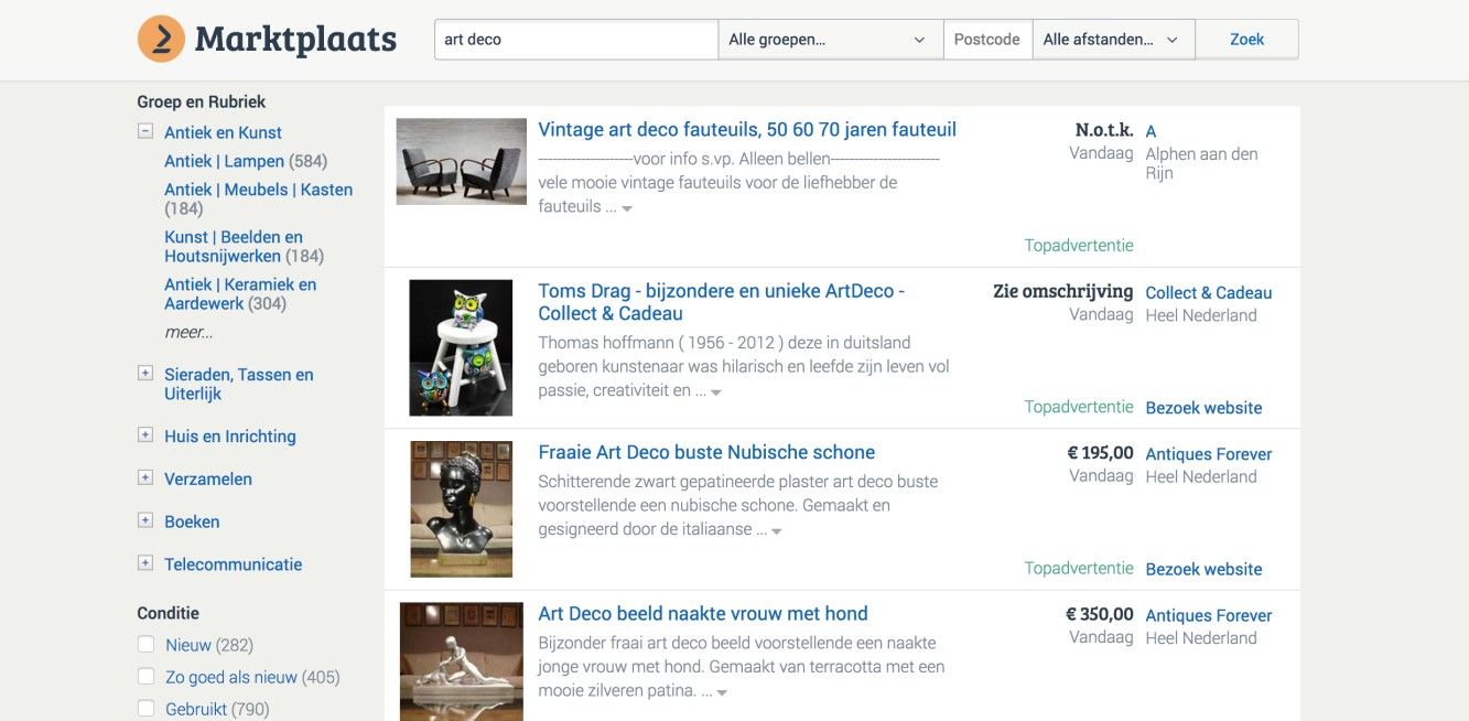
The Dutch Marktplaats (a website where people can sell their personal stuff to others) boldly implemented the prioritized advertisements design pattern—in this years-old screenshot—by placing commercial providers at the top of the list of search results, leaving any private offerings out of first sight. The advertisements can be recognized by the green label ‘Topadvertentie’.
© Marktplaats, Fair Use
In slight defense of Google, the sponsored advertisements here are distinguished from the other promotional emails, with the addition of the word 'Ads' under each message and some slight color difference (as you can see in the image at the top). However, the designers also switched the delete/close function to the right-hand side—unlike all other emails, which have a checkbox on the left-hand side—thus circumventing the users’ automatic approach to deleting messages and making their job harder. Therefore, Google adapted the sponsored advertisements so they are eye-catching and encourage the user to engage with the display consciously in order to work out how to clear the sponsored advertisements.
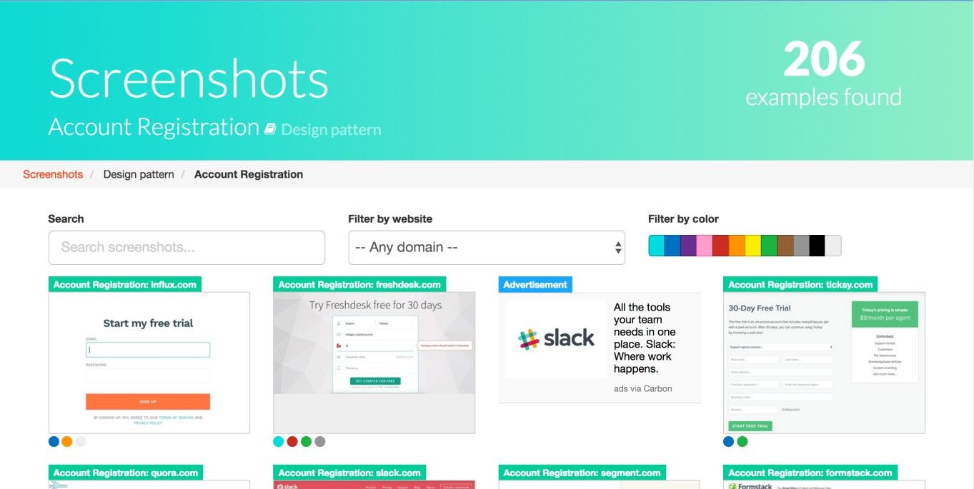
This historical screenshot from the UI Patterns website also sneaks in an advertisement at the top of its search results. Here, advertisements can be distinguished from screenshots of design pattern examples by the blue label ‘Advertisement’.
© UI Patterns, Fair Use
The Take Away
Companies who use the prioritized advertisements design pattern aim to seduce users into buying products or services that third parties offer. It is a dark pattern, because they don’t show users these advertisements because it will help users to do what they want, but rather because it will increase their own revenues. If you want to incorporate prioritized advertisements into your design in a more responsible way, you should at least clearly distinguish the advertisements from the rest of the content. This way, users will be able to ignore the prioritized advertisements while proceeding with their tasks. That means you get the benefit of deriving some traffic in this way while keeping the name of the organization you’re working for that much more clear of cynical, if justified, assumptions.
References and Where to Learn More
Hero Image: © Moyan Brenn , CC BY 2.0.
Jenifer Tidwell, Designing Interfaces: Patterns for Effective Interaction Design, 2010
Martijn van Welie, Pattern Library, 2008
Harry Brignull’s website dedicated to deceptive design