
The design team behind the Interaction Design Foundation got a chance to review UXPin – a collaborative UX Design tool – and here is our review (spoiler: it’s awesome!)
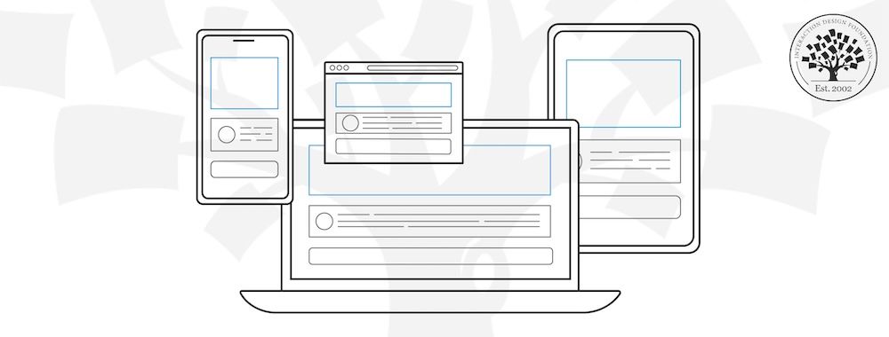
To fully appreciate a tool like UXPin, it’s important to understand the context in which it exists. With the digital revolution rapidly changing the way we interact with the world around us, there has never been a greater demand for well-designed products – both aesthetically and functionally. The design processes that lead to product successes are both multidisciplinary and complex. The tools you use should reflect that. In other words, if your design process involves people from varying professional backgrounds, your tool should support that.
New wireframing and prototyping tools appear almost every day in the market but these tools typically focus only on one part of the design and development process. InVision, for example, is collaborative but not very powerful for creation. Axure, meanwhile, is powerful but not very collaborative. UXPin aims to be the best of both worlds. It’s precisely for this reason that UXPin’s integrative and collaborative approach to building products stands out. UXPin describes itself as a collaborative platform for increasing the speed, quality, and scalability of product creation and that’s exactly how it feels to use the platform. The people who have built UXPin – and now continually evolve its capabilities – have the advantage of 8 years of user feedback and market experience, and this shows in key areas. After having spent time using UXPin, it seems they’ve resisted the temptation of “creeping featurism”, i.e. cluttering their interface with more and more features. Instead, they offer a well-chosen set of capabilities that makes the right tool handy at the right time for team members.
In addition, unnecessary documentation is replaced with a more intuitive way of working. The tool goes a long way in getting rid of the need for a single moment that reflects the transition from design to development. Rather, designers, developers, and product managers can work in a continuum. That’s the collaborative and integrative approach that we mentioned above, which makes UXPin stand out.
We had a chance to explore the key features that make UXPin unique and have listed them below. These are in no way exhaustive as there are countless other features.
Rapid Prototyping
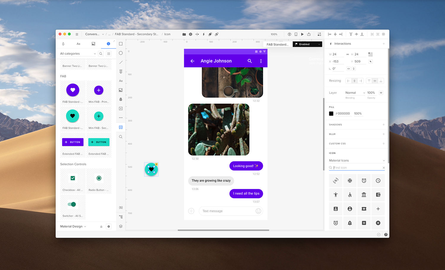
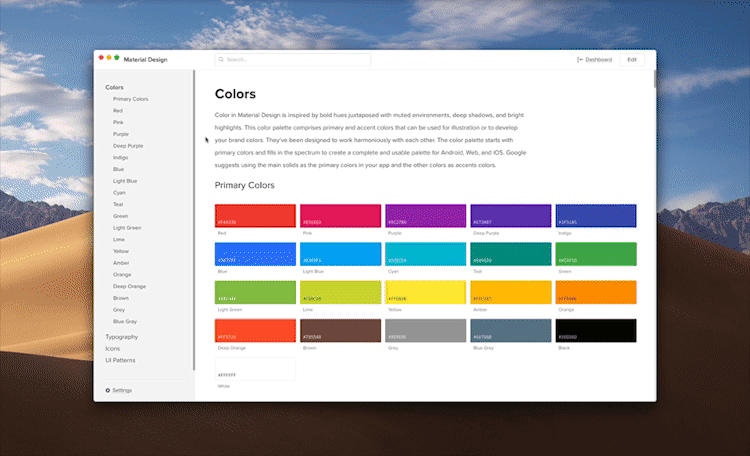
if you're about the speed, UXPin gives you 1000s of ready responsive components for iOS, Material Design, Bootstrap as well as few big sets of icons ready to drag and drop into your design. And if that wasn't enough, you have a nice set of animations that you can pick from and to your interactions and transitions
Interface design
While libraries are extremely helpful for putting together a working prototype quickly, UXPin still allows you plenty of room for customization. You can create your own animations, or use your Photoshop and Sketch files with drag-and drop integration. We appreciated the nice touch of actually preserving the layers in the Photoshop and Sketch files.
Hi-fi Prototypes
While libraries are extremely helpful for putting together a working prototype quickly, UXPin still allows you plenty of room for customization. You can create your own animations, or even add audio and or video to make your prototypes look and feel just like the final product.
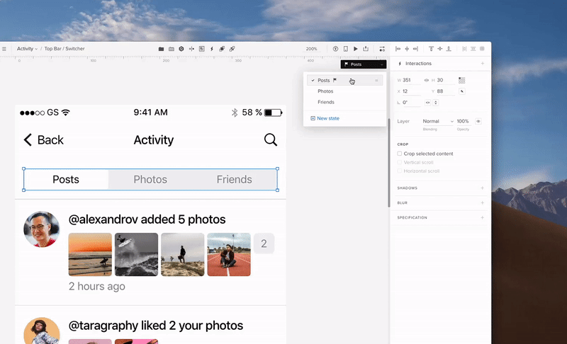
For advanced prototyping, we preferred creating states. In UXPin, which are sets of items, like boxes, buttons, and images grouped as components, that change between configurations upon interaction. For example, two configurations — states — may each show different states of a button. Clicking the element then flips between the states.
It’s pretty simple to create different states. When viewing a particular state, you can move elements within that state, change their styles like color and opacity, hide them altogether, or give them interactions.
Code Snippets & Use Cases
When prototyping, you can also add custom code snippets to any element. As you reuse the element, the code follows along for contextual documentation.
For further clarification, you can also use Contextual documentation to add descriptions of use cases (or whatever other notes you want to attach to elements). It might not be as useful as the code snippets but doesn’t hurt to over-communicate.
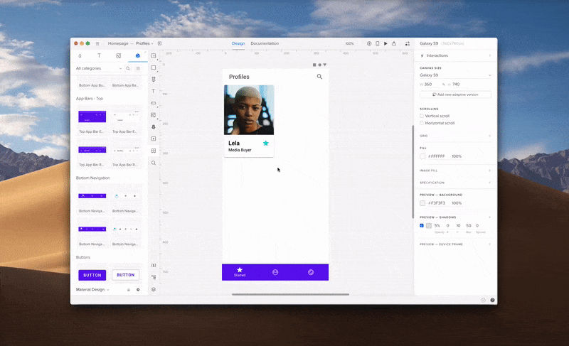
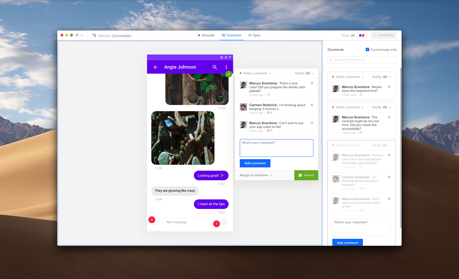
Collaboration and Handoffs
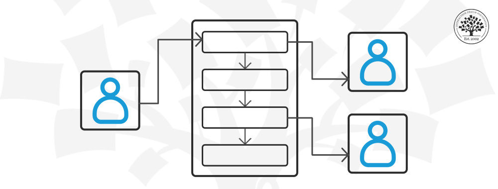
Because each team member has a set of very specialized skills, we’ve often struggled to maintain the macro perspective necessary to build a good product. With real-time collaboration, that changes completely.
Based on the permissions you set for your team, members can co-design in real time with automated notifications for updates and new comments. The need for documentation can be kept within the actual prototype and be read by anyone with a preview link. Going back and forth from the planning table to designing becomes streamlined as the comments turn into contextual feedback that can be immediately acted upon.
Prototype documentation
As you prototype, it helps to jot down any notes for technical nuances and edge cases. Very useful for complex enterprise products.
Specs, assets, and code
For final developer handoff, we switched to specs to auto-generate specifications (colors, typefaces, etc.) and CSS code. If you use Sketch, a useful workflow is to import your file into UXPin, transform the static design into a prototype, then enter Spec Mode for developer handoff.
Different team members can still comment on the prototype at Preview.

Scalable Design Systems
When rapidly scaling your product (rolling out new features, adding cross-platform compatibility), it can be extremely frustrating to get caught in a cycle of redundant work. We found that the Design System Libraries and symbols features definitely help to create a reusable toolkit.
Of course, it takes a bit of time to build your library in the beginning, but you end up saving far more time in the long run.
Design System Libraries
Team pattern libraries not only improve consistency of design but make component-based design a simple matter of dragging and dropping the right elements. There’s no need to refer to a separate style guide, the elements you are working with is your style guide.
Because they live in the cloud, the symbols in the design system libraries in UXPin behave like a more collaborative and consistent version of Symbols in Sketch.
To start building your library, right-click on any element, then click “Add to Library”
Once you’ve built out the library, you can review all the elements in the Design System Library itself.
Components
Components are an exceptionally nifty feature that makes you modify an element just once and automatically update it for your entire product. If you know Adobe Photoshop, then this is like “Smart Objects” in Photoshop: Very, very powerful.
Conclusion
Our conclusion is simple. UXPin is fast, powerful, and naturally collaborative.
Pros
Improved design consistency thanks to Design System Libraries and symbols
Creative freedom in design and prototyping with lo-fi and hi-fi capabilities
Intuitive comment tracking, design approvals, and project tracking
Sketch, Google Fonts, and Slack integrations
No redlining and minimal documentation needed thanks to Spec Mode
Cons
Slight learning curve
No birds-eye view of prototype screens
No Illustrator integration
Overall, our hat’s off to the team. We give UXPin both our very best recommendations and warmest regards!
References
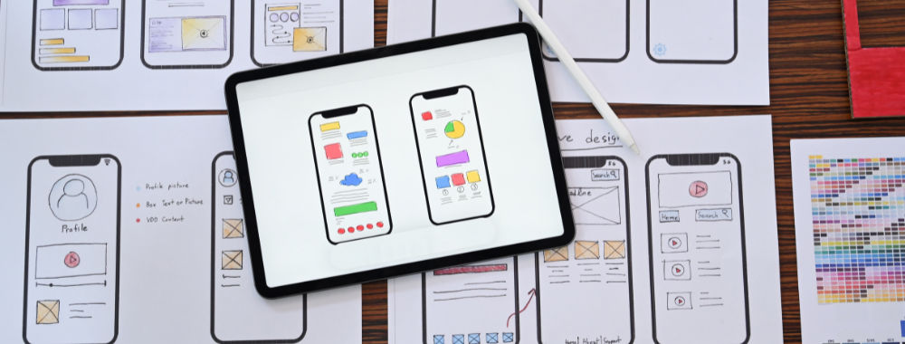
Hero Image: Author/Copyright holder: UXPin. Copyright terms and licence: All rights reserved.
