Advertising is a commercial necessity for any number of application providers and website owners. Yet, the User Experience of such advertising is often terrible. Done badly, online advertising can drive your users away in droves. We can’t offer the formula for the perfect advert (because then we would be multi-millionaire advertising execs) but we can offer some simple tips to make adverts more appealing to your users:
Don’t Interrupt Your Users
Users have an objective when they use your product; if your advertising breaks their process flow in achieving that objective then your users are going to go elsewhere. Interrupting someone’s user experience is a great way to tell them that their needs aren’t important to you and if they aren’t important to you – they’ll find a place where they are important.
Don’t Fake People Out

Author/Copyright holder: thewvsr.com. Copyright terms and licence: All rights reserved Img source
Don’t disguise your advertising as “useful data”. If you place a hyperlink in your content it should go somewhere valuable and not to an advert. You need your users to trust you; if you mislead them into clicking on ads – that trust will be gone forever.
Don’t Automate Play Functions for Video and Audio Ads
The Guardian website this year introduced a video advert in every article which immediately started playing when you landed on the page. This led me to finally install Ad-Blocking in my browser. When I land on the homepage – I open multiple articles at once. Each of these was playing the same video and each one at a slightly different time interval than the other. The noise of the adverts itself was also annoying; I like quiet in my work environment not webpages screaming at me.
Usability Comes First
Author/Copyright holder: Niall Kennedy. Copyright terms and licence: CC BY-NC 2.0
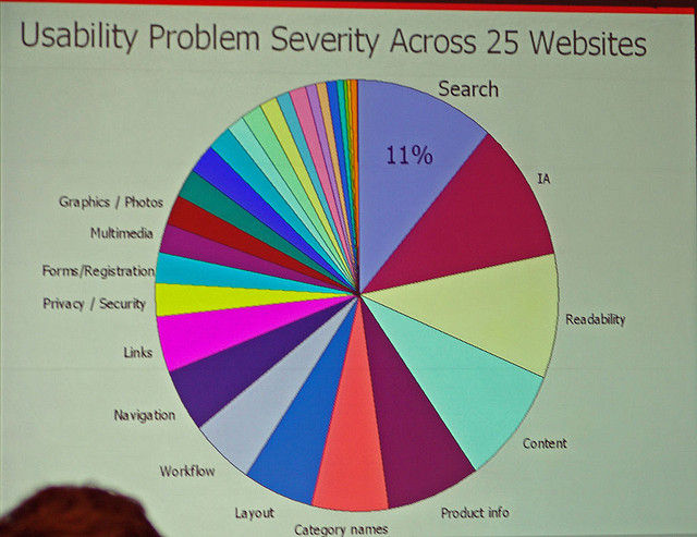
If you adverts detract from the usability of your website or application; it’s the adverts that need to go. You can rework them so that they don’t impair usability but if someone can’t use the site easily – they’re leaving.
No Pre-Registration
If your content is good and I’ve found what you have to offer useful – I’ll happily give you my e-mail address but you’re not having it until I’ve seen what you offer. Don’t force me to fill in a form just to take a wander round your site. That’s the equivalent of being required to show a passport and complete a clubcard registration form just to enter a supermarket.
No Pop-Unders – Not Ever

Author/Copyright holder: Kryptoklix. Copyright terms and licence: All rights reserved Img source
Pop-Unders suck they’re sneaky, devious and underhanded and you deserve users walking away if you use them. Treat people as you’d like to be treated.
Make Adverts Clearly Adverts
If you use advertising content it should be very clear that it’s an advert. Readers want to trust you and that means advertorials, etc. should be marked as such. Don’t mislead people by leaving a tiny print confession at the end of an advert.
Keep Pop Ups to a Minimum Too
Yes, pop ups work but they’re also annoying. One is enough per visit. Keep cluttering my screen space and I’m out of there for good.
Header Image: Author/Copyright holder: Tiger Pixel. Copyright terms and licence: CC BY-NC-ND 2.0


