
Today we’re looking at great UX techniques with a look at what developers can do to improve the UX of the projects that they’re working on.
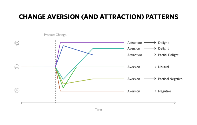
1. Make It Clear to Users When You Change Things
If you make a change to your product or website; you need to let your users know about it. It’s often very frustrating when an experienced user lands in a familiar place to find that nothing works in quite the way they expect it to. You need to draw their attention to changes and ensure that they understand the way that they work.
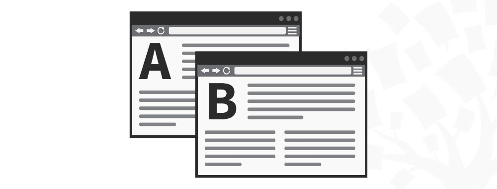
Author/Copyright holder: Digital Telepathy. Copyright terms and licence:All rights reserved Img source
This could be done by highlighting changes in different colours, increasing the weight of the font (or changing the font and/or colour of the font), by adding arrows which draw the attention, and so on… it shouldn’t be too hard to call a user’s attention to the improvements that you’ve made. These improvements also need to be self-explanatory or have an explanation of what they’re for alongside them.
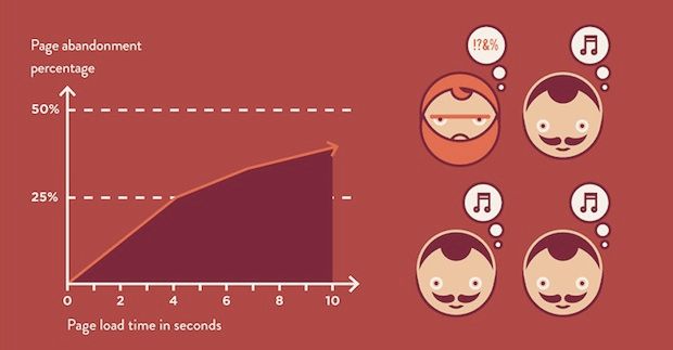
2. Pay Attention to Load Times
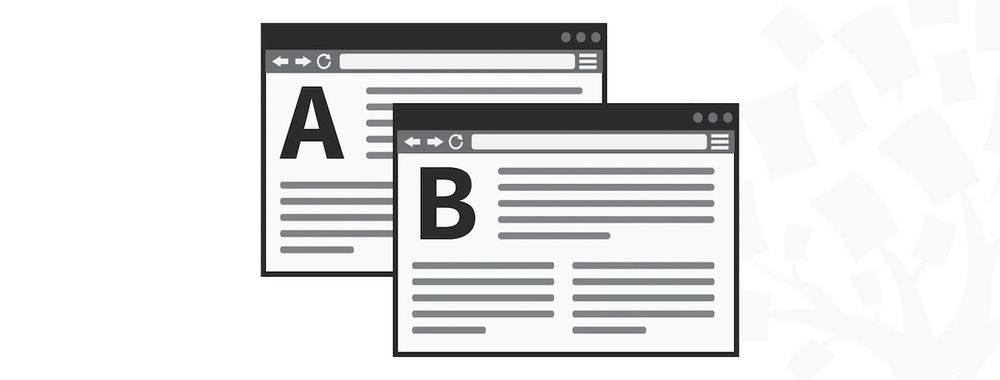
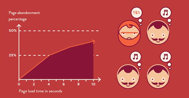
Author/Copyright holder: Fast Company. Copyright terms and licence: All rights reserved Img source
Load times for web presences are really important and yet… all too often they’re completely neglected. Google penalizes sites with long load times on the basis that their research shows that users abandon these sites before the content loads. You can always develop your product so that you load all the static elements first and prioritize content “above the fold” so that the user can get started quickly while other elements take a little longer to appear “below the fold”.
3. Pay Attention to Older Devices
It can be tempting to focus your development efforts on the latest and greatest browsers and platforms but in reality – many people don’t upgrade their hardware often enough for them to have access to all these features and that’s frustrating. Always test your offering with older browsers and hardware and try to ensure that the experience is a consistent one throughout.
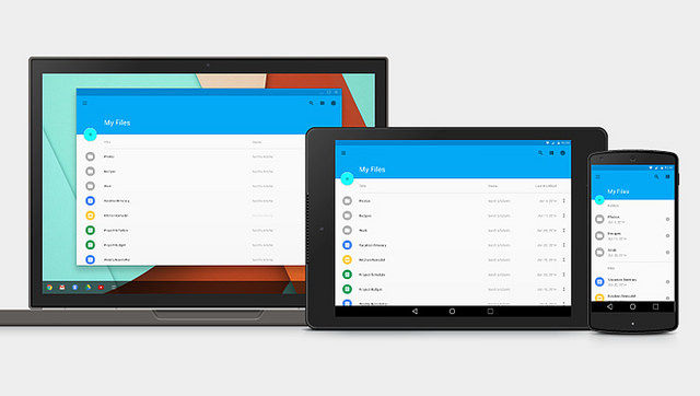
4. Responsive Design Matters
Author/Copyright holder: Isriya Paireepairit. Copyright terms and licence: CC BY-NC 2.0
We’re redeveloping the IxDF website because this matters so much now. Small screens are becoming the standard method of working and playing online. If you’re not catering for a wide-variety of screen sizes your customers are going to get frustrated. Always try and aim for scalable and responsive designs wherever possible.
5. Use HTML 5 Tags Properly
HTML 5 has a wide range of input field specifications and if they’re used properly; the browser will automatically configure the keyboard and input devices to those input specifications. That makes it much easier to fill in forms and particularly, it makes it much easier on mobile devices where screen real estate is at a premium. Look out for fields such as URL, Date, Email, Date, Time, etc.
Header Image: Author/Copyright holder: Design For Use. Copyright terms and licence: All rights reserved. Img


