
There is, perhaps, no area of the user experience that sucks harder than the average terms and conditions page for a website or application. These giant legalese documents are supposed to protect the provider from any possible legal avenue of recourse. In practice, nobody reads them.
It’s been estimated that it takes up to 25 minutes just to plough through most t’s and c’s. Users are way too busy to bother – so they do what everyone has done since time immemorial; they click “I accept” and hope that they haven’t signed over the soul of their first born child in doing so. (In fact in one famous April Fool’s day prank – GameStation actually did take their user’s souls in their t’s and c’s).
This isn’t how it should be. Terms and conditions aren’t fair to a user who isn’t going to read them. We suspect that in Europe, at least, this isn’t going to be allowed for much longer either. You can’t seriously expect to hold someone to terms that they’ve not read. What’s desperately called for here is a simplification of terms and conditions and for them to reflect the bigger user experience picture.
10 Tips for Improving the UX of Terms and Conditions
Use Plain English
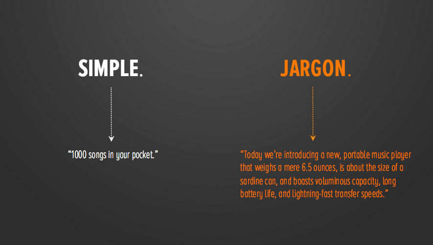
We appreciate that your lawyers need to use lots of legal words and jargon – that’s the nature of the law. The trouble is that this isn’t accessible to the majority of users out there. They aren’t lawyers and they shouldn’t have to be to understand what’s expected of them.
If you can’t dispense with all that legal terminology – you can make it easier to understand. Put summary paragraphs in plain English against each paragraph. If your terminology doesn’t appear in a reduced dictionary (a dictionary which focuses on the most common terms in everyday use) then remove it and find a term that does.
Author/Copyright holder: The Daily Rind. Copyright terms and licence: All rights reserved Img source
Less Words is More
We all know that a picture is worth a thousand words; that’s taken as given in a design community. But what many people fail to appreciate is that a well-constructed sentence is worth a badly constructed paragraph or even a terribly constructed page.
Keeping the number of words in a sentence to a minimum aids reading comprehension. Many users aren’t going to be first language speakers and many first language speakers struggle with long sentences. So keep your word count down.
Simplicity is Important
Just as important as keeping the number of words to a minimum is keeping complexity to a minimum. Sentences with a dozen clauses don’t belong in a user friendly environment. Keep syntax and other linguistic devices simple. Short sentences are better than long sentences.
Paragraphs Should Contain One Simple Idea
The humble paragraph is designed to separate ideas. If your paragraphs are nearly a page long – they’re not serving their purpose.
Put each new idea in a separate paragraph.
This makes it easier for someone to scan the text to find what they need. It also reduces the chances of someone falling into a coma whilst ploughing through your incredibly dull terms and conditions.
And it’s important to remember that to your users – all your terms and conditions are dull.
Use Highlighting to Draw Attention to Key Concepts
Just by using the bold function or the italic function you can draw people’s attention to the really important stuff in your terms and conditions. If you really must, you can also use different colours or sizes of type to do this but it reduces accessibility to disabled users – so only do this if you have a very strong reason to do so. Bold and italic works for everyone.
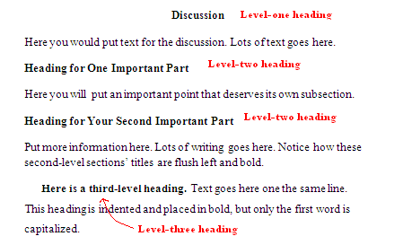
Don’t be Afraid to Use Sub-Headings
Newspapers do it. We do it here on the UX Daily (and we’ve done it in this article). Sub-headings make it easier for text to stand alone and for people to pay attention when they feel they need to. It makes navigating through a long, tedious document much easier. It’s also more aesthetically pleasing. Why? Who knows? It just is.
Author/Copyright holder: Kirsten Borne. Copyright terms and licence: All rights reserved Img source
DON’T SHOUT AT YOUR AUDIENCE
There’s a certain person who writes terms and conditions out there who seems to believe that people who read terms and conditions are visually deaf. THEIR EULAS AND PARAGRAPHS ARE ALWAYS IN BLOCK CAPITALS. This makes reading text really difficult. It’s incredibly impolite in an age where everyone knows that CAPS = shouting.

Author/Copyright holder: David Goehring. Copyright terms and licence: CC BY 2.0
Choose Fonts and Sizes Carefully
No, we’re not going to have an easy pop at Comic Sans here. That’s because everything that it’s possible to say on that subject has been said.
However, everyone knows that some fonts are easier to read than other fonts. So choose fonts that people can get along with as they wade through the t’s and c’s. There’s no need to make them go cross-eyed.
Similarly, choose font sizes that are appropriate. They may call, terms and conditions, the small print but that doesn’t mean it needs to be in 5 point Arial. Tiny fonts are particularly unfair on the visually impaired and might be considered discriminatory in some legal jurisdictions.
Test Terms and Conditions With Your Users
You know this makes sense. This is why you’re a UX designer. There’s no excuse for not testing the usability and overall UX of your terms and conditions with real people. Then you can at least have half a hope that when they’re in the public domain that they will be read and used appropriately.
Keep UX in Mind for Terms and Conditions All The Time
There’s no real excuse for not focusing on the UX of T’s and C’s throughout the design process. You wouldn’t neglect any other area of your site or application – so why neglect this one? Reading doesn’t have to be a chore and in fact, if you do this right – it might even be enjoyable.
Summary
Terms and conditions are a key part of the user experience and they shouldn’t be neglected during the design phase. Put an end to boring walls of text and create something of value to your users instead. Hopefully, the tips above will get you thinking in the right direction.
Header Image: Author/Copyright holder: Unknown. Copyright terms and licence: Unknown. Img


