The concept of Interaction Styles refers to all the ways the user can communicate or otherwise interact with the computer system. The concept belongs in the realm of HCI or at least have its roots in the computer medium, usually in the form of a workstation or a desktop computer. These concepts do however retain some of their descriptive powers outside the computer medium. For example, you can talk about menu selection (defined below) in mobile phones.
In HCI textbooks, such as Shneiderman (1997) and Preece et al. (1994), the types of interaction styles mentioned are usually command language, form fillin, menu selection, and direct manipulation.
26.1 Command language (or command entry)
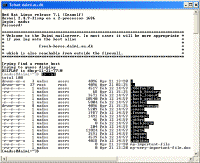
Command language is the earliest form of interaction style and is still being used, though mainly on Linux/Unix operating systems. These "Command prompts" are used by (usually) expert users who type in commands and possibly some parameters that will affect the way the command is executed. The following screen dump shows a command prompt - in this case, the user has logged on to a (mail) server and can use the server's functions by typing in commands.
Click to enlarge.
Figure 1: Command prompt. The command "ls- al" has just been executed
('ls' stands for 'list' and the parameters '-al' specify that the list command should display a detailed list of files).
Command language places a considerable cognitive burden on the user in that the interaction style relies on recall as opposed to recognition memory. Commands as well as their many parameterised options have to be learned by heart and the user is given no help in this task of retrieving command names from memory. This task is not made easier by the fact that many commands (like the 'ls' command in the above example) are abbreviated in order to minimize the number of necessary keystrokes when typing commands. The learnability of command languages is generally very poor.
26.1.1 Advantages and disadvantages of Command Language
Some of the following points are adapted from Shneiderman (1997) and Preece et al. (1994)
Advantages- Flexible.
- Appeals to expert users.
- Supports creation of user-defined "scripts" or macros.
- Is suitable for interacting with networked computers even with low bandwidth.
Disadvantages
- Retention of commands is generally very poor.
- Learnability of commands is very poor.
- Error rates are high.
- Error messages and assistance are hard to provide because of the diversity of possibilities plus the complexity of mapping from tasks to interface concepts and syntax.
- Not suitable for non-expert users.
26.2 Form fillin
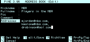
The form fillin interaction style (also called "fill in the blanks") was aimed at a different set of users than command language, namely non-experts users. When form fillin interfaces first appeared, the whole interface was form-based, unlike much of today's software that mix forms with other interaction styles. Back then, the screen was designed as a form in which data could be entered in the pre-defined form fields. The TAB-key was (and still is) used to switch between the fields and ENTER to submit the form. Thus, there was originally no need for a pointing device such as a mouse and the separation of data in fields allowed for validation of the input. Form fillin interfaces were (and still is) especially useful for routine, clerical work or for tasks that require a great deal of data entry. Some examples of form fillin are shown below.
Figure 2.A: Classic Form fillin via a terminal
Figure 2.B: More modern-day form fillin,
could be from a web page.
Even today, a lot of computer programs like video rental software, financial systems, pay roll systems etc. are still purely forms-based.
26.2.1 Advantages and disadvantages of Form Fillin
Some points below are adapted from Shneiderman (1997) and Preece et al. (1994).
Advantages- Simplifies data entry.
- Shortens learning in that the fields are predefined and need only be 'recognised'.
- Guides the user via the predefined rules.
- Consumes screen space.
- Usually sets the scene for rigid formalisation of the business processes.
Please note that "form fillin" is not an abbreviation of "form filling". Instead, it should be read "form fill-in".
26.3 Menu selection
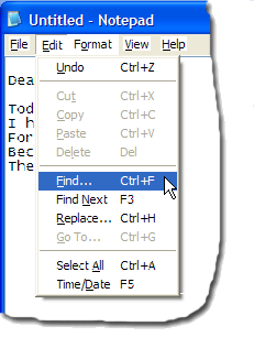
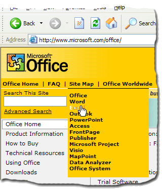
A menu is a set of options displayed on the screen where the selection and execution of one (or more) of the options results in a state change of the interface (Paap and Roske-Hofstrand, 1989, as cited in Preece et al. 1994). Using a system based on menu-selection, the user selects a command from a predefined selection of commands arranged in menus and observes the effect. If the labels on the menus/commands are understandable (and grouped well) users can accomplish their tasks with negligible learning or memorisation as finding a command/menu item is a recognition as opposed to recall memory task (see recall versus recognition). To save screen space menu items are often clustered in pull-down or pop-up menus. Some examples of menu selection is shown below.
Figure 3.A: Contemporary menu selection
(Notepad by Microsoft Cooperation)
Figure 3.B: Menu selection in the form of a webpage (microsoft.com).
Webpage in general can be said to be based on menu selection.
26.3.1 Advantages and disadvantages of Menu Selection
Some points below are adapted from Shneiderman (1997) and Preece et al. (1994).
Advantages- Ideal for novice or intermittent users.
- Can appeal to expert users if display and selection mechanisms are rapid and if appropriate "shortcuts" are implemented.
- Affords exploration (users can "look around" in the menus for the appropriate command, unlike having to remember the name of a command and its spelling when using command language.)
- Structures decision making.
- Allows easy support of error handling as the user's input does not have to be parsed (as with command
language).
- Too many menus may lead to information overload or complexity of discouraging proportions.
- May be slow for frequent users.
- May not be suited for small graphic displays.
26.4 Direct manipulation
Direct manipulation is a central theme in interface design and is treated in a separate encyclopedia entry (see this). Below, Direct manipulation is only briefly described.
The term direct manipulation was introduced by Ben Shneiderman in his keynote address at the NYU Symposium on User Interfaces (Shneiderman 1982) and more explicitly in Shneiderman (1983) to describe a certain ‘direct’ software interaction style that can be traced back to Sutherlands sketchpad (Sutherland 1963). Direct manipulation captures the idea of “direct manipulation of the object of interest” (Shneiderman 1983: p. 57), which means that objects of interest are represented as distinguishable objects in the UI and are manipulated in a direct fashion.
Direct manipulation systems have the following characteristics:
- Visibility of the object of interest.
- Rapid, reversible, incremental actions.
- Replacement of complex command language syntax by direct manipulation of the object of interest.
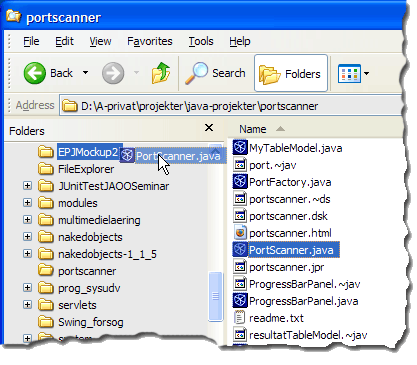
Figure 4.A: The text-book example of Direct Manipulation, the Windows File Explorer,
where files are dragged and dropped.
Click to enlarge.
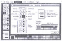
Figure 4.B: One of the earliest commercially available
direct manipulation interfaces was MacPaint.
26.4.1 Advantages and disadvantages of Direct Manipulation
Some points below are adapted from Shneiderman (1997) and Preece et al. (1994).
Advantages- Visually presents task concepts.
- Easy to learn.
- Errors can be avoided more easily.
- Encourages exploration.
- High subjective satisfaction.
- Recognition memory (as opposed to cued or free recall memory)
- May be more difficult to programme.
- Not suitable for small graphic displays.
- Spatial and visual representation is not always preferable.
- Metaphors can be misleading since the “the essence of metaphor is understanding and experiencing one kind of thing in terms of another” (Lakoff and Johnson 1983: p. 5), which, by definition, makes a metaphor different from what it represents or points to.
- Compact notations may better suit expert users.
