Welcome back to some great UX tips and tricks to get your project's UX practices on key!
Pre-Made Palettes Rock
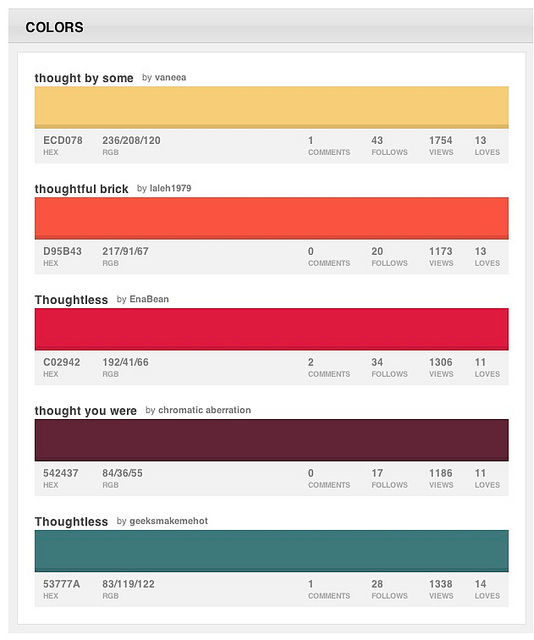
Author/Copyright holder: Amber Case. Copyright terms and licence: CC BY-NC 2.0
Of course you’re going to want to customize the look and feel of your website. One of the easiest ways to do that is to change the colours. We’d encourage everyone to do just that but to save time and energy; we’d recommend that you pick your palette from a pre-made library and then adjust it to suit. That’s a great way to get what you want with much less work than starting from scratch.
No Frustrating Forms
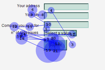
Author/Copyright holder: Rosenfeld Media. Copyright terms and licence: CC BY 2.0
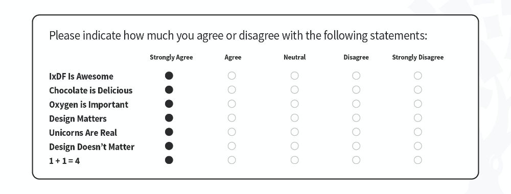
We’d prefer that all forms in existence just accepted whatever we type in their fields. We know it’s not going to happen because some data must be in a certain format but it would be nice if that could be kept to a minimum. Secondly, it would be really useful if your form told us as soon as we made a mistake and not after we hit the submit button – particularly if clicking on submit with erroneous data leaves us having to fill in the whole form from scratch again. Treat us like children and hand hold us to the format you want.
Plan Content
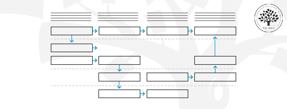
Your content team will love you for this and it will be easier to know what you need and where. Just set up a simple Excel sheet and fill it with the screen name, what the content is required for, the message, and any calls to action that might be needed for someone to move on from that content. Leave space for others in the team to make notes and share the plan as soon as possible with your team.
Content Should Tell a Story
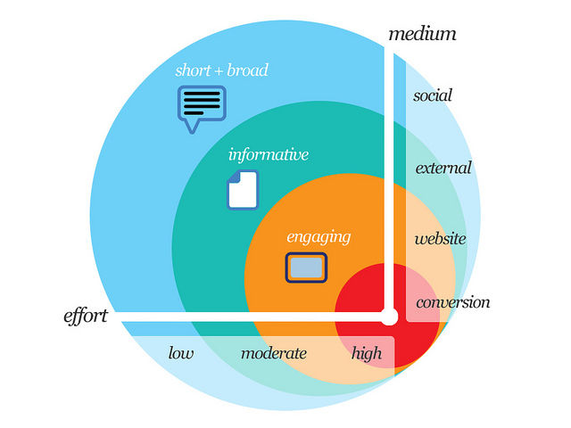
Author/Copyright holder: Troy Thompson. Copyright terms and licence: CC BY 2.0
There are a million reasons that your content should tell a story; one of the best reasons is the simplest – we relate to stories. When you next talk to someone about anything; see how many times they tell a story to explain a point or to emphasize why something matters to them. Human beings make sense of reality by telling stories. So help people make sense of your content by making it into a story – the story doesn’t have to be all in words; pictures can really bring a story to life too.
Speak the Same Language as Your Users
Seriously, it doesn’t matter what industry you are in – if you don’t talk in the language of your users; they won’t want to deal with you. If, for example, you are building an app for the teenage market – you should probably know they don’t say things like groovy or awesome so much anymore. You may need to learn a whole new bunch of slang to get this right.
Header Image: Author/Copyright holder: Jeff Patton. Copyright terms and licence: All rights reserved. Img


