
Now, our guess is that you’re quite an experienced computer user. Perhaps Linux is a bridge too far, but using Windows or Mac OS X will not have many secrets anymore. We can imagine you’re multitasking right now, reading this article, and keeping an eye on your incoming email at the same time. From a design perspective, you’re an expert user, adept at arranging information on your screen to meet your needs. Multitasking with Photoshop, email, and Word documents would be impossible without the design pattern explained here: movable pieces.
The Design Problem
Users are working with different applications at once. The applications don’t need to be arranged in a specific configuration, and the users would benefit from being able to change the position of one or more of the windows or panels. Let’s picture a scene, for instance, where a user is about to sit down to watch a streaming movie, while relisting his eBay items at new prices, while drafting a well-worded email to his aunt Mildred, who lives in another country and to whom it has taken three months for him to find the time to write.
He’s determined to get the email off to her that evening, but he needs to try pushing his unwanted items on eBay (including some sweaters his aunt gave him), and—as it’s the evening and he’s had a hard day at work—he wants to unwind with a movie. He wants to keep the movie playing in a small window towards the right of his laptop screen. Meanwhile, on the left, he’s going to want to have a browser open with three windows (Yahoo, Facebook, and eBay). At the same time, he’ll need Word open, as he wants to write a good email and—as his aunt is very ‘proper’—he’ll want to spellcheck the document to death before even thinking about cutting and pasting it into an email.
He’s going to need to flip between the Word document and the eBay page intermittently, as one idea comes to him for the letter and another comes to him about his pricing strategy. Suddenly, he remembers his aunt doesn’t use Instagram or Facebook, so he’ll have to upload her some pics of his new apartment from a memory stick – and will need another mini-window to go through that. For our user to get things done while he manages to unwind at the same time, he’s going to need to be in control of what he gets to examine at a time and fine-tune any mini-screens so they don’t invade his movie as it plays. For us as designers, this is the intimate reality of our users’ worlds; we need to let them have their own ways to see and do things, within reason.
The Design Solution
Where appropriate, allow users to resize and move panels around the user interface. If they are likely to want or need to multitask, give them the chance to switch panels around to suit their comfort and switch up smaller ones to make them larger. They should be able to adjust the size of the screens in a freestyle way, by dragging borders at the sides or shrinking/expanding panels from the corners. The name of the game is giving free rein to users so they can interact with sites and screens in a way that keeps them happy.
Why Choose a Movable Pieces Design Pattern?
The ability to customize displays can help users improve their productivity. Over time, users become more and more adept at arranging information and graphical user interface elements to support their needs better. Each person will likely have an ideal arrangement, or one he or she has simply become accustomed to; so, imposing restrictions on them such as fixed and immovable panels limits the potential for them to arrange the user interface to support frequently performed tasks. For example, our user in the scenario is used to concentrating his attention to the left (a practice reinforced by the position of his workstation in the office); so, the movie playing at the right of the screen will be there more as a point of comfort. He’s already seen the movie numerous times—he just wants it on as background, or to keep him ‘company’, while he takes on the hard work of pushing 25 unsold items on eBay and thinking up the right words so as to keep his aunt from complaining about his not writing to her to his mother.
With practice, a user learns where items are and how to get to them in the shortest possible time. Even when the tools needed for a task are in different panels, the user's spatial memory enables him or her to switch from piece to piece promptly and seamlessly. An important thing to remember here is that, although the objective is to facilitate multitasking, users will build up their arrangements by opening and adjusting items (e.g., a YouTube screen) on a panel-by-panel basis; so, they need to focus on customizing a comfortable arrangement of panels by first customizing the size and position of each panel.
“The man who chases two rabbits catches neither.”
—Confucius, ancient Chinese teacher, editor, politician, and philosopher
The ability to customize the user interface in this way also allows users to prioritize their tasks and actions. For example, many users will indeed want to have a video playing in the background while they write a document, so they shrink the video window but make the document window larger. Of course, emails and social media updates will enter the picture at some point, so the user will want to click between screens so as to see what’s happening. If it’s something really noteworthy—for instance, a friend instant messages him—the user will want to keep that window open, perhaps at the bottom right of the screen. A key point here is remembering that we should keep the convenience level high, so the user never has to resort to a secondary device. After all, that smartphone or tablet may be recharging in another room.
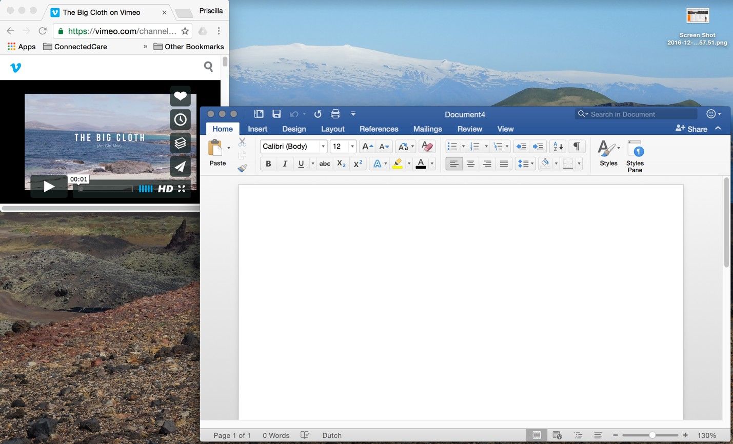
Author/Copyright holder: Microsoft and Vimeo. Copyright terms and license: Fair Use.
Movable pieces allow users to prioritize their own tasks and actions. For example, this convenience allows a user to have a video playing in the background while writing a document.
Best Practice: How to Implement Movable Pieces
Provide the users with small indicators which inform them of the opportunity to resize panels. Usually, the cursor changes to a horizontal, bi-directional arrow when hovered over the very outer edges of a panel.
Additionally, provide a 'maximize' square in the top right- or left-hand corner of the panel, so the user can quickly view a panel in full-screen mode.
When the panel is in full-screen mode, allow the user to revert back to the previous arrangement, by switching the 'maximize' icon to a 'restore down' icon. Ensure the previous state is automatically saved; otherwise, 'restore down' will change the customized arrangement.
If you only want to permit a certain level of customization, such as limiting how far along the screen panels can be moved or how small they can be reduced to, then you must set certain parameters. Likewise, if you do not want the user to overlap panels, then you must establish some sort of grid in which all of the panels can be moved or resized.
So as to allow for quick and easy movement, you need to implement a handle somewhere on the panels, so the user can grab one and place it somewhere else on the screen.
If the users decide they no longer want or need the customized layout, they would benefit from a 'revert to default' action. Add this option so it is either visible within the current panel(s) or in a clearly labelled and easily accessed position deeper in the user interface. So, with a click, users can warp back to the way they found things.
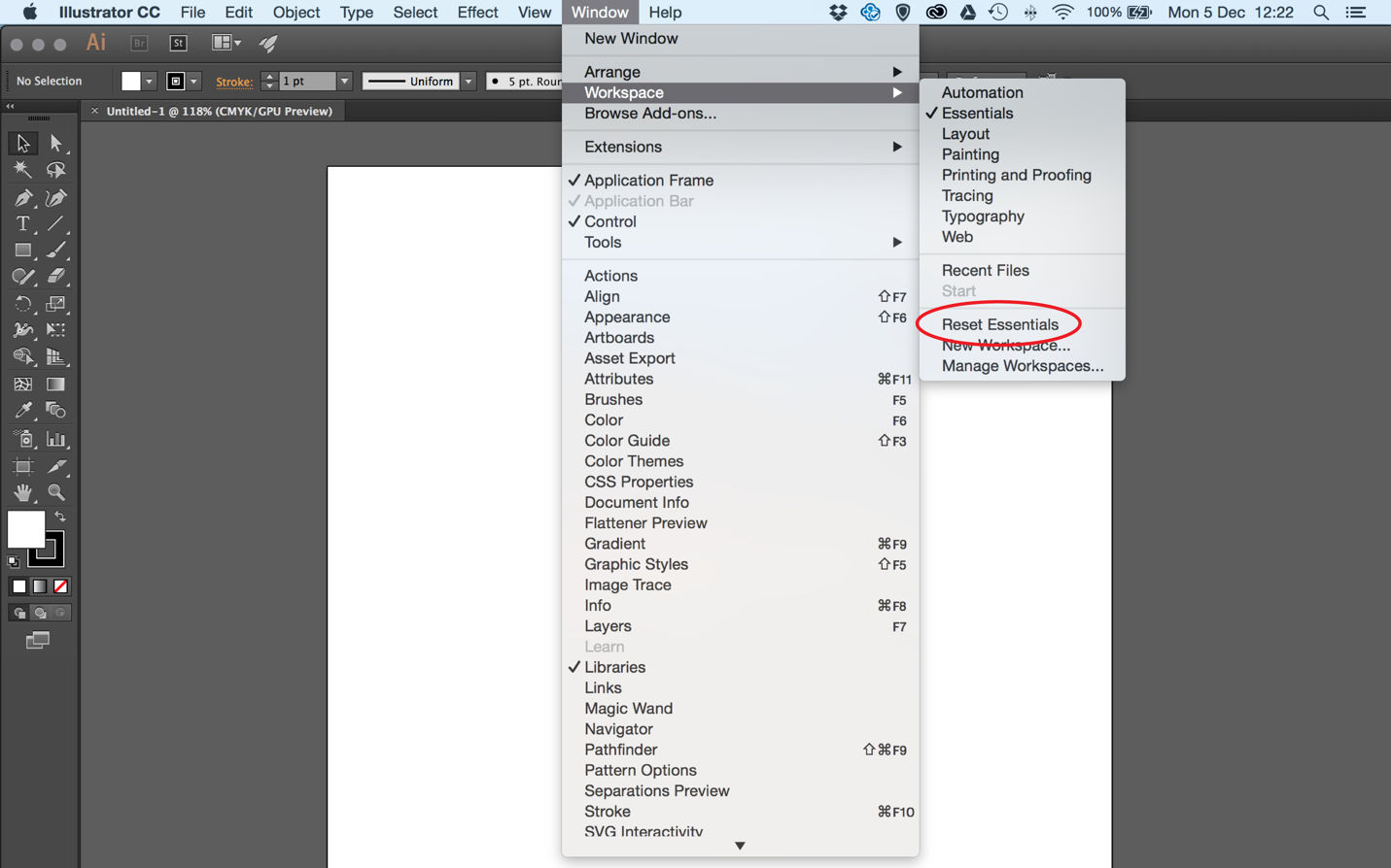
Author/Copyright holder: Adobe. Copyright terms and license: Fair Use.
The ‘revert to default’ action is provided by Adobe in its creative suite. Expert users often rearrange their panels to fit their workflow best. When they decide they would no longer benefit from the customized view, they are helped by the resetting option.
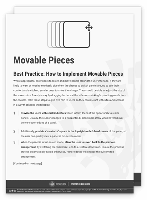
To help you get started implementing movable pieces, you can download and print our “Movable Pieces” template:
Potential Problems with Movable Pieces
Movable panels are generally a problem-free user interface design pattern; the only potential problem is if the user changes the layout and doesn’t know how to switch to the original or default arrangement. As stated above, a simple 'revert to default' option would allow the user to tidy the user interface with the click of the mouse.
Also, arranging multiple screens to support multitasking may become too time-consuming—especially when you want to view multiple applications side by side, while using the maximum amount of space on your screen for visibility. This is where small and simple applications such as Spectacle (shown in the example below) can help. Users therefore have guidance on optimizing views without making compromises or having to spend time manually adjusting panels.
Above all, remember that the line between entertainment and “getting stuff done” is blurred in the 21st century, at least in terms of what happens on one screen at a given moment. With the advent of streaming and the prevalence of YouTube, increasing numbers of users are getting their TV, movie, and other audiovisual ‘fixes’ on the same screen and at the same time as they’re chatting to friends, paying bills, doing research for essays, writing poetry – you name it. For them, this is more comfortable—not to mention economical—than having the TV on and having to look up from what they’re doing every few moments. For us as designers, that means we have even less room in which to offer them flexibility with the panels they are using to interact or work with. So, proceeding with insight into this phenomenon should help us help users to help themselves.
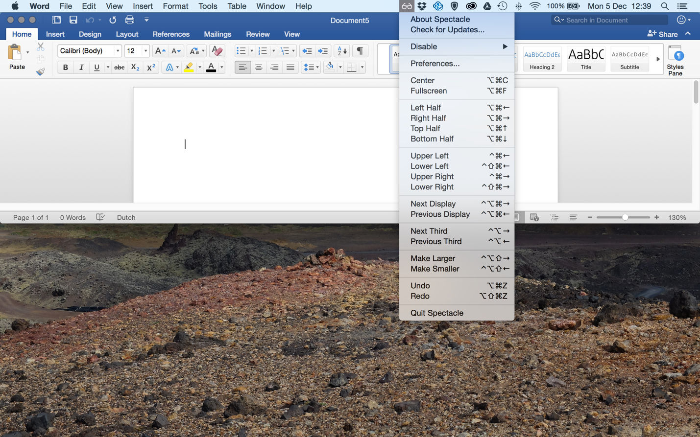
Author/Copyright holder: Spectacle. Copyright terms and license: Fair Use.
The Spectacle app supports the design pattern of movable pieces by giving the user shortcuts for quickly resizing and positioning windows on the screen.
The Take Away
You can support users’ workflow by letting them have control over how their windows and panels are positioned. Especially when users are multitasking, it helps them to find their own preferred way through the content they need, as they will have many panels open and they will need to switch between them. If you allow users to move separate pieces of content around the screen freely, they will have optimal control. This basic, but essential design pattern is called ‘movable pieces’ and is especially useful when designing for an expert user group. The most important consideration to make when implementing this design pattern is how to give the user the right cues for controlling the panels, such as icons or other indicators. Finally, consider including a ‘revert to default’ option to allow users to return to neutral. Multitasking is all about ‘many’, which means getting lost in a whirlwind of information and unintentionally resized windows can happen all too easily. With an easy-to-notice set of icons that can help users make their ideal panel arrangements and zip to and from, your design will be sure to click with even the most peculiar user tastes.
References & Where to Learn More
Hero Image: Author/Copyright holder: José M Macías. Copyright terms and license: CC BY-SA 2.0.
Jenifer Tidwell, Designing Interfaces: Patterns for Effective Interaction Design, 2010
Martijn van Welie, Pattern Library, 2008


