How can you design computer displays that are as meaningful as possible to human viewers? Answering this question requires understanding of visual representation - the principles by which markings on a surface are made and interpreted. The analysis in this article addresses the most important principles of visual representation for screen design, introduced with examples from the early history of graphical user interfaces. In most cases, these principles have been developed and elaborated within whole fields of study and professional skill - typography, cartography, engineering and architectural draughting, art criticism and semiotics. Improving on the current conventions requires serious skill and understanding. Nevertheless, interaction designers should be able, when necessary, to invent new visual representations.
Introduction to Visual Representation by Alan Blackwell
Alan Blackwell on applying theories of Visual Representation
5.1 Typography and text
For many years, computer displays resembled paper documents. This does not mean that they were simplistic or unreasonably constrained. On the contrary, most aspects of modern industrial society have been successfully achieved using the representational conventions of paper, so those conventions seem to be powerful ones. Information on paper can be structured using tabulated columns, alignment, indentation and emphasis, borders and shading. All of those were incorporated into computer text displays. Interaction conventions, however, were restricted to operations of the typewriter rather than the pencil. Each character typed would appear at a specific location. Locations could be constrained, like filling boxes on a paper form. And shortcut command keys could be defined using onscreen labels or paper overlays. It is not text itself, but keyboard interaction with text that is limited and frustrating compared to what we can do with paper (Sellen and Harper 2001).
But despite the constraints on keyboard interaction, most information on computer screens is still represented as text. Conventions of typography and graphic design help us to interpret that text as if it were on a page, and human readers benefit from many centuries of refinement in text document design. Text itself, including many writing systems as well as specialised notations such as algebra, is a visual representation that has its own research and educational literature. Documents that contain a mix of bordered or coloured regions containing pictures, text and diagrammatic elements can be interpreted according to the conventions of magazine design, poster advertising, form design, textbooks and encyclopaedias. Designers of screen representations should take care to properly apply the specialist knowledge of those graphic and typographic professions. Position on the page, use of typographic grids, and genre-specific illustrative conventions should all be taken into account.
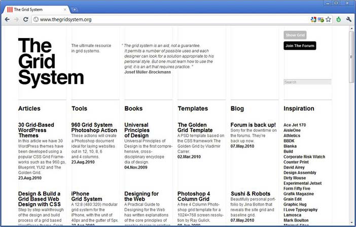
Author/Copyright holder: Unknown (pending investigation). Copyright terms and licence: Unknown (pending investigation). See section "Exceptions" in the copyright terms below.
Figure 5.1: Contemporary example from the grid system website
![]()
Author/Copyright holder: Unknown (pending investigation). Copyright terms and licence: Unknown (pending investigation). See section "Exceptions" in the copyright terms below.
Figure 5.2: Example of a symbolic algebra expression (the single particle solution to Schrodinger's equation)
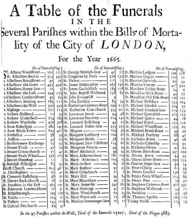
Author/Copyright holder: Unknown (pending investigation). Copyright terms and licence: Unknown (pending investigation). See section "Exceptions" in the copyright terms below.
Figure 5.3: Table layout of funerals from the plague in London in 1665
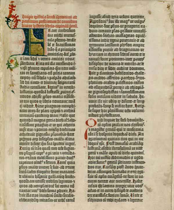
Author/Copyright holder: Unknown (pending investigation). Copyright terms and licence: Unknown (pending investigation). See section "Exceptions" in the copyright terms below.
Figure 5.4: Tabular layout of the first page of the Gutenberg Bible: Volume 1, Old Testament, Epistle of St. Jerome. The Gutenberg Bible was printed by Johannes Gutenberg, in Mainz, Germany in the 1450s
5.1.1 Summary
Most screen-based information is interpreted according to textual and typographic conventions, in which graphical elements are arranged within a visual grid, occasionally divided or contained with ruled and coloured borders.
Where to learn more:
Resnick, Elizabeth (2003): Design for Communication: Conceptual Graphic Design Basics. Wiley
5.2 Maps and graphs
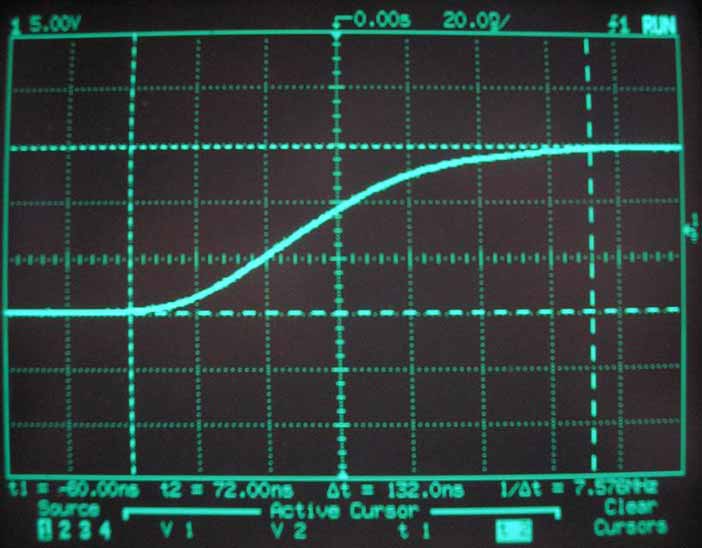
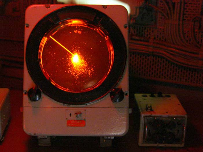
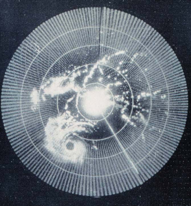
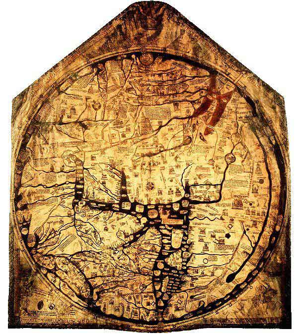
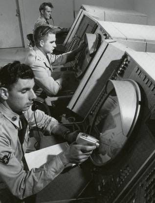
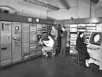
The computer has, however, also acquired a specialised visual vocabulary and conventions. Before the text-based computer terminal (or 'glass teletype') became ubiquitous, cathode ray tube displays were already used to display oscilloscope waves and radar echoes. Both could be easily interpreted because of their correspondence to existing paper conventions. An oscilloscope uses a horizontal time axis to trace variation of a quantity over time, as pioneered by William Playfair in his 1786 charts of the British economy. A radar screen shows direction and distance of objects from a central reference point, just as the Hereford Mappa Mundi of 1300 organised places according to their approximate direction and distance from Jerusalem. Many visual displays on computers continue to use these ancient but powerful inventions - the map and the graph. In particular, the first truly large software project, the SAGE air defense system, set out to present data in the form of an augmented radar screen - an abstract map, on which symbols and text could be overlaid. The first graphics computer, the Lincoln Laboratory Whirlwind, was created to show maps, not text.
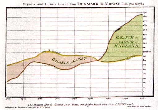
Author/Copyright holder: Unknown (pending investigation). Copyright terms and licence: Unknown (pending investigation). See section "Exceptions" in the copyright terms below.
Figure 5.5: The technique invented by William Playfair, for visual representation of time series data.
Author/Copyright holder: Courtesy of Premek. V. Copyright terms and licence: pd (Public Domain (information that is common property and contains no original authorship)).
Figure 5.6: Time series data as shown on an oscilloscope screen
Author/Copyright holder: Courtesy of Remi Kaupp. Copyright terms and licence: CC-Att-SA (Creative Commons Attribution-ShareAlike 3.0 Unported)
Figure 5.7: Early radar screen from HMS Belfast built in 1936
Author/Copyright holder: Courtesy of NOAA's National Weather Service. Copyright terms and licence: pd (Public Domain (information that is common property and contains no original authorship)).
Figure 5.8: Early weather radar - Hurricane Abby approaching the coast of British Honduras in 1960
Author/Copyright holder: Unknown (pending investigation). Copyright terms and licence: Unknown (pending investigation). See section "Exceptions" in the copyright terms below.
Figure 5.9: The Hereford Mappa Mundi of 1300 organised places according to their approximate direction and distance from Jerusalem
Author/Copyright holder: Courtesy of Wikipedia. Copyright terms and licence: Unknown (pending investigation). See section "Exceptions" in the copyright terms below.
Figure 5.10: The SAGE system in use. The SAGE system used light guns as interaction devices.
Author/Copyright holder: The MITRE Corporation. Copyright terms and licence: All Rights Reserved. Reproduced with permission. See section "Exceptions" in the copyright terms below.
Figure 5.11: The Whirlwind computer at the MIT Lincoln Laboratory
5.2.1 Summary
Basic diagrammatic conventions rely on quantitative correspondence between a direction on the surface and a continuous quantity such as time or distance. These should follow established conventions of maps and graphs.
Where to learn more:
MacEachren, Alan M. (2004): How Maps Work: Representation, Visualization, and Design. The Guilford Press
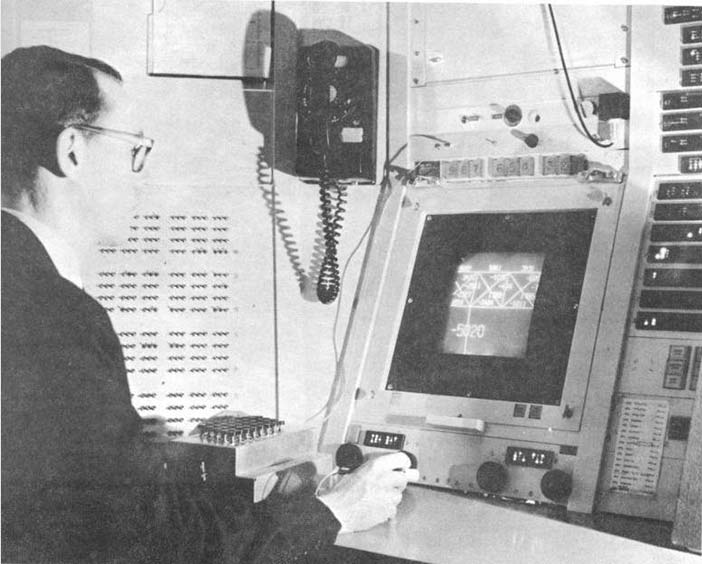
5.3 Schematic drawings
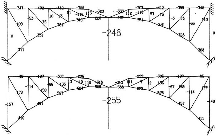
Ivan Sutherland's groundbreaking PhD research with Whirlwind's successor TX-2 introduced several more sophisticated alternatives (Sutherland 1963). The use of a light pen allowed users to draw arbitrary lines, rather than relying on control keys to select predefined options. An obvious application, in the engineering context of Massachusetts Institute of Technology (MIT) where Sutherland worked, was to make engineering drawings such as the girder bridge in Figure 13. Lines on the screen are scaled versions of the actual girders, and text information can be overlaid to give details of force calculations. Plans of this kind, as a visual representation, are closely related to maps. However, where the plane of a map corresponds to a continuous surface, engineering drawings need not be continuous. Each set of connected components must share the same scale, but white space indicates an interpretive break, so that independent representations can potentially share the same divided surface - a convention introduced in Diderot's encyclopedia of 1772, which showed pictures of multiple objects on a page, but cut them loose from any shared pictorial context.
Author/Copyright holder: Courtesy of Ivan Sutherland. Copyright terms and licence: CC-Att-SA-3 (Creative Commons Attribution-ShareAlike 3.0).
Figure 5.12: The TX-2 graphics computer, running Ivan Sutherland's Sketchpad software
Author/Copyright holder: Courtesy of Ivan Sutherland. Copyright terms and licence: CC-Att-SA-3 (Creative Commons Attribution-ShareAlike 3.0).
Figure 5.13: An example of a force diagram created using Sutherland's Sketchpad
Author/Copyright holder: Unknown (pending investigation). Copyright terms and licence: Unknown (pending investigation). See section "Exceptions" in the copyright terms below.
Figure 5.14: A page from the Encyclopédie of Diderot and d'Alembert, combining pictorial elements with diagrammatic lines and categorical use of white space.
5.3.1 Summary
Engineering drawing conventions allow schematic views of connected components to be shown in relative scale, and with text annotations labelling the parts. White space in the representation plane can be used to help the reader distinguish elements from each other rather than directly representing physical space.
Where to learn more:
Engineering draughting textbooks
Ferguson, Eugene S. (1994): Engineering and the Mind's Eye. MIT Press
5.4 Pictures
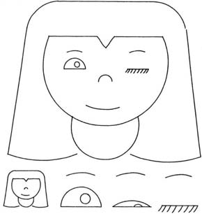
The examples so far may seem rather abstract. Isn't the most 'natural' visual representation simply a picture of the thing you are trying to represent? In that case, what is so hard about design? Just point a camera, and take the picture. It seems like pictures are natural and intuitive, and anyone should be able to understand what they mean. Of course, you might want the picture to be more or less artistic, but that isn't a technical concern, is it? Well, Ivan Sutherland also suggested the potential value that computer screens might offer as artistic tools. His Sketchpad system was used to create a simple animated cartoon of a winking girl. We can use this example to ask whether pictures are necessarily 'natural', and what design factors are relevant to the selection or creation of pictures in an interaction design context.
We would not describe Sutherland's girl as 'realistic', but it is an effective representation of a girl. In fact, it is an unusually good representation of a winking girl, because all the other elements of the picture are completely abstract and generic. It uses a conventional graphic vocabulary of lines and shapes that are understood in our culture to represent eyes, mouths and so on - these elements do not draw attention to themselves, and therefore highlight the winking eye. If a realistic picture of an actual person was used instead, other aspects of the image (the particular person) might distract the viewer from this message.
Author/Copyright holder: Courtesy of Ivan Sutherland. Copyright terms and licence: CC-Att-SA-3 (Creative Commons Attribution-ShareAlike 3.0).
Figure 5.15: Sutherland's 'Winking Girl' drawing, created with the Sketchpad system
It is important, when considering the design options for pictures, to avoid the 'resemblance fallacy', i.e. that drawings are able to depict real object or scenes because the viewer's perception of the flat image simulates the visual perception of a real scene. In practice, all pictures rely on conventions of visual representation, and are relatively poor simulations of natural engagement with physical objects, scenes and people. We are in the habit of speaking approvingly of some pictures as more 'realistic' than others (photographs, photorealistic ray-traced renderings, 'old master' oil paintings), but this simply means that they follow more rigorously a particular set of conventions. The informed designer is aware of a wide range of pictorial conventions and options.
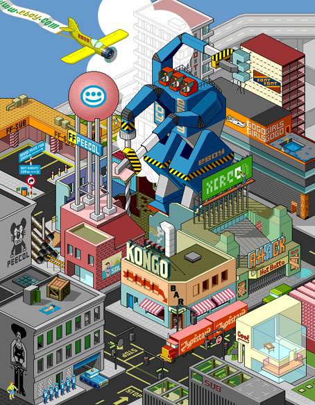
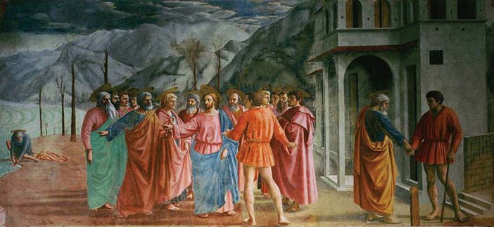
As an example of different pictorial conventions, consider the ways that scenes can be rendered using different forms of artistic perspective. The invention of linear perspective introduced a particular convention in which the viewer is encouraged to think of the scene as perceived through a lens or frame while holding his head still, so that nearby objects occupy a disproportionate amount of the visual field. Previously, pictorial representations more often varied the relative size of objects according to their importance - a kind of 'semantic' perspective. Modern viewers tend to think of the perspective of a camera lens as being most natural, due to the ubiquity of photography, but we still understand and respect alternative perspectives, such as the isometric perspective of the pixel art group eBoy, which has been highly influential on video game style.

Author/Copyright holder: Courtesy of Masaccio (1401-1428). Copyright terms and licence: pd (Public Domain (information that is common property and contains no original authorship))
Figure 5.16: Example of an early work by Masaccio, demonstrating a 'perspective' in which relative size shows symbolic importance
Author/Copyright holder: eBoy.com. Copyright terms and licence: All Rights Reserved. Reproduced with permission. See section "Exceptions" in the copyright terms below.
Figure 5.17: Example of the strict isometric perspective used by the eBoy group
Author/Copyright holder: Courtesy of Masaccio (1401-1428). Copyright terms and licence: pd (Public Domain (information that is common property and contains no original authorship)).
Figure 5.18: Masaccio's mature work The Tribute Money, demonstrating linear perspective
As with most conventions of pictorial representation, new perspective rendering conventions are invented and esteemed for their accuracy by critical consensus, and only more slowly adopted by untrained readers. The consensus on preferred perspective shifts across cultures and historical periods. It would be naïve to assume that the conventions of today are the final and perfect product of technical evolution. As with text, we become so accustomed to interpreting these representations that we are blind to the artifice. But professional artists are fully aware of the conventions they use, even where they might have mechanical elements - the way that a photograph is framed changes its meaning, and a skilled pencil drawing is completely unlike visual edge-detection thresholds. A good pictorial representation need not simulate visual experience any more than a good painting of a unicorn need resemble an actual unicorn. When designing user interfaces, all of these techniques are available for use, and new styles of pictorial rendering are constantly being introduced.
5.4.1 Summary
Pictorial representations, including line drawings, paintings, perspective renderings and photographs rely on shared interpretive conventions for their meaning. It is naïve to treat screen representations as though they were simulations of experience in the physical world.
Where to learn more:
Micklewright, Keith (2005): Drawing: Mastering the Language of Visual Expression. Harry N. Abrams
Stroebel, Leslie, Todd, Hollis and Zakia, Richard (1979): Visual Concepts for Photographers. Focal Press
5.5 Node-and-link diagrams
The first impulse of a computer scientist, when given a pencil, seems to be to draw boxes and connect them with lines. These node and link diagrams can be analysed in terms of the graph structures that are fundamental to the study of algorithms (but unrelated to the visual representations known as graphs or charts). A predecessor of these connectivity diagrams can be found in electrical circuit schematics, where the exact location of components, and the lengths of the wires, can be arranged anywhere, because they are irrelevant to the circuit function. Another early program created for the TX-2, this time by Ivan Sutherland's brother Bert, allowed users to create circuit diagrams of this kind. The distinctive feature of a node-and-link connectivity diagram is that, since the position of each node is irrelevant to the operation of the circuit, it can be used to carry other information. Marian Petre's research into the work of electronics engineers (Petre 1995) catalogued the ways in which they positioned components in ways that were meaningful to human readers, but not to the computer - like the blank space between Diderot's objects this is a form of 'secondary notation' - use of the plane to assist the reader in ways not related to the technical content.
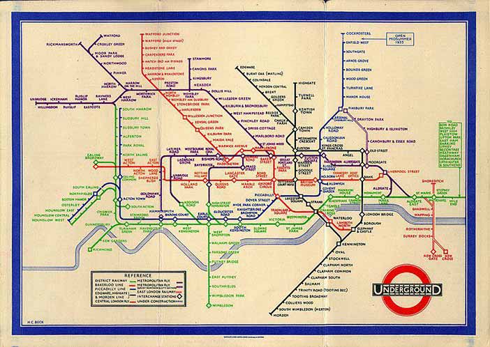
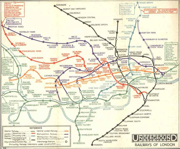
Circuit connectivity diagrams have been most widely popularised through the London Underground diagram, an invention of electrical engineer Henry Beck. The diagram clarified earlier maps by exploiting the fact that most underground travellers are only interested in order and connectivity, not location, of the stations on the line. (Sadly, the widespread belief that a 'diagram' will be technical and hard to understand means that most people describe this as the London Undergound 'map', despite Beck's insistence on his original term).
Author/Copyright holder: Courtesy of Harry C. Beck and possibly F. H. Stingemore, born 1890, died 1954. Stingmore designed posters for the Underground Group and London Transport 1914-1942. Copyright terms and licence: Unknown (pending investigation). See section "Exceptions" in the copyright terms below.
Figure 5.19: Henry Beck's London Underground Diagram (1933)
Author/Copyright holder: Computer History Museum, Mountain View, CA, USA. Copyright terms and licence: All Rights Reserved. Reproduced with permission. See section "Exceptions" in the copyright terms below.
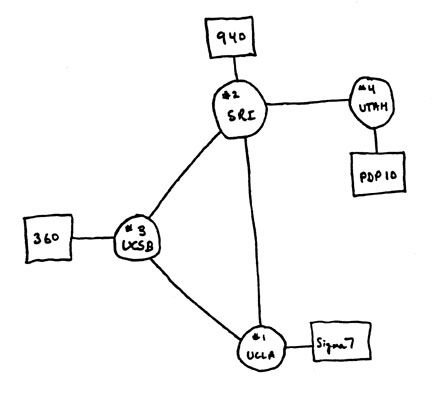
Figure 5.20: Node and link diagram of the kind often drawn by computing professionals
Author/Copyright holder: Courtesy of Harry C. Beck and possibly F. H. Stingemore, born 1890, died 1954. Stingmore designed posters for the Underground Group and London Transport 1914-1942. Copyright terms and licence: Unknown (pending investigation). See section "Exceptions" in the copyright terms below.
Figure 5.21: Map of the London Underground network, as it was printed before the design of Beck's diagram (1932)
5.5.1 Summary
Node and link diagrams are still widely perceived as being too technical for broad acceptance. Nevertheless, they can present information about ordering and relationships clearly, especially if consideration is given to the value of allowing human users to specify positions.
Where to learn more:
Diagrammatic representation books
Lowe, Ric (1992): Successful Instructional Diagram.
5.6 Icons and symbols
Maps frequently use symbols to indicate specific kinds of landmark. Sometimes these are recognisably pictorial (the standard symbols for tree and church), but others are fairly arbitrary conventions (the symbol for a railway station). As the resolution of computer displays increased in the 1970s, a greater variety of symbols could be differentiated, by making them more detailed, as in the MIT SDMS (Spatial Data Management System) that mapped a naval battle scenario with symbols for different kinds of ship. However, the dividing line between pictures and symbols is ambiguous. Children's drawings of houses often use conventional symbols (door, four windows, triangle roof and chimney) whether or not their own house has two storeys, or a fireplace. Letters of the Latin alphabet are shapes with completely arbitrary relationship to their phonetic meaning, but the Korean phonetic alphabet is easier to learn because the forms mimic the shape of the mouth when pronouncing those sounds. The field of semiotics offers sophisticated ways of analysing the basis on which marks correspond to meanings. In most cases, the best approach for an interaction designer is simply to adopt familiar conventions. When these do not exist, the design task is more challenging.
It is unclear which of the designers working on the Xerox Star coined the term 'icon' for the small pictures symbolising different kinds of system object. David Canfield Smith winningly described them as being like religious icons, which he said were pictures standing for (abstract) spiritual concepts. But 'icon' is also used as a technical term in semiotics. Unfortunately, few of the Xerox team had a sophisticated understanding of semiotics. It was fine art PhD Susan Kare's design work on the Apple Macintosh that established a visual vocabulary which has informed the genre ever since. Some general advice principles are offered by authors such as Horton (1994), but the successful design of icons is still sporadic. Many software publishers simply opt for a memorable brand logo, while others seriously misjudge the kinds of correspondence that are appropriate (my favourite blooper was a software engineering tool in which a pile of coins was used to access the 'change' command).
It has been suggested that icons, being pictorial, are easier to understand than text, and that pre-literate children, or speakers of different languages, might thereby be able to use computers without being able to read. In practice, most icons simply add decoration to text labels, and those that are intended to be self-explanatory must be supported with textual tooltips. The early Macintosh icons, despite their elegance, were surprisingly open to misinterpretation. One PhD graduate of my acquaintance believed that the Macintosh folder symbol was a briefcase (the folder tag looked like a handle), which allowed her to carry her files from place to place when placed inside it. Although mistaken, this belief never caused her any trouble - any correspondence can work, so long as it is applied consistently.
![]()
Copyright terms and licence: pd (Public Domain (information that is common property and contains no original authorship)).
Figure 5.22: In art, the term Icon (from Greek, eikon, "image") commonly refers to religious paintings in Eastern Orthodox, Oriental Orthodox, and Eastern-rite Catholic jurisdictions. Here a 6th-century encaustic icon from Saint Catherine's Monastery, Mount Sinai
![]()
Author/Copyright holder: Apple Computer, Inc. Copyright terms and licence: All Rights Reserved. Reproduced with permission. See section "Exceptions" in the copyright terms below.
Figure 5.23: In computing, David Canfield Smith described computer icons as being like religious icons, which he said were pictures standing for (abstract) spiritual concepts.
5.6.1 Summary
The design of simple and memorable visual symbols is a sophisticated graphic design skill. Following established conventions is the easiest option, but new symbols must be designed with an awareness of what sort of correspondence is intended - pictorial, symbolic, metonymic (e.g. a key to represent locking), bizarrely mnemonic, but probably not monolingual puns.
Where to learn more:
Napoles, Veronica (1987): Corporate Identity Design.
5.7 Visual metaphor
The ambitious graphic designs of the Xerox Star/Alto and Apple Lisa/Macintosh were the first mass-market visual interfaces. They were marketed to office professionals, making the 'cover story' that they resembled an office desktop a convenient explanatory device. Of course, as was frequently noted at the time, these interfaces behaved nothing like a real desktop. The mnemonic symbol for file deletion (a wastebasket) was ridiculous if interpreted as an object placed on a desk. And nobody could explain why the desk had windows in it (the name was derived from the 'clipping window' of the graphics architecture used to implement them - it was at some later point that they began to be explained as resembling sheets of paper on a desk). There were immediate complaints from luminaries such as Alan Kay and Ted Nelson that strict analogical correspondence to physical objects would become obstructive rather than instructive. Nevertheless, for many years the marketing story behind the desktop metaphor was taken seriously, despite the fact that all attempts to improve the Macintosh design with more elaborate visual analogies, as in General Magic and Microsoft Bob, subsequently failed.
The 'desktop' can be far more profitably analysed (and extended) by understanding the representational conventions that it uses. The size and position of icons and windows on the desktop has no meaning, they are not connected, and there is no visual perspective, so it is neither a map, graph nor picture. The real value is the extent to which it allows secondary notation, with the user creating her own meaning by arranging items as she wishes. Window borders separate areas of the screen into different pictorial, text or symbolic contexts as in the typographic page design of a textbook or magazine. Icons use a large variety of conventions to indicate symbolic correspondence to software operations and/or company brands, but they are only occasionally or incidentally organised into more complex semiotic structures.
![]()
Author/Copyright holder:Apple Computer, Inc and Computer History Museum, Mountain View, CA. Copyright terms and licence: All Rights Reserved. Reproduced with permission. See section "Exceptions" in the copyright terms below.
Figure 5.24: Apple marketed the visual metaphor in 1983 as a key benefit of the Lisa computer. This advertisement said 'You can work with Lisa the same familiar way you work at your desk'. However a controlled study by Carroll and Mazur (1986) found that the claim for immediately familiar operation may have been exaggerated.
Copyright terms and licence: pd (Public Domain (information that is common property and contains no original authorship)).
Figure 5.25: The Xerox Alto and Apple Lisa, early products in which bitmapped displays allowed pictorial icons to be used as mnemonic cues within the 'desktop metaphor'
Author/Copyright holder: Courtesy of Mschlindwein. Copyright terms and licence: CC-Att-SA (Creative Commons Attribution-ShareAlike 3.0 Unported).
Figure 5.26: Apple Lisa
5.7.1 Summary
Theories of visual representation, rather than theories of visual metaphor, are the best approach to explaining the conventional Macintosh/Windows 'desktop'. There is huge room for improvement.
Where to learn more:
Blackwell, Alan (2006): The reification of metaphor as a design tool. In ACM Transactions on Computer-Human Interaction, 13 (4) pp. 490-530
5.8 Unified theories of visual representation
The analysis in this article has addressed the most important principles of visual representation for screen design, introduced with examples from the early history of graphical user interfaces. In most cases, these principles have been developed and elaborated within whole fields of study and professional skill - typography, cartography, engineering and architectural draughting, art criticism and semiotics. Improving on the current conventions requires serious skill and understanding. Nevertheless, interaction designers should be able, when necessary, to invent new visual representations.
One approach is to take a holistic perspective on visual language, information design, notations, or diagrams. Specialist research communities in these fields address many relevant factors from low-level visual perception to critique of visual culture. Across all of them, it can be necessary to ignore (or not be distracted by) technical and marketing claims, and to remember that all visual representations simply comprise marks on a surface that are intended to correspond to things understood by the reader. The two dimensions of the surface can be made to correspond to physical space (in a map), to dimensions of an object, to a pictorial perspective, or to continuous abstract scales (time or quantity). The surface can also be partitioned into regions that should be interpreted differently. Within any region, elements can be aligned, grouped, connected or contained in order to express their relationships. In each case, the correspondence between that arrangement, and the intended interpretation, must be understood by convention, explained, or derived from the structural and perceptual properties of marks on the plane. Finally, any individual element might be assigned meaning according to many different semiotic principles of correspondence.
The following table summarises holistic views, as introduced above, drawing principally on the work of Bertin, Richards, MacEachren, Blackwell & Engelhardt and Engelhardt.
Where to learn more:
Engelhardt, Yuri (2002). The Language of Graphics. A framework for the analysis of syntax and meaning in maps, charts and diagrams (PhD Thesis). University of Amsterdam
Graphic Resources | Correspondence | Design Uses | |
Marks | Shape | Literal (visual imitation of physical features) | Mark position, identify category (shape, texture colour) |
Symbols | Geometric elements | Topological (linking) | Texts and symbolic calculi |
Regions | Alignment grids | Containment | Identifying shared membership |
Surfaces | The plane | Literal (map) | Typographic layouts |
Table 5.1: Summary of the ways in which graphical representations can be applied in design, via different systems of correspondence

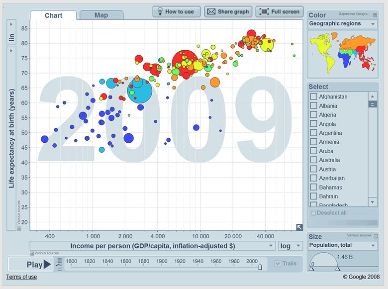
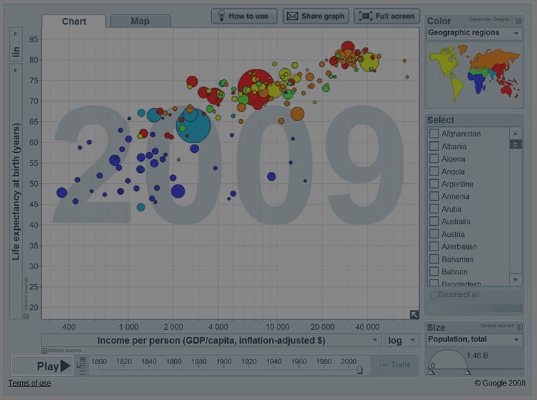

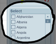
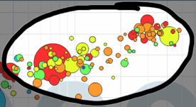
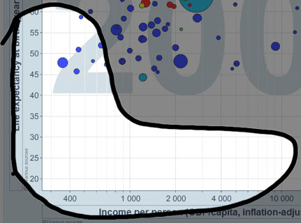

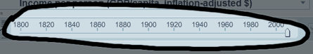
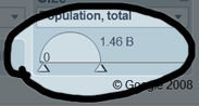
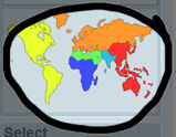
Table 5.2: Screenshot from the site gapminder.org, illustrating a variety of correspondence conventions used in different parts of the page
As an example of how one might analyse (or working backwards, design) a complex visual representation, consider the case of musical scores. These consist of marks on a paper surface, bound into a multi-page book, that is placed on a stand at arms length in front of a performer. Each page is vertically divided into a number of regions, visually separated by white space and grid alignment cues. The regions are ordered, with that at the top of the page coming first. Each region contains two quantitative axes, with the horizontal axis representing time duration, and the vertical axis pitch. The vertical axis is segmented by lines to categorise pitch class. Symbols placed at a given x-y location indicate a specific pitched sound to be initiated at a specific time. A conventional symbol set indicates the duration of the sound. None of the elements use any variation in colour, saturation or texture. A wide variety of text labels and annotation symbols are used to elaborate these basic elements. Music can be, and is, also expressed using many other visual representations (see e.g. Duignan for a survey of representations used in digital music processing).
5.9 Where to learn more
The historical examples of early computer representations used in this article are mainly drawn from Sutherland (Ed. Blackwell and Rodden 2003), Garland (1994), and Blackwell (2006). Historical reviews of visual representation in other fields include Ferguson (1992), Pérez-Gómez and Pelletier (1997), McCloud (1993), Tufte (1983). Reviews of human perceptual principles can be found in Gregory (1970), Ittelson (1996), Ware (2004), Blackwell (2002). Advice on principles of interaction with visual representation is distributed throughout the HCI literature, but classics include Norman (1988), Horton (1994), Shneiderman ( Shneiderman and Plaisant 2009, Card et al 1999, Bederson and Shneiderman 2003) and Spence (2001). Green's Cognitive Dimensions of Notations framework has for many years provided a systematic classification of the design parameters in interactive visual representations. A brief introduction is provided in Blackwell and Green (2003).
Research on visual representation topics is regularly presented at the Diagrams conference series (which has a particular emphasis on cognitive science), the InfoDesign and Vision Plus conferences (which emphasise graphic and typographic information design), the Visual Languages and Human-Centric Computing symposia (emphasising software tools and development), and the InfoVis and Information Visualisation conferences (emphasising quantitative and scientific data visualisation).
5.9.0.1 IV - International Conference on Information Visualization
20082007200620052004200320022001200019991998
5.9.0.2 DIAGRAMS - International Conference on the Theory and Application of Diagrams
5.9.0.3 VL-HCC - Symposium on Visual Languages and Human Centric Computing
20082007200720062005200420032002200120001999199819971996199519941993199219911990
5.9.0.4 InfoVis - IEEE Symposium on Information Visualization
2005200420032002200120001999199819971995
5.10 References
Anderson, Michael, Meyer, Bernd and Olivier, Patrick (2002): Diagrammatic Representation and Reasoning.London, UK,
Bederson, Benjamin B. and Shneiderman, Ben (2003): The Craft of Information Visualization: Readings and Reflections. Morgan Kaufman Publishers
Bertin, Jacques (1967): Semiology of Graphics: Diagrams, Networks, Maps (Sémiologie graphique: Les diagrammes - Les réseaux - Les cartes). English translation by W. J. Berg. Madison, WI, USA, University of Wisconsin Press
Blackwell, Alan (2002): Psychological perspectives on diagrams and their users. In: Anderson, Michael, Meyer, Bernd and Olivier, Patrick (eds.). "Diagrammatic Representation and Reasoning". London, UK: pp. 109-123
Blackwell, Alan (2006): The reification of metaphor as a design tool. In ACM Transactions on Computer-Human Interaction, 13 (4) pp. 490-530
Blackwell, Alan and Engelhardt, Yuri (2002): A Meta-Taxonomy for Diagram Research. In: Anderson, Michael,Meyer, Bernd and Olivier, Patrick (eds.). "Diagrammatic Representation and Reasoning". London, UK: pp. 47-64
Blackwell, Alan and Green, T. R. G. (2003): Notational Systems - The Cognitive Dimensions of Notations Framework. In: Carroll, John M. (ed.). "HCI Models, Theories, and Frameworks". San Francisco: Morgan Kaufman Publisherspp. 103-133
Carroll, John M. and Mazur, Sandra A. (1986): LisaLearning. In Computer, 19 (11) pp. 35-49
Engelhardt, Yuri (2002). The Language of Graphics. A framework for the analysis of syntax and meaning in maps, charts and diagrams (PhD Thesis). University of Amsterdam
Ferguson, Eugene S. (1994): Engineering and the Mind's Eye. MIT Press
Garland, Ken (1994): Mr. Beck's Underground Map. Capital Transport Publishing
Goodman, Nelson (1976): Languages of Art. Hackett Publishing Company
Gregory, Richard L. (1970): The Intelligent Eye. London, Weidenfeld and Nicolson
Horton, William (1994): The Icon Book: Visual Symbols for Computer Systems and Documentation. John Wiley and Sons
Ittelson, W. H. (1996): Visual perception of markings. In Psychonomic Bulletin & Review, 3 (2) pp. 171-187
Lowe, Ric (1992): Successful Instructional Diagram.
MacEachren, Alan M. (2004): How Maps Work: Representation, Visualization, and Design. The Guilford Press
Mccloud, Scott (1994): Understanding Comics: The Invisible Art. Harper Paperbacks
Micklewright, Keith (2005): Drawing: Mastering the Language of Visual Expression. Harry N. Abrams
Napoles, Veronica (1987): Corporate Identity Design.
Norman, Donald A. (1988): The Design of Everyday Things. New York, Doubleday
Petre, Marian (1995): Why Looking Isn't Always Seeing: Readership Skills and Graphical Programming. InCommunications of the ACM, 38 (6) pp. 33-44
Pérez-Gómez, Alberto and Pelletier, Louise (1997): Architectural Representation and the Perspective Hinge. MIT Press
Resnick, Elizabeth (2003): Design for Communication: Conceptual Graphic Design Basics. Wiley
Richards, Clive (1984). Diagrammatics: an investigation aimed at providing a theoretical framework for studying diagrams and for establishing a taxonomy of their fundamental modes of graphic organization. Unpublished Phd Thesis. Royal College of Art, London, UK
Sellen, Abigail and Harper, Richard H. R. (2001): The Myth of the Paperless Office. MIT Press
Shneiderman, Ben and Plaisant, Catherine (2009): Designing the User Interface: Strategies for Effective Human-Computer Interaction (5th ed.). Addison-Wesley
Spence, Robert (2001): Information Visualization. Addison Wesley
Sutherland, Ivan E. (1963). Sketchpad, A Man-Machine Graphical Communication System. PhD Thesis at Massachusetts Institute of Technology, online version and editors' introduction by Alan Blackwell & K. Rodden. Technical Report 574. Cambridge University Computer Laboratory
Tufte, Edward R. (1983): The Visual Display of Quantitative Information. Cheshire, CT, Graphics Press
Ware, Colin (2004): Information Visualization: Perception for Design, 2nd Ed. San Francisco, Morgan Kaufman
