Modes and Modal Interfaces
What are Modes and Modal Interfaces?
Modes and modal interfaces are related concepts. Designers need to understand both to build effective interactions. A mode is a change in behavior of an interface that remains in effect until exited, typically by a user. Modal interfaces extend the concept of modes to apply to an entire application or system.
Explore how to make use of modes and modal interfaces, in this video with Alan Dix: Author of the bestselling book “Human-Computer Interaction” and Director of the Computational Foundry at Swansea University.
Show
Hide
video transcript
- Transcript loading…
The Need for Modes
In some interfaces, modes are essential. The printer control panel shown below and in the video is a typical example, where the meaning of the keys changes according to what is on the display. In fact, the “OK” key used in many interfaces is usually modal in the sense that a user is committing to perform whatever action is being offered by the interface. Similarly, “Cancel” is a rejection of that action. In early windowing-system designs, the action was intended to be expressed clearly in the dialog or message box title, but regrettably, this is often not the case in modern interfaces. Other common modes are menu selection, where a choice of actions to perform is displayed in popup panels (or similar) and message boxes, which often disable other functionality in a system until they are dismissed. (Message boxes that do not have this behavior are called “modeless”.)
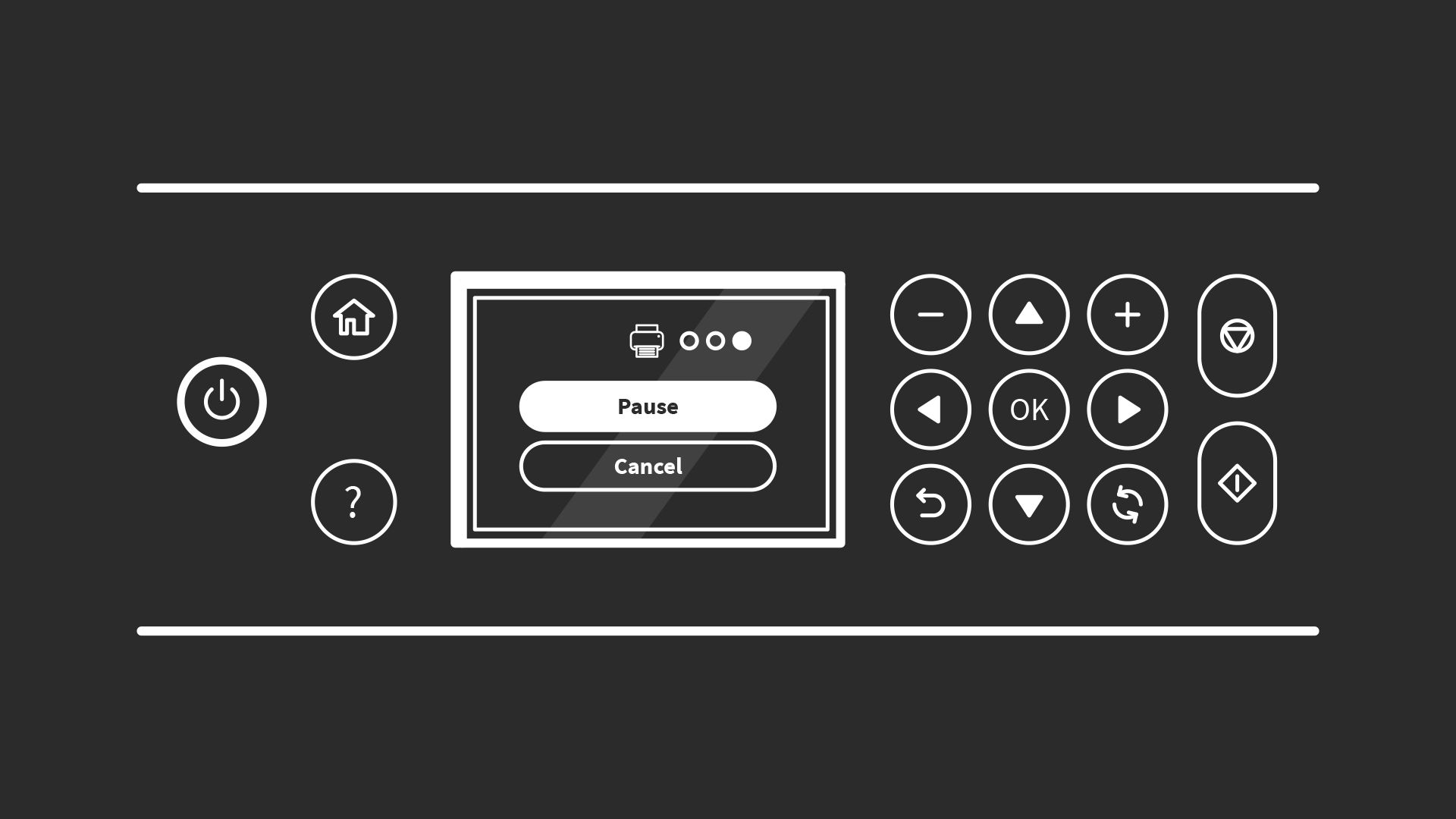
Compact control panels, such as those usually found on printers and scanners, would not be possible without the use of modes. In this example, the mode is “printing” (indicated by the icon above the Pause button) and the “OK” button would pause it.
© Interaction Design Foundation, CC BY-SA 3.0
The Drawbacks of Modes
The primary challenge that modes present is in allowing users to feel in control. The typical sequence of operations is:
1. User/interface enters mode.
2. User performs mode-related activities.
3. User/interface exits mode.
This sounds straightforward enough, but all of these steps and states must be apparent to users. For them, entering a mode needs to be obvious and predictable, and the mode itself must make sense and warrant the overheads of entering a special state, particularly from a cognitive perspective. Finally, it needs to be as easy to exit the mode as it was to enter it.

Caps lock is probably the world’s most common example of a mode, but has its origins in mechanical typewriters.
© Arlo Barnes, CC0, via Wikimedia Commons
For example, many mobile apps allow users to view an item they’ve created, such as a calendar entry or password details. But they provide no means of changing them except in edit mode. Edit mode is often shown simply as a pencil icon, but equally, it might just be the word “edit” in a corner of the screen or hidden away in the menu. So, the need for and practicalities of entering edit mode can be challenging. In these examples, the mode itself is shown by a change of text color. The text tends to be grey in the default “view” mode. Once in edit mode, the text changes to black. The color change may not be meaningful to users, but grey text is often used to indicate that an interface element is disabled. Unfortunately, making the text grey does make it harder to read, and grey is increasingly used without meaning in mobile apps. Finally, users must work out how to exit edit mode. This is possibly the most straightforward operation of the three since there is usually an obvious “save” or “close” button that also exits the mode.
But is this example worthy of a mode at all? This approach is rarely used in desktop applications. If a user makes inadvertent changes to an item and closes it, there is usually a confirmation message box asking whether the changes should be saved. The same approach should be used in mobile apps.
Finally, in some cases, continuing in a mode without realizing it can have unpleasant consequences. Consider a “delete” mode. Everything clicked will be deleted with or without confirmation (hopefully with!). Remaining in this mode for even one superfluous action could be problematic.
Modal Interfaces
Modal interfaces are a mode type, but the term has a specific meaning. An interface is called modal when the normal operation of an application (or even a complete system) is suspended until the mode is exited. The most common examples are on-screen dialogs and message boxes. Often the dialogs are involved in collecting or modifying data that is used by the rest of the system. Allowing normal operation while the data is being entered or changed could produce unexpected results. Interfaces that suspend normal operations at the application level are called “application modal”. The few interfaces that suspend operation at the system level – such as notifying users of a serious fault – are called “system modal”.
Learn More About Modes and Modal Interfaces
A collection of snippets warning of the dangers of modal interfaces.
Detailed discussion of modal and non-modal screens.
Guidelines from Apple on the use of modes in iOS.
Questions related to Modes and Modal Interfaces
What is a modal interface in UX design?
A modal interface interrupts your workflow by presenting a focused overlay—or popup—that demands user input or decision. It blocks interaction with the rest of the screen until the user responds to it, and so it is ideal for asking critical questions or showing essential information.
Modals shrink distractions and emphasize tasks that matter most, such as confirming deletions, filling important forms, or conveying urgent alerts. A modal differs from a normal window because it enforces prioritization: you cannot continue until you interact with it.
You should use modals sparingly as they stop flow, but when the content demands full attention—for example, making irreversible choices or offering time-sensitive warnings—they are invaluable for clarity and safety.
Harvest a wealth of insights in our article, Best Practices and UI Design Patterns for Help in Mobile.
What is the difference between a mode and modal?
A mode changes how your interface responds based on context—for example, entering “edit mode” turns clicks into text-editing commands, and Caps Lock turns typed letters into uppercase.
Modal describes the interface mechanism—the overlay or dialog—that forces attention and blocks other actions. Hence, modal dialog or modal message box.
Modes persist in the background as context switches, while modal interfaces deliberately interrupt to demand focus. Modes influence behavior in a silent way. Modal interfaces exert explicit control, often as urgent alerts. Users may slip into modes unknowingly, resulting in surprising behavior, but modals always show.
Aim to reduce confusing modes, especially hidden ones, and use modals when you want to make context and demands crystal clear.
Understand user behavior to anticipate their needs and what can happen when they are on your design solution.
Why do designers use modal popups or dialogs?
You use modal interfaces to draw user focus to something truly important, such as confirming a destructive choice, completing a form, or seeing a vital alert. The interfaces often isolate the content by dimming or disabling the rest of the interface, eliminating distractions while the user focuses on important actions. That visual cutoff clarifies what matters right now.
Modal interfaces can preserve the state of the current page, too; after dismissing the modal, users return exactly where they paused. That makes modals handy for quick tasks, such as adding details without losing context or place. Done well, modals add emphasis, enable safe flows, and maintain context. They help users avoid mistakes in high-impact or high-stakes moments. Apply them judiciously, though, as too many modals kill usability.
Explore how to help users enjoy better experiences with your digital product, in our article User Interface Design Guidelines: 10 Rules of Thumb.
How do modes affect the user experience?
Modes change how your interface interprets input, which can help or hurt users. A helpful mode like “drawing” might let you sketch freely, while “selection mode” changes clicks to drag actions. Both address different needs without switching screens.
However, when modes activate invisibly—like hidden keyboard shortcuts or sticky toggles—users may accidentally work under wrong assumptions. That will trigger “mode errors,” where actions diverge from expectations and users may see strange results and feel confused or frustrated. To prevent such surprises, make modes visible, predictable, and reversible.
Clear “You are in X mode” cues, easy exit options, or automatic returns to default mode improve user experiences. Well-managed modes expand interface flexibility without confusing users, risking errors, or causing surprises.
Harness insights from a solid understanding of human error to help keep users informed and content.
What are the main types of modal interfaces?
Modal interfaces take several forms, each with its own applications and strengths:
Dialog boxes: Small popups for confirmations, alerts, or short forms. They assert clarity and draw focus.
Lightboxes: Overlays for images or media galleries, giving space to view content without leaving the page.
Fullscreen modals: Cover the entire screen—common on mobile or when goal completion demands full attention, like completing multistep forms.
Slidein panels or drawers: Appear from a screen edge and block only part of the interface temporarily.
System modal: These are often used for security or significant error conditions. No applications or other features are accessible until the system modal dialog or message box is dismissed.
These interfaces match task complexity and device constraints. Dialog boxes suit simple decisions, lightboxes shine for media, fullscreens fit immersive tasks, and drawers support quick input without losing the main context for users.
Explore a helpful approach for users to enjoy better efficiency and more in our article, Embrace the Mental Models of Users by Implementing Tabs.
How do I design modals that do not frustrate users?
Design frustration-free modals by following three principles:
Be clear and concise: Keep the message direct, use plain language, and make clear choices (“Yes, delete” vs. “OK”).
Make dismissal easy: Offer visible “Close” or “X” buttons to allow clicking outside or hitting Esc, and manage focus for keyboard users.
Respect timing and relevance: Do not interrupt casually; only trigger modal interruptions when action demands attention. Avoid repeated pop-ups. If a modal triggers repeatedly, let users disable it.
Another point is to maintain visual consistency: match your UI styling, control language tone, and ensure loading remains quick. This combination of clarity, control, and convenience makes modals feel like helpful allies to heed, not annoyances to dismiss.
Discover how to help keep users on board with better-designed solutions, in our article Shneiderman′s Eight Golden Rules Will Help You Design Better Interfaces.
When should I use a modal interface versus a new page or screen?
Use a modal dialog or message box to perform short, focused tasks that do not break flow, such as confirming deletion, quick data entry, or viewing an alert. Modal interfaces let users act without losing their place.
Choose a new page or screen when tasks are more complex, such as filling long forms, reviewing settings, or reading detailed information. New pages work better when users need space, time, or distinct navigation.
If users can complete the task quickly and return immediately, a modal suits, although there also must be a requirement that users do not proceed with other actions in the interface. If tasks require sustained focus or include multiple steps, it is wise to use a separate screen; and if users do need access to other functions or features, do not use a modal interface. Always test whether users drop off or stumble in each scenario, and pick the pattern that preserves clarity and control.
Find fascinating facts to gear design decisions around in our article Flow Design Processes - Focusing on the Users′ Needs.
How do I avoid mode errors in interface design?
Prevent mode errors by making modes obvious and forgiving:
Show persistent indicators: Use banners, icons, or header labels like “Editing mode” or “Debug mode.”
Use visual styling: Change cursor shape, screen tint, or toolbar appearance to reflect the mode.
Offer easy escape: Let users hit Esc, tap a “Done” button, or click an obvious area to exit.
Autorevert when possible: Return to default mode after action completes, reducing lingering confusion.
The above strategies inform users about the current context and give them tools to recover gracefully. Mode errors drop when users clearly see the mode they are in and know exactly how to exit it.
Understand user needs better to be able to envision how to best support users with modes.
What makes a modal interface accessible for all users?
Accessibility requires careful design:
Manage focus: Shift keyboard focus into the modal dialog or popup when it opens and back when it closes. Trap focus inside so tabbing stays within.
Support screen readers: Label the modal with an ARIA role like role="dialog" and provide accessible names via aria-labelledby or aria-describedby.
Ensure visible contrast and size: Make text readable, buttons large enough to click or tap, and visuals distinguishable.
Enable keyboard usage: Let users open, close, and act within the modal using only their keyboard (Tab, Enter, Esc).
Provide skip options: Offer clear dismissal and avoid trap loops for people using assistive tools.
All together, these steps ensure modal interactions feel natural and inclusive for every user, regardless of how they access your interface.
Enjoy our Master Class Accessible and Inclusive Design Patterns with Vitaly Friedman, Senior UX Consultant, European Parliament, and Creative Lead, Smashing Magazine.
When should you consider alternatives to modal dialogs?
Modal dialogs are appropriate whenever you need to ensure critical user attention or prevent potentially destructive actions. However, consider alternatives when the interaction does not require breaking the primary task flow of the user:
For supplementary information:
Tooltips or popovers: Brief contextual help that does not warrant full attention
Inline expansion: Reveal additional details within the current context
For secondary tasks:
Slide-in panels: Allow users to complete related tasks while maintaining visibility of their primary work
Sidebar or drawer interfaces: Provide access to tools or information without losing context
For non-critical feedback:
Toast notifications: Confirm actions without demanding immediate attention
Status indicators: Show system state changes unobtrusively
Keep modality when needed: Use modal dialogs for destructive actions, required decisions, critical errors, or when the user must complete a specific task before proceeding. The goal is not to avoid modality, but to use it purposefully.
Discover more about tooltips and other helpful ways to guide users through progressive disclosure (gradually showing users what they need to do and how, as needed).
What are common mistakes designers make with modal interfaces?
Designers often trip over these common modal pitfalls:
Overusing modals: Bombarding users with pop-ups for minor choices leads to fatigue and annoyance.
Blocking without escape: Removing easy dismissal frustrates users; modals should never trap you.
Overloading content: Cramming forms or articles into modals makes them cramped and hard to parse.
Disrespecting mobile patterns: Poorly sized modals can be hard to scroll or use on small screens.
Ignoring accessibility: Neglecting focus management, labeling, or keyboard navigation locks out users with disabilities.
Avoid those mistakes by limiting modals to critical tasks, ensuring easy exits, chunking content, optimizing for devices, and coding with accessibility from day one.
Discover how to design modes and modals with another vital consideration in mind, in our article How Emotions Impact Cognition.
How can I help users remember they are in a different mode?
Reinforce awareness through the best use of design cues:
Use clear visual labels: Show text like “You are editing” or “Review mode” where users look—headers, titles, or toolbars.
Change styling: Apply a distinct background color, border, or screen tint when in a mode.
Modify the cursor or icon: For edit mode, use text insertion pointer; for draw mode, show a pencil icon.
Show breadcrumbs or mode toggles: Let users see and switch the mode clearly.
Provide reminders: If users stay idle, offer a tooltip like “You are still editing. Save when done.”
These strategies reinforce context and reduce slipup risks. Users can stay aware when the interface visually communicates mode status and gives them control.
Find out how to help users find their ways back, in our article Help Users Retrace Their Steps with Breadcrumbs.
What are some helpful resources about modes and modal interfaces for UX designers?
Blog Posts & Articles
Eleken. (2025, July 18). Mastering modal UX: Best practices, common pitfalls, and realworld examples. Eleken. https://www.eleken.co/blog-posts/modal-ux
This article by Eleken explores modal windows from a practical design standpoint, providing real-world examples and guidelines to improve user interaction. It explains when modals should be used, their drawbacks when misused, and offers alternatives like inline expansion. Best practices include clear labeling, providing escape mechanisms, and limiting modals to one per interaction. The guidance is grounded in user-centric thinking. The article is significant because it bridges UX theory with actionable design strategies, making it a strong foundational read for digital product designers.
Rahman, T. (2024, November 13). Modal UX design: Patterns, examples, and best practices. LogRocket Blog. Updated by O. Jite-Orimiono. https://blog.logrocket.com/ux-design/modal-ux-design-patterns-examples-best-practices/
This LogRocket article breaks down modal design in UX by defining modals, discussing their potential to disrupt user flow, and detailing best practices for their effective implementation. It includes design patterns and visual examples to reinforce key takeaways such as clarity, timing, and accessibility. Updated in 2024, it offers a contemporary take on UI/UX trends and helps designers understand the context in which modals support versus hinder user tasks. Its importance lies in its evidence-backed advice and illustrations, which make complex modal interactions more accessible to both novice and experienced designers.
Boicheva, S. (2022, December 14). Modal UI design in a nutshell: The basics, types of modals and best practices. HTMLBurger Blog. https://htmlburger.com/blog/modal-ui-design/
This concise guide by Sandra Boicheva covers foundational knowledge about modal interfaces, differentiating between types such as fullscreen modals, popups, and overlays. It outlines six best practices including minimizing friction, ensuring relevance, and designing with mobile responsiveness in mind. The article is tailored for beginner-to-intermediate UX designers seeking a practical overview. It stands out for its clear categorization of modal types and straightforward advice, making it a helpful reference when deciding whether and how to integrate modals into digital experiences.
Braun, K. (2023, December 1). Mastering modals in web design to enhance UX. Lounge Lizard. https://www.loungelizard.com/blog/mastering-modals-in-web-design-to-enhance-ux/
This article by Ken Braun explains how modals can be used effectively to boost user engagement and conversions—if well-timed and purposefully designed. It covers key areas such as call-to-action (CTA) clarity, responsive design, and content relevance. The piece emphasizes avoiding overuse and ensuring that modals enhance rather than interrupt user flow. Its importance stems from balancing business goals (like conversions) with user needs, offering product teams strategic insight into optimizing modal experiences in real-world applications.
UX24/7. (2024, June 19). Modality in user experience (UX). UX24/7. https://ux247.com/modality-in-user-experience-ux/
This article focuses on the concept of modality and its impact on user experience. It provides a balanced perspective on the benefits and risks of modal dialogs, particularly their potential to disrupt workflows. The piece advises designers to evaluate necessity and user intent before deploying modals. Its strength lies in contextualizing modality within broader UX principles, making it a critical read for designers who want to use interruption mechanisms like modals responsibly. It underscores the ethical and usability considerations of design choices in digital environments.
Gapsy Studio. (2025, March 1). Modals: Enhance or hinder UX in web design? Gapsy Studio. https://gapsystudio.com/blog/modals-in-web-design/
This Gapsy Studio article, authored by Dasha, provides a balanced evaluation of modal interfaces, examining when they contribute positively to user experience and when they disrupt it. It presents best practices and alternative UI elements, stressing accessibility, timing, and design clarity. The article is current and design-focused, offering practical tips for modern UI environments. Its importance lies in its holistic approach to assessing modal effectiveness and encouraging thoughtful integration based on user needs and behavior.
Savolainen, O. (2018, April 23). The risks of modal user interfaces: A deep dive. savolai.net. https://savolai.net/notes/dangers-of-modal-user-interfaces/
In this deeply analytical post, Olli Savolainen dissects the cognitive and usability challenges posed by modal user interfaces—interfaces that behave differently based on implicit modes. He illustrates how such designs increase cognitive load and cause “mode errors,” where users unknowingly act within the wrong context, potentially leading to serious mistakes. The article draws from interface theory and real-world consequences, emphasizing alternatives such as modeless or quasimodal designs that reduce friction and improve clarity. This post is influential for UX designers and HCI professionals seeking to design safer, more intuitive interfaces that preserve user context and minimize unintended interactions.
Books
Oviatt, S. (2008). Multimodal User Interfaces: From Signals to Interaction. Springer.
In Multimodal User Interfaces: From Signals to Interaction, Sharon Oviatt presents a rigorous treatment of multimodal interaction paradigms designed to enhance user interface adaptability. The book explores theoretical foundations and modeling strategies for UI plasticity—interfaces that flexibly respond to diverse input channels and contexts. Through explanations of multimodal signal processing and detailed proof-of-concept examples, Oviatt delivers a richly grounded perspective combining cognitive science with interface engineering. This work is essential for UX designers and researchers building adaptive systems, such as voice-gesture interfaces or context-aware UIs, because it bridges theory and practical implementation for resilient, user-centered multimodal design.
Earn a Gift, Answer a Short Quiz!
- Question 1
- Question 2
- Question 3
- Get Your Gift
Try Again! IxDF Cheers For You!
Remember, the more you learn about design, the more you make yourself valuable.
Improve your UX / UI Design skills and grow your career! Join IxDF now!
- Question 1
- Question 2
- Question 3
- Get Your Gift
Congratulations! You Did Amazing
You earned your gift with a perfect score! Let us send it to you.
Check Your Inbox
We've emailed your gift to name@email.com.
Improve your UX / UI Design skills and grow your career! Join IxDF now!
Literature on Modes and Modal Interfaces
Here's the entire UX literature on Modes and Modal Interfaces by the Interaction Design Foundation, collated in one place:
Open Access—Link to us!
We believe in Open Access and the democratization of knowledge. Unfortunately, world-class educational materials such as this page are normally hidden behind paywalls or in expensive textbooks.
If you want this to change, , link to us, or join us to help us democratize design knowledge!