As an information designer, your main aim is to help people understand the world better. Whether they’re trying to make sense of national election sentiments or get a grip on tourism activities in a region, people need to understand the meaning and implications of facts and figures. These collections of words and numbers are raw data. Your duty as a designer is to translate this data into relevant information for users. When you get it right, you will add value to people’s lives. If you should fail to, though, the danger of information anxiety will arise.
When we’re designing information visualisations, we need to understand how to avoid information anxiety. For example, the image below shows how an online shop prevents information anxiety for a regular user, looking to buy a new desktop monitor. For regular use (email applications, text editors), he or she does not need information on every specific feature of each monitor. The online shop accommodates this user by providing filters for the type of task he/she wants to perform with the product.
Understanding user goals and using this understanding to influence design decisions is essential for this. It involves understanding the information users need for performing their tasks and how they want to feel as they undertake them. Scary as it may sound, it’s true: failing to match the information visualisation to the users’ objective and subjective needs will turn users off using your designs. In other words, if you fail to match it, your work will fail to latch with them.
“Information anxiety is the black hole between data and knowledge, and it happens when information doesn't tell us what we want or need to know.”
—Richard Saul Wurman, graphic designer, information visualization pioneer and founder of the TED talks.
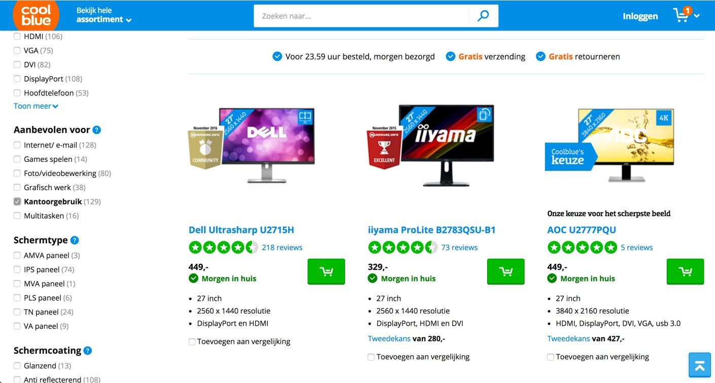
This Dutch online shop helps users find the products they need—by taking their goals into account. Users can filter results based on the main task they will fulfil with the product, on the left-hand side of the interface. From the options that include ‘gaming’ and ‘graphical work’, the user has selected ‘regular office use’.
© CoolBlue, Fair Use
Data Is Not the Same as Information
Here’s an (extreme and fictional) example which illustrates the importance of adding value through information design: imagine you’re a mother of a young boy in a nuclear disaster zone. The government says it’s safe enough to return to your old house and start rebuilding your life. In your surroundings, you can’t see any signs of danger. Everything seems okay. However, you and other people around you aren’t convinced it’s a hundred percent safe. You join a group of people who use personal Geiger counters to map the radiation levels around town. All data is presented in an app, which should be able to put your mind at ease when your child asks if he can play at his favourite playground. In this case, the data gathered must be translated properly into a visualisation for it to be truly relevant and valuable in your life. Peace of mind is your main goal. Existing Geiger apps, such as those shown below, do not meet these needs. Whoever designed these apps did not have your goals in mind. As we can see, the screens show radiation levels in numbers and graphs, when what you really need is clear information on whether an area is safe for your child or not.
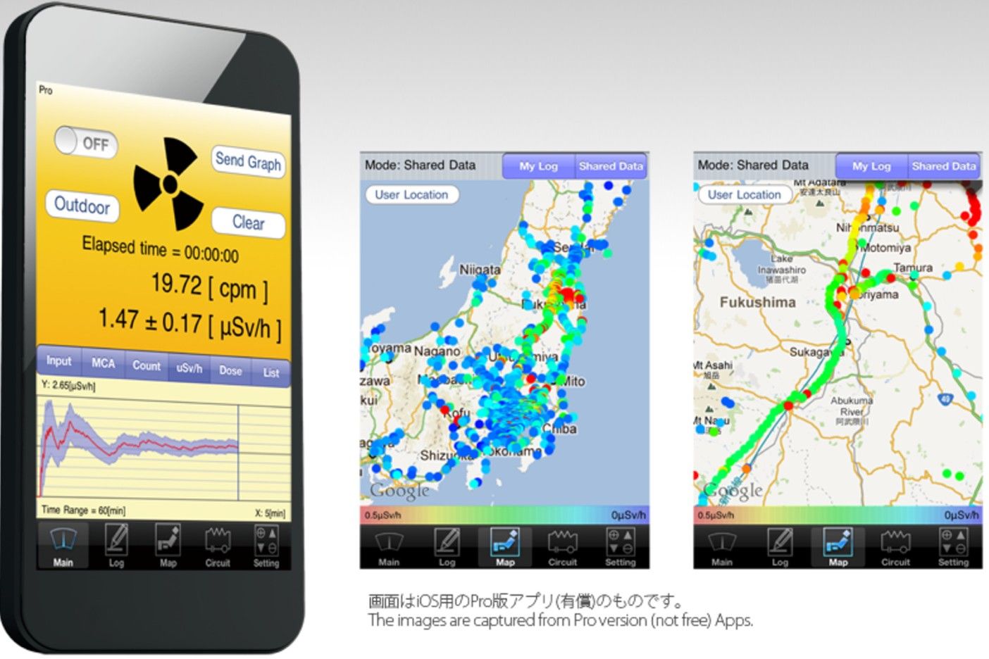
Pocket Geiger Counter, an existing Geiger counter app used by Radiation Watch. It’s an open and non-profit project to develop inexpensive and smart radiation detectors for everyone. Its main focus has been Fukushima, Japan. Although the initiative can have a great impact on the available data in disaster areas, it does not yet support the needs of regular people, such as a concerned mother.
© Radiation Watch, Fair Use.
What’s gone wrong here is that data got mistaken for information. Nathan Shedroff, the renowned interaction designer, explains this in his continuum of understanding—which describes the process by which we understand data. The process starts with data, which has no intrinsic meaning in itself. Without context or other data sets to compare it to, we can’t find any meaning in raw data. To the unaided eye (meaning most people’s eyes and certainly the users’), numbers, Greek-lettered scientific abbreviations, squiggly lines and coloured bars and dots are just sources of confusion. To make matters worse, our example involves a—no pun intended—toxic subject; failing to understand would almost certainly add a stress line to users. Think of a doctor who enters a hospital waiting room to inform worried relatives about the outcome of their loved one’s operation. They want to know what the future holds for him, not a jumble of data on heart rate, ECG readings and other numbers relating to his vital signs.
This is our cue to get away from data and up to the next level. When we take the step to information, we add this meaning, namely by sorting and processing the data. This is when we find patterns and trends. As designers, our job is to help people find and understand the patterns and trends that turn data into information.
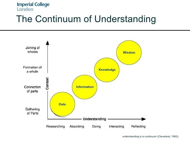
The continuum of understanding, as described by Nathan Shedroff, shows how understanding starts with data and, through a process of connecting and reflecting, transforms into information, knowledge and, ultimately, wisdom. By merely presenting data to people, you don’t connect your designs to users’ goals. You need to take the step to understand which information they need for performing their tasks.
© Imperial College London, Fair Use.
User Goals in Each Step of the Design Process
Taking user goals into account will impact decisions along all steps of designing an information visualisation. Riccardo Mazza, an information visualisation researcher, describes five steps in his book Introduction to Information Visualisation:
Define the problem.
Define the data to be represented.
Define the dimensions required to represent the data.
Define the structures of the data.
Define the interaction required from the visualisation.
Let’s see exactly how user goals will influence our design decisions in each step. So as to do that, an example from the healthcare sector—a context where various people have different roles and thereby different user goals—makes an ideal test subject. As the first step is where user goals have the most impact, we’ll get deeply inside step 1 and look at steps 2 to 5 more briefly.
Step 1 – The Main Step of Defining the Problem
When designing information visualisations, understanding the information people need to perform their tasks is the starting point. It requires some user research. You should be asking questions such as the following: Why do my users need information? In what context will my users search for information? And what will they do with the information they find?
Taking an example from healthcare, an ocean of information surrounds diabetes treatments. This information stretches from dosages, side effects and long-term effects to lifestyle changes and prevention. What’s important to recognise is that the people providing this information (doctors, nurses and dieticians) have much more knowledge of—and experience with—this type of information than patients do. It’s also likely their education levels are higher. Moreover, their main goal is to get the patient’s health situation under control effectively and efficiently. Therefore, these specialists deliver the information transfer to patients from the perspective of objectively balancing the blood sugar levels around a certain level throughout the day. To reach this goal, the patient should ‘just’ take regular measurements, eat the right type of food at set times and adjust the dosages of insulin accordingly. The sooner the patient understands this, the better; so, healthcare specialists tend to impart information about this as soon as possible.
However, from the patient’s perspective, the first response to hearing the diagnosis is emotional: ‘Why did this happen to me? How does this happen when I don’t even eat chocolate or drink wine? What does this mean for the rest of my life? Am I capable of giving myself insulin shots?’ These are questions that may occupy a new patient’s mind. At this point, there’s not much room for instructions. User goals are firstly directed towards acceptance and understanding of the general situation. Only in later stages will patients become receptive to more detailed instructions. Information designed for newly diagnosed diabetes patients should take this process into account. However, typical information leaflets from hospitals start by giving a quick overview of causes, symptoms and treatments. It is not uncommon to read that—left untreated—diabetes can lead to blindness, comas and death in such a leaflet. Also, the vast amount of dietary and lifestyle advice given to patients in this early stage is overwhelming. All in all, the information available to people is not likely to take away any of the insecurities surrounding a diagnosis. Often, such leaflets will scare many at-risk people away. Many may try to make improvements in their diets, which may or may not do any good. As the creators of the ‘information leaflets’ did not take these users’ needs sufficiently into account, they’ll have succeeded in turning much of their readership into ostriches. If a hospital is out of sight, it’s out of mind—meanwhile missing the point that had the information appeared in a ‘healthier’ way, it would have stood a better chance of latching with these people, and catching many of them early enough to prevent a medical emergency.
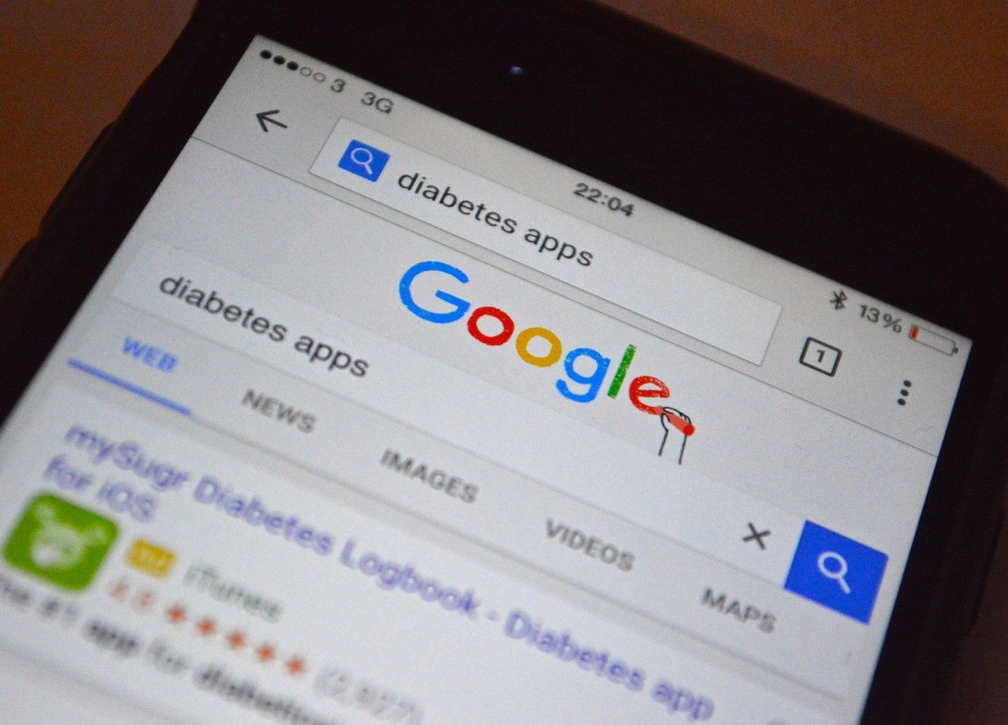
As the number of diabetes patients is growing at alarming rates, diabetes apps are appearing left and right. However, these are often focused on logging blood sugar levels and giving medication reminders. These are perfectly useful functionalities for patients in certain stages of treatment, but not so much for newly diagnosed people.
© Integrated Change, Fair Use.
As the number of diabetes patients is growing at alarming rates, diabetes apps are appearing left and right. However, these are often focused on logging blood sugar levels and giving medication reminders. These are perfectly useful functionalities for patients in certain stages of treatment, but not so much for newly diagnosed people.
So, what would be the way to go here? How should the user goals influence design decisions in this case? In this first step, it is essential that you research user needs by interviewing patients at different stages of treatment. What happened when they first heard their diagnosis? What questions did they have? What were their impressions of the information they received? Where did they search for additional information that answered the questions that remained? Who did they want to give them their information? And what did they wish they had known sooner? After you talk to a number of patients, you will have an impression of the information needs from a patient’s perspective, rather than from a healthcare professional’s perspective. Once you’ve understood their needs, having been immersed in their worlds of despair, fear, determination and hope, you’re ready to proceed to the next step in the design process.
Steps 2 to 5 – The Remaining Steps of Designing the Information
Once you understand the user needs and the context in which they will be using the information design, you can proceed to step 2 and start selecting the data necessary for providing them with the insights they need. Perhaps they need reassurance that they can still go out with friends for dinner and drinks when they feel like it. You need to select the necessary data accordingly, which in this case includes data (among many other things) on the effects of common drinks and common desserts on the blood glucose level.
“Design cannot rescue failed content.”
― Edward R. Tufte, statistician and information design expert from Yale University
Above all, remember the continuum of understanding! You have to determine the right dimensions and structures so as to translate this data into relevant information. That is what you do in steps 3 and 4. For example, when your user needs to know how much of different types of food he or she is allowed to eat, the data is clear. Tables exist, showing the glycaemic index of different types of food (the relative ranking of carbohydrate in foods according to how they affect blood glucose levels). Even so, what does this data mean to someone eating at a friend’s house? How many potatoes can he or she put on a plate? How much meat could he or she eat? Nobody wants to apologise at the dinner table for having to ask the host to measure portions of dishes to the gram, after all! A first step is to translate the glycaemic index into a number of grams for each food type. However, that doesn’t take the context of use into account. It might be more suitable to translate it into terms of ‘the size of a fist’ or ‘the size of a tennis ball’. These are terms people can relate to in a context of use, and will make for more appropriate dimensions. As for the structure of the data, linear or spatial structures wouldn’t make much sense in this context. A hierarchical structure, where the users can select food types based on the course they’re having (starter, main course, dessert) is far better.
Finally, in step 5, you need to define the interaction required from the visualisation. Does the visualisation need to be static, transformable, or manipulable? In the case of diabetes, the effects of food and drinks on blood sugar level is very personal. It depends on overall activity, stress, and other factors, supporting a choice for an interaction whereby the user can manipulate the data so as to personalise it. All of these considerations together will help you in designing the best patient experience for your application.
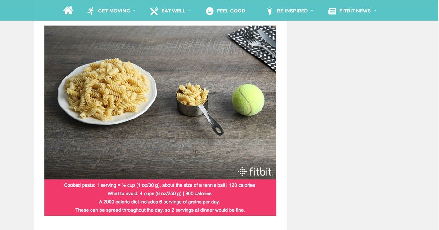
Fitbit understands their users’ need for information. In their blog, they provide a comparison of the amount of pasta you can eat to the size of a tennis ball. This has a dimension and structure that fits people’s activities and would be more suitable for diabetes patients as well. When cooking with friends, patients will not be interested in data on the glycaemic index of ingredients. Instead, they will need a translation of that data into information which is useful in their context.
© Fitbit, Fair Use.
The Take Away
When designing information visualisations, starting with research for understanding the user goals is vital. Without it, you’ll find it difficult to take the step from data to relevant information on the continuum of understanding; consequently, the danger of information anxiety will emerge. This is especially important in design cases where different users have different goals and emotions play a role. You need to take user goals into account in each of Riccardo Mazza’s five steps of information visualisation. User goals are the basis of step 1, defining the problem, but their effects extend to the other four steps in which you define the data, its dimensions, structures and interactions. Keeping this continuum in mind every step of the way will increase your chances of creating compelling designs that users not only will trust but may enjoy using, too.
References & Where to Learn More
Richard Saul Wurman, Information Anxiety, 1989
Edward R. Tufte, The Visual Display of Quantitative Information, 2001
Hero Image: © cea+, Fair Use