UI Animation is a valuable skill in a designer’s toolkit. You can use UI animation effects to reduce cognitive load and add personality and charm to an interface. More importantly, animation will help you overcome language and cultural barriers in interaction design. However, if done poorly, animation can seem distracting and even nauseating! So, how can we ensure we use animation effectively? Who better to learn from than Disney, the pioneers of computer animation. Here, we look at Disney's 12 Principles of Animation and how you can apply them to user interfaces.
As a UI designer, you need to master the principles of animation to create experiences that feel familiar, intuitive and real. The secret to successful animations, therefore, is to generate emotions.
Arguably, no one knows this better than Disney.
The “try not to smile” video compilation by Disney.
© The Walt Disney Company, Fair UseWhat are Disney’s 12 Principles of Animation?
What seems real to the mind can be as important as any material fact. We live by the spirit and the imagination as well as by our senses. Cartoon animation can give fantasy the same reality as those things we can touch and see and hear.
— Walt Disney
Disney animators Ollie Johnston and Frank Thomas developed the 12 Principles of Animation to produce more realistic animations. They published them in 1981 in the book, The Illusion of Life: Disney Animation which is often referred to as the “Bible of Animation.”
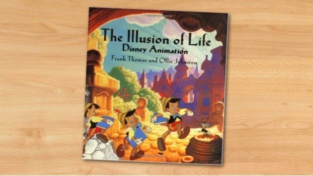
Disney Animation: The Illusion of Life is a book by Frank Thomas and Ollie Johnston.
© The Walt Disney Company, Fair Use.
Those 12 principles combine the fundamental laws of physics—that all animations need to follow to be believable—with cognitive psychology principles, intended to generate emotion.
So, how can you apply Disney’s lead to take your animation and UI design skills to the next level?
1. Squash and Stretch
The squash and stretch principle is essential to creating animations with the illusion of gravity, weight, mass and flexibility. A bouncing ball commonly exemplifies this principle; it stretches when it travels up and down and squishes when it hits the ground. How much it stretches and squishes depends on the material the ball is supposed to be made of. The effect will be very pronounced if the ball is made of rubber, whereas if it emulates a bowling ball, it will be very subtle.
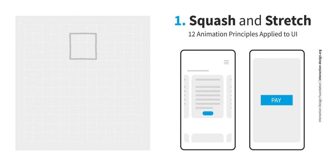
In digital interfaces, the squash and stretch principle makes elements feel tactile and gives visual cues or feedback regarding available affordances. For example, if you’d like your users to effectuate a purchase, you can use the squash and stretch principle to animate the pay button to draw the users' attention and entice them to “press” the button.
When using squash and stretch, keeping the object's volume consistent is essential. So, when you stretch something, it needs to get thinner, and when you squash something, it needs to get wider.
2. Anticipation
Anticipation helps to prepare the viewer for what's about to happen, and it’s key to making any motion feel real. Can you tell someone is about to jump right before they do it? In most cases, yes, because they’re bending their knees and moving their arms in a particular way. The same phenomenon happens with most motions. There are many anticipatory movements that our brain processes at a subconscious level.
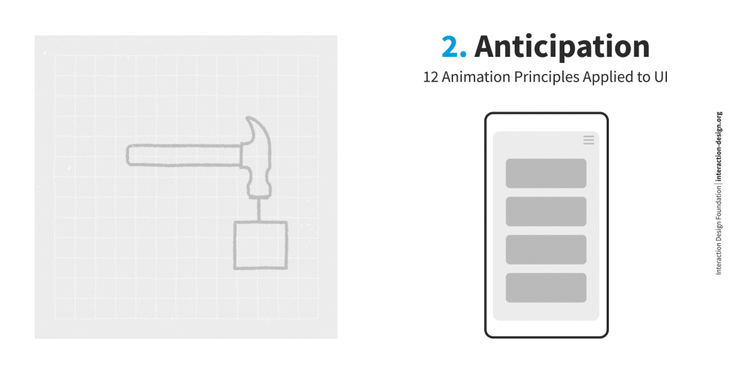
In digital interfaces, you can use the anticipation principle to inform the user about what will happen if they perform a particular action. One of the main applications of this principle is hover animations: if users hover over a button, it moves to show the users it is interactive.
3. Staging
The staging principle describes motions that guide the viewer's eye and draw attention to what's important within the scene.
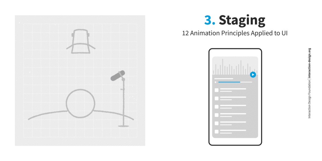
Imagine you were designing an interface with lots of animations. It would probably confuse the user if all the elements are competing for attention. Use animation to show your user where to focus within the interface and keep the motion of everything else (that’s not as important) to a minimum.
4. Straight-Ahead Action and Pose to Pose
This principle refers to two different approaches to animation. Straight-ahead animation is created, drawing frame-by-frame from start to finish.
The pose-to-pose technique involves creating the key frame first—a frame in the beginning, middle and end. Then, in the case of computer animation, the animation software completes the rest automatically for you.
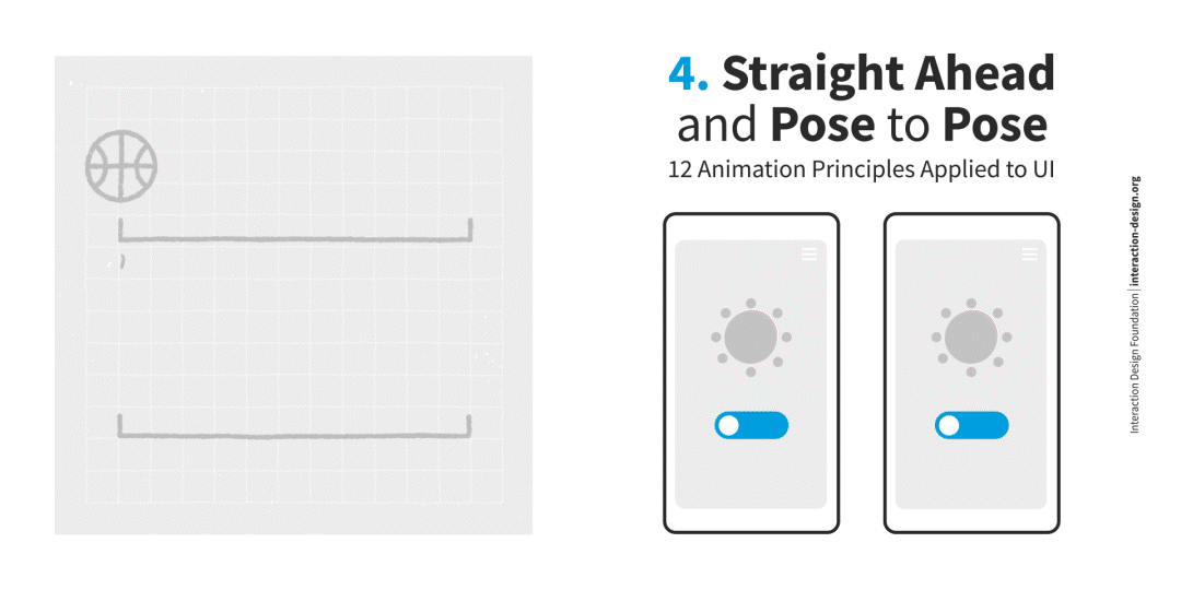
In UI design, you will most likely use the pose-to-pose method—for instance, to create component states—except if you’re looking to animate something unusual.
5. Follow Through and Overlapping Action
This principle reflects the fact that not all parts of an object move at the same time. For instance, look at yourself in the mirror and shake your head. If you have longer hair, you’ll see your hair movement is a bit delayed to the movement of your head, and your eyes might move differently (an overlapping action). This phenomenon is critical when objects come to a standstill after being in motion. In the same example, your hair might still be in motion slightly after you’ve stopped moving your head (follow through).
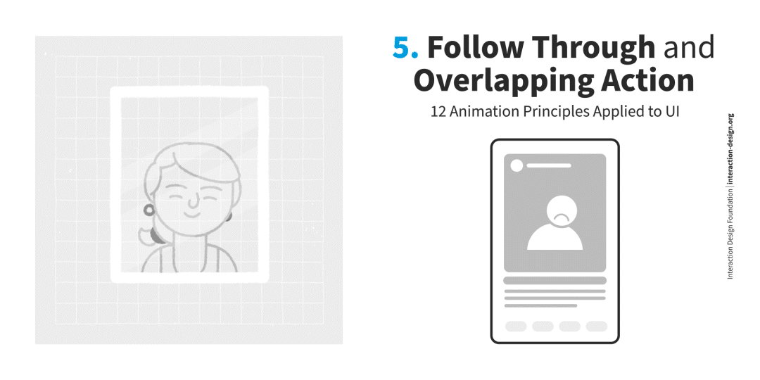
In UI animation design, you can have elements that are related to each other but that may move at different rates. For example, you may have an image, a title and a description. The initiator of the movement will be the most crucial element, in this case, the image. Then the title and description follow. This principle helps you establish a hierarchy in an interface.
6. Slow In and Slow Out
The best way to understand this principle is to imagine how a car starts and stops. Any vehicle starts moving slowly before accelerating and speeding up, and the reverse happens when the car brakes. Add more frames at the beginning and end of a motion sequence to achieve this effect.
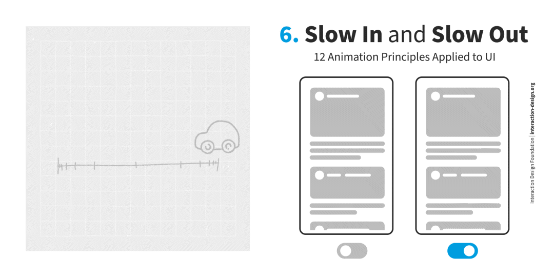
This principle is vital to make any motion in your design feel natural and authentic. Without easing in and out, your animations will feel robotic.
7. Arc
In the physical world, most objects move following a slight arc. Think of how you walk or the motion of a ball you toss into the air.
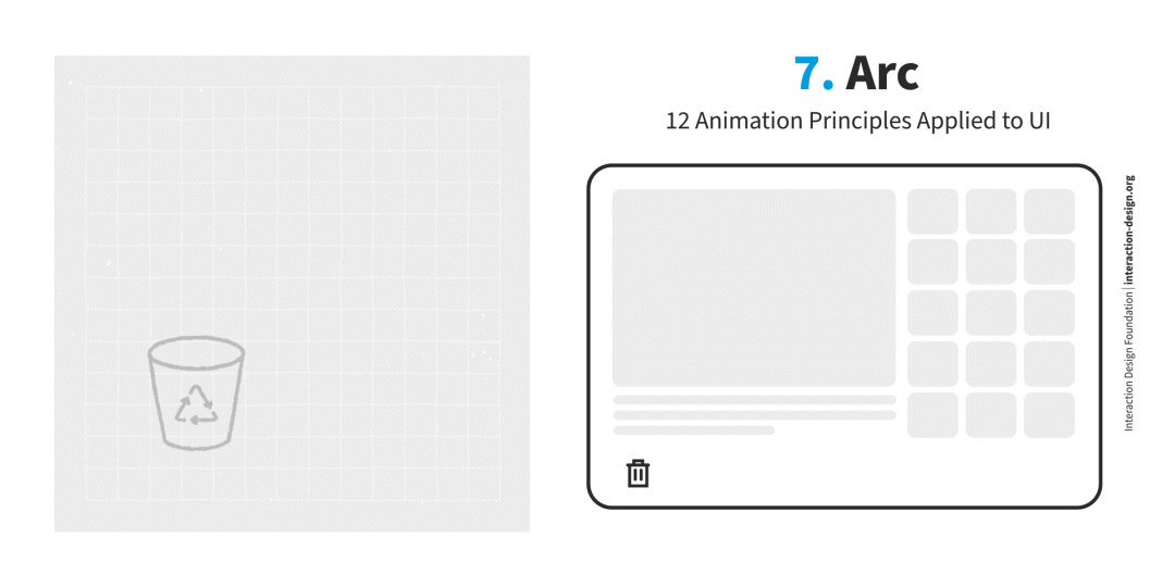
In UI animation design, you can breathe life into your animations by using arcs as animation paths instead of straight lines. A great example of this principle is the Mac’s dock bar hover animation, which makes navigation through the different apps anchored in the dock intuitive and fun.
8. Secondary Action
Secondary actions are used to support or emphasize the main action going on within a scene. The addition of secondary actions adds another dimension to your animations.
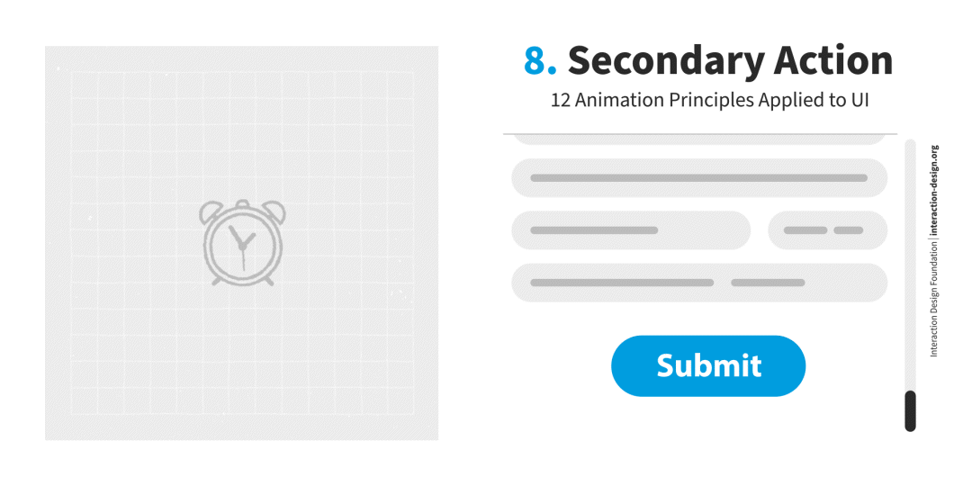
In UI design, you can use secondary actions to elicit emotions in your users. Imagine your user has submitted a very long form. You can animate the submit button to have a secondary celebratory animation (for instance, confetti) to congratulate your user for completing a time-consuming task.
9. Timing
How quickly or slowly an object moves gives us a lot of information. If we saw a snail moving fast, we would be puzzled and maybe think we’ve discovered a new species!
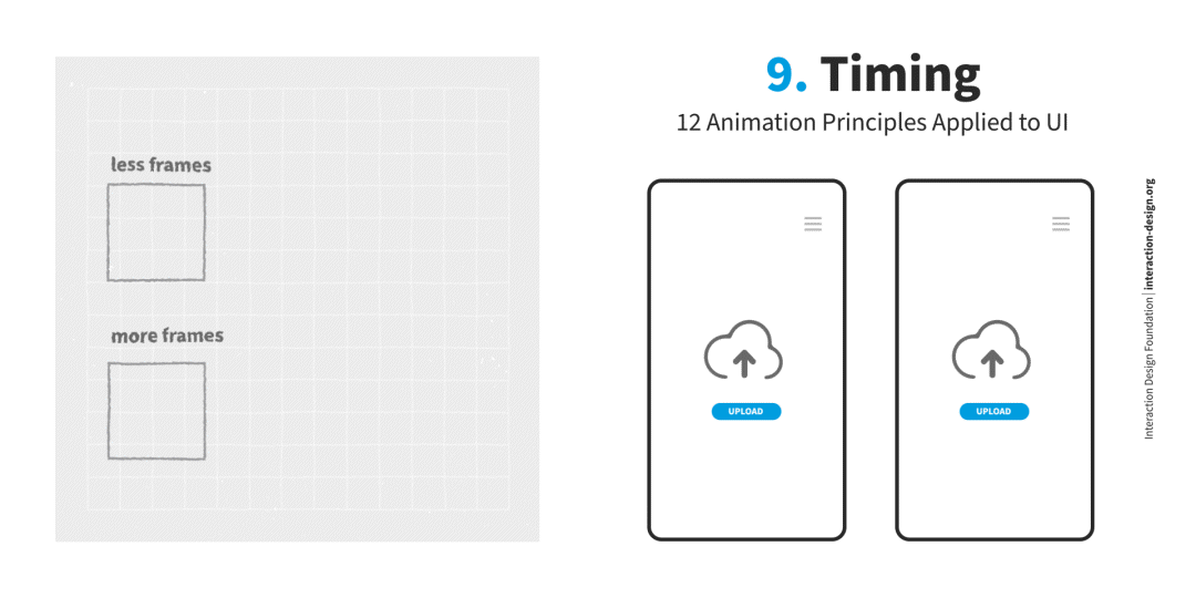
In UI design, you can use timing to inform your users. For instance, you can link the speed of a file-loading animation to how big the file is. This will give your user a sense of how long the process will take and why—so the upload will be slower if you’re uploading a big file and much quicker if it’s a small file.
10. Exaggeration
This principle gives the animations a fun character and helps the viewer focus on what’s important.
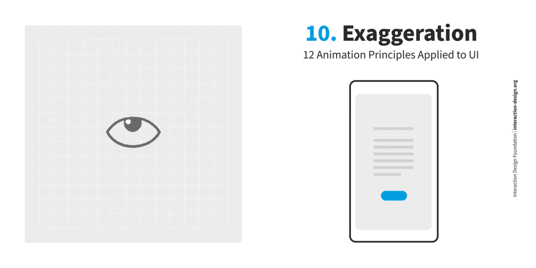
In UI animation design, you can exaggerate certain elements to make it clear to users how they are supposed to interact with the interface. In addition, exaggeration always adds an entertaining aspect to the design. How much you can exaggerate an element will depend on the purpose of the product and its overall look and feel.
A good animation effect will be invisible to the viewer. However, if you exaggerate too much, it may annoy users. If that happens, consider making the animation more subtle.
11. Solid Drawing
Understanding the basics of drawing—or in the case of UI, the principles of visual design—will help you design more successful animations.
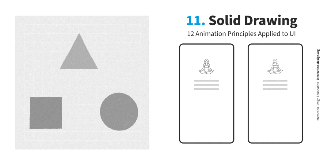
Imagine you design a button with a shadow, and the shadow doesn’t follow a proper perspective. The user would immediately think that there was something wrong with the app.
This phenomenon is even more evident in skeuomorphic design, where elements imitate their real-world counterparts.
While you can push the limits here, it's essential to remain consistent, and any distortion in your design needs to be justified and feel intentional to the user.
12. Appeal
Animations need to appeal to the viewer. There is no mathematical formula to get this right, but any animation should trigger the viewer's attention and create a pull. Research and testing are vital aspects of getting the appeal of your animations just right.
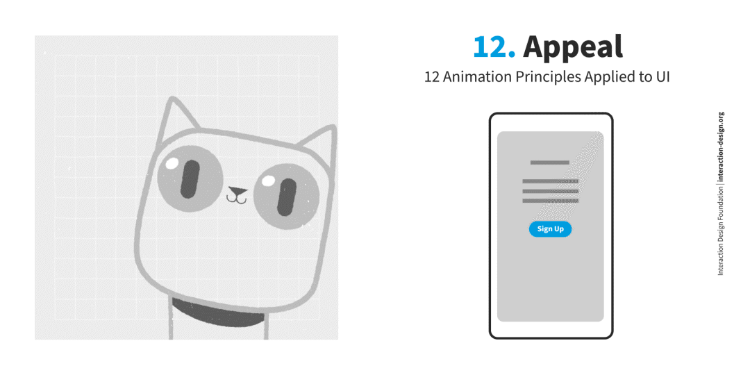
In UI design, the appeal is critical to stand out. Many products will compete with yours. You can use animation to define your product's personality and create an emotional connection with the user.
Some digital products like Mailchimp create actual animated characters to add personality and visual appeal to their interfaces, and that can create a deeper connection with the user.
The Take Away
UI animation is an essential part of UI design. Great animation can bring your digital interfaces to life, help your products stand out and build a more intuitive and captivating experience for your users.
However, getting it wrong, and creating an animation for the sake of animation will result in a poor user interface.
So, as a UI designer, use Disney’s 12 principles of animation as a foundation to create meaningful animations that engage your users and enhance your product's success.
References and Where to Learn More
Read the book The Illusion of Life: Disney Animation by Frank Thomas and Ollie Johnston to learn more about Disney’s 12 principles of animation.
Watch Michal Malewicz’s Master Class Beyond Interfaces: The UI Design Skills You Need to Know to learn more about how to design great user interfaces.
Learn more about visual design in the IxDF Visual Design: The Ultimate Guide course.
Hero image: © Interaction Design Foundation, CC BY-SA 4.0