
If you’re involved in designing online or even app learning tools then there are some fairly useful tips that you can use to make your projects more effective. This is where User Experience and ROI on learning investment collide:
Visuals Plus Text = Better Retention
Author/Copyright holder: Daily Genius. Copyright terms and licence: All rights reserved Img source
If you’re delivering learning that is simply text; you’re probably missing a trick. There’s a reason a lot of kids hate going to school and it’s book learning. When you have a medium which allows you to present more than a wall of text – it’s going to be more interesting with more. There are plenty of non-text additions you can make too; from movies, infographics, pictures, charts, animated material, etc.
Relevant Visuals Are Best of All
There’s a decent case for making things pretty by adding pictures but it’s much better if your visuals actually add to the learning experience. A chart which illustrates the key components of a point will aid learning; a picture of a frog (because the reader may be jumping up and down with frustration) won’t add much in the way of value.
Stock imagery is a major cause of complaint in websites, magazines, etc. and it’s pretty safe to assume that it’s not that well received in learning experiences too.
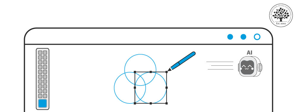
Animated Visuals Are Best for Things People Do
If you’re going to teach someone how to tie a bow tie or their shoelaces; it’s a good idea to show this process in some form of animation (this includes actual videos of someone walking through the process). Learning to do things from a series of diagrams is much harder; think about the problems people have with assembling furniture from IKEA or similar places – it should be simple but it rarely is.
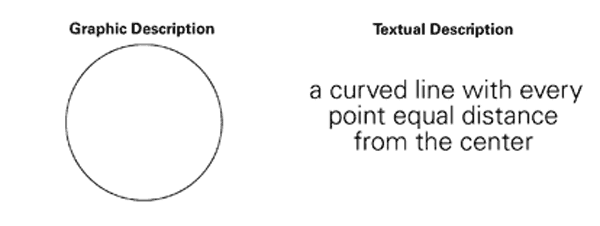
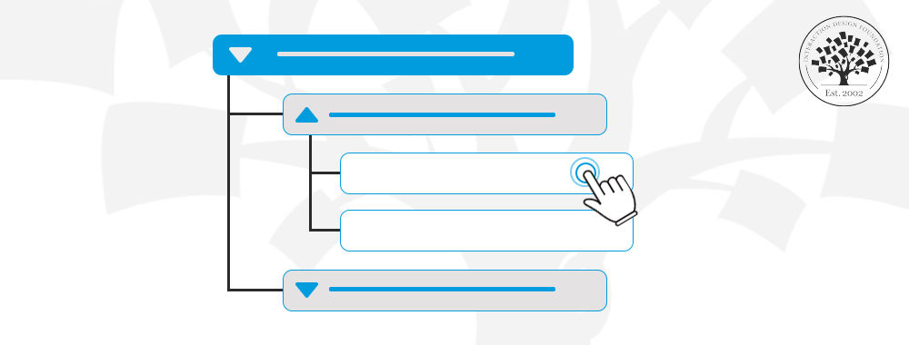
Static Visuals Help Us Form Connections
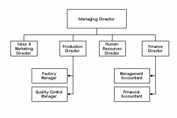
Author/Copyright holder: Tutor2u. Copyright terms and licence: All rights reserved Img source
In contrast, static visuals, are really good at helping us make logical connections between items. That makes them really good for teaching processes that don’t have a “hands on” component. If you want to show how a corporate hierarchy works, for example, you don’t need the CEO’s laughing and revolving head shouting out the distance from the top that the position occupies… it would be distracting (and nightmarish, frankly). A simple and static hierarchy diagram should do the trick instead.
Visuals Can Simplify the Complex
Imagine teaching photosynthesis from a series of electron microscope slides showing each stage of the process. It would be awful wouldn’t it? The visuals would be so complex that the learners would switch off. Whereas a nice simple diagram of how photosynthesis works has had millions of biology students around the world passing biology exams at school for decades.
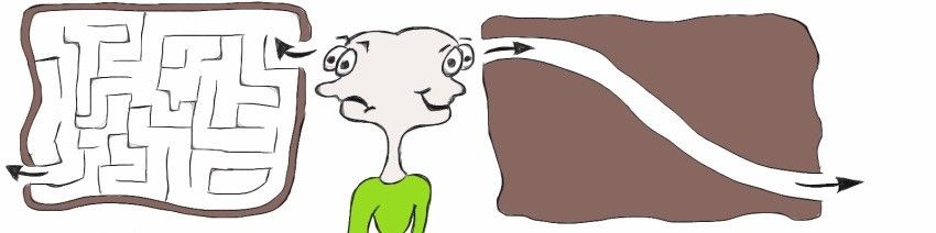
Author/Copyright holder: Visual Thinking Magic. Copyright terms and licence: All rights reserved Img source
This is really important, visuals in a learning context are about promoting learning more than they are about promoting 100% accurate representations of the world we are learning about.
Summary
This series continues tomorrow with more pointers on how to improve the UX of learning experience design. Which of the techniques above do you already use? Why not tell us about it on our Facebook page?
Header Image: Author/Copyright holder: Posterous Spaces. Copyright terms and licence: All rights reserved. Img


