A heuristic is a simple principle or “rule of thumb”. A heuristic evaluation is one where an evaluator or group of evaluators walks through the design of an interface and decides whether or not it complies with these “rules of thumb”.

There are some advantages and disadvantages to this methodology:
Good Reasons to Use Heuristic Evaluation
It’s fast, quick and cheap to conduct a heuristic evaluation. This is especially true if you are only going to use a single evaluator.
It provides good insight into possible usability problems that might damage the user experience.
Reasons to be Cautious about Using Heuristic Evaluations
A single evaluator may miss issues that are not readily apparent to them. The use of more than one evaluator is recommended.
Heuristic analysis is subjective. It does not “prove” anything and thus findings may be open to debate.
Experienced evaluators are hard to come by and that means that you may need to use less skilled evaluators whose findings may not be as valuable.
How to Conduct a Heuristic Evaluation in Human-Computer Interaction (HCI) for Usability
There is a simple process to follow to conduct a heuristic analysis for HCI usability:
Know What You Will Test and How
Before you begin any form of usability testing or user research it is essential for you to have an objective for your testing. You really need to be articulate: What will you test? (The whole product or just a sign up page, for example?) How will you test? How will you ensure the evaluators understand this?
Understand Your Users
You also need some background on your users. This form of testing doesn’t involve users but your evaluators need to be able to act on behalf of the user – that means they need to know the target audience and what they expect to achieve from the interaction. It can be very useful to supply the evaluator with user personas to achieve this understanding. If your evaluators don’t operate from a user’s perspective the analysis may lack focus or fail to provide the specific insights that you need to improve the product.
Decide on the Heuristics to be Used
Jakob Nielsen and Rolf Molich designed a set of 10 heuristics that can be used to evaluate HCI usability in 1990. Nielsen later revised the heuristics in 1994 to deliver the following 10 heuristics:
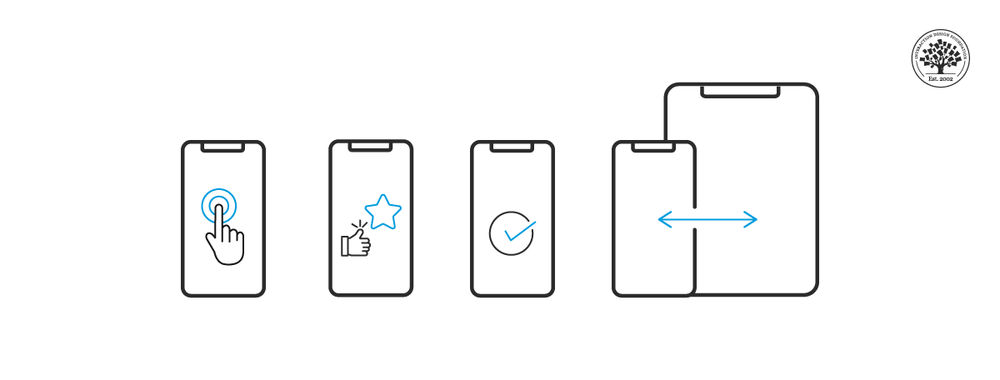
Jakob Nielsen’s 10 Usability Heuristics for User Interface Design
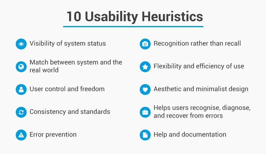
Visibility of the system’s status. Users should be given feedback on what is happening within a reasonable timescale.
Match between the system and real world. Information should be presented in a means familiar to the user including language and conventions rather than terms developed for the system. Information should be presented in a logical order.
User control and freedom. Users make mistakes. There should be an “emergency exit” which is easy to find and exit the current system state without having to jump through hoops. Undo and redo functions are essential.
Consistency and standards. Words, actions, situations, etc. should always mean the same thing and users should be able to understand that.
Error prevention. Preventing error is better than clear error messages. Eliminate error conditions or make users aware that they may be about to occur and ask them if they want to proceed.
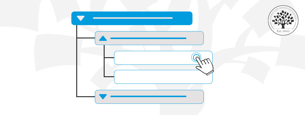
Recognition rather than recall. Reduce the load on a user’s memory. Make actions, options, and objects visible. Users shouldn’t have to remember things from one screen to the next. Instructions should be easy to access when needed.
Flexibility and efficiency of use. The use of accelerators, where appropriate, may be invisible to new users but improve the efficiency of use for experienced users. Actions could be customized by users.
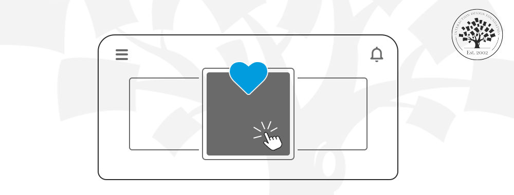
Aesthetics and minimalist design. Dialogue should not give irrelevant or rarely useful information. The more data in dialogue the more it diminishes the overall visibility of individual points for the user.
Help users recognize, diagnose and recover from error. This means error messages should be in clear language and avoid the use of codes. They should explain the problem and offer a solution to that problem.
Help and documentation. The best approach is to construct a system which needs no help or documentation but if it is necessary – it should be easy to search, be based on the tasks the user wishes to execute, offer concrete steps to follow and be kept to a minimum.
It is worth noting that while Nielsen’s heuristics are those most commonly employed to carry out heuristic evaluation – they are not set in stone. You are free to add additional heuristics, remove heuristics and amend them as you see fit to deliver a usable interface for your user base.
Conduct the Heuristic Walkthrough
Evaluators should conduct the walkthrough independently of each other – to give the broadest range of input without “group think” occurring during the process. They should record any issues that they encounter on a piece of paper or electronically and explain which heuristic has been violated and why.
So let’s say that an evaluator finds that when they enter a new password it needs to contain a special character (e.g. # or $ or % etc.) but that this isn’t shown on the instructions and without that character – the system displays an error. This would conflict with the idea of “error prevention” and should be noted as such.
Collect and Analyze Results
This is simply a roundup of all the evaluators’ comments into a single report. This report can be marked with severity ratings, if you desire, to enable rapid deployment of resources to fix the problems identified.
Heuristic Analysis and Information Visualization
Information visualization is a relatively new discipline from a formal perspective and it is only the recent boom in “big data” which has transformed the use of interaction visualization from static perspectives (diagrams) into interactive systems. In theory, it should be straightforward to conduct a heuristic analysis of an information visualization, however there is no set of “off-the-shelf” heuristics for information visualization assessment (unlike for HCI which was shown above).
This means that to some extent the researcher will need to define their own heuristics which may be based on the HCI heuristics. This is perfectly OK but does introduce the risks of missing usability problems during an information visualization heuristic analysis because of the lack of a particular heuristic.
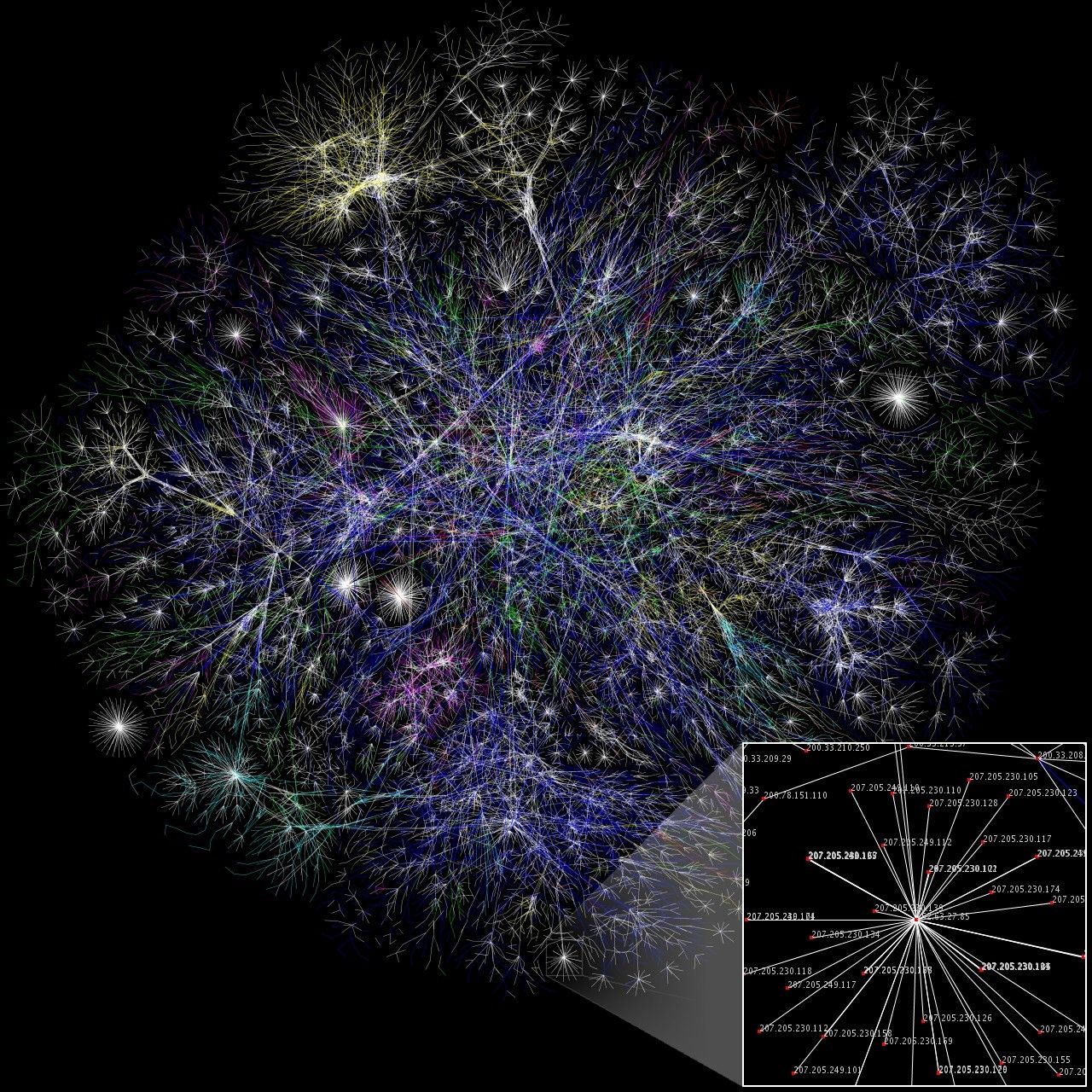
Author/Copyright holder: The Opte Project. Copyright terms and licence: CC BY 2.5
The Take Away
Heuristic analysis is easy and cheap to conduct. It is best used with computer interfaces and conducted by experienced researchers. However, experience comes over time and even an inexperienced evaluator can add value by using this process. It is more challenging to use when it comes to information visualization as there is no clearly defined set of heuristics for information visualization though researchers can adapt them from HCI.
You should also try to keep in mind what the Nobel Prize winning economist Daniel Kahneman has to say about heuristics; “By their very nature, heuristic shortcuts will produce biases” and try to ensure that wherever possible your use of heuristics is objective rather than subjective.
References & Where to Learn More:
Course: Conducting Usability Testing
Molich, R and Nielsen, J (1990). Improving a human-computer dialogue, Communications of the ACM 33, 3 (March), 338-348.
Nielsen, J and Molich, R (1990). Heuristic evaluation of user interfaces, Proc. ACM CHI'90 Conf.(Seattle, WA, 1-5 April), 249-256.
Nielsen, J (1994a). Enhancing the explanatory power of usability heuristics. Proc. ACM CHI'94 Conf. (Boston, MA, April 24-28), 152-158.
Nielsen, J (1994b). Heuristic evaluation. In Nielsen, J., and Mack, R.L. (Eds.), Usability Inspection Methods, John Wiley & Sons, New York, NY.
Neilsen J (1995), 10 Usability Heuristics for User Interface Design
Hero Image: Author/Copyright holder: Yandle. Copyright terms and licence: CC BY 2.0